What’s become of Otl Aicher’s former abode? A visit to the Allgäu.
What’s become of Otl Aicher’s former abode? A visit to the Allgäu.
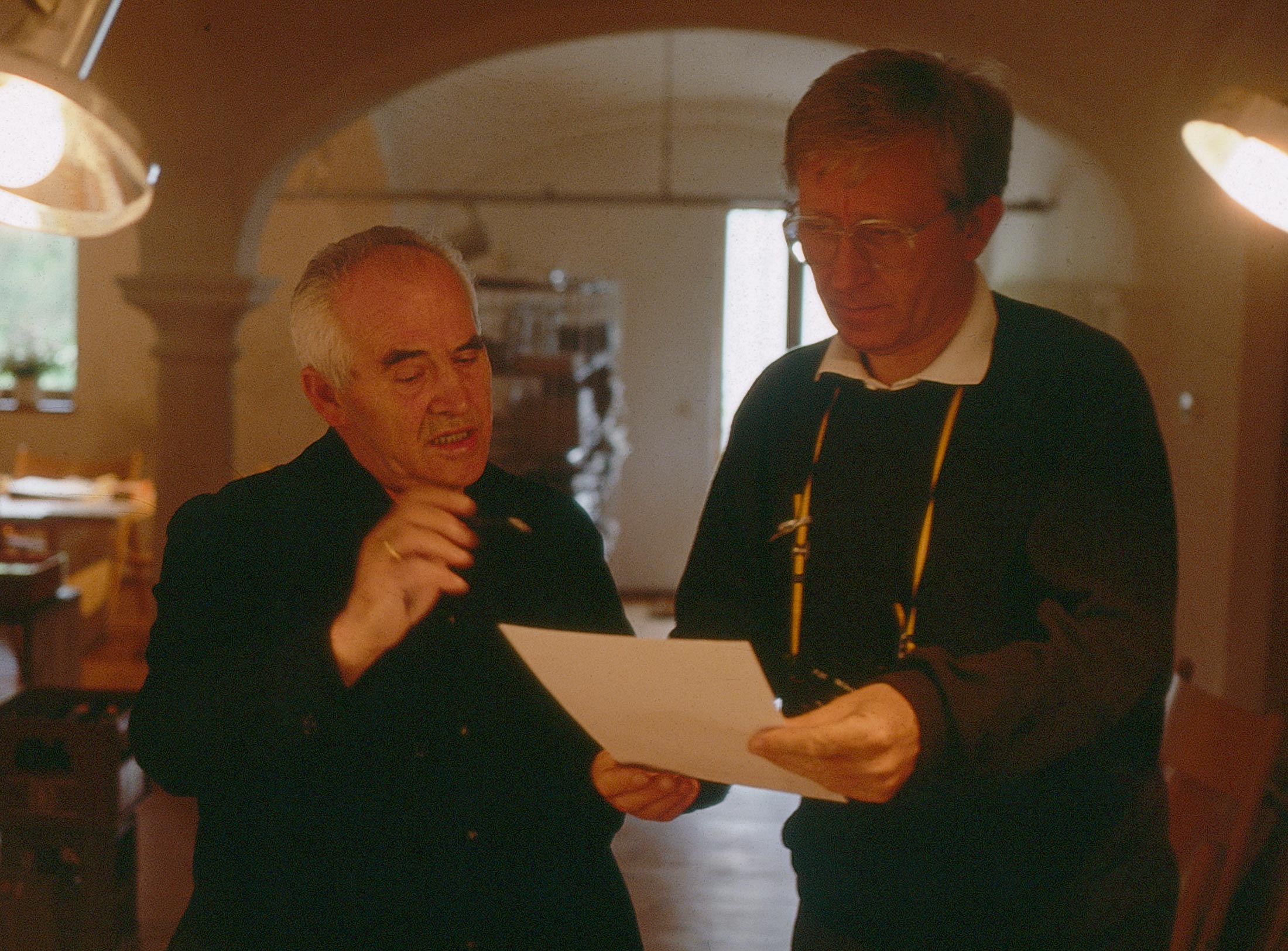
Interviewed: Erik Spiekermann, type designer, author and Aicher critic.
Technology: a central notion and fixed point of perspective in the work of Otl Aicher.
The British architect Norman Foster on his friendship with Otl Aicher: He had absolute integrity.
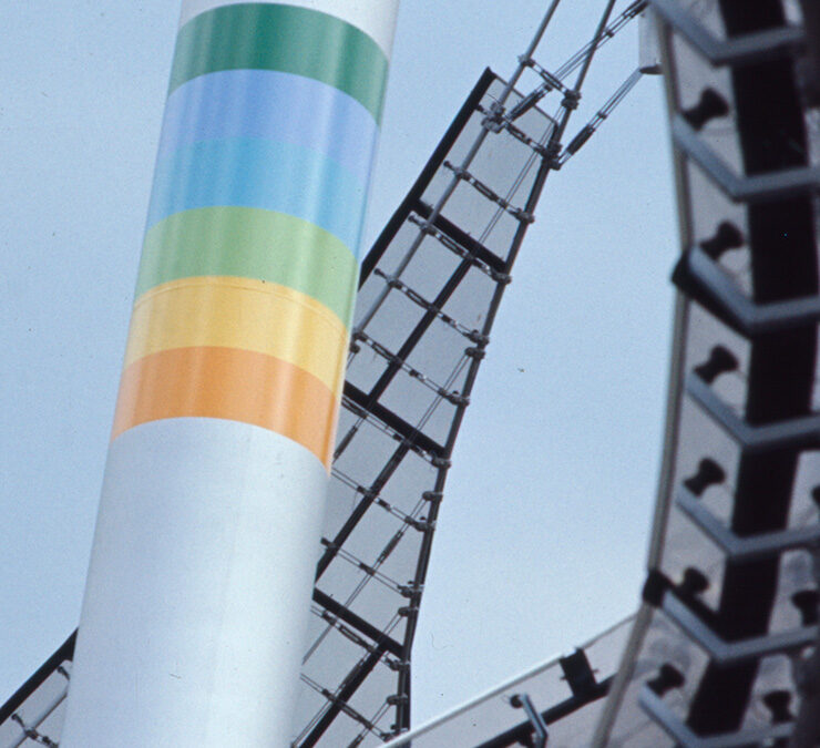
Thoughts on the colour palettes of Otl Aicher.
Absolute sharpness, reduction and strict rules determine the character of his pictures: Otl Aicher as photographer.

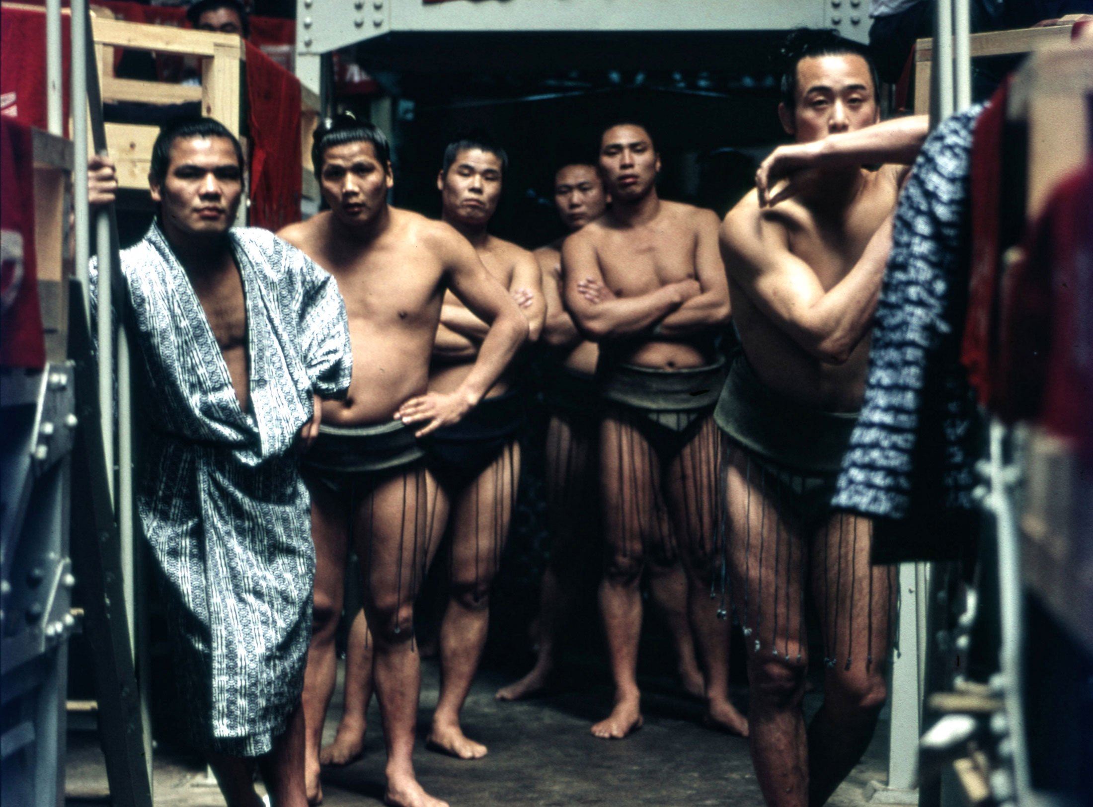
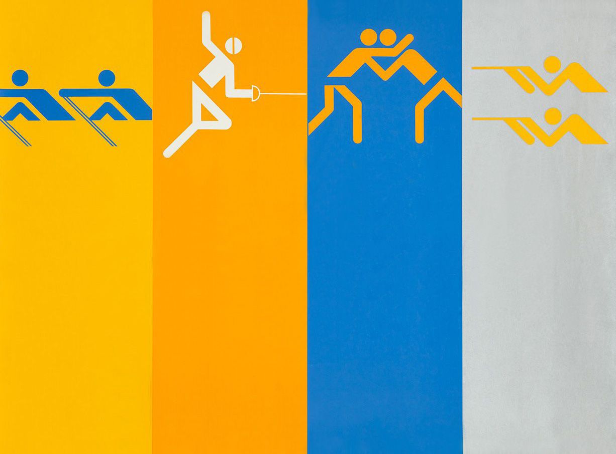
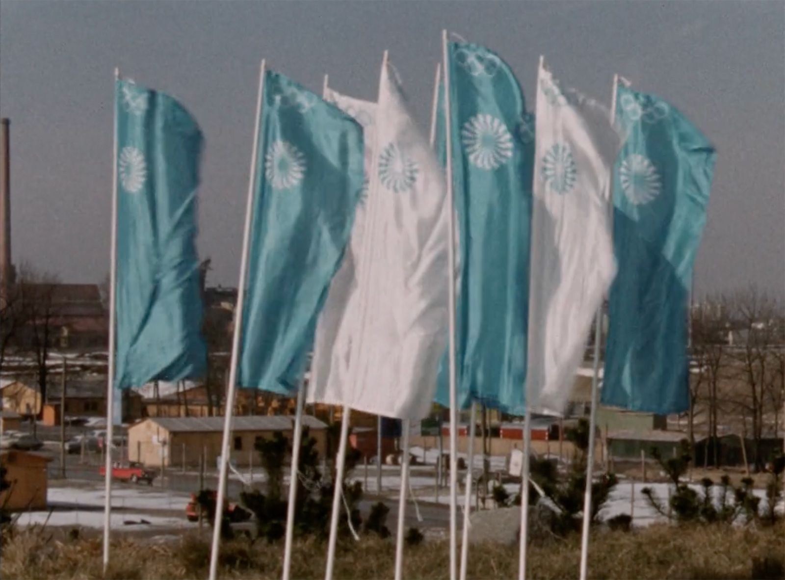
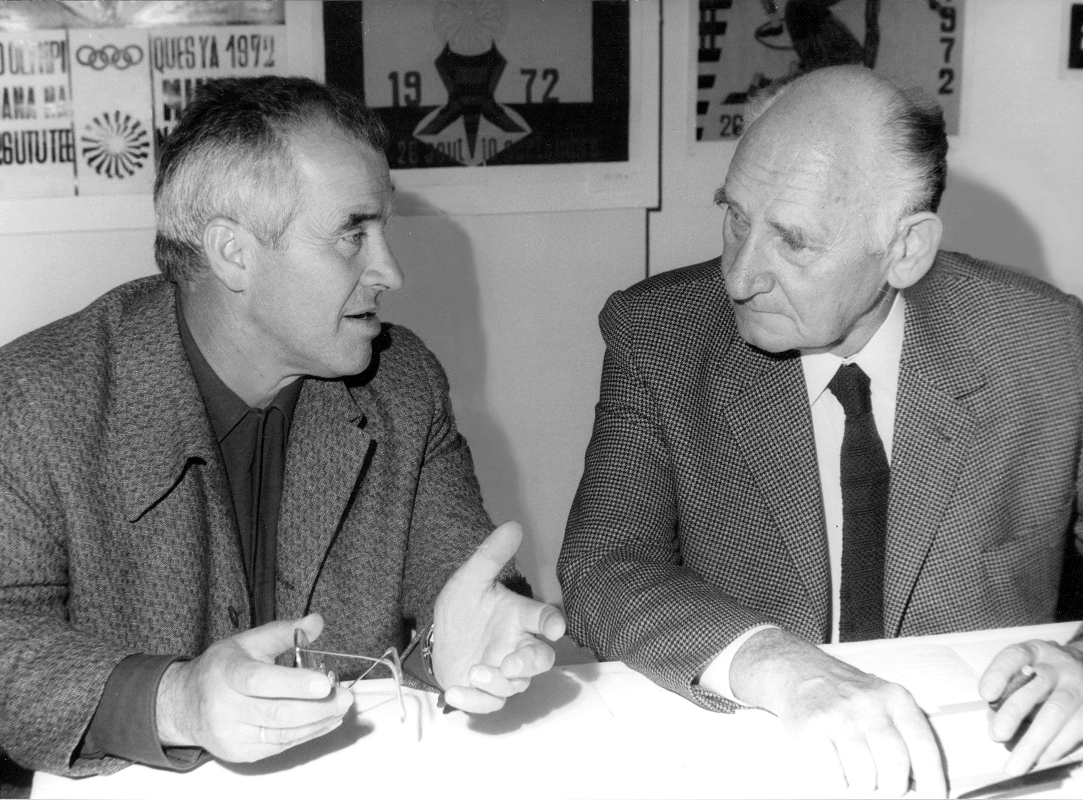
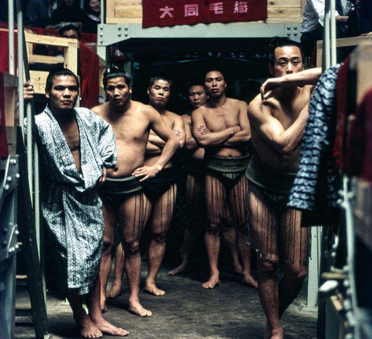
Under Otl Aicher’s direction, designers, architects and landscape planners shaped the face of the Olympic Games 1972.
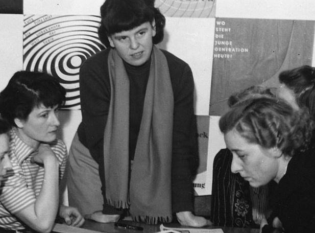
Inge Aicher-Scholl preserved the legacy of the White Rose.
An interview with design icon Stefan Sagmeister about typefaces, beauty and the legacy of Otl Aicher.
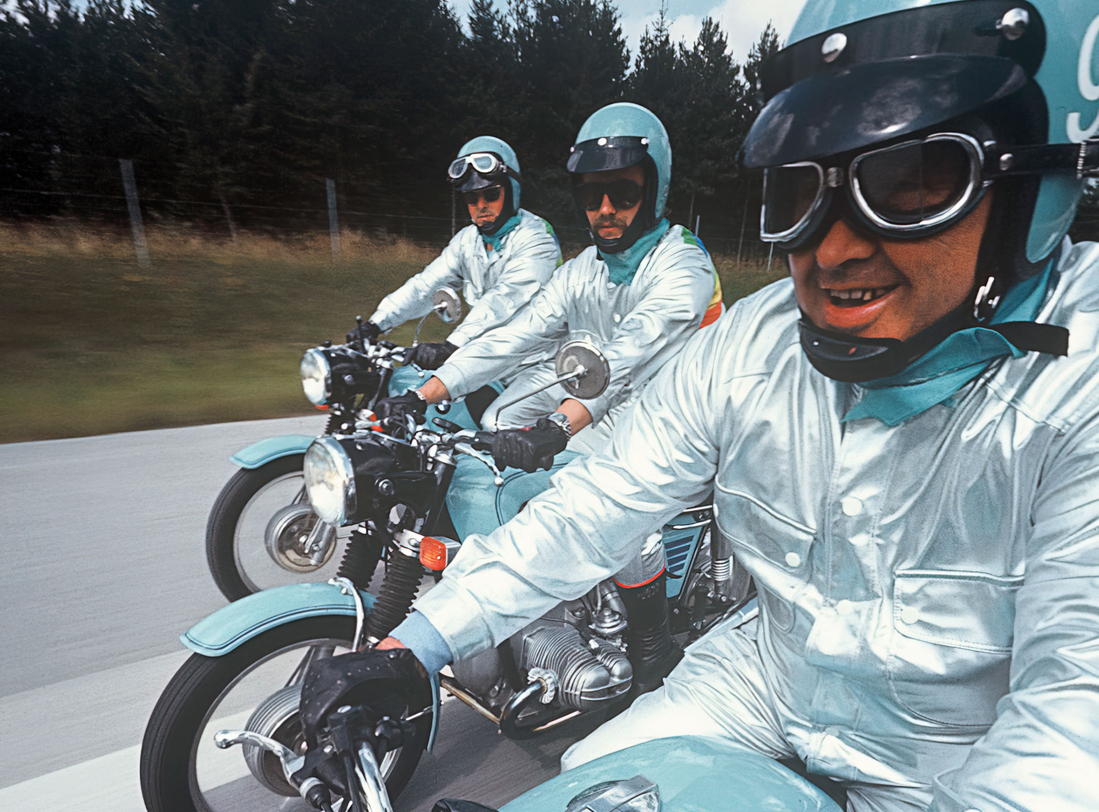
The International Design Center Berlin (IDZ) invites you to a slide show and panel talk at Architektur Galerie Berlin on 20 October. Karsten de Riese and Prof. Michael Klar will report on a photo reportage commissioned by BMW that took them to Tunisia in 1975 together...
On the occasion of the 50th anniversary of the 1972 Olympic Games, the IDZ invites you to a discussion on the vision of the Munich Games and the status quo as well as the future of the Olympic movement on 26 August. The event at Berlin’s Akademie der Künste on Pariser...
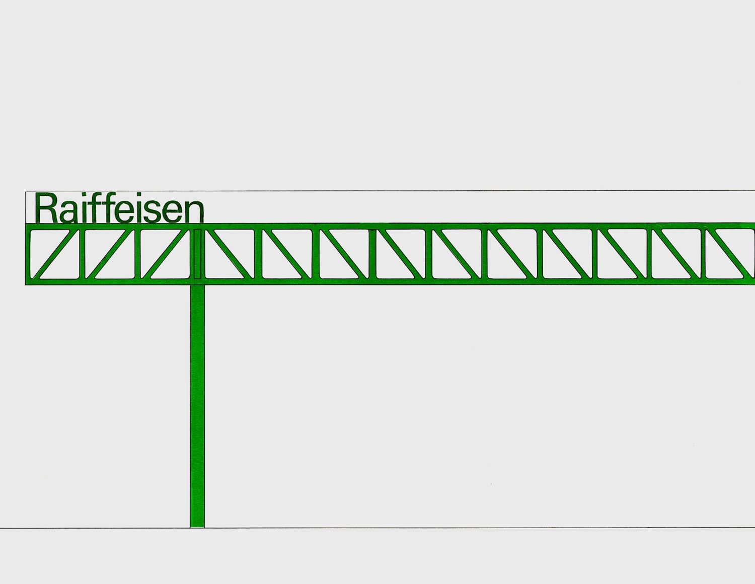
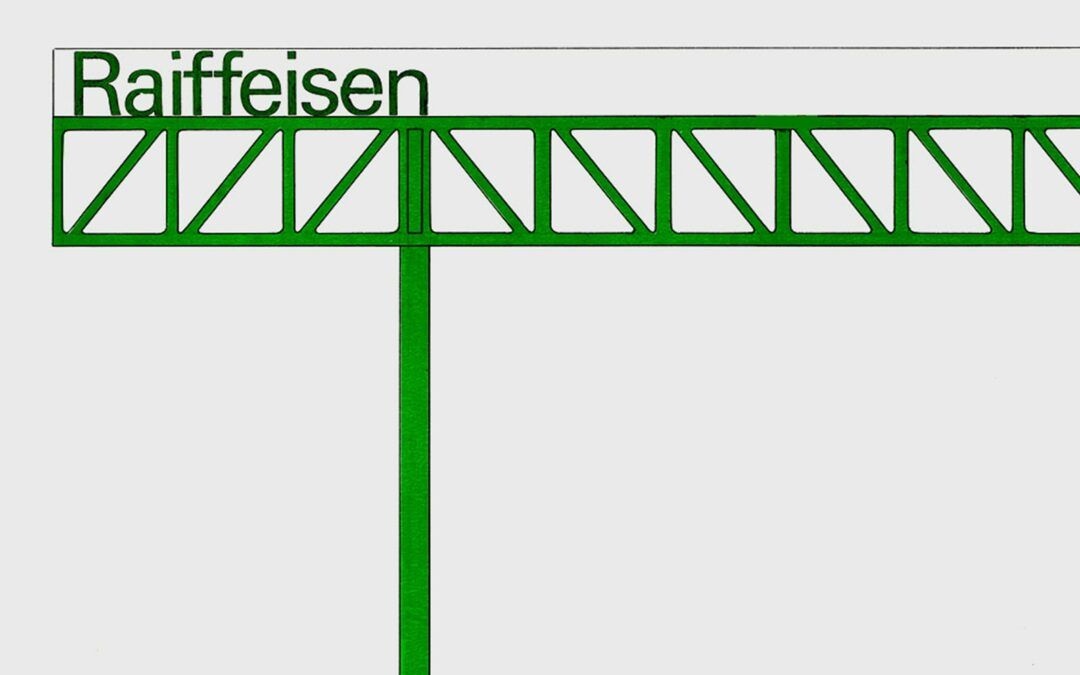
Isny im Allgäu owes Otl Aicher a corporate design that is concise, bold and singular.
With a retrospective of Otl Aicher’s book “kritik am auto – schwierige verteidigung des autos gegen seine anbeter” (Criticism of the Car – Difficult Defence of the Car against its Worshippers) published in 1984, the IDZ continues its series of events on the “otl...
Today marks the centenary of Otl Aicher’s birth. The International Design Center Berlin (IDZ) is taking this date as an opportunity to pay tribute to this great designer. With otlaicher100.de, a new online platform is being launched – a curated space that provides...
Reflections on Inge Aicher-Scholl and Otl Aicher.
The International Design Center Berlin (IDZ) is taking Otl Aicher’s centenary as an opportunity to pay tribute to this great designer and to make his work visible. An online platform and a series of events will address Otl Aicher’s multifaceted cosmos of topics and...
Eine Stadt leuchtet: Mit seinem farbenfrohen Erscheinungsbild der XX. Olympischen Sommerspiele 1972 setzte Otl Aicher ein Signal. Die junge Bundesrepublik war in der Moderne angekommen.
Otl Aicher’s Poster displays for the Ulmer Volkshochschule (Ulm Adult Education Centre).
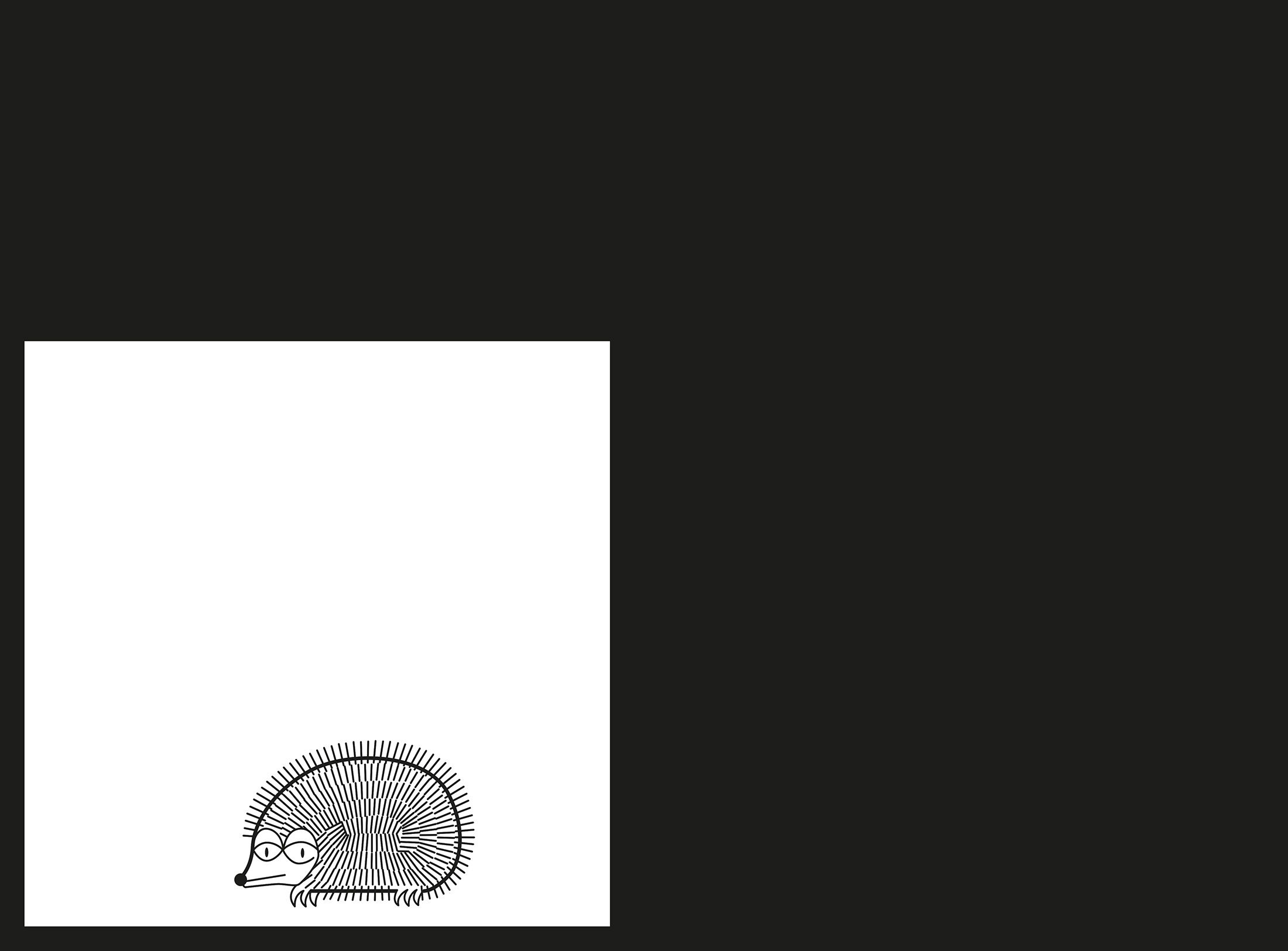
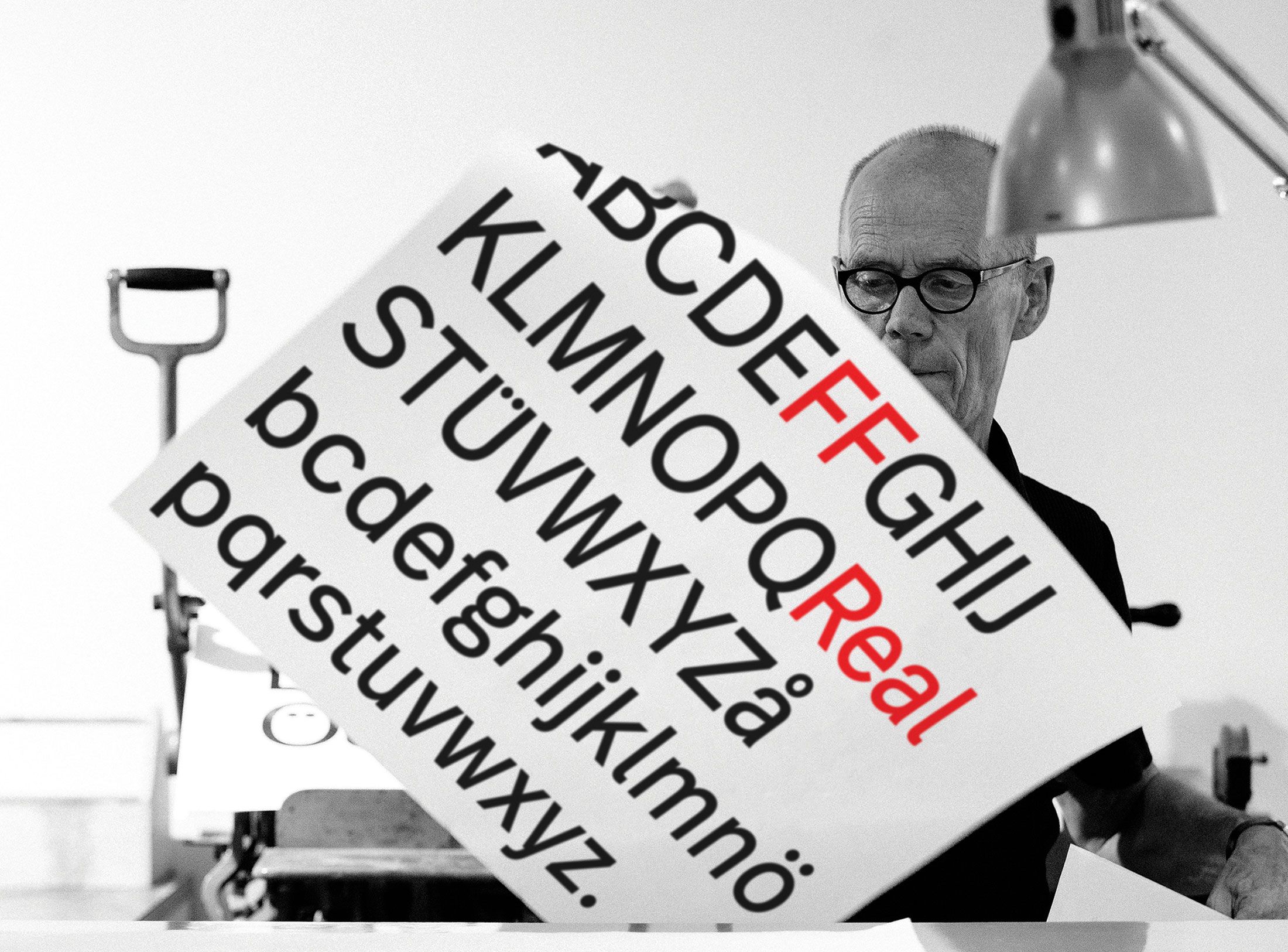
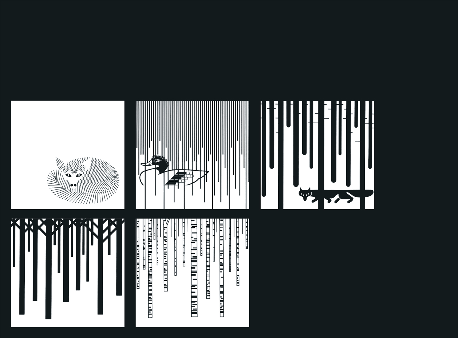
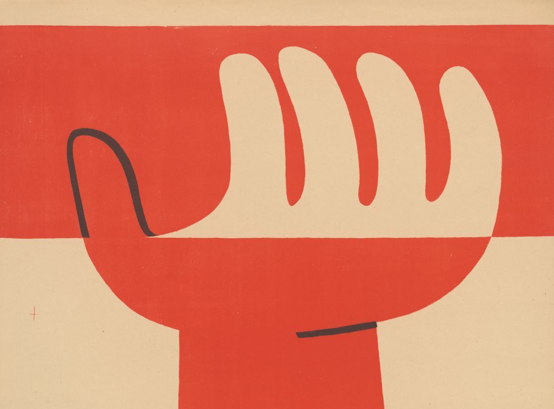
From O to R: Let’s talk about a hedgehog, standardisation and neurotis for a change (please click on the letters).

Otl Aicher’s Dept. XI team: the visual identity of the Munich ’72 Olympics was the work of graphic designers, illustrators and technical staff from all over the world.

Aicher’s childhood and youth: the years 1922 to 1945.

Otl Aicher’s signage systems for airports, metro stations and hospitals are considered exemplary to this day.
Der einstige Braun-Chef-Designer im Gespräch über den Co-Gründer der HfG.
A Broadcast: What is his place in today’s world?
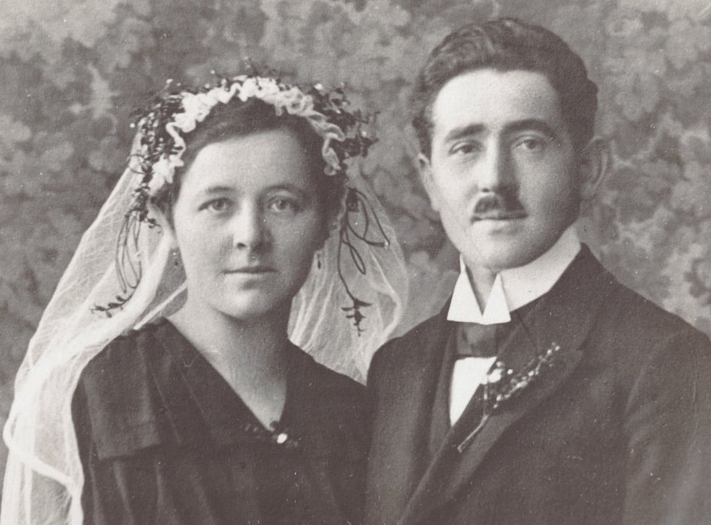
The Aichers: a brief family history.
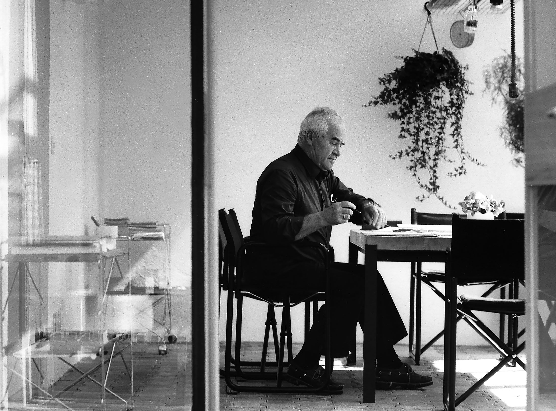
Drawing in Rotis: former Aicher co-worker Reinfriede Bettrich talks about hand sketches, the first computers and everyday life at the office.
How Otl Aicher’s papers and materials came to the HfG-Archiv/Museum Ulm.
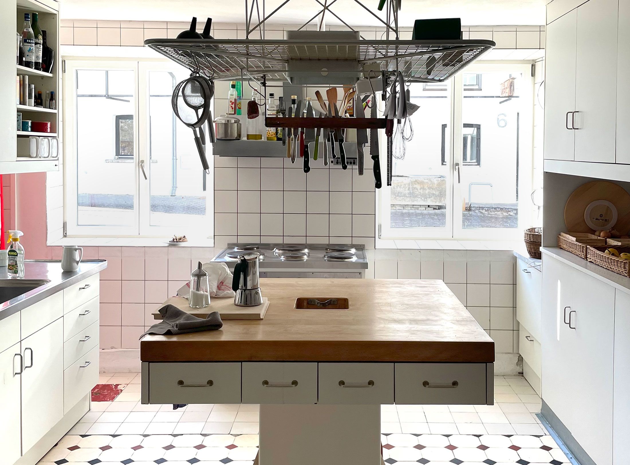
Die Küche zum Kochen (The Kitchen for Cooking) – the genesis of a book that has lost none of its relevance.
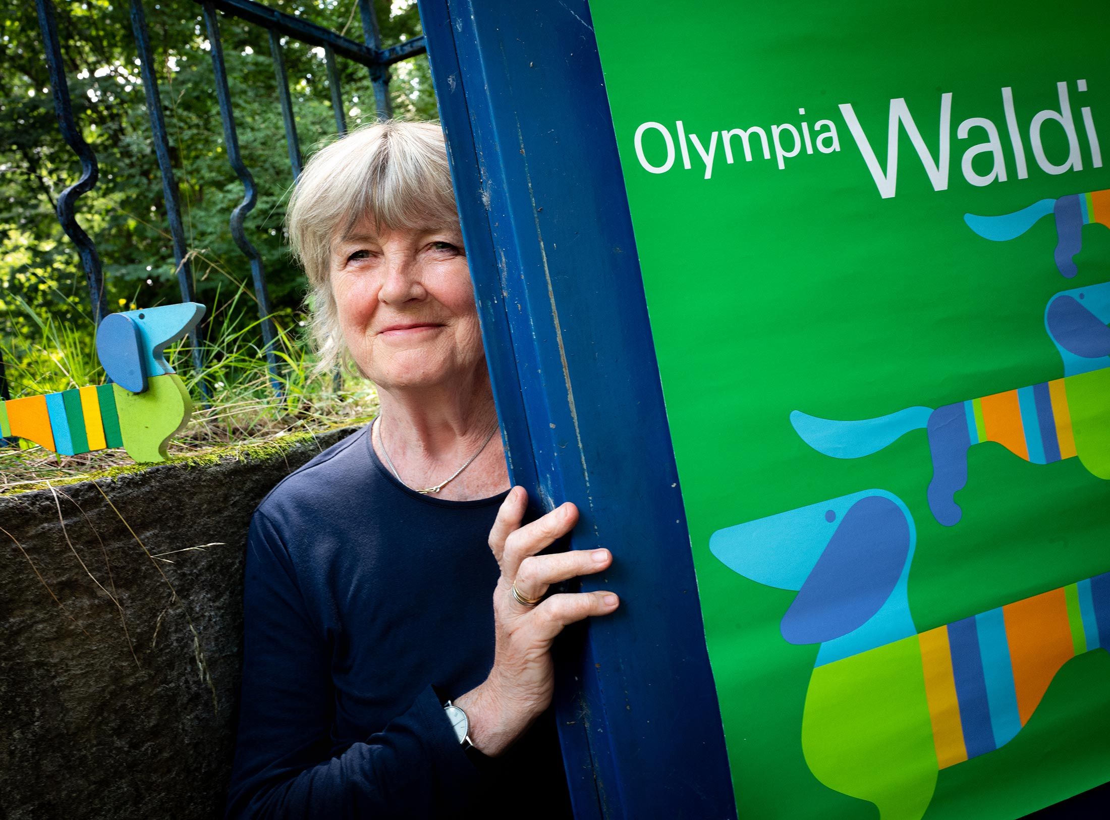
How a dachshund conquered the world: former Aicher staff member Elena Schwaiger on plush animals, fakes and the authentic mascot of the 1972 Olympic Games in Munich.
Le Violon d’Ingres or An Attempt to Defend the Writings of Otl Aicher.

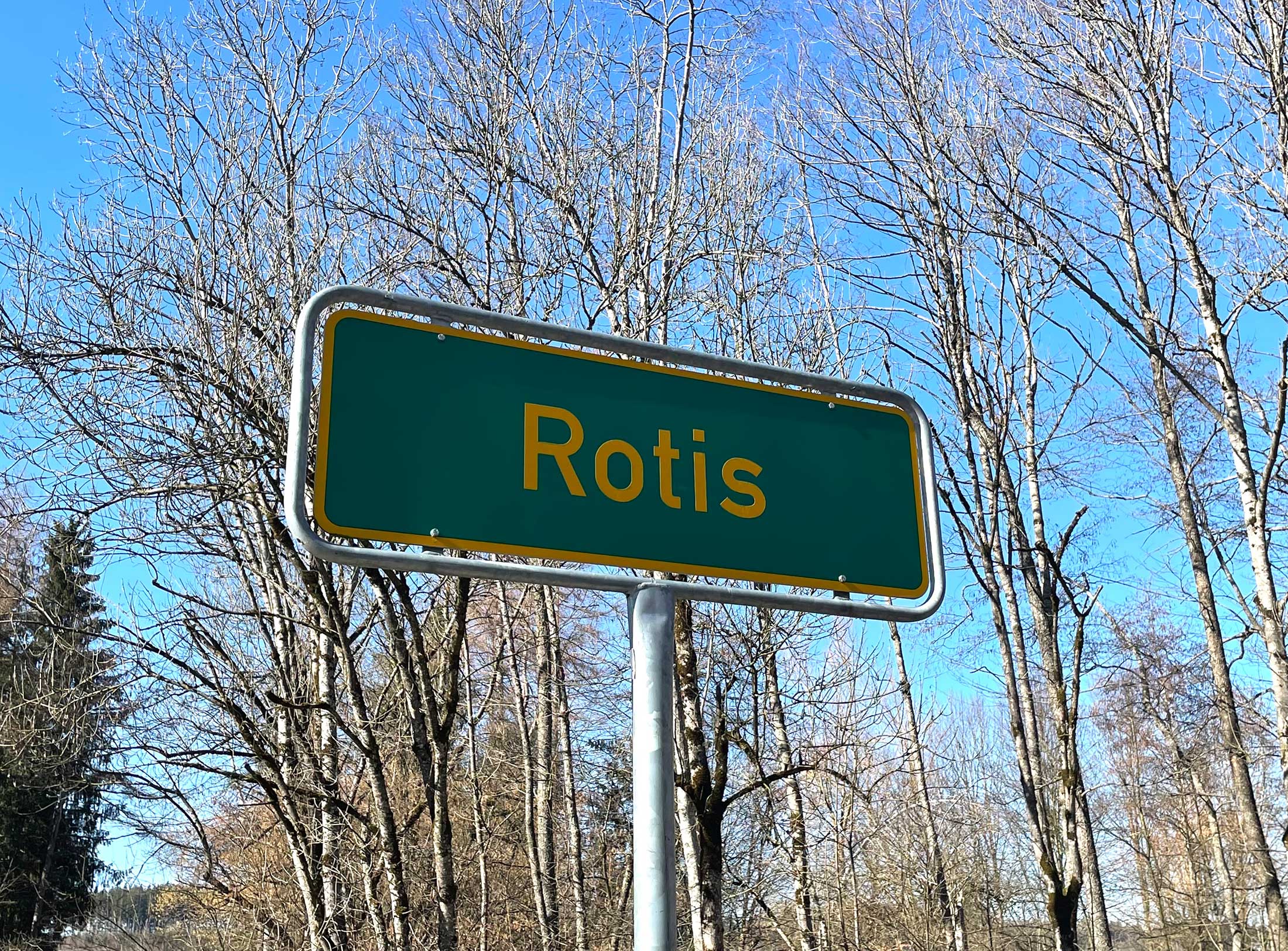
Otl Aicher as the architect of Rotis.
Otl Aicher and his critique of the automobile.
First broadcast: 15.02.1971 on Bayerischer Rundfunk, Munich (Only available in German).
Interviewed: Jürgen Werner Braun on his collaboration with Otl Aicher.
They created the signature of an epoch: designers Otl Aicher, Willy Fleckhaus, Anton Stankowski and Kurt Weidemann.
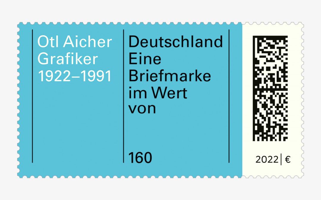
The designers of the British-German office Brighten the Corners, Frank Philippin and Billy Kiosoglou, have deliberately avoided a portrait image. They have little in mind with conventions and feel in agreement with the honoured, who formulated: “a graphic designer is a graphic designer, he is what he can do”. Thus their stamp is adorned with the word “graphic artist”, one of Otl Aicher’s many self-chosen professions, in addition to his name and life data. A profession with which he achieved his international breakthrough as design commissioner for the 1972 Olympic Games. The colour scheme and use of space are reminiscent of the title page of the “Guidelines and Standards for Visual Design” for the XX Olympiad and rules that Aicher developed with his team. The value of the postage stamp is currently sufficient to frank a large letter. The now obligatory 2D matrix code reduces the freely designable area of each stamp. At the same time, it makes franking by postmark practically superfluous, since scanning the stamp detects whether it has already been “used” or not. For collectors – and not only of stamps – Swiss Post also offers a multi-page remembrance sheet in its online shop to mark the 100th anniversary of Otl Aicher’s birth. At a price of 6.95 euros, it contains some photos and texts on his life and work. In addition to that two of the stamps are provided with the Berlin first-day postmark, which was also designed by Brighten the Corners. kte