What’s become of Otl Aicher’s former abode? A visit to the Allgäu.
What’s become of Otl Aicher’s former abode? A visit to the Allgäu.
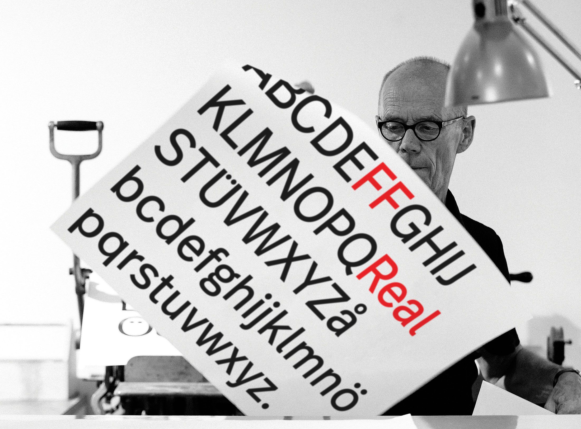
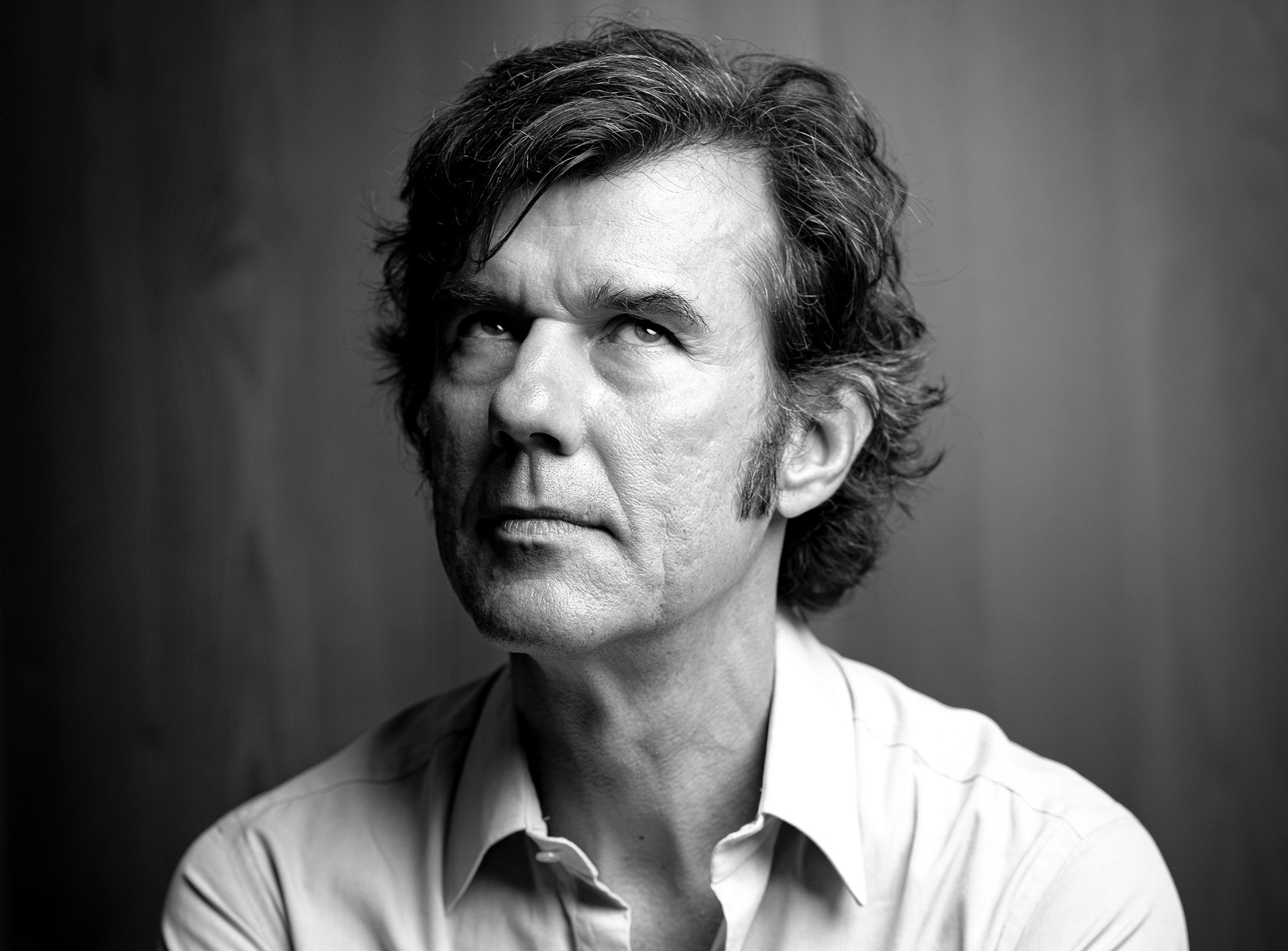
Interviewed: Erik Spiekermann, type designer, author and Aicher critic.
Technology: a central notion and fixed point of perspective in the work of Otl Aicher.
The British architect Norman Foster on his friendship with Otl Aicher: He had absolute integrity.
Thoughts on the colour palettes of Otl Aicher.
Absolute sharpness, reduction and strict rules determine the character of his pictures: Otl Aicher as photographer.

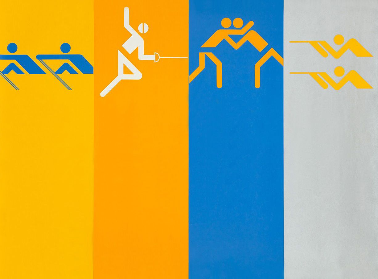
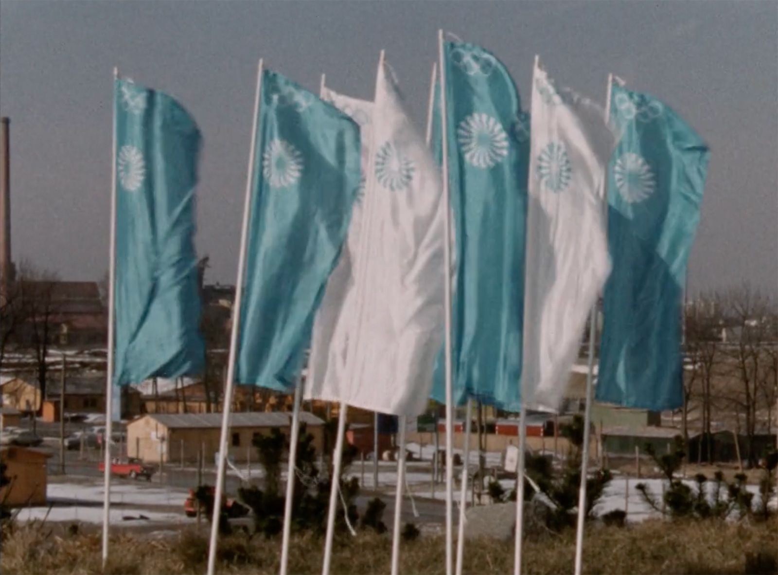
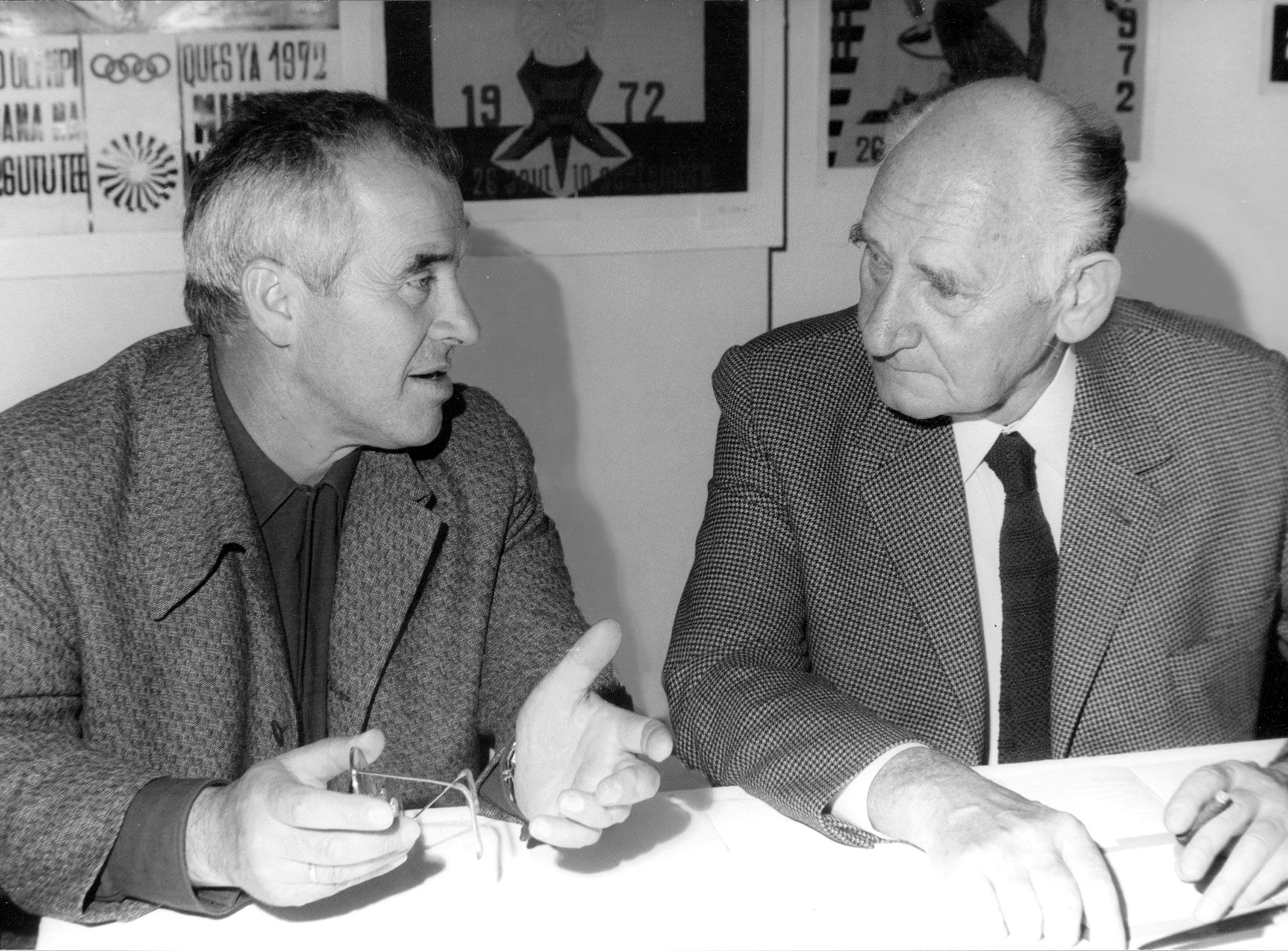
Under Otl Aicher’s direction, designers, architects and landscape planners shaped the face of the Olympic Games 1972.
Inge Aicher-Scholl preserved the legacy of the White Rose.
An interview with design icon Stefan Sagmeister about typefaces, beauty and the legacy of Otl Aicher.
The International Design Center Berlin (IDZ) invites you to a slide show and panel talk at Architektur Galerie Berlin on 20 October. Karsten de Riese and Prof. Michael Klar will report on a photo reportage commissioned by BMW that took them to Tunisia in 1975 together...
On the occasion of the 50th anniversary of the 1972 Olympic Games, the IDZ invites you to a discussion on the vision of the Munich Games and the status quo as well as the future of the Olympic movement on 26 August. The event at Berlin’s Akademie der Künste on Pariser...
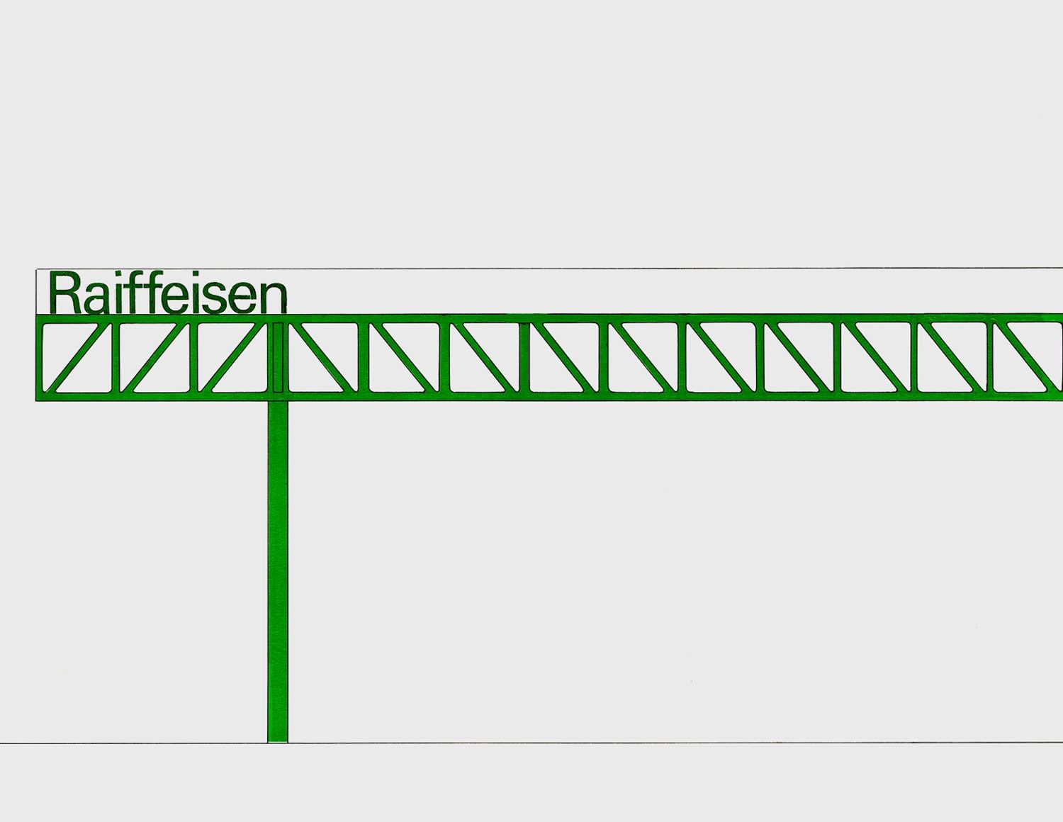
Isny im Allgäu owes Otl Aicher a corporate design that is concise, bold and singular.
With a retrospective of Otl Aicher’s book “kritik am auto – schwierige verteidigung des autos gegen seine anbeter” (Criticism of the Car – Difficult Defence of the Car against its Worshippers) published in 1984, the IDZ continues its series of events on the “otl...
Today marks the centenary of Otl Aicher’s birth. The International Design Center Berlin (IDZ) is taking this date as an opportunity to pay tribute to this great designer. With otlaicher100.de, a new online platform is being launched – a curated space that provides...
Reflections on Inge Aicher-Scholl and Otl Aicher.
The International Design Center Berlin (IDZ) is taking Otl Aicher’s centenary as an opportunity to pay tribute to this great designer and to make his work visible. An online platform and a series of events will address Otl Aicher’s multifaceted cosmos of topics and...
Eine Stadt leuchtet: Mit seinem farbenfrohen Erscheinungsbild der XX. Olympischen Sommerspiele 1972 setzte Otl Aicher ein Signal. Die junge Bundesrepublik war in der Moderne angekommen.
Otl Aicher’s Poster displays for the Ulmer Volkshochschule (Ulm Adult Education Centre).
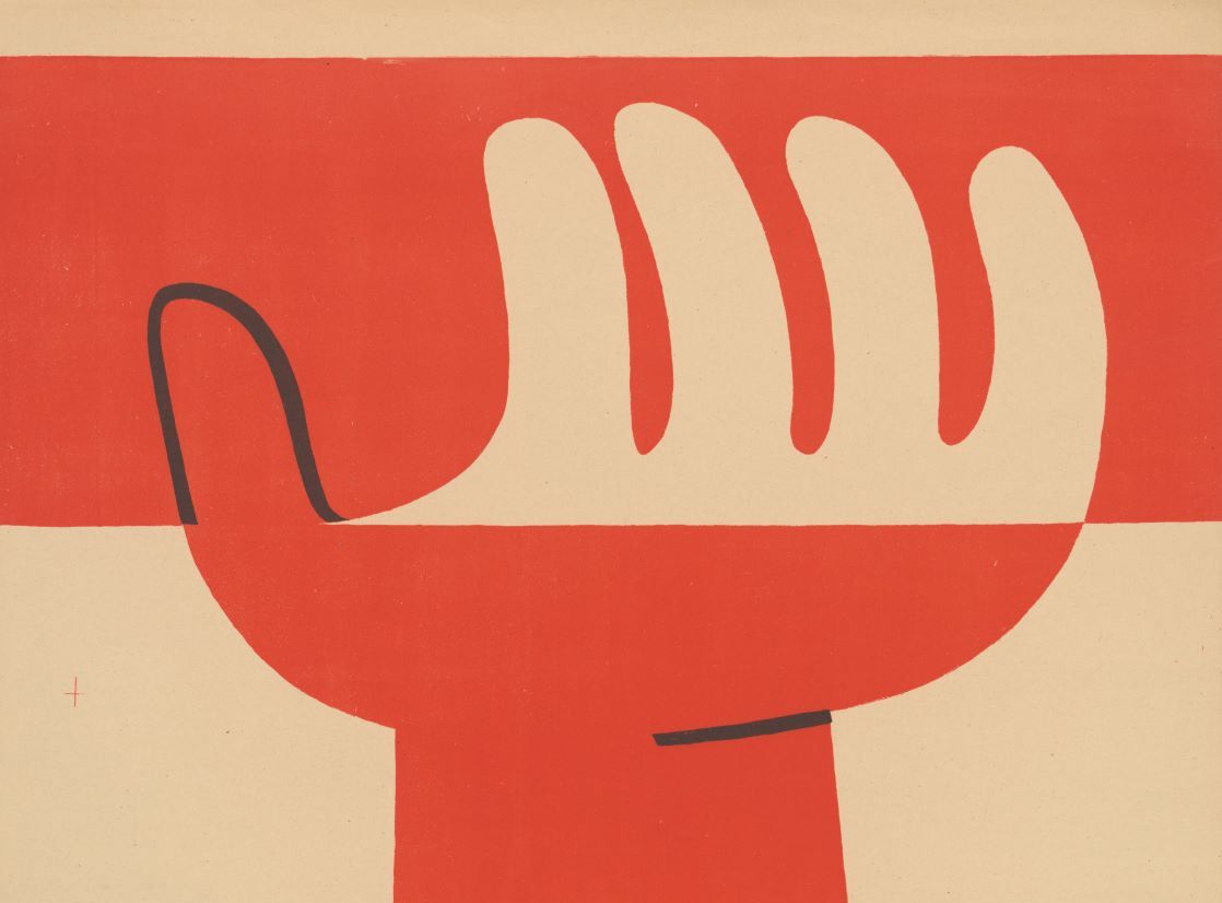
From O to R: Let’s talk about a hedgehog, standardisation and neurotis for a change (please click on the letters).

Otl Aicher’s Dept. XI team: the visual identity of the Munich ’72 Olympics was the work of graphic designers, illustrators and technical staff from all over the world.

Aicher’s childhood and youth: the years 1922 to 1945.

Otl Aicher’s signage systems for airports, metro stations and hospitals are considered exemplary to this day.
Der einstige Braun-Chef-Designer im Gespräch über den Co-Gründer der HfG.
A Broadcast: What is his place in today’s world?
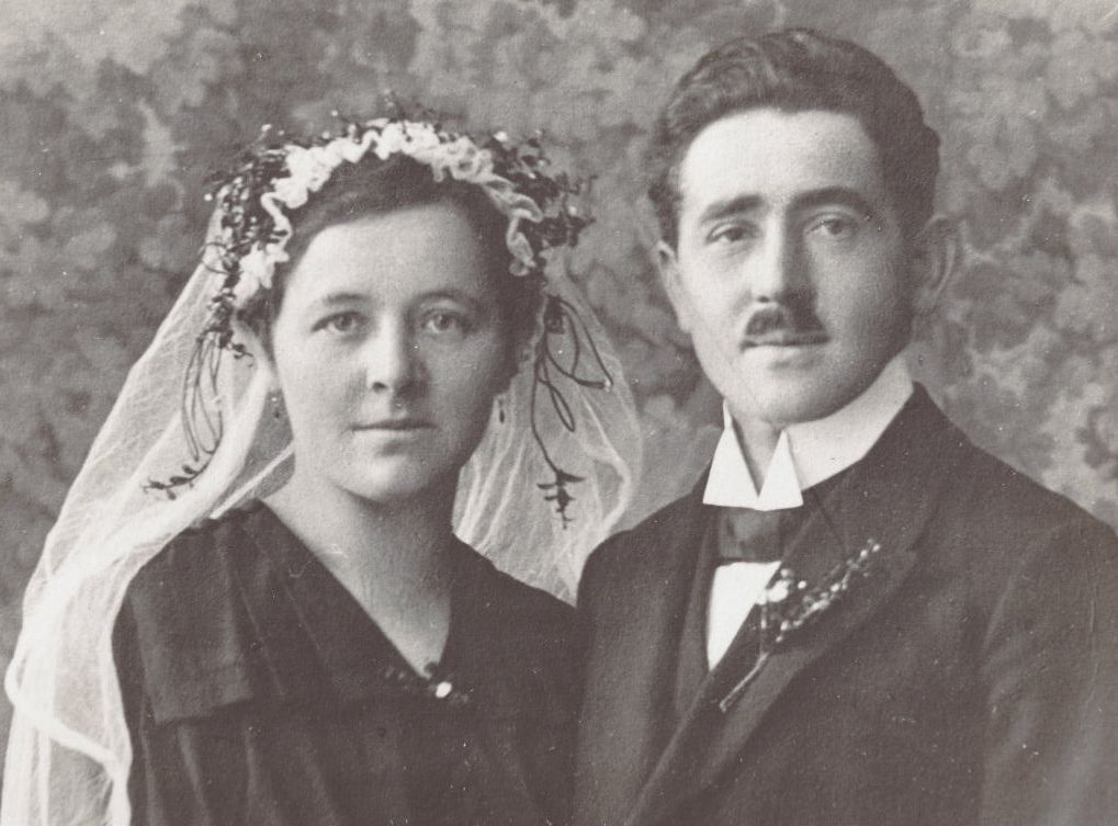
The Aichers: a brief family history.
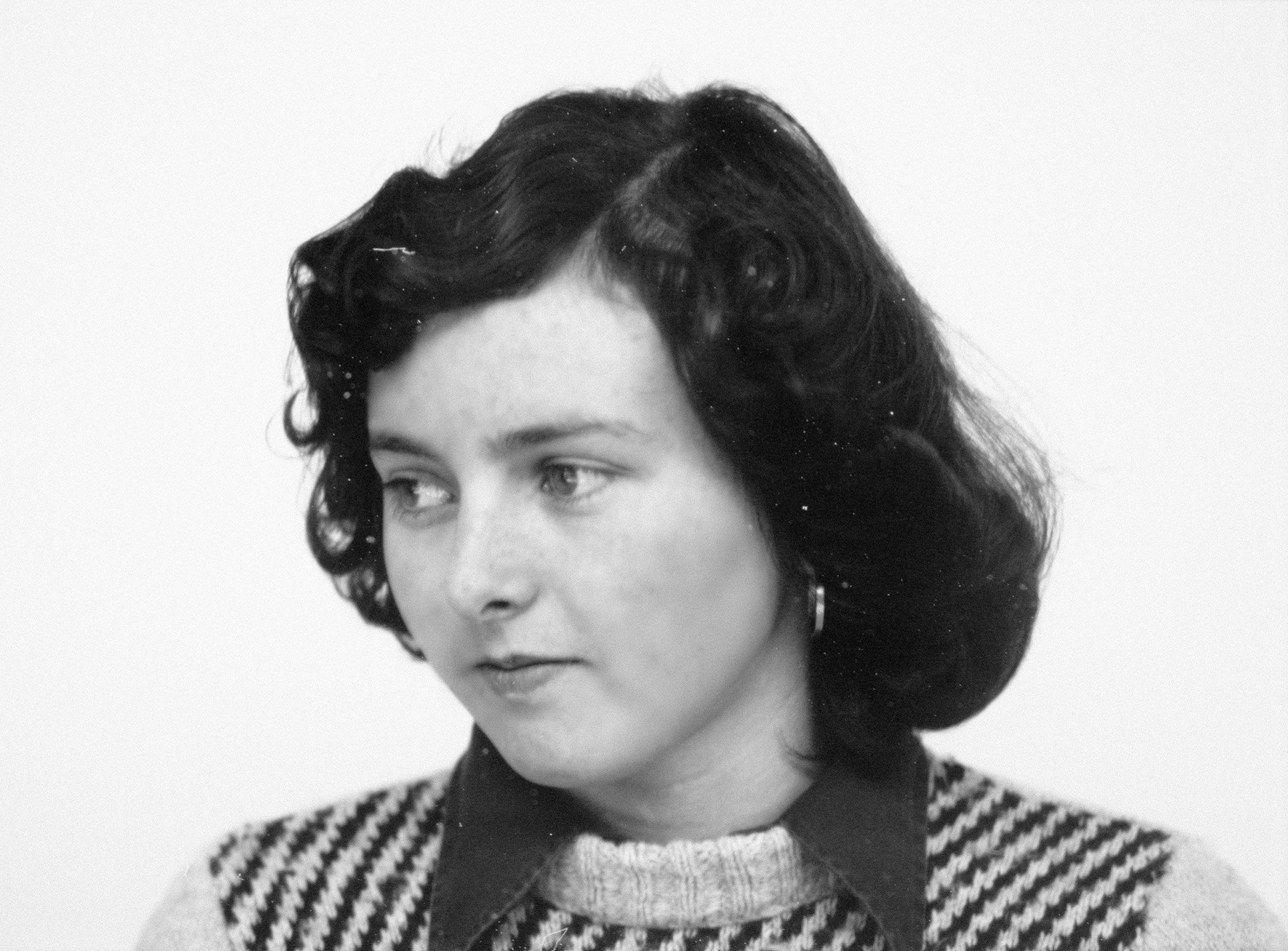
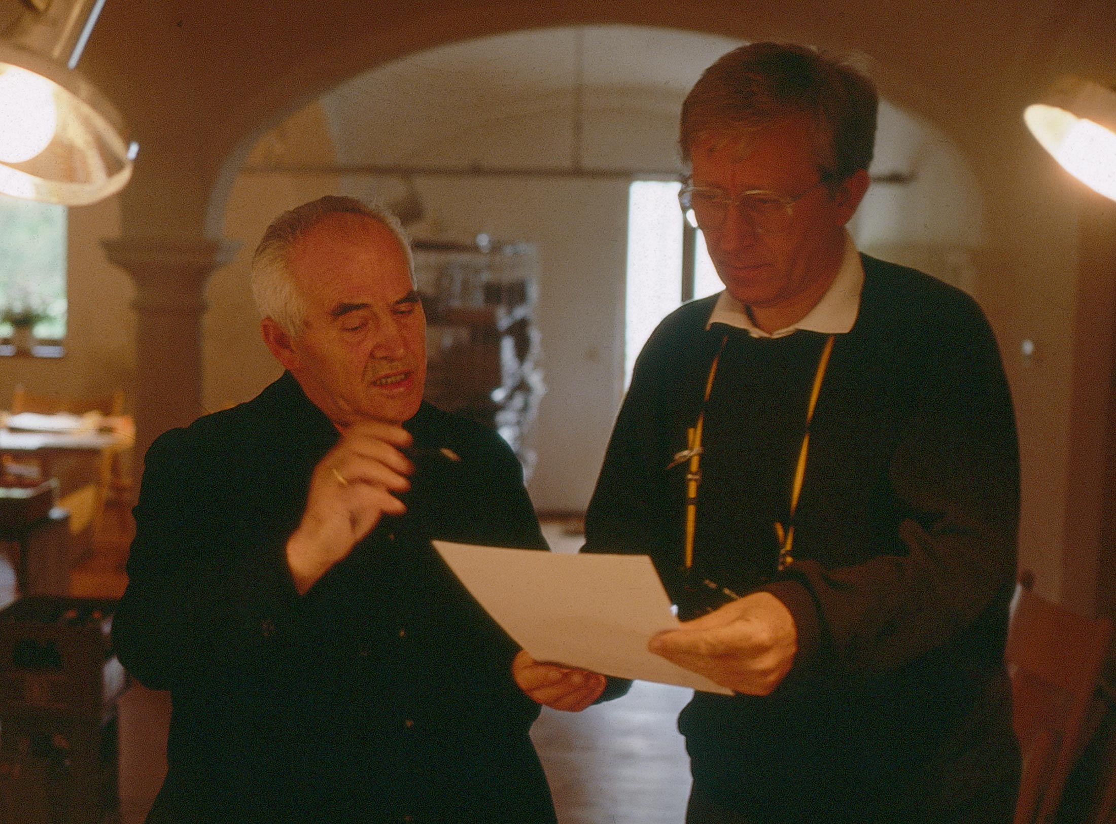
Drawing in Rotis: former Aicher co-worker Reinfriede Bettrich talks about hand sketches, the first computers and everyday life at the office.
How Otl Aicher’s papers and materials came to the HfG-Archiv/Museum Ulm.
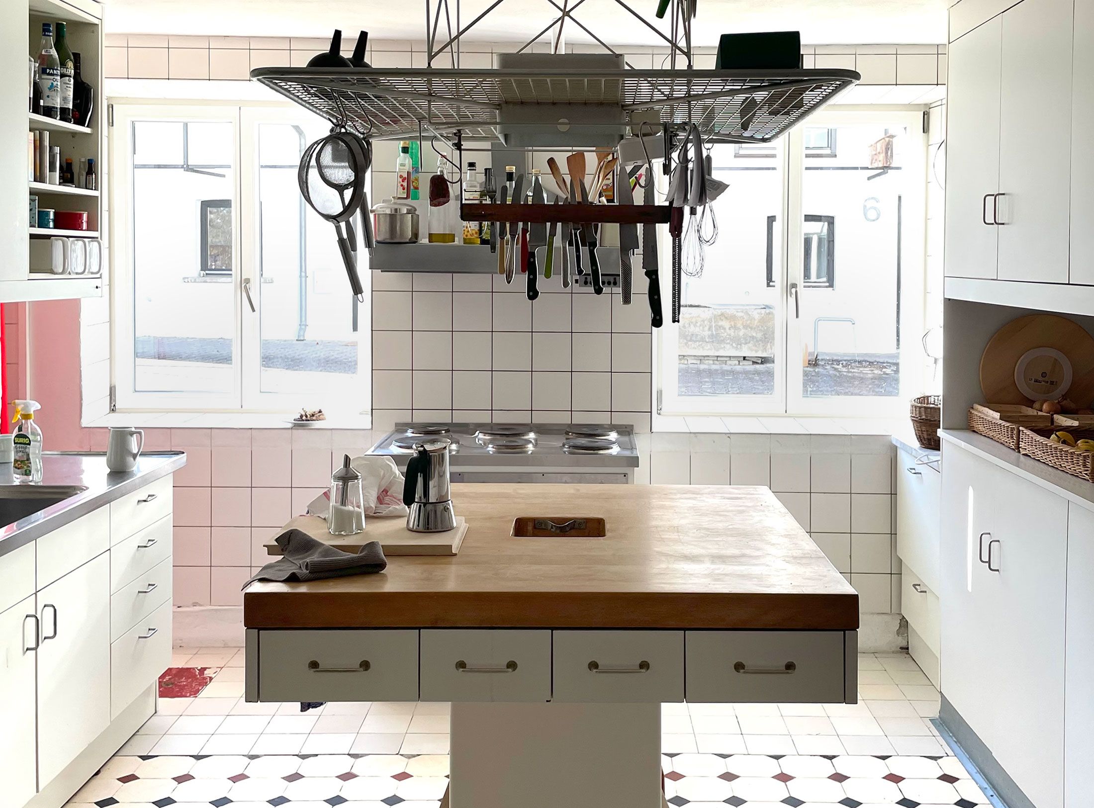
Die Küche zum Kochen (The Kitchen for Cooking) – the genesis of a book that has lost none of its relevance.
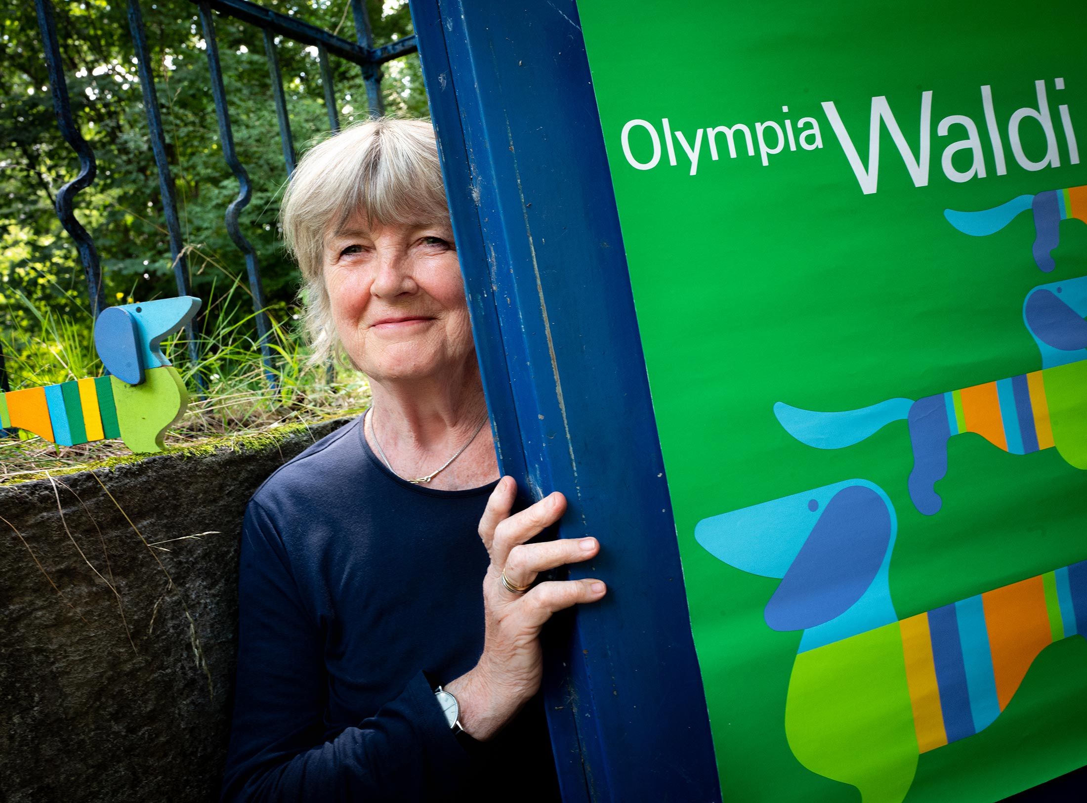
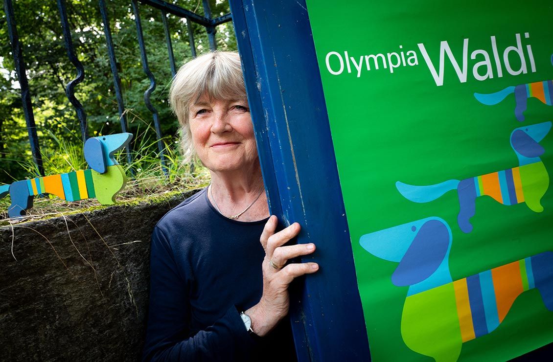
How a dachshund conquered the world: former Aicher staff member Elena Schwaiger on plush animals, fakes and the authentic mascot of the 1972 Olympic Games in Munich.
Le Violon d’Ingres or An Attempt to Defend the Writings of Otl Aicher.

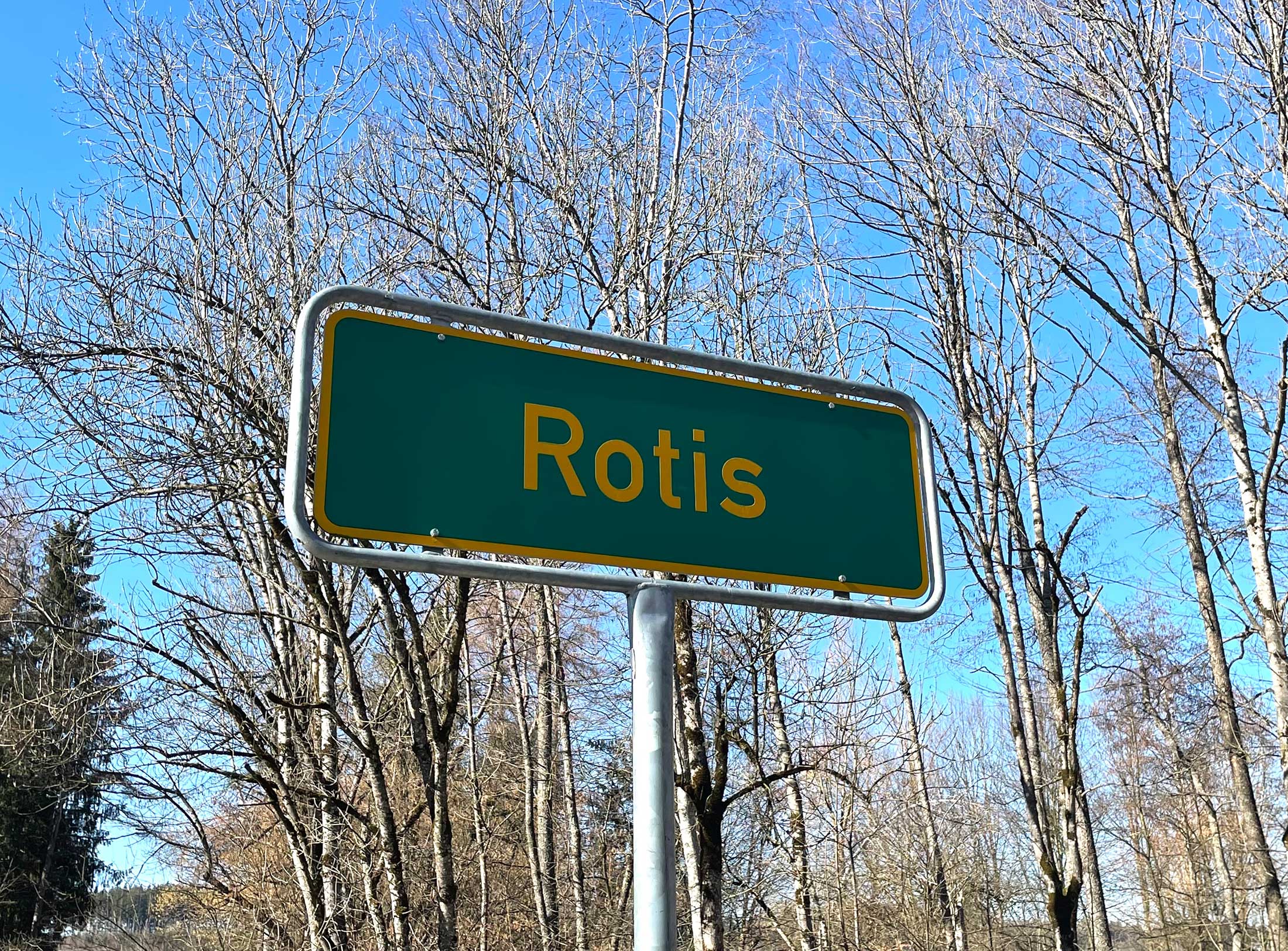
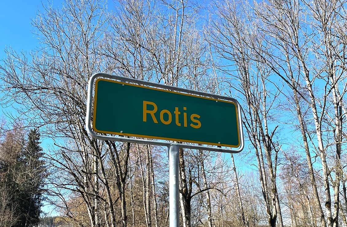
Otl Aicher as the architect of Rotis.
Otl Aicher and his critique of the automobile.
First broadcast: 15.02.1971 on Bayerischer Rundfunk, Munich (Only available in German).
Interviewed: Jürgen Werner Braun on his collaboration with Otl Aicher.
They created the signature of an epoch: designers Otl Aicher, Willy Fleckhaus, Anton Stankowski and Kurt Weidemann.
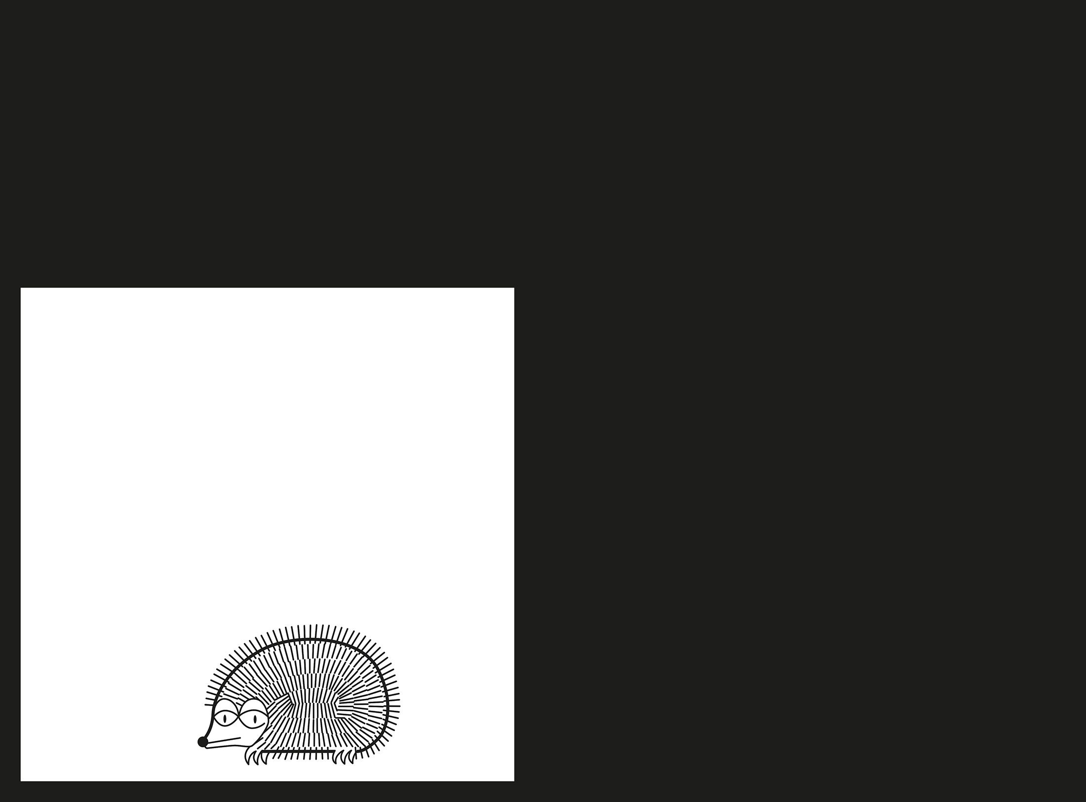
Marcel runs around the house and shouts: Otl quick, a hedgehog! He rushes over, bends down and reappears indignantly – the nine-year-old, the anti-authoritarian children’s shop child, has teased him, the authority par excellence, and laughs and everyone watches – a hedgehog is sitting there, but one from Steiff.
The large-format work on typography that Aicher published in 1988 contains the sum of his experiences with type, its design and arrangement. The tradition in which he moves like a fish in water is that of “Swiss Typography”. Aicher owes much to the most important type designer of the After-Times era, the Swiss Adrian Frutiger, and his typeface Univers. Less well known is the affinity between origin (the craft of plumbing), the functional principle of a turbine (hydroelectric power station in Rotis) and the absoluteness of the right angle in image formats, grids and print space. His own typeface, Rotis, is the most widely used typeface of the nineties – from Audi to the Bible Society, whether as bread-and-butter type or title line, Rotis is unmistakable – unfortunately.
Stuttgart main station, summer 1976. He came by train, I arrived from Berlin. He was smaller, more angular than I had pictured him, and wore only black. Three years later, on a ship on Lake Constance, we looked at each other in amazement – both wearing beige. Colours fascinated him even as a child, and he knew an infinite number of things about them. Today, when we talk about the cheerful, colourful games of the 1972 Olympics in Munich, what do we see when we look back? Aicher’s colours! The light blue, white and silver, deep orange and saffron yellow, the dark and the light green.
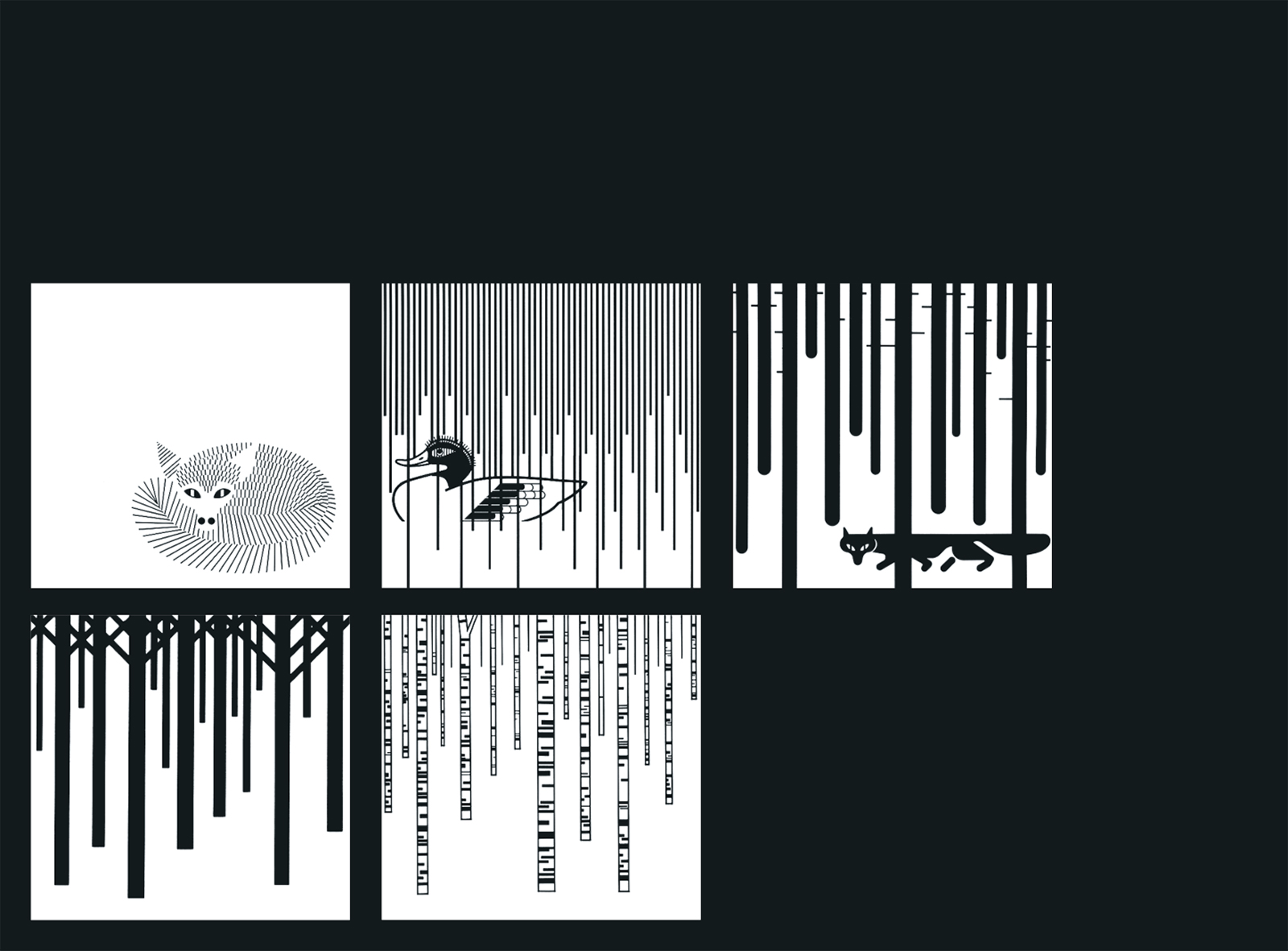
had no money for advertising, but it did have an enthusiastic head of the tourist office. Moreover, everything was there: the foothills of the Alps with rivers and the Eistobel, the striking townscape of towers and gates. Instead of expensive colour pictures, Aicher created a black-and-white drawing system for advertisements and posters with verses and lines of text – such as by Günter Herburger: “My hometown always sates me.” Aicher’s Isny drawings are incomparable even after a quarter of a century: down-to-earth and shimmering, powerful and floating – Zen pictograms sui generis.
Hans Gugelot designed a slide projector with a circular magazine for Kodak in 1963: Carousel. That was the name of the seminar we organised for photographer friends in Rotis in the summer of 1978. Aicher himself was a sceptical photographer. He distrusted colour photography, which dominated Stern and Geo. He revered the black-and-white documentarists: W. Eugene Smith, Magnum and Life. One result of the Carousel seminar was “Circular – a non-commercial and non-saleable magazine from the field of photojournalism and visual communication”. The magazine appeared in December 1978; a second one was never made.
Thirty-three years after it was liquidated by the then Stuttgart state government, it is a much-lauded model. What the then head of government Filbinger promised – “We want to do something new and that requires liquidating the old” – was not fulfilled even by his puppet Späth – a university of design that brings students from all over the world to Baden-Württemberg.
When I arrived in the Allgäu in January 1977, the snow was high and revealed that someone was already trudging ahead of me to Rotis: Bitz. The former farmhand, pistolero and marten catcher worked “at Aicher’s”, all at the age of 76! “Does he have anything to boil?” he asked, shoving an egg into my pocket. “What beats the beauty of one egg, or better still two eggs, slightly different in colour?” In his book “The Kitchen is for Cooking”, Otl Aicher visited quite a few renowned chefs at their workplaces.
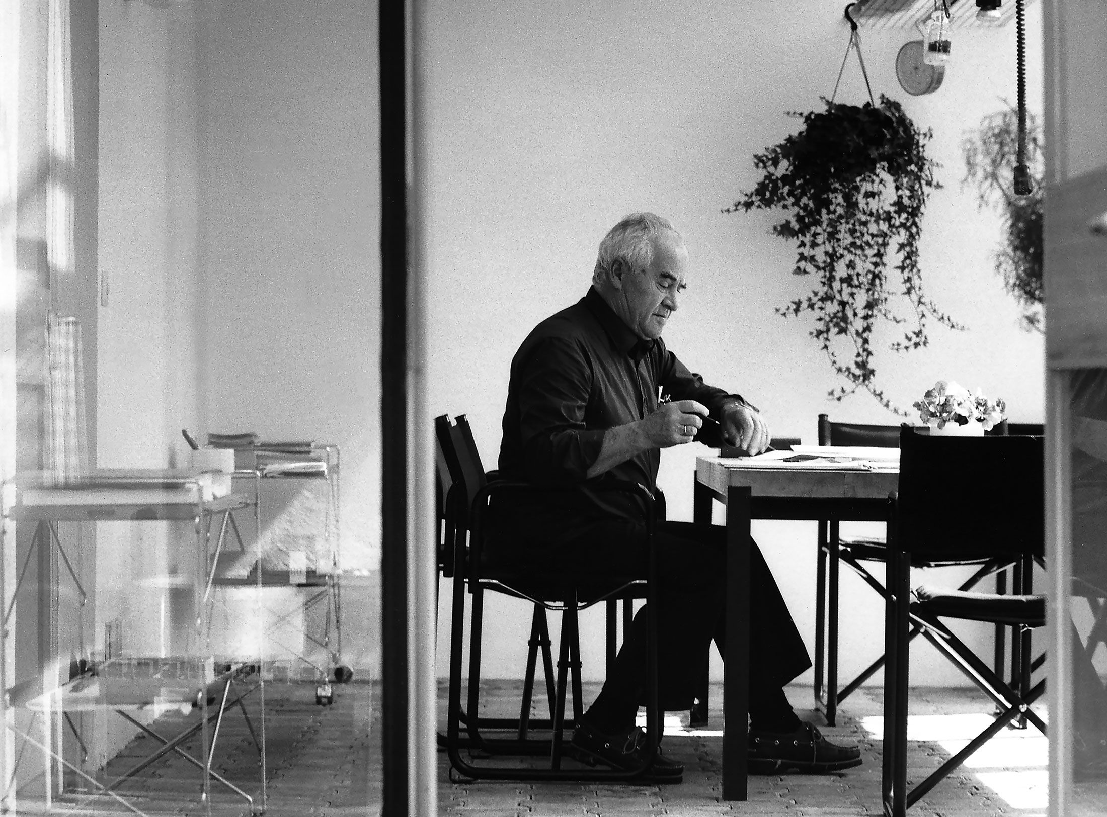
was a ramshackle water mill that Aicher bought with his fee from the 1972 Olympics and converted into a place to live and work. Since then, a lot of nonsense has been written about the supposedly “autonomous republic”. Yet there was hardly any other place that was so compulsively standardised and autocratically run as Rotis. The staff spoke of “neurotis”, and most of them left sooner rather than later. In a 1987 commemorative publication, the names of those missing from the book are particularly striking: Fred Kern, for example. Kern was Aicher’s closest collaborator in Ulm, then Munich and later in Rotis – for more than thirteen years. His contribution to the development of Rotis and to Aicher’s graphic work is considerable – why ignore him? Fred Kern, who lives in Ulm and is a top graphic artist – salü!
The book, published posthumously in 1993, contains a collection of “political essays” and other writings. Reading it, I encounter again the Aicher whose contradictions destroyed my faith. He curses the terror of low-flying military aircraft above him and his family and participates in the construction of the new airport near Munich. My reproaches do not reach him. He looks past me with a tight-lipped expression. He praises the precious water and instructs Bitz to empty the septic tank into the stream. Incomprehensible. In his essays he argues against the state and the greed of companies for profit, yet he lives very well off them. Either or. What is the point of all the theory, the better knowledge, if it remains inconsequential for one’s own life? Anger returns over this man who is such a stranger to me and over his conscience, written as if clear.
Andreas Schwarz is an author, graphic designer and exhibition organiser. He worked for Otl Aicher in Rotis in Allgäu from 1976 to 1980 and was managing director of Villa Seidl, Haus für Schwabing, in Munich from 1991 to 1996.
The text was first published under the title “Als Grönland noch im Allgäu lag”, Süddeutsche Zeitung, 1/2 September 2007; here shortened and arranged as a sequence of letters by Chup Friemert. With the kind permission of the author and Süddeutscher Verlag, Munich.

Aicher’s childhood and youth: the years 1922 to 1945.
What’s become of Otl Aicher’s former abode? A visit to the Allgäu.
How a dachshund conquered the world: former Aicher staff member Elena Schwaiger on plush animals, fakes and the authentic mascot of the 1972 Olympic Games in Munich.