What’s become of Otl Aicher’s former abode? A visit to the Allgäu.
What’s become of Otl Aicher’s former abode? A visit to the Allgäu.
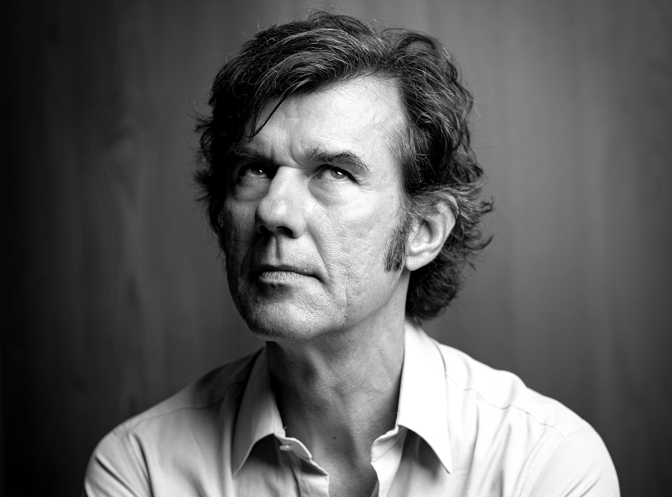
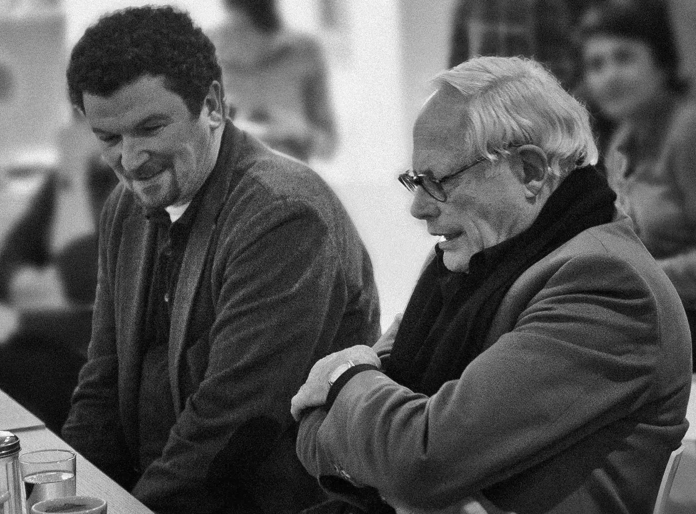
Interviewed: Erik Spiekermann, type designer, author and Aicher critic.
Technology: a central notion and fixed point of perspective in the work of Otl Aicher.
The British architect Norman Foster on his friendship with Otl Aicher: He had absolute integrity.
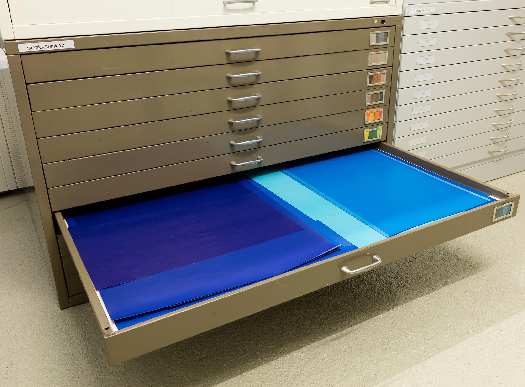
Thoughts on the colour palettes of Otl Aicher.
Absolute sharpness, reduction and strict rules determine the character of his pictures: Otl Aicher as photographer.
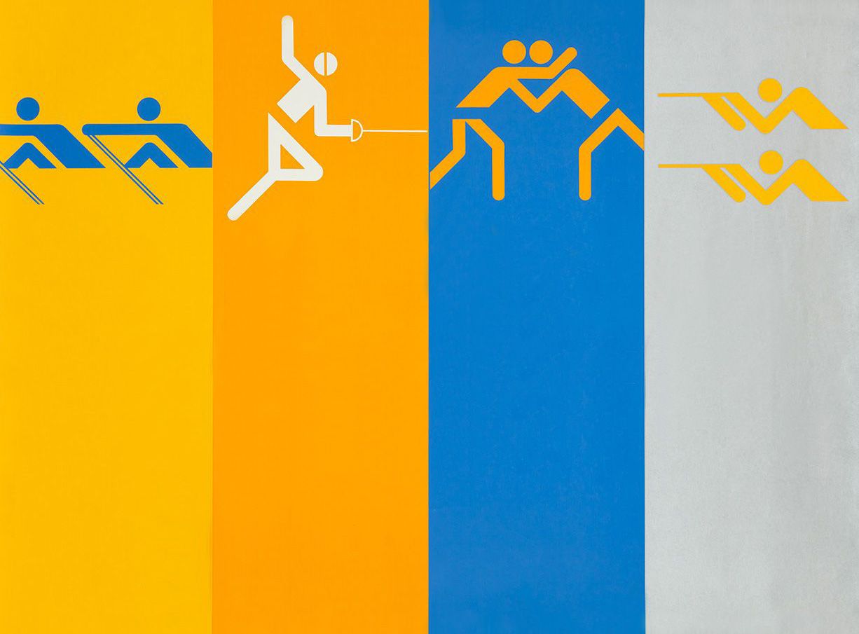
Under Otl Aicher’s direction, designers, architects and landscape planners shaped the face of the Olympic Games 1972.
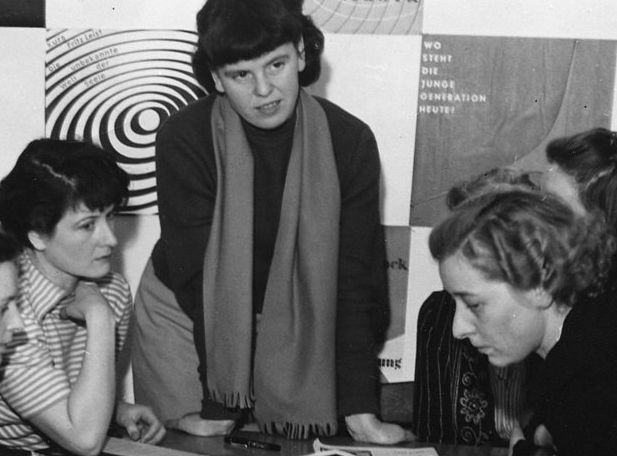
Inge Aicher-Scholl preserved the legacy of the White Rose.
An interview with design icon Stefan Sagmeister about typefaces, beauty and the legacy of Otl Aicher.
The International Design Center Berlin (IDZ) invites you to a slide show and panel talk at Architektur Galerie Berlin on 20 October. Karsten de Riese and Prof. Michael Klar will report on a photo reportage commissioned by BMW that took them to Tunisia in 1975 together...
On the occasion of the 50th anniversary of the 1972 Olympic Games, the IDZ invites you to a discussion on the vision of the Munich Games and the status quo as well as the future of the Olympic movement on 26 August. The event at Berlin’s Akademie der Künste on Pariser...
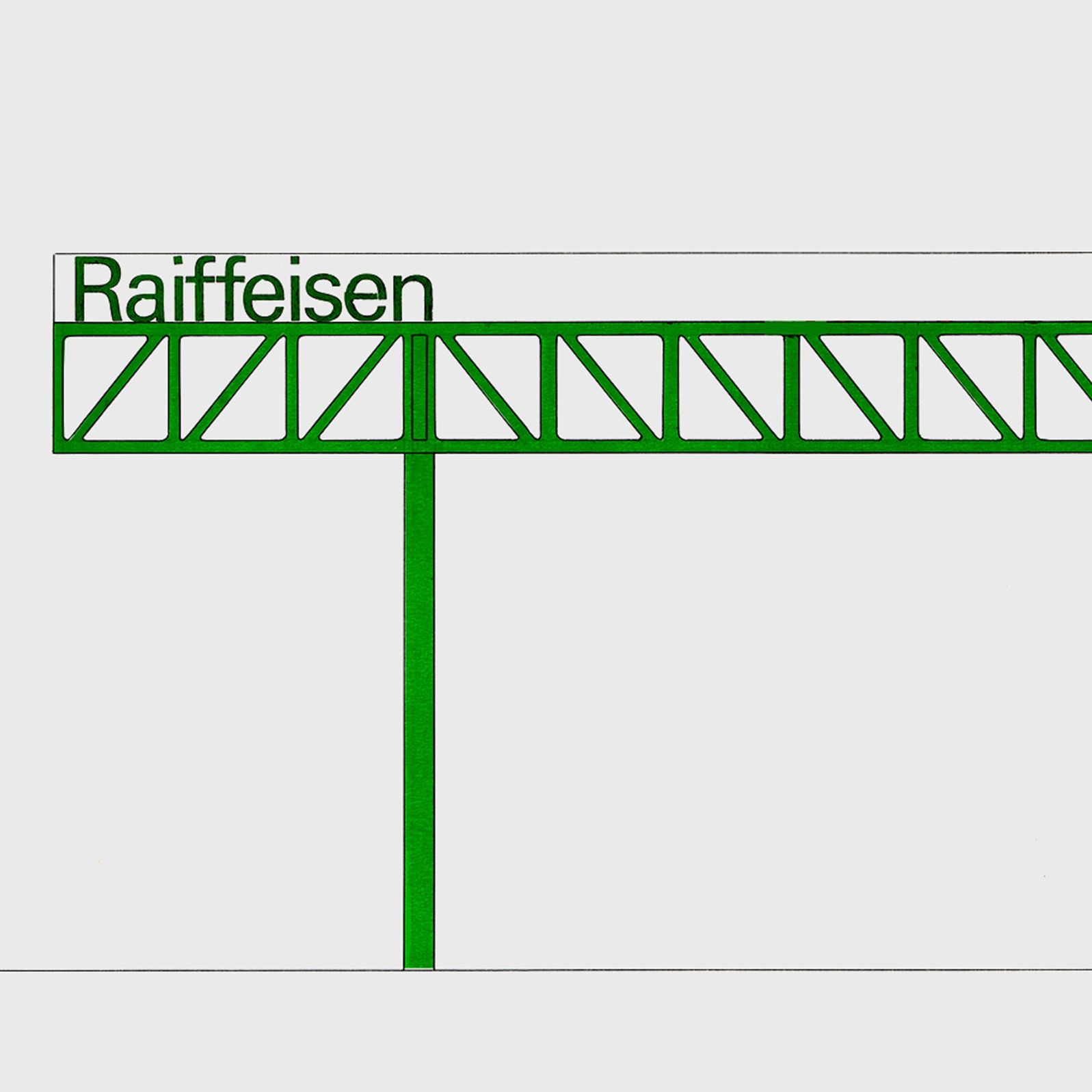
Isny im Allgäu owes Otl Aicher a corporate design that is concise, bold and singular.
With a retrospective of Otl Aicher’s book “kritik am auto – schwierige verteidigung des autos gegen seine anbeter” (Criticism of the Car – Difficult Defence of the Car against its Worshippers) published in 1984, the IDZ continues its series of events on the “otl...
Today marks the centenary of Otl Aicher’s birth. The International Design Center Berlin (IDZ) is taking this date as an opportunity to pay tribute to this great designer. With otlaicher100.de, a new online platform is being launched – a curated space that provides...
Reflections on Inge Aicher-Scholl and Otl Aicher.
The International Design Center Berlin (IDZ) is taking Otl Aicher’s centenary as an opportunity to pay tribute to this great designer and to make his work visible. An online platform and a series of events will address Otl Aicher’s multifaceted cosmos of topics and...
Eine Stadt leuchtet: Mit seinem farbenfrohen Erscheinungsbild der XX. Olympischen Sommerspiele 1972 setzte Otl Aicher ein Signal. Die junge Bundesrepublik war in der Moderne angekommen.
Otl Aicher’s Poster displays for the Ulmer Volkshochschule (Ulm Adult Education Centre).
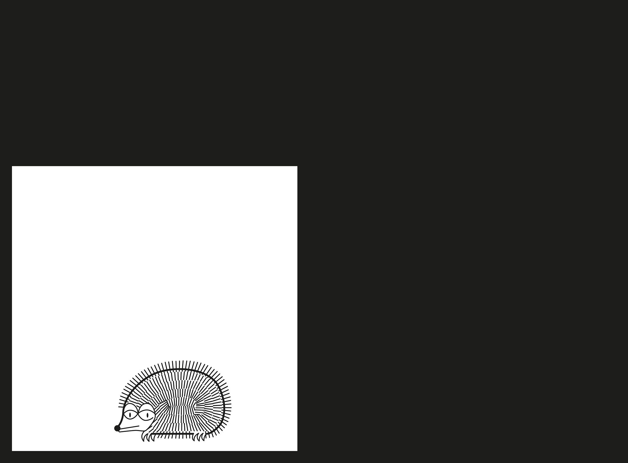
From O to R: Let’s talk about a hedgehog, standardisation and neurotis for a change (please click on the letters).

Otl Aicher’s Dept. XI team: the visual identity of the Munich ’72 Olympics was the work of graphic designers, illustrators and technical staff from all over the world.
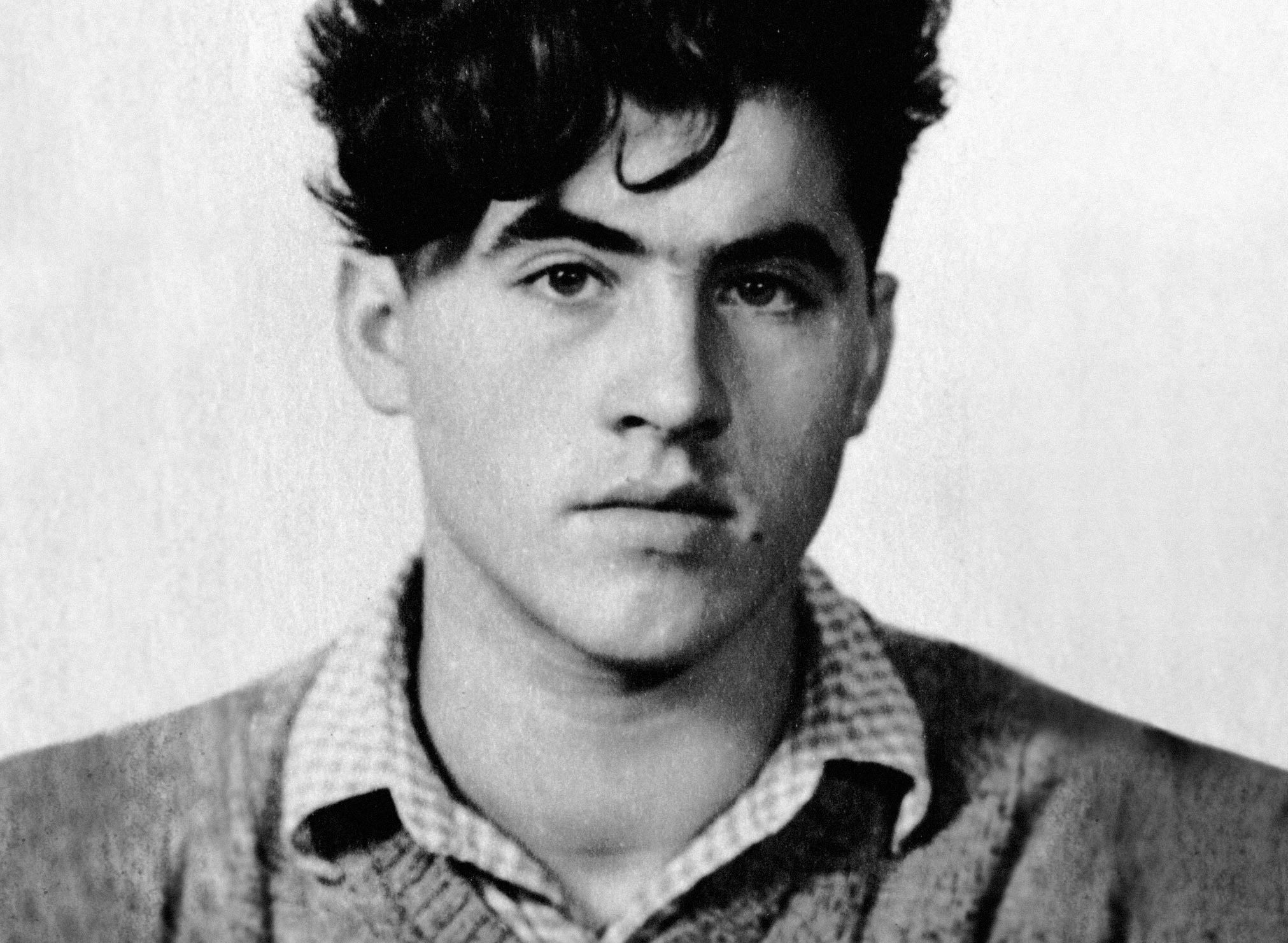
Aicher’s childhood and youth: the years 1922 to 1945.

Otl Aicher’s signage systems for airports, metro stations and hospitals are considered exemplary to this day.
Der einstige Braun-Chef-Designer im Gespräch über den Co-Gründer der HfG.
A Broadcast: What is his place in today’s world?
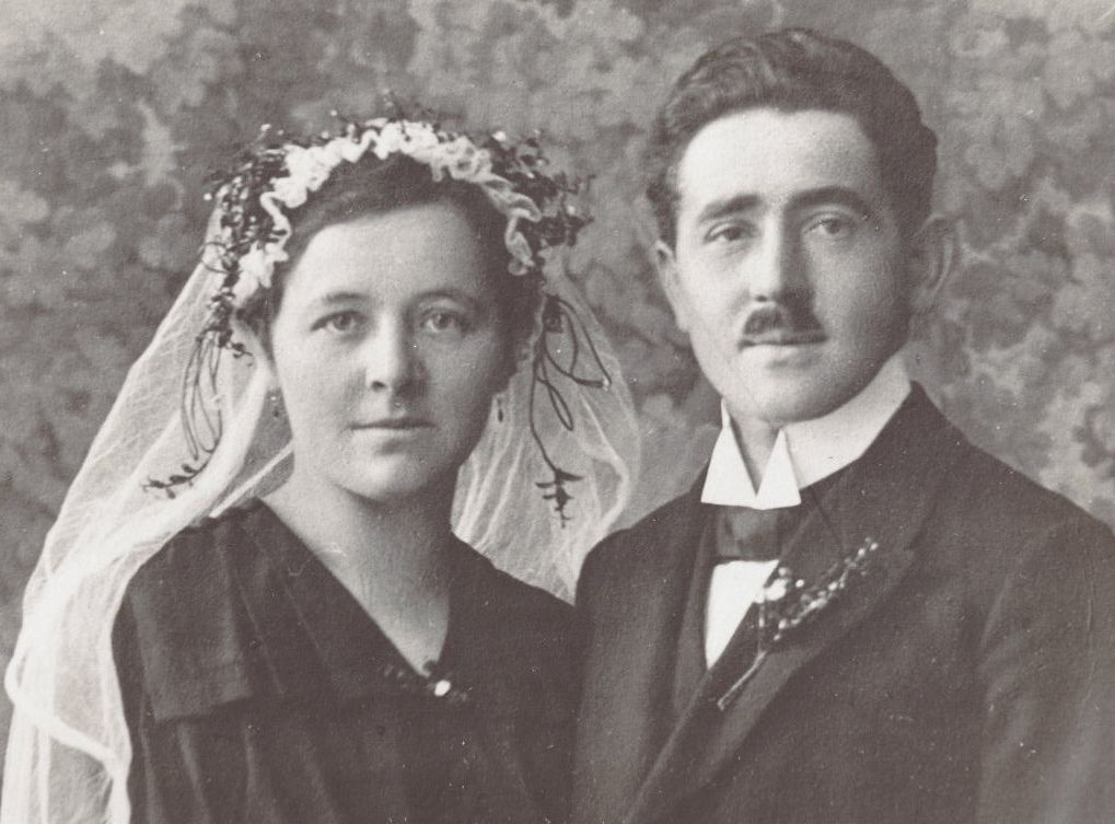
The Aichers: a brief family history.
Drawing in Rotis: former Aicher co-worker Reinfriede Bettrich talks about hand sketches, the first computers and everyday life at the office.
How Otl Aicher’s papers and materials came to the HfG-Archiv/Museum Ulm.
Die Küche zum Kochen (The Kitchen for Cooking) – the genesis of a book that has lost none of its relevance.
How a dachshund conquered the world: former Aicher staff member Elena Schwaiger on plush animals, fakes and the authentic mascot of the 1972 Olympic Games in Munich.
Le Violon d’Ingres or An Attempt to Defend the Writings of Otl Aicher.

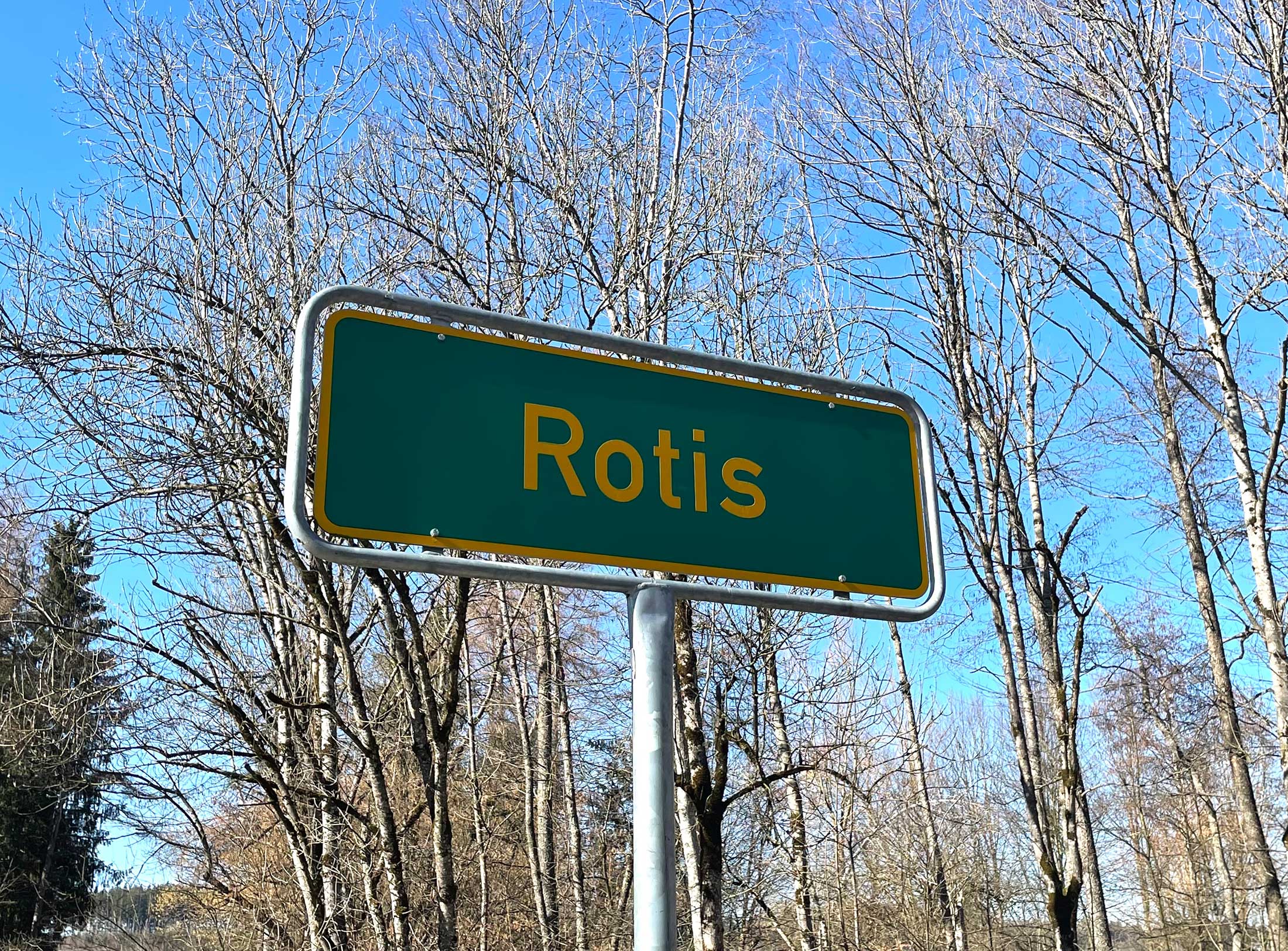
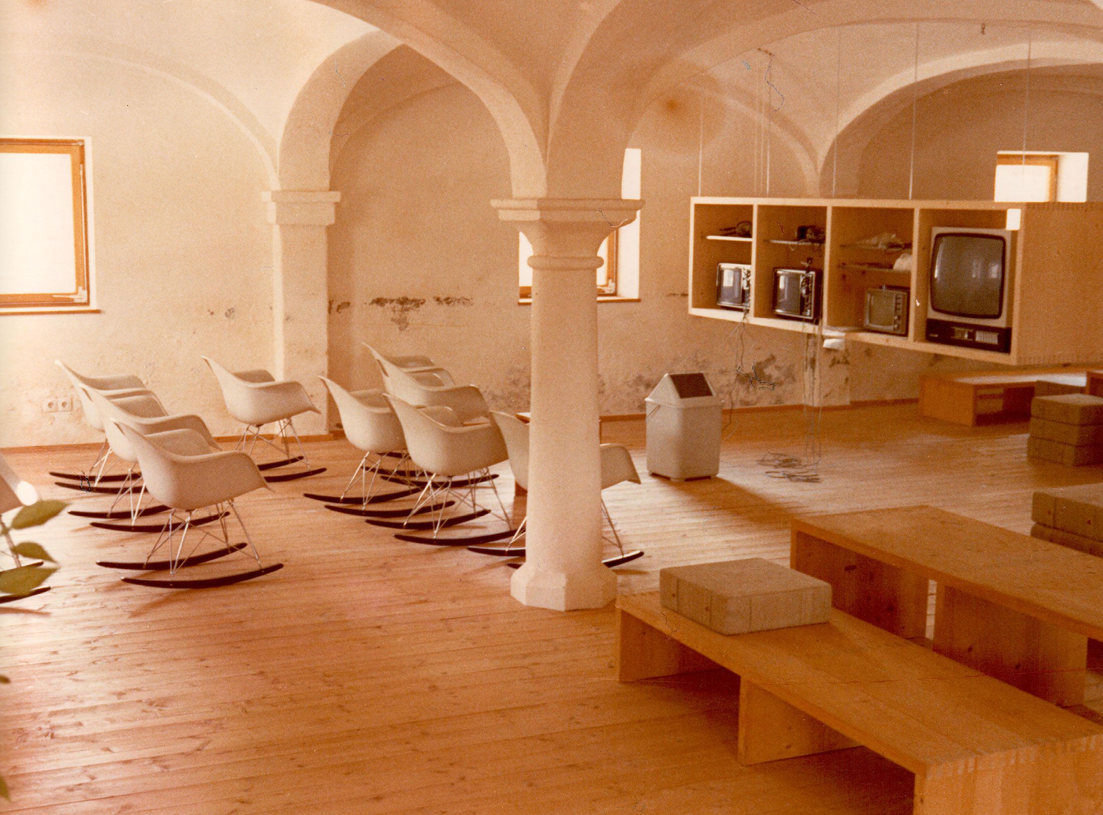
Otl Aicher as the architect of Rotis.
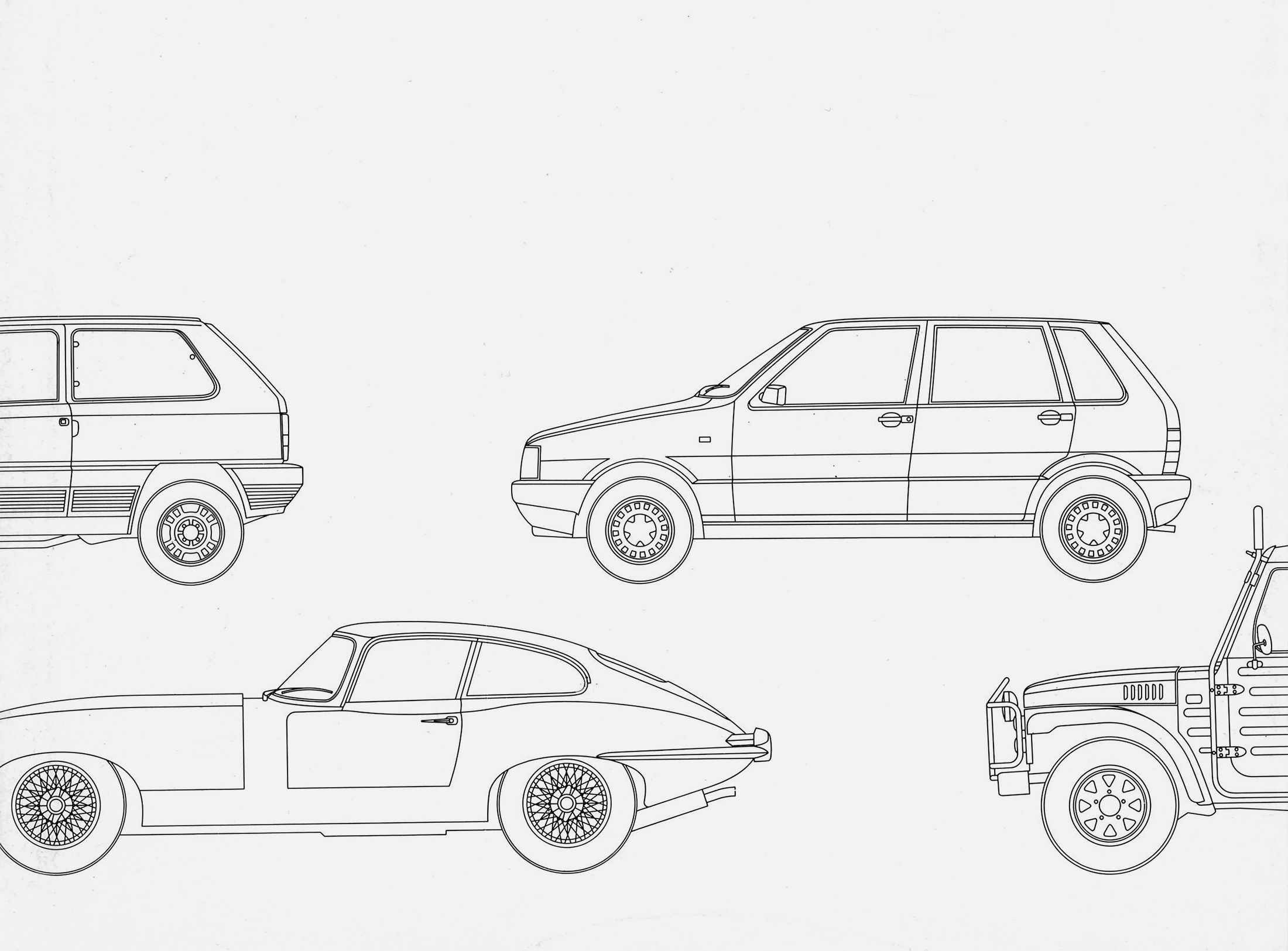
Otl Aicher and his critique of the automobile.
First broadcast: 15.02.1971 on Bayerischer Rundfunk, Munich (Only available in German).
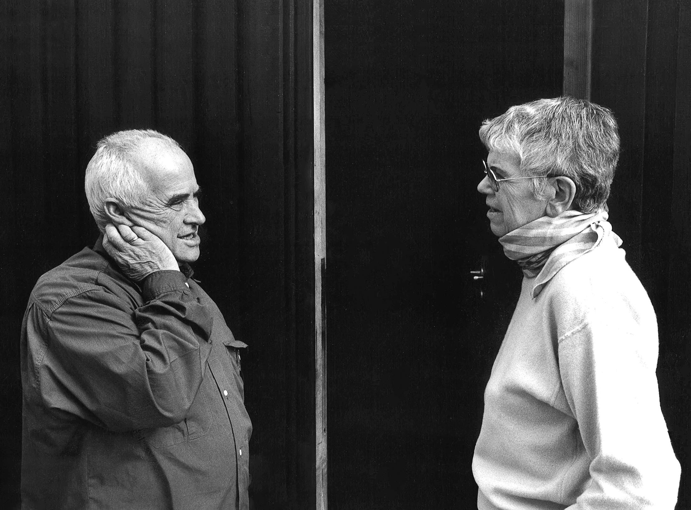
Interviewed: Jürgen Werner Braun on his collaboration with Otl Aicher.
They created the signature of an epoch: designers Otl Aicher, Willy Fleckhaus, Anton Stankowski and Kurt Weidemann.
Looking back at German graphic design of the second half of the 20th century, there are four very different personalities who – each in his own way – had a formative influence on this period: Otl Aicher, Willy Fleckhaus, Anton Stankowski and Kurt Weidemann.
A comparison of these four designers’ biographies reveals obvious parallels: in their youth, Aicher (1922–91), Fleckhaus (1925–83), Weidemann (1922-2011) and Stankowski (1906–98) were all affected by National Socialism and their participation in the second world war. Whereas Aicher and Fleckhaus were staunch young Catholics and opposed to the Nazi regime early on, Weidemann volunteered for duty and was an officer on the eastern front.
Aicher and Fleckhaus were conscripted as very young men. Aicher deserted in 1945, Fleckhaus returned home the same year. Stankowski and Weidemann were only freed after spending several years in the Soviet Union as prisoners of war. In the first few years of his career, Fleckhaus tried his hand working at an art association and then as editor of a Catholic youth magazine before turning his attention to design as an autodidact. Stankowski, who was around 20 years older than the others, was able to take up as a designer again after having worked in the profession in the 1930s. Weidemann trained as a typesetter before studying book design and typography. Aicher spent one term studying sculpture in Munich before resolving to turn his hand to commercial art instead.
What they all had in common was their experience of war, the resulting insight that a new beginning was necessary and a great hunger for life. In different ways, they all contributed to this new beginning in the field of “commercial art”, “advertising” and “makeup”, as it was still called in the 1950s. From the 1960s on, the terms graphic design, visual communication and art direction came into use. And these men played a decisive part in this radical change. That, however, is where the common ground between the four of them ends. It’s far more fascinating to look at the differences in their characters, temperaments and graphic design preferences.
The inventor: Anton Stankowski
In the 1920s, Anton Stankowski, or Stanko as his friends called him, had studied graphic design, typography and photography with Max Burchartz at the school of trades, crafts and applied art in Essen, which later became known as the Folkwang School. The early works of the young Stankowski show his desire to formulate his subject matter as concisely as possible, resulting in succinct forms, brief texts and expressive images. In his hands, typography, graphic design and photography were condensed into attractive collages.
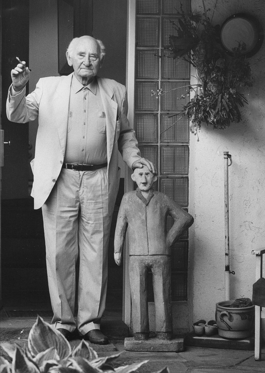
2 x Anton, Anton Stankowski, 1986, photo: Stefan Moses © Stefan Moses
From 1929–34 Stankowski worked at the renowned advertising studio of Max Dalang in Zurich and became part of the circle of artists who propagated “constructive graphics”. After returning from Soviet captivity in 1948, he worked as an editor, graphic designer and photographer for Stuttgarter Illustrierte magazine for several years before opening his own studio in Stuttgart in 1951. In the two decades that followed, Stankowski was equally successful as a painter as he was as a designer.
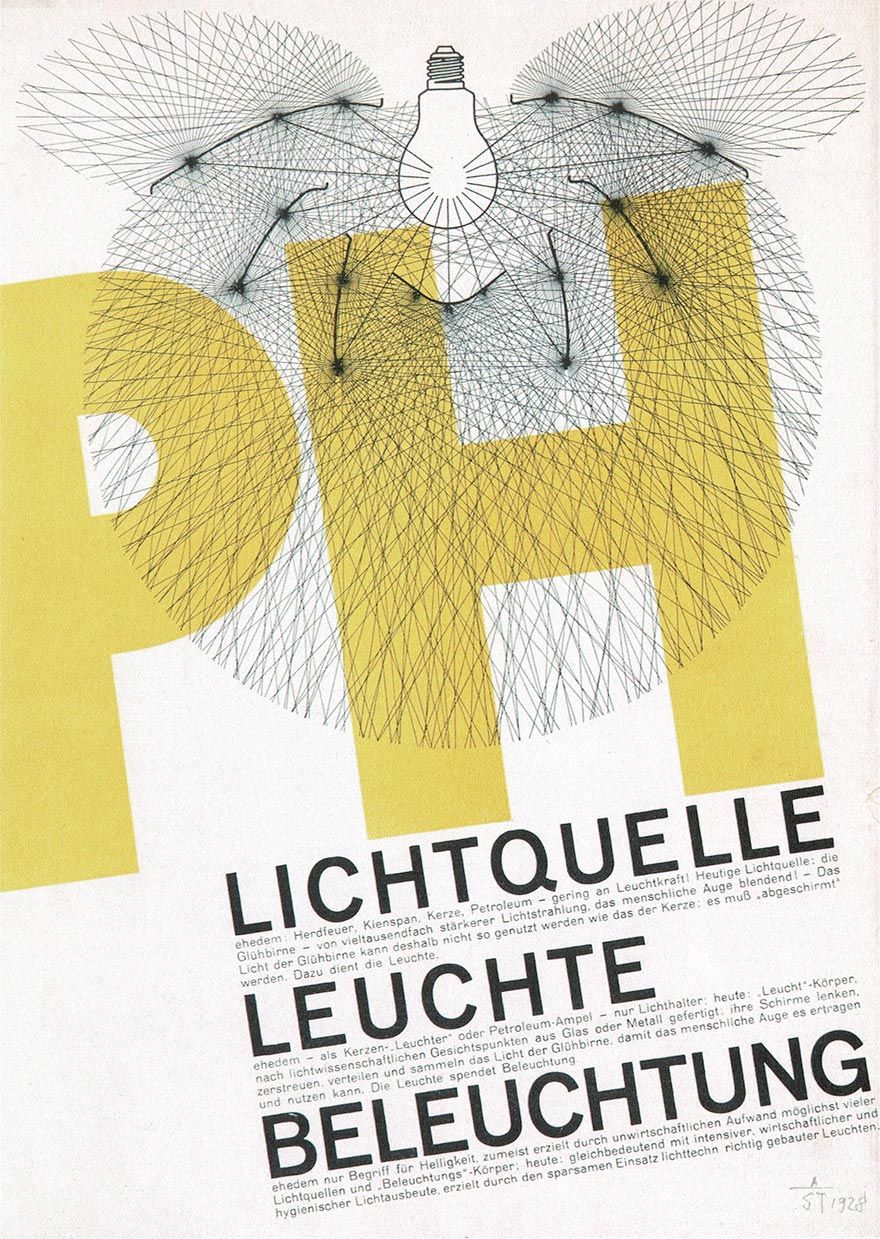
Anton Stankowski, brochure cover for PH Lighting Germany, Karlsruhe, 1929 © Stankowski-Stiftung
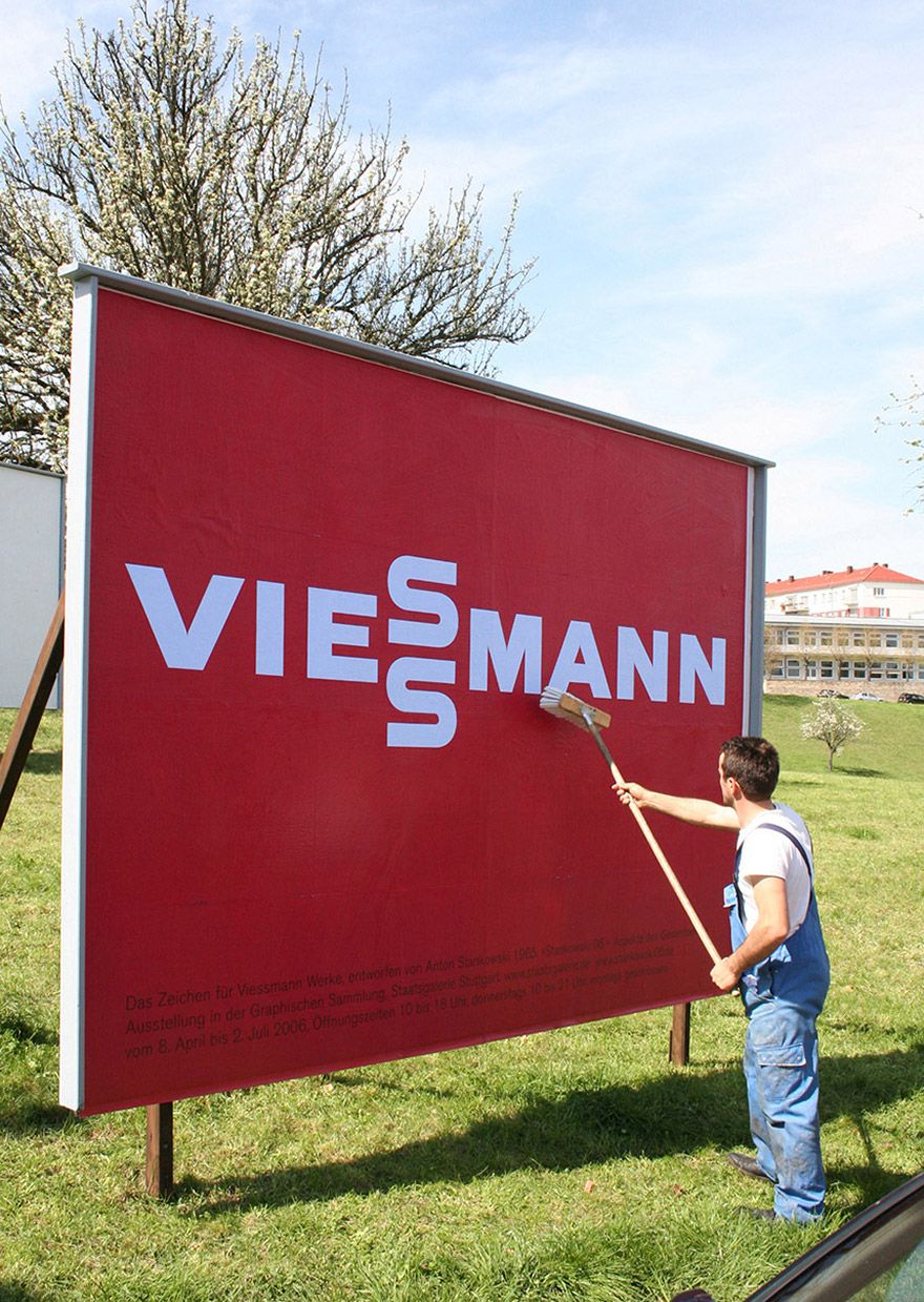
Graphic design studio Anton Stankowski, Viessmann logotype, 1965, poster exhibition 2006, Stuttgart
Anton Stankowski, brochure cover for PH Lighting Germany, Karlsruhe, 1929 © Stankowski-Stiftung
Graphic design studio Anton Stankowski, Viessmann logotype, 1965, poster exhibition 2006, Stuttgart
His most famous work is undoubtedly the Deutsche Bank logo (1974), consisting of a diagonal bar in a square that some interpret as balance sheet growth, others as the slot of a money box. (Very few people know that Stankowski and Duschek were actually thinking of an aircraft when they created it, because they had recently – and unsuccessfully – suggested this symbol to Stuttgart Airport as a logo and pulled it out of the filing cabinet for the Deutsche Bank competition.)
The Viessmann wordmark (1960) simply and succinctly integrates the object of the company – heating and air-conditioning technology – by placing the two “s”s one above the other. In 1969, Stankowski won the competition to create a visual identity for the city of Berlin with the now legendary Berlin Layout, which based all media on a very simple, flexible and yet distinctive and modern design grid.
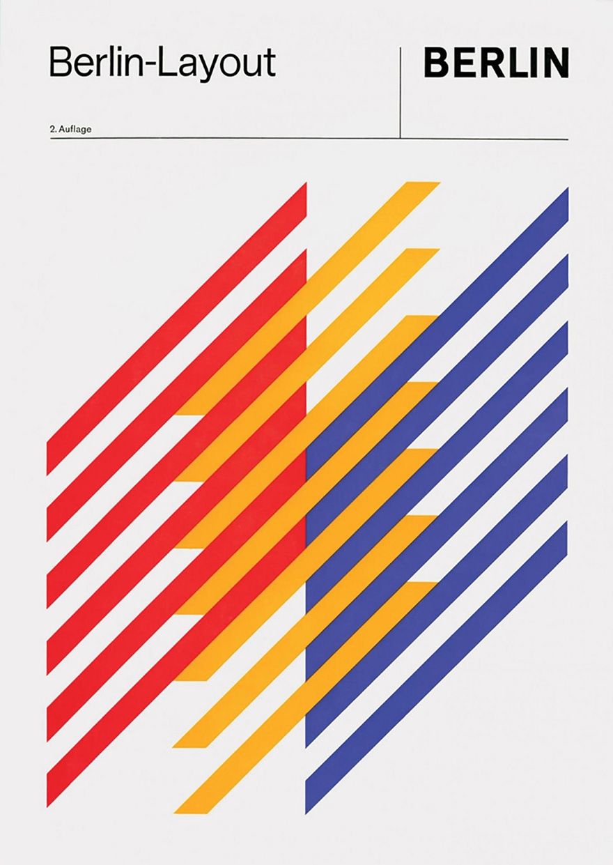
Graphic design studio Anton Stankowski, Berlin Layout manual, 1971 (2nd edition) © Stankowski-Stiftung

Graphic design studio Anton Stankowski, design for a Stuttgart Airport logo, 1969 © Stankowski-Stiftung
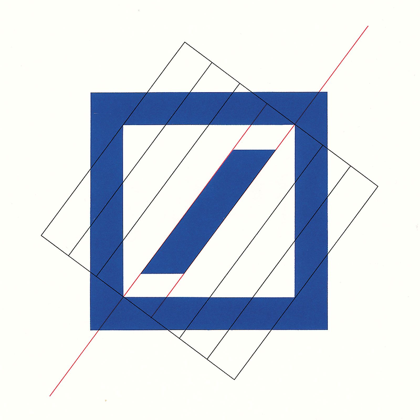
Stankowski + Partner, design drawing for the Deutsche Bank logo, 1973, © Meike Gatermann and Stankowski-Stiftung
Graphic design studio Anton Stankowski, Berlin Layout manual, 1971 (2nd edition) © Stankowski-Stiftung
Graphic design studio Anton Stankowski, design for a Stuttgart Airport logo, 1969 © Stankowski-Stiftung
Stankowski + Partner, design drawing for the Deutsche Bank logo, 1973, © Meike Gatermann and Stankowski-Stiftung
In 1974, not long after joining Stankowski’s studio in 1972, Karl Duschek took over as head of design, while Stankowski increasingly turned his attention to painting. Together they developed trademarks for Messe Frankfurt (1983) and Deutsche Börse (1995). The fact that many of their trademarks were created decades ago and are still used in identical or only slightly modified form today testifies to the outstanding quality of the designs. Stankowski’ pictorial mark for the German Design Council (1960), for instance, still credibly embodies the institution’s guiding principle: “Design makes brands strong and companies successful.”
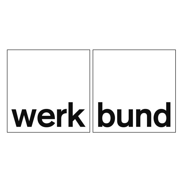
Grafisches Atelier Anton Stankowski, word mark for the Deutscher Werkbund, 1963 © Stankowski-Stiftung

Graphic design studio Anton Stankowski, German Design Council logo, 1960 © Stankowski-Stiftung
Grafisches Atelier Anton Stankowski, word mark for the Deutscher Werkbund, 1963 © Stankowski-Stiftung
Graphic design studio Anton Stankowski, German Design Council logo, 1960 © Stankowski-Stiftung
So what was the recipe for Stankowski’s huge success? Using the simplest of shapes – circles, squares, triangles – and primary colours, he was able to develop clear and eye-catching symbols that stood out clearly from those of competitors in the increasingly complex world of the 1960s and 1970s. Furthermore, in an era of increasing internationalisation, these symbols were signals that transcended national borders and language barriers; they made the companies who used them as trademarks visible, and therefore served as the focal point of their brand message. Once, asked what he most enjoyed doing, Stankowski answered: “Inventing! Portraying new combinations, forms and processes that I’m not familiar with yet, processes that can’t be depicted.”
The great communicator: Kurt Weidemann
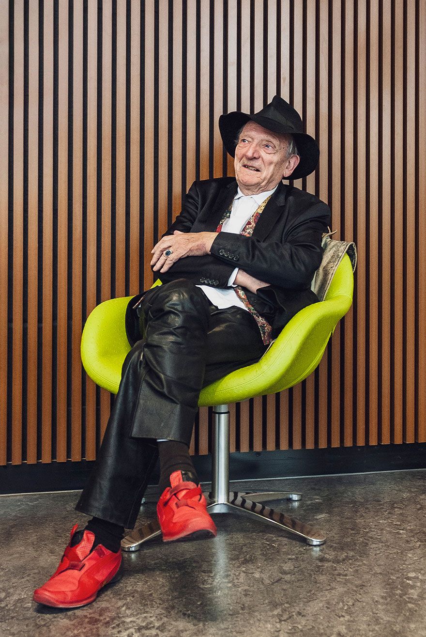
Even today, Kurt Weidemann is still a familiar figure in the design scene. Up until a few years ago, there was hardly an award ceremony, hardly a panel discussion where he couldn’t be seen sitting on the podium in a hat and red sneakers, with a lorgnette dangling round his neck and a freshly drawn beer in front of him. Throughout his life, Weidemann was an opinionated and argumentative fellow who was all too happy to share his thoughts on everything and all too happy to do so unasked. Nor was he one to avoid conflict. As a creative he was not exactly prolific – design historian Eckhard Neumann once noted rather sarcastically that his work could be “exhibited in a phone box”.
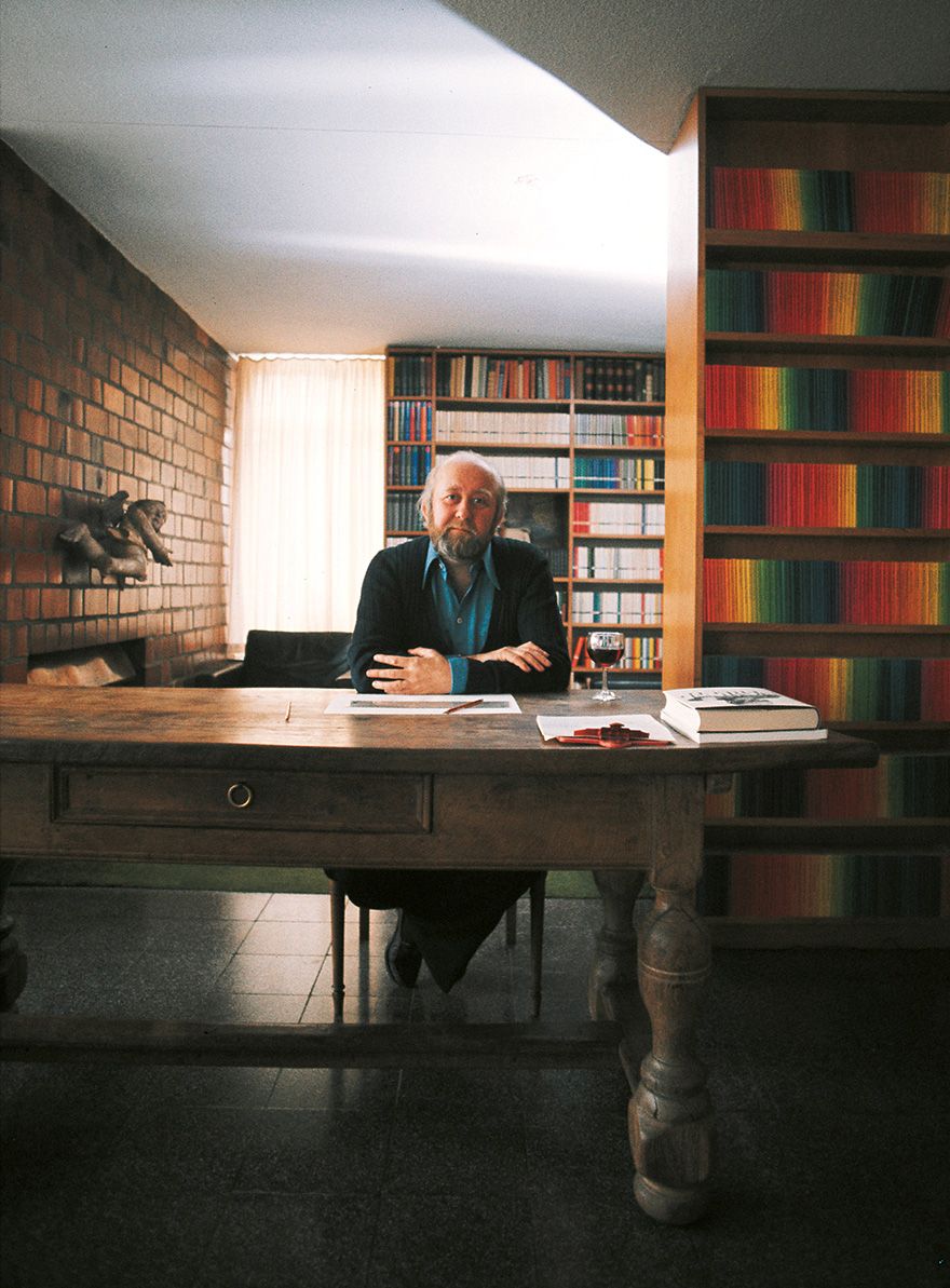
Kurt Weidemann, 2010 © photo: Julia Kneuse
In the 1960s he designed the logo for the co-op consumer cooperative. In the presentation for the trademark, Weidemann explained that the three letters c, o and p are “asocial characters” because they consist of round, self-contained forms. Unlike the A, V, M or E, he said, they didn’t have an open side. However, paradoxically, the abbreviation “co-op” stood for the exact opposite – for cooperation. The solution, he proclaimed, was the combination of the four characters into a coloured surface. This early example illustrates that it is impossible to separate his work from his personality, from his impressive rhetorical talent – which is perhaps why he sometimes referred to himself as a “mouth for hire”.
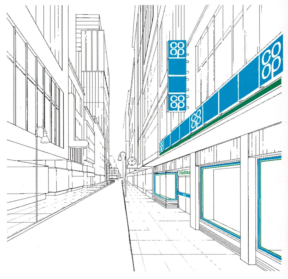
Kurt Weidemann, co op trademark, approx. 1972 © Steffen Weidemann
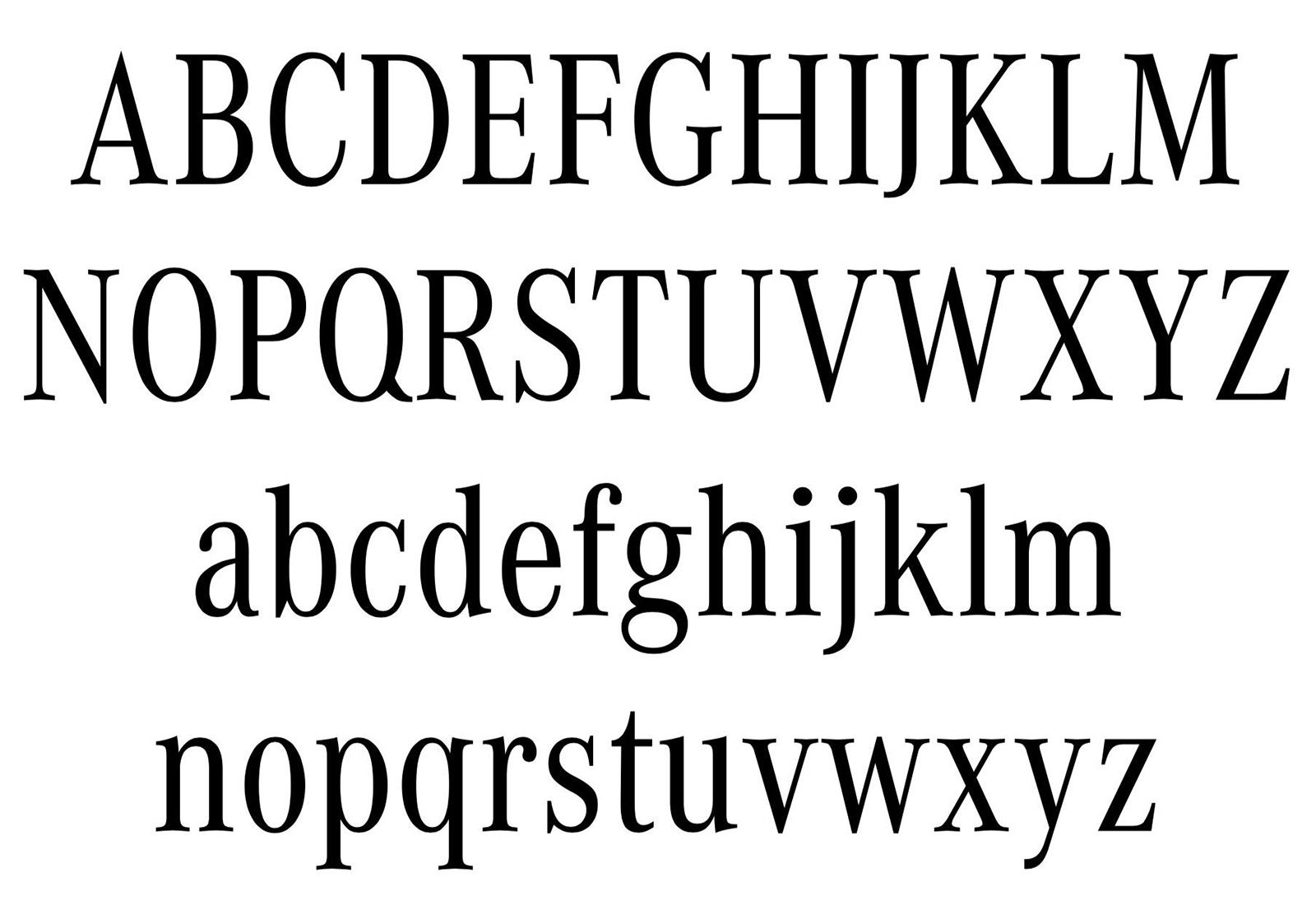
The Corporate A-S-E superfamily, 1985–1989, Antiqua Condensed Regular font
Kurt Weidemann, co op trademark, approx. 1972 © Steffen Weidemann
The Corporate A-S-E superfamily, 1985–1989, Antiqua Condensed Regular font
For Mercedes-Benz, later the Daimler-Benz group, he served as a consultant for the corporate design, developed various logotypes and was able to get the company to adopt his Corporate A-S-E font family as its typeface. In 1993, he created a controversial redesign for the Deutsche Bahn’s lettermark. It wasn’t so much its simple, serene form that drew criticism as Weidemann’s argument against the logo that had been in use since 1955 (created by Eduard Ege). He said it had too many rounded shapes and described them in vivid detail as “breast curves”, “hip curves” and “pregnancy curves”. And as for the “round corners”, which symbolised “deep-seated indecisiveness”, he found them totally inappropriate. Nowadays the use of such terms would make him a pariah, but back then it did not prevent the new logo being adopted. Even though admittedly rather colourless, it remains in use to this day.
In 1990 he revised the crest and logotype of sports car brand Porsche. In this connection, he wanted the Bordeaux red that had been used for the logo up until that point to be replaced with a lighter shade of red. His reasoning: “Do you know the difference between arterial and venous blood? Venous blood is darker, flows more slowly and carries all the toxins away. By contrast, arterial blood is a lighter colour, flows faster and is rich in oxygen. What is it that you’re actually selling, gentlemen?” Evidently this kind of argumentation had the desired effect and the logo was changed accordingly. And because the sports car maker was a little strapped for cash at the time, the designer accepted his fee in the form of a Carrera 4.
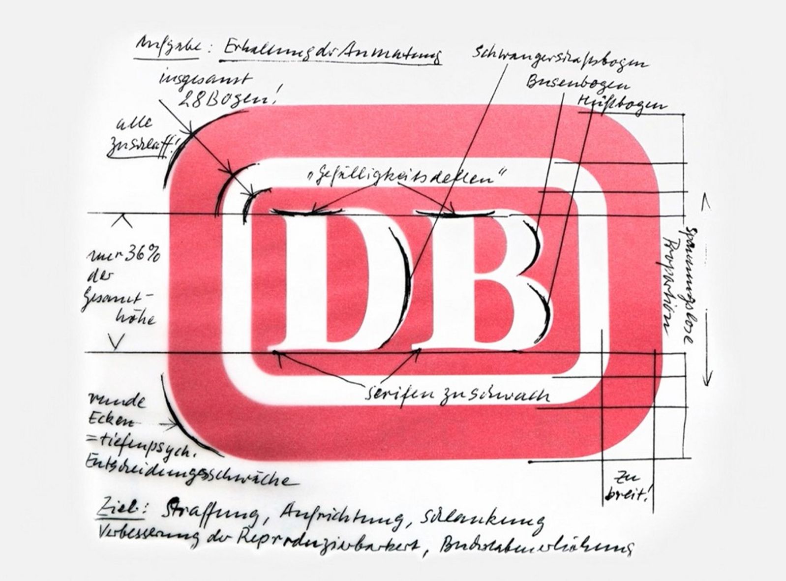
Analysis of the Bundesbahn logo, 1993 © Steffen Weidemann
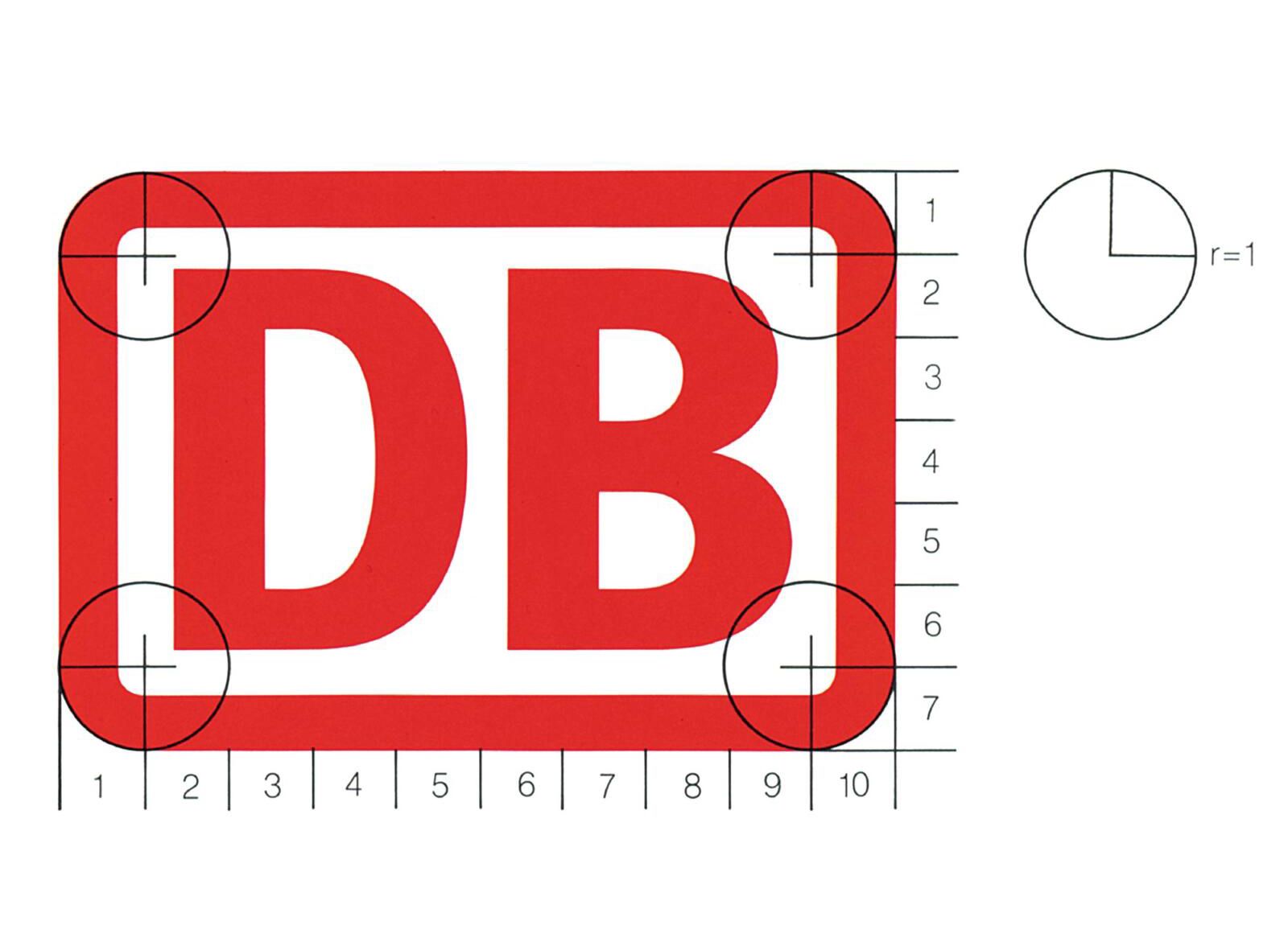
Logo of Deutsche Bahn AG, 1993 © Steffen Weidemann
Analysis of the Bundesbahn logo, 1993 © Steffen Weidemann
Logo of Deutsche Bahn AG, 1993 © Steffen Weidemann
Weidemann was always a typographer – although he occasionally departed from the field of type design, such as when he created the pictorial mark for the Bankgesellschaft Berlin (around 1995). All the same, it was his typographic works that made him famous. For an interdenominational edition of the Bible he created the Biblica font family, which retains good legibility even in a small type size and with tight letter-spacing; later it went on sale as ITC Weidemann (1983). As a book designer, he worked for Büchergilde Gutenberg and publishing houses Ullstein, Propyläen, Ernst Klett and Thieme.
As an author, Weidemann is unique on the German scene. He published regularly in magazines and journals, wrote books and never failed to take a stance in the discourse. In a 1960 article in the German book trade’s weekly magazine Börsenblatt entitled Holde und Unholde in der Typografie (Fair and Foul in Typography), he criticised the dogmatists of the new Swiss typography just as much as the fraction of typographic traditionalists: “Those who resort to the one extreme of devout one-armed grotesque soloists or to the other extreme of symmetrical medieval poets will easily go wrong. It is always incomprehensible to me how one can voluntarily renounce the plethora of means available for expressing oneself and cut off one’s own arm, so to speak, while wildly waving the other around and categorically proclaiming: ‘Look at all the things I can still do with it!’.”
When talking to artists and other creatives, the author of this article is fond of quoting this cryptic statement from Kurt Weidemann, the interpretation of which provides an excellent subject for an argument to this day: “The artist does what he wants. The designer wants what he does.”
Germany’s first art director: Willy Fleckhaus
When twen was founded in 1959, Europe caught up with the magazine design of America’s east coast. twen was a new type of magazine: visually speaking, it was in no way comparable with the existing European titles. The black background alone was enough to set the magazine apart from illustrated periodicals like Stern, Spiegel or Quick, and the four huge white letters glowing in the nameplate like a neon sign issued an irresistible invitation to read it. Topics like “Six girls talk about sex”, “Love in the car” or “Dream car” pointed the way to the free-spending, hedonistic years ahead.
Willy Fleckhaus at his house in the Bergisches Land region, designed by Max Bill, photo: Will McBride, © Will McBride Estate
Willy Fleckhaus is also justifiably known as “Germany’s first art director”. The designs of twen founder and art director Willy Fleckhaus were final, the editorial staff scarcely dared to change his layouts pasted up with lorem ipsum. That’s the only way the ultra-short headlines consisting of just three or four letters made it into the magazine – headlines like “Joy” or “Mach”, the number used to indicate the speed of supersonic jets, which Fleckhaus rendered as a narrow black typogram juxtaposed with the vapour trail of an aircraft. twen represented a mostly carefree outlook on life that probably had little in common with the reality of most German youngsters in the late 1950s. But then it wasn’t about reproducing everyday life; it was about the idealised vision of a liberal society greedy for new ideas. Consequently, for this first German lifestyle magazine (which soon began being published on a monthly basis), the right thematic and visual recipe was of immense importance in order to ensure that, month after month, the individual ingredients – photography, literature, horsepower, stars, love and sex – could be turned into a sparkling, eclectic and fascinating mix of topics. Fleckhaus attached great importance to the design of attractive double-page spreads and a dramaturgic approach to page sequencing.
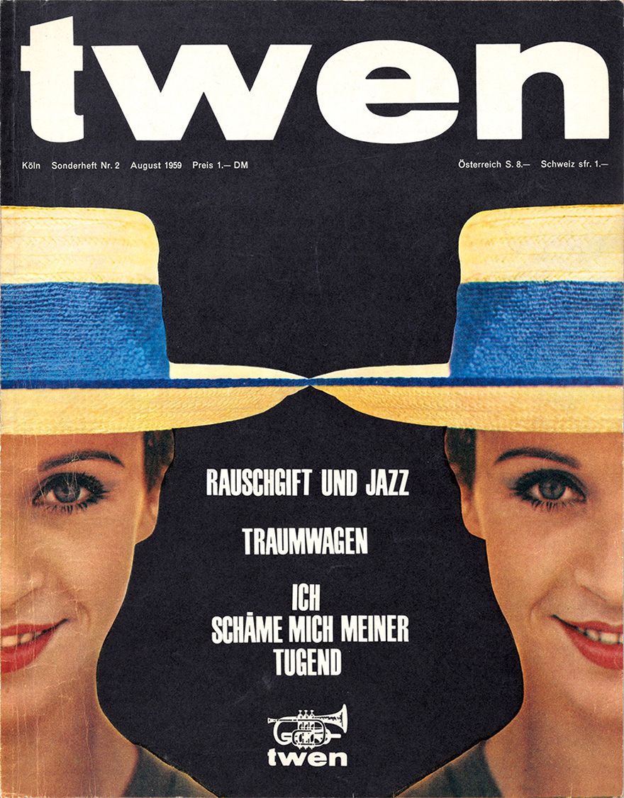
Willy Fleckhaus twen magazine, cover 1959 repro: Hans Döring
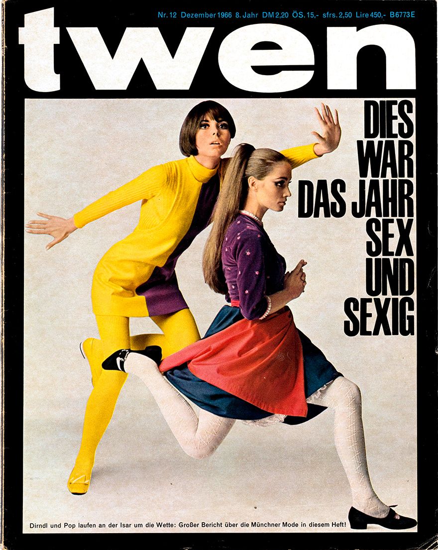
Willy Fleckhaus twen magazine, cover 1963 © Fleckhaus Now! Designforum (owner: Carsten Wolff), Frankfurt am Main
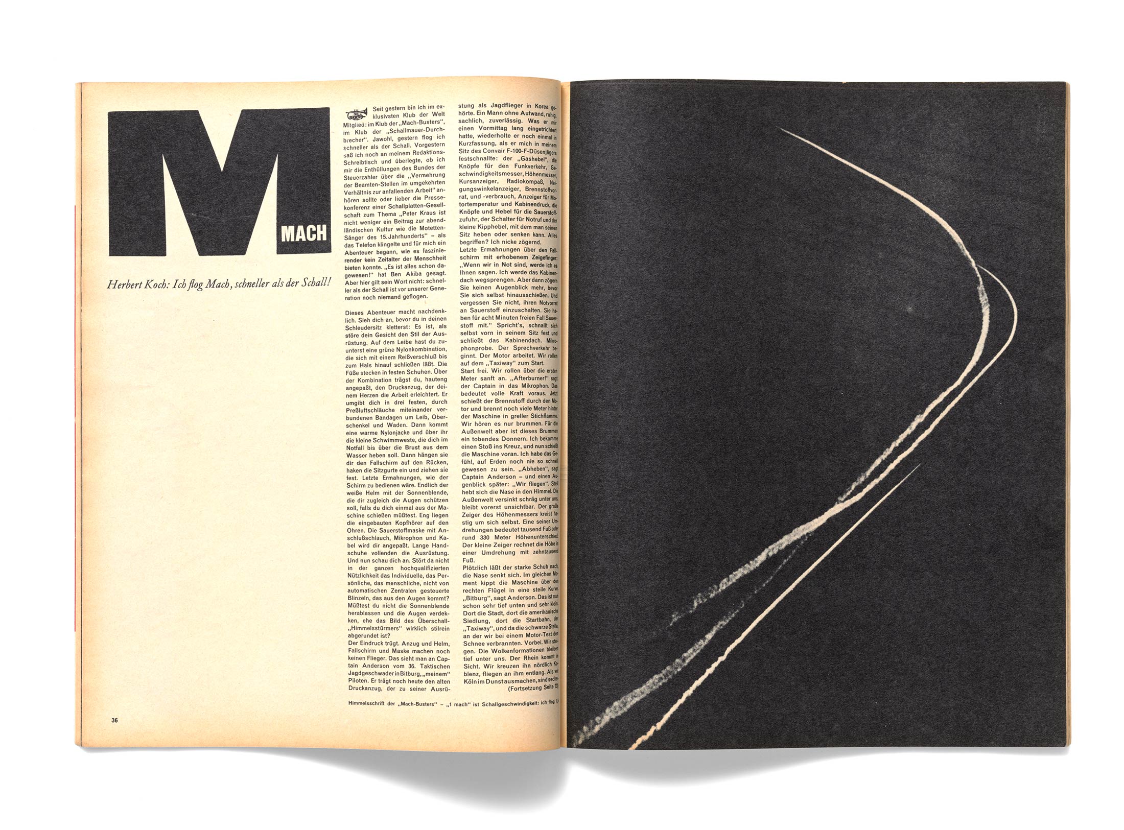
Willy Fleckhaus twen magazine, “Mach” 1960 © Fleckhaus Now! Designforum (owner: Carsten Wolff), Frankfurt am Main
Willy Fleckhaus twen magazine, cover 1959 repro: Hans Döring
Willy Fleckhaus twen magazine, cover 1963 © Fleckhaus Now! Designforum (owner: Carsten Wolff), Frankfurt am Main
Willy Fleckhaus twen magazine, “Mach” 1960 © Fleckhaus Now! Designforum (owner: Carsten Wolff), Frankfurt am Main
When Fleckhaus was commissioned to create the graphic concept for a supplement of the Frankfurter Allgemeine Zeitung in 1980, he showcased his magnificent skills once again. This time too, he chose a black background for the cover, the design of which was bolder and more playful than for twen – but the magazine always maintained its sleek appearance and subtle humour. Having co-founded the German Art Directors Club, Fleckhaus didn’t even enter the Frankfurter Allgemeine Magazin for its competition – perhaps he thought he’d already received enough accolades, because as illustrator Heinz Edelmann put it: “He lived in landscapes, not in annuals.”
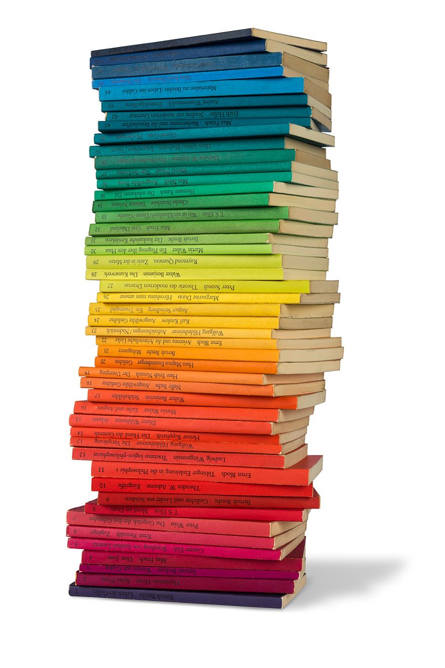
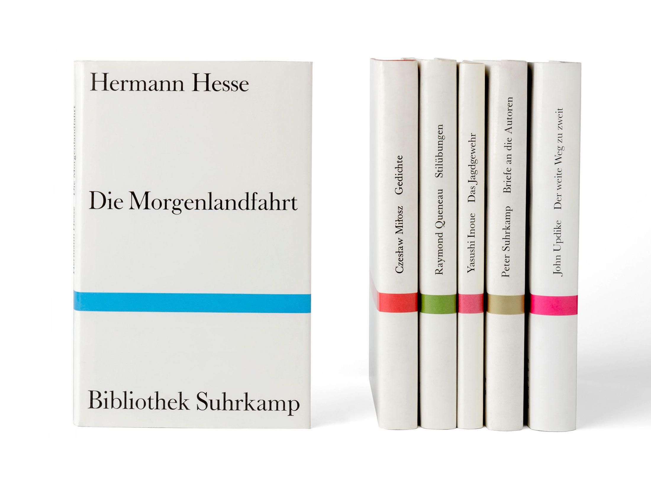
Fleckhaus made his mark on book design too. In the mid-1950s, the paperback had begun its conquest of German bookstores. The glossy white covers of the dtv series, designed by Celestino Piatti, had appeared in 1961. Suhrkamp wanted to confront this market success with something even more ambitious: “Only contemporary literature, preferably first editions.” Willy Fleckhaus was commissioned to create the design, having already successfully outfitted the Bibliothek Suhrkamp series with new covers in 1959. Fleckhaus suggested countering the dtv series with an eye-catching design consisting of 48 colours of the spectrum. The front cover of the books featured a minimalist grid consisting of horizontal lines, with typography in just one font and just one size between them. The first 20 volumes of edition suhrkamp were published in 1963; today the series numbers almost 2,800 titles. In 1997, advertising guru Wolf D. Rogosky wrote a letter for the monograph on the legendary art director that ended in a postscript: “Your rainbow series is still going strong; in the meantime it’s so big you can probably even see it from up there.”
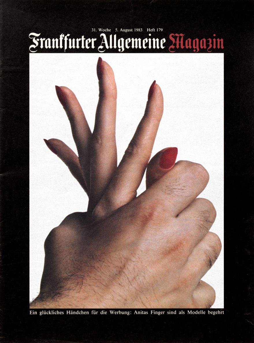
Willy Fleckhaus Frankfurter Allgemeine Magazin, cover, 1983 repro: Hans Döring
Willy Fleckhaus jacket design “edition suhrkamp”, from 1963 © Fleckhaus Now! Designforum (owner: Carsten Wolff), Frankfurt am Main
Willy Fleckhaus jacket design “Bibliothek Suhrkamp”, from 1959 © Fleckhaus Now! Designforum (owner: Carsten Wolff), Frankfurt am Main
When Willy Fleckhaus died of a heart attack at his home in Tuscany in 1983, the media world mourned his passing. It had lost one of its true greats, and perhaps the grief was amplified by the premonition that an era was inevitably approaching its end. In his obituary, Wolf D. Rogosky rote: “You’d love to have someone like him again, right? Good luck with that!”
The Swabian utilitarian: Otl Aicher
Don’t leave anything to chance – that was Otl Aicher’s guiding principle. If you think of his work, your mind’s eye pictures grid systems, regular forms and sober, rationally based systems. Years before Fleckhaus, Aicher had met Swiss designer Max Bill (1947) and, through him, the grid – as was soon to be evident in Aicher’s work.
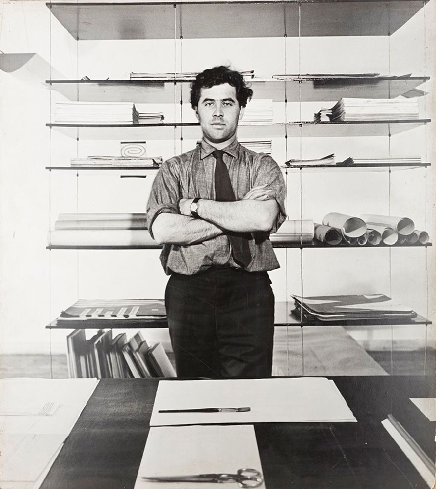
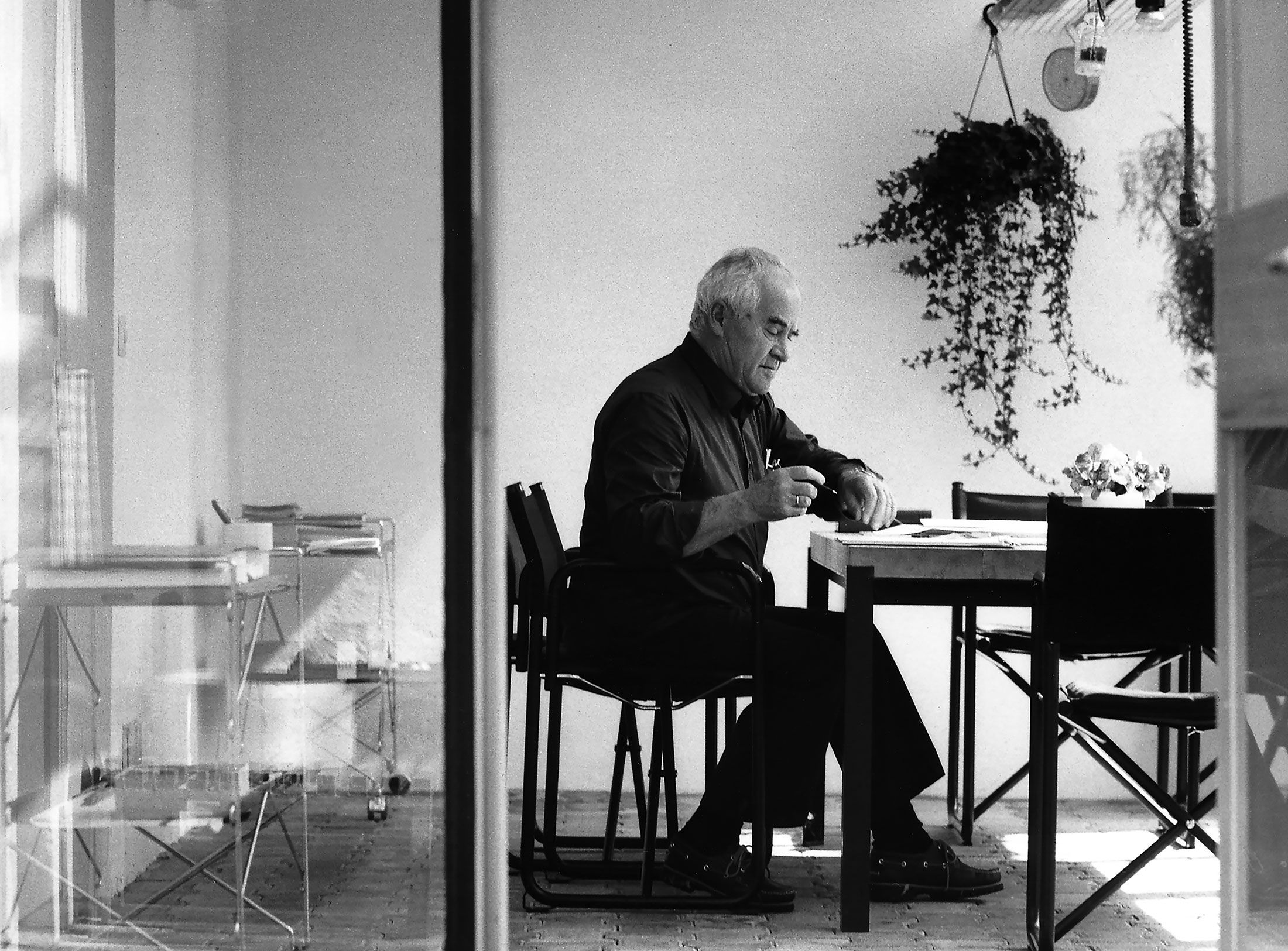
Portrait of Otl Aicher in his studio, 1953 (in front of suspended shelving) © Florian Aicher, HfG-Archiv / Museum Ulm
Differences as to whether and how the teaching concept should evolve led to Bill’s departure in 1957 and to the school being headed by a rectorate consisting of Otl Aicher, Hans Gugelot, Tomás Maldonado and Friedrich Vordemberge-Gildewart. In 1962 Aicher became sole rector. Aicher wrote: “The result is the Ulm model: a model of design underpinned by technology and science, with the designer no longer as a superior artist but as an equal partner in the decision-making process of industrial production.” Preceding analyses, the rational justifiability of designs and comprehensive concepts became the basis of all related processes. The intuitive, artistic approach to design was suppressed.
From 1962 on, under Aicher’s leadership, the school’s internal development team E5 developed the new corporate design for Lufthansa. Aicher designed the logo with the stylised crane; his suggestion of replacing the bird with a simple arrow was extreme – even from today’s perspective – and was rejected. The group developed comprehensive and unprecedented standards and guidelines for brochures, ads, tickets, counters and uniforms, as well as for all media that customers or suppliers came into contact with. Aicher and the team had thus established the Erscheinungsbild, a term that’s still used in Germany to this day to refer to a corporate or visual identity.
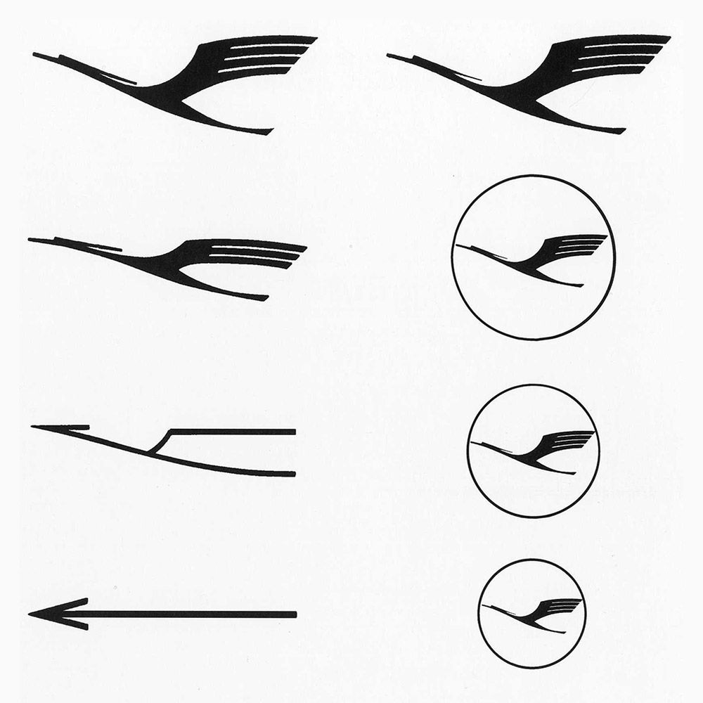
Initially, Aicher wanted to replace the outdated Lufthansa crane with a simple arrow. © Florian Aicher, Rotis
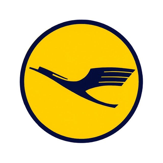
Otl AIcher, Development Group 5 (E5), element of Lufthansa corporate identity. The crane is based on a 1918 design by Otto Firle; Aicher slenderised it and surrounded it with a circle, approx. 1965
Initially, Aicher wanted to replace the outdated Lufthansa crane with a simple arrow. © Florian Aicher, Rotis
Otl AIcher, Development Group 5 (E5), element of Lufthansa corporate identity. The crane is based on a 1918 design by Otto Firle; Aicher slenderised it and surrounded it with a circle, approx. 1965
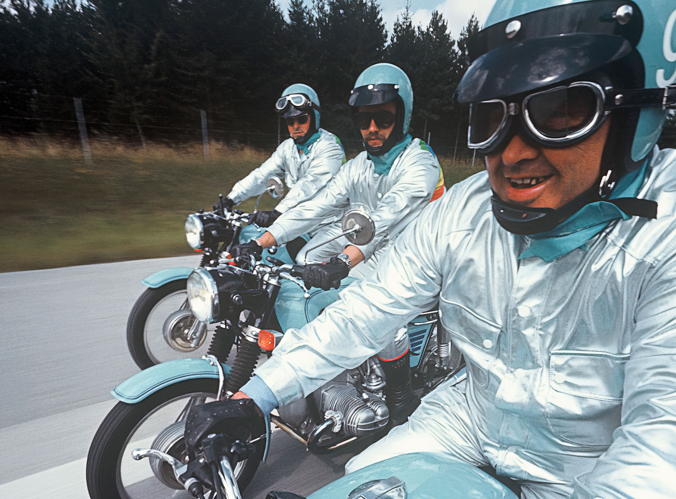
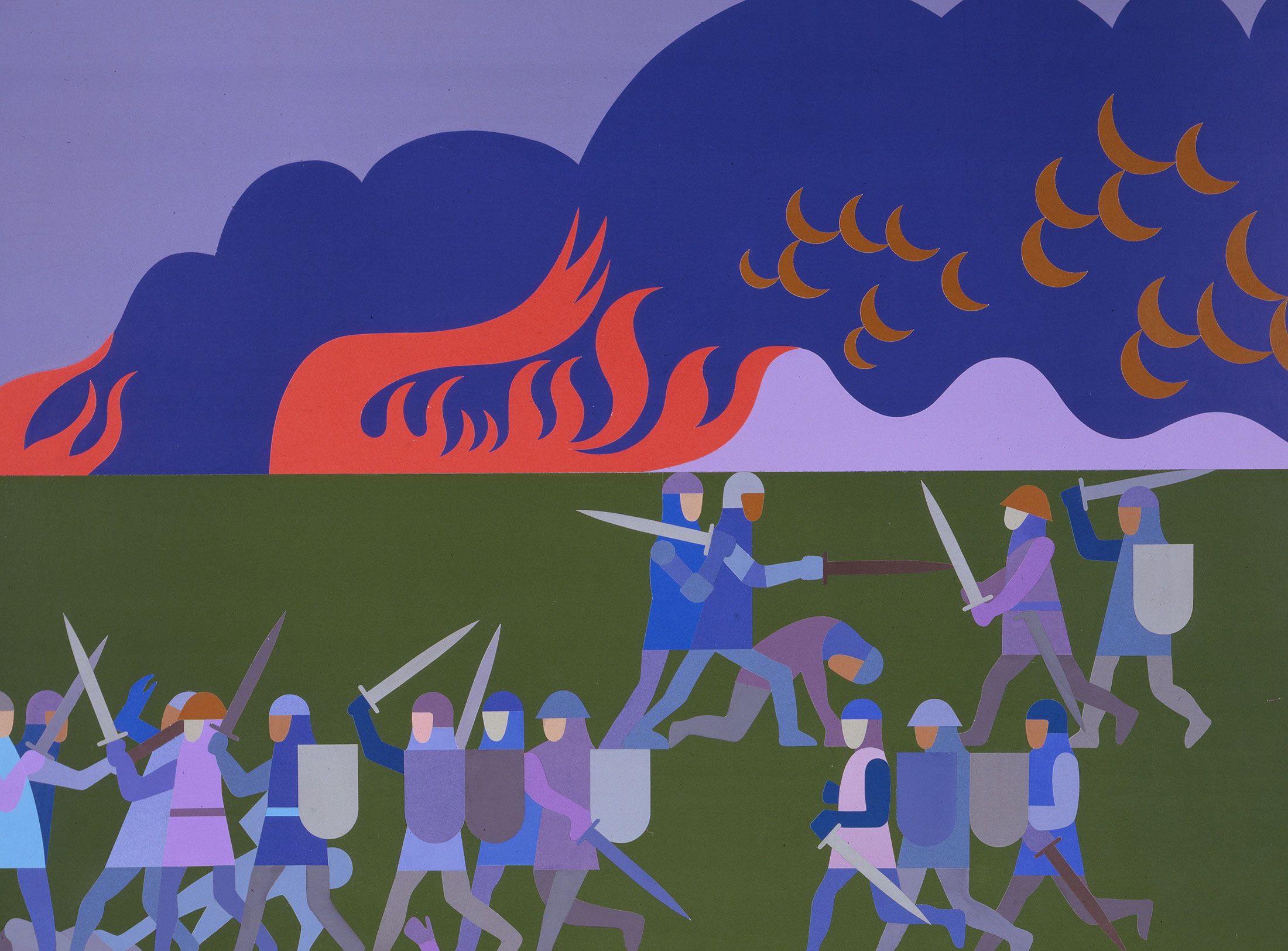
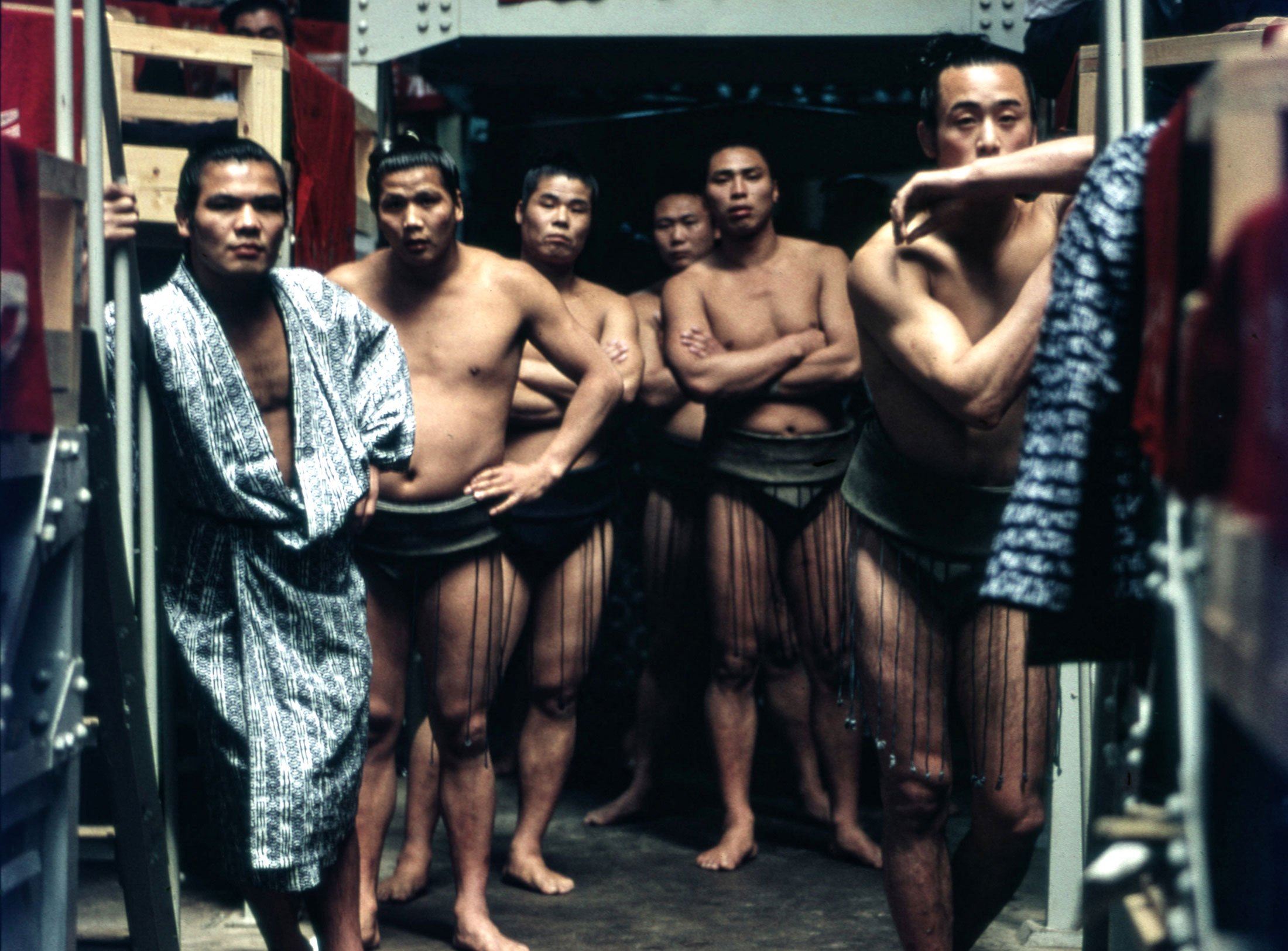
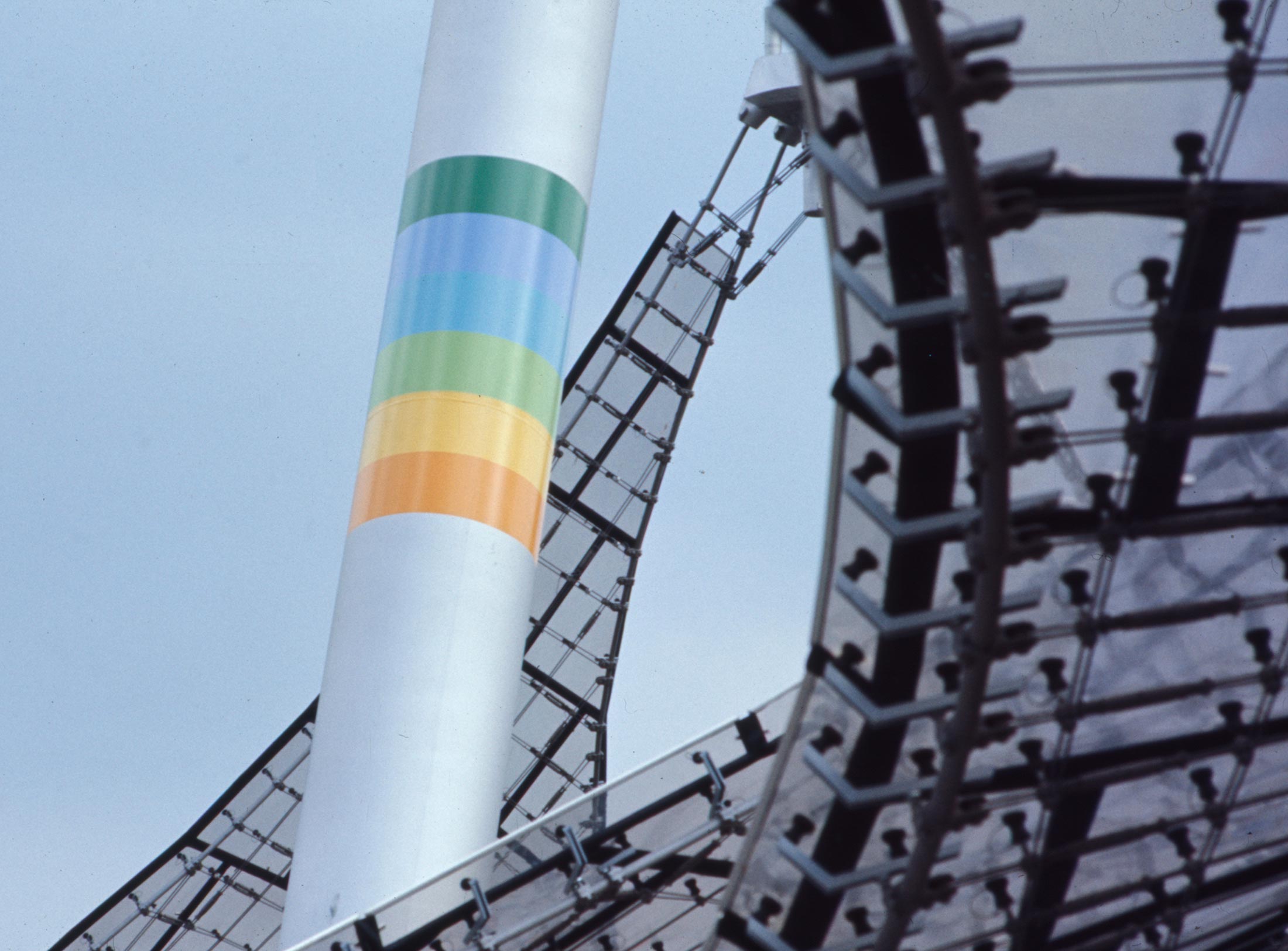
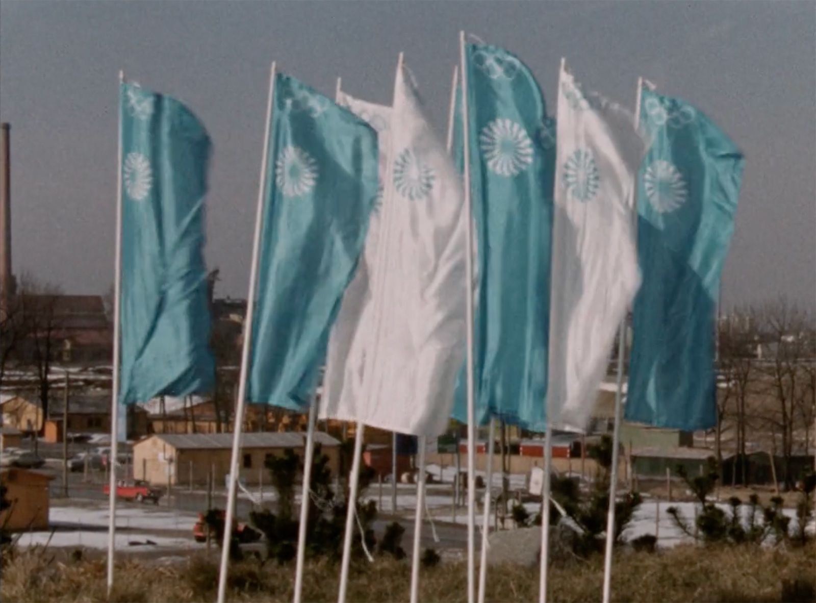
Aicher focused a great deal of attention on the development of visual identities. In 1966, he was appointed Design Commissioner of the 1972 Olympic Games in Munich. Aicher, who found shows of state prestige repulsive, selected just a few light colours and gleaming silver – no red, no gold. All media adhered to a strict grid. Univers was the only font used. The clothing for the athletes and staff followed the design principles too, and even the police and military were dressed in jumpsuits so as to make the “joyful games” look as unpolitical and separate from the state as possible.
Even the mascot, Waldi the dachshund, was developed by Aicher’s office and marketed in the form of cuddly toys, key chains and wooden toys. While pictograms had already been deployed in Masaru Katsumie’s design for the 1964 Olympic Games in Tokyo, those created by Aicher were based on a uniform grid and thus led to unity of form: the reduction of torsos and extremities to just two line thicknesses, the restriction to three angles (0°, 45° and 90°) and the reduction of the head to a circle were and remain utterly convincing in their simplicity and legibility. Using few but characteristic forms, Otl Aicher and fellow team member Gerhard Joksch translated sports like football, dancing and cycling into minimalist pictograms that provided quick and easy orientation for the international, multilingual public in Munich. This light, life-affirming visual identity played an essential role in the success of the Games. Until the deadly Palestinian attack on the Israeli team eradicated all trace of joy.
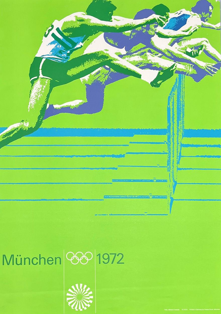
Poster for the Games of the XX Olympiad in Munich, 1970 © Florian Aicher, HfG-Archiv / Museum Ulm
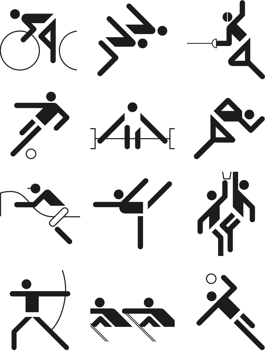
Sports pictograms for the Munich Olympic Games, 1970–71. © 1976 by ERCO, www.otl-aicher-piktogramme.de

© 1976 by ERCO, www.otl-aicher-piktogramme.de
Poster for the Games of the XX Olympiad in Munich, 1970 © Florian Aicher, HfG-Archiv / Museum Ulm
Sports pictograms for the Munich Olympic Games, 1970–71. © 1976 by ERCO, www.otl-aicher-piktogramme.de
© 1976 by ERCO, www.otl-aicher-piktogramme.de
In 1972, when the work for the Olympics was completed, Aicher moved his office to Rotis in the Allgäu region of southern Germany, where he designed and built studio houses for himself and his office community over the following years. Aicher continued to develop trademarks and comprehensive corporate design systems, including for ERCO (1975), Bulthaup (1979), Munich Airport (1979–85) and FSB (1986). He became friends with architect Norman Foster, which resulted in the commission to create the corporate design of the Metro Bilbao (1988).
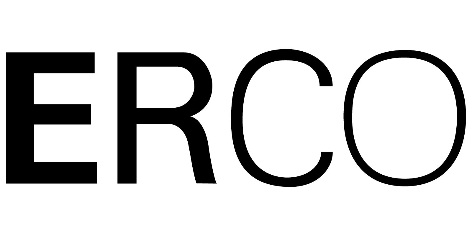
Lettermark for ERCO, 1974–1976 © Florian Aicher, HfG-Archiv / Museum Ulm
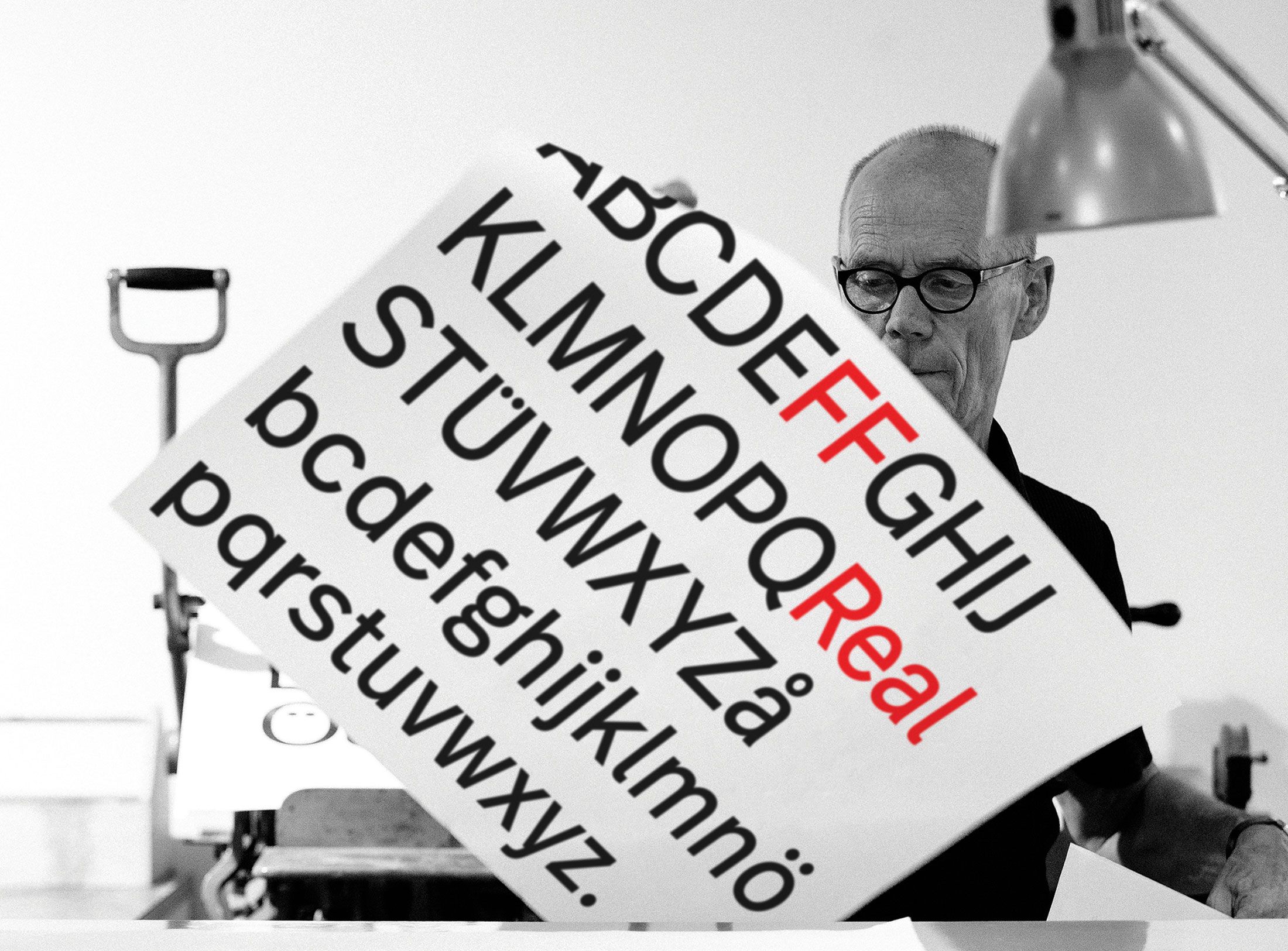
In 1988 Aicher issued his rotis font superfamily; in keeping with his quirk of lowercasing everything, the capital letters only followed later. Erik Spiekermann disparaged the chimera of antiqua and grotesque as a “flight of fancy”; to this day, its poor legibility and idiosyncratic aesthetic are the object of controversy. Otl Aicher died in 1991 as the result of a traffic accident – at the very time, according to Norman Foster, when he was at the height of his creativity. Aicher, the Swabian utilitarian, had once expressed the goal and spirit of his work as a formula: “Design is art squared. You have to multiply aesthetics with fulfilment of purpose.”
What remains of the work of these four exceptional designers? Stankowski will be remembered for his succinct trademarks, Weidemann perhaps most likely as the scene’s powerfully eloquent mouthpiece, Fleckhaus for his epochal book and magazine design and Otl Aicher as the principal trailblazer of comprehensive and systematic corporate design. Looking back admiringly at an epoch when graphic design was part of the social discourse and played a substantial role both in public perception and the media, you can’t help feeling just a tiny bit sentimental.
Carsten Wolff is a graphic designer and author. He runs the multi-award-winning Fine German Design agency in Frankfurt am MainWith his designs for Frankfurt Airport’s corporate design, he continues Aicher’s work for the airport. With the Fine German Gallery he offers contemporary art online As an author, he has published books and texts on graphic design and contemporary art, including “Willy Fleckhaus. Germany’s First Art Director.” In his blog 667.run, he comments on current topics.
Translation: Alison Du Bovis
Otl Aicher’s signage systems for airports, metro stations and hospitals are considered exemplary to this day.