What’s become of Otl Aicher’s former abode? A visit to the Allgäu.
What’s become of Otl Aicher’s former abode? A visit to the Allgäu.
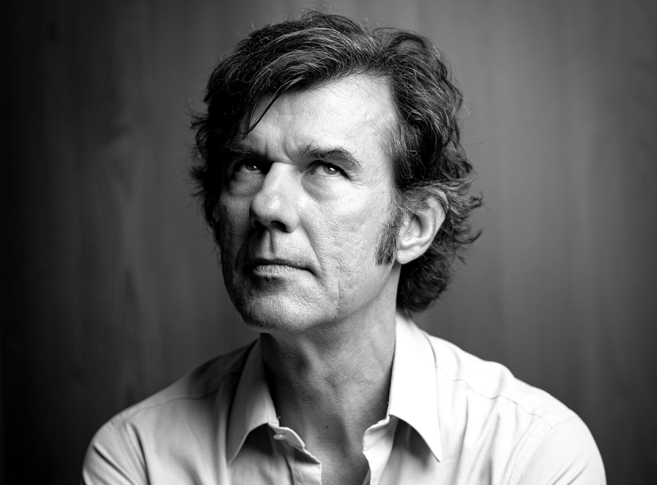
Interviewed: Erik Spiekermann, type designer, author and Aicher critic.
Technology: a central notion and fixed point of perspective in the work of Otl Aicher.
The British architect Norman Foster on his friendship with Otl Aicher: He had absolute integrity.
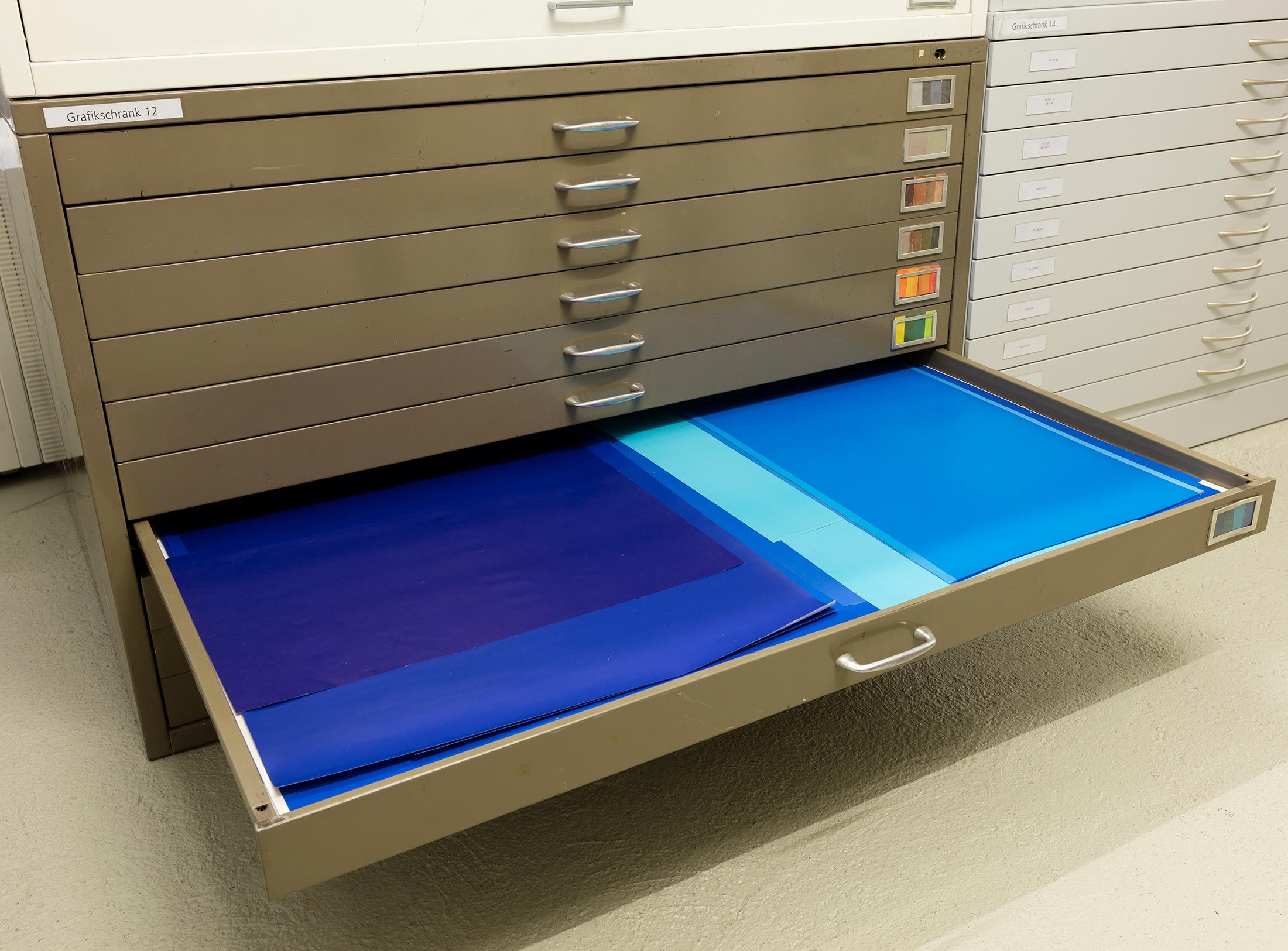
Thoughts on the colour palettes of Otl Aicher.
Absolute sharpness, reduction and strict rules determine the character of his pictures: Otl Aicher as photographer.
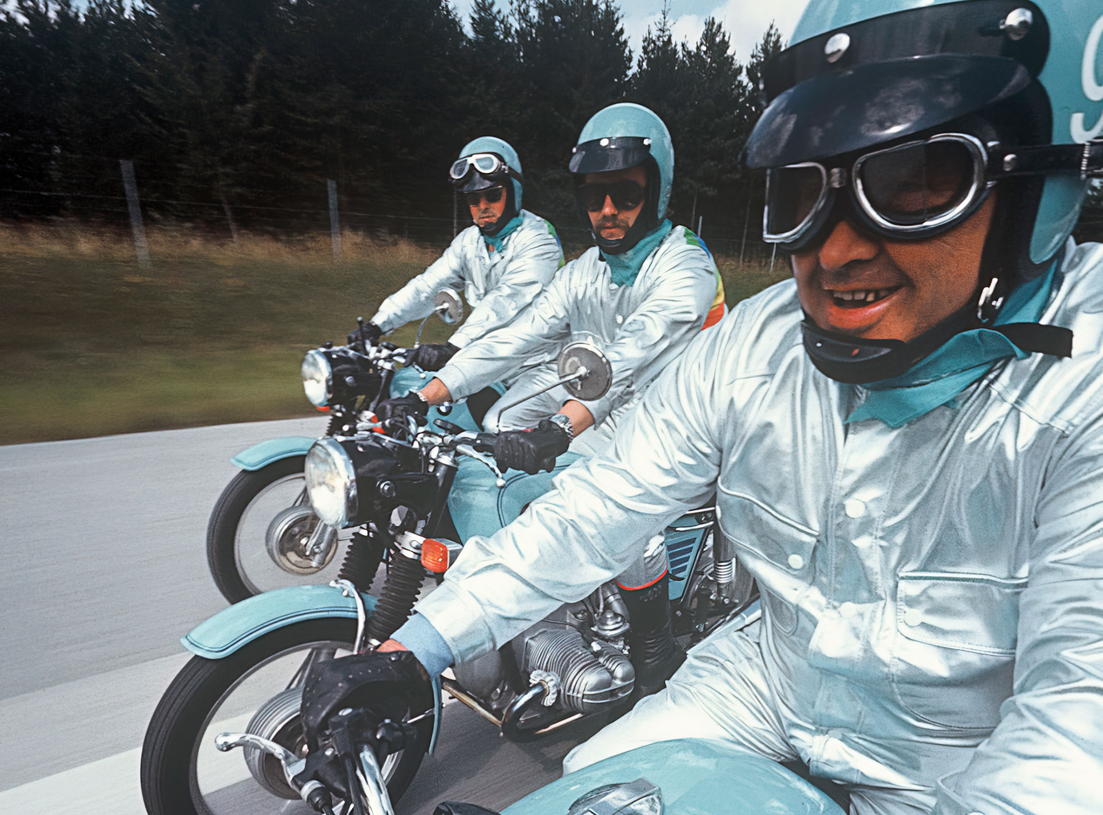
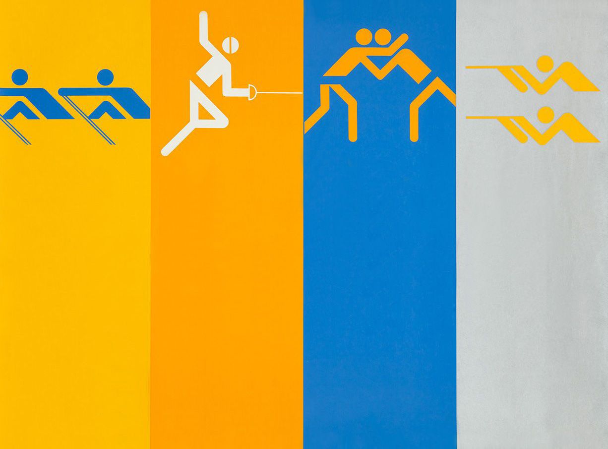
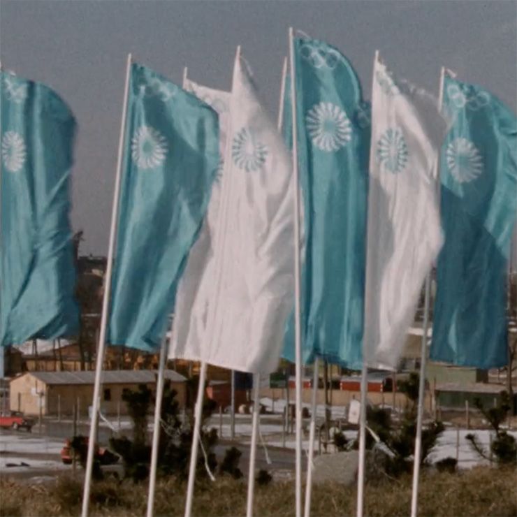
Under Otl Aicher’s direction, designers, architects and landscape planners shaped the face of the Olympic Games 1972.
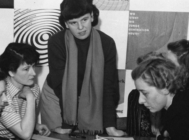
Inge Aicher-Scholl preserved the legacy of the White Rose.
An interview with design icon Stefan Sagmeister about typefaces, beauty and the legacy of Otl Aicher.
The International Design Center Berlin (IDZ) invites you to a slide show and panel talk at Architektur Galerie Berlin on 20 October. Karsten de Riese and Prof. Michael Klar will report on a photo reportage commissioned by BMW that took them to Tunisia in 1975 together...
On the occasion of the 50th anniversary of the 1972 Olympic Games, the IDZ invites you to a discussion on the vision of the Munich Games and the status quo as well as the future of the Olympic movement on 26 August. The event at Berlin’s Akademie der Künste on Pariser...
Isny im Allgäu owes Otl Aicher a corporate design that is concise, bold and singular.
With a retrospective of Otl Aicher’s book “kritik am auto – schwierige verteidigung des autos gegen seine anbeter” (Criticism of the Car – Difficult Defence of the Car against its Worshippers) published in 1984, the IDZ continues its series of events on the “otl...
Today marks the centenary of Otl Aicher’s birth. The International Design Center Berlin (IDZ) is taking this date as an opportunity to pay tribute to this great designer. With otlaicher100.de, a new online platform is being launched – a curated space that provides...
Reflections on Inge Aicher-Scholl and Otl Aicher.
The International Design Center Berlin (IDZ) is taking Otl Aicher’s centenary as an opportunity to pay tribute to this great designer and to make his work visible. An online platform and a series of events will address Otl Aicher’s multifaceted cosmos of topics and...
Eine Stadt leuchtet: Mit seinem farbenfrohen Erscheinungsbild der XX. Olympischen Sommerspiele 1972 setzte Otl Aicher ein Signal. Die junge Bundesrepublik war in der Moderne angekommen.
Otl Aicher’s Poster displays for the Ulmer Volkshochschule (Ulm Adult Education Centre).
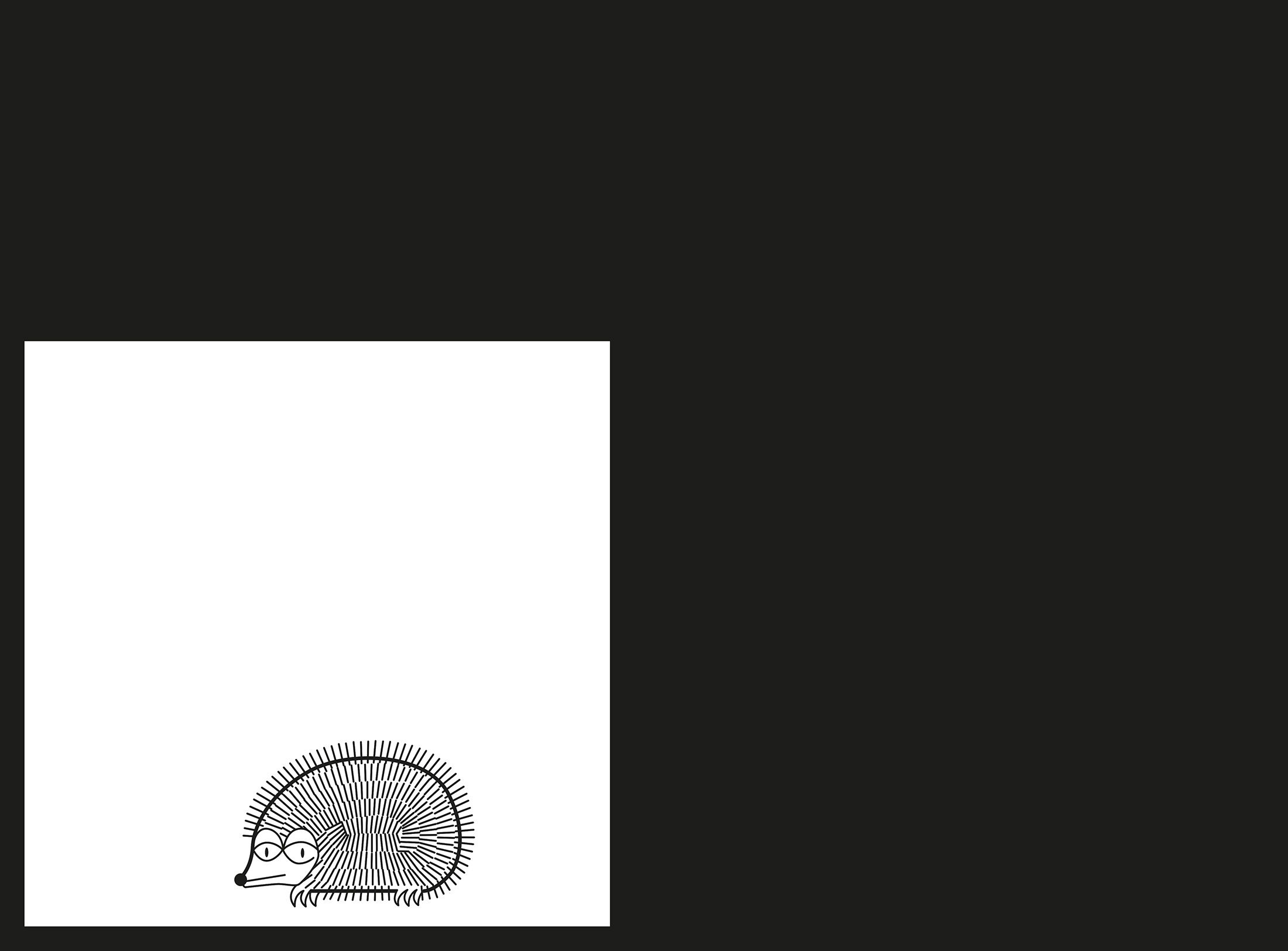
From O to R: Let’s talk about a hedgehog, standardisation and neurotis for a change (please click on the letters).

Otl Aicher’s Dept. XI team: the visual identity of the Munich ’72 Olympics was the work of graphic designers, illustrators and technical staff from all over the world.
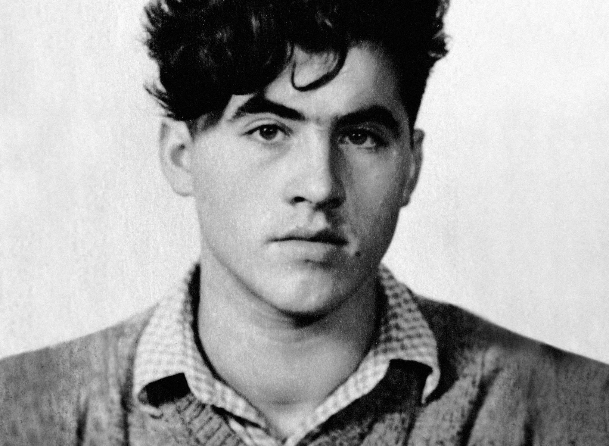
Aicher’s childhood and youth: the years 1922 to 1945.

Otl Aicher’s signage systems for airports, metro stations and hospitals are considered exemplary to this day.
Der einstige Braun-Chef-Designer im Gespräch über den Co-Gründer der HfG.
A Broadcast: What is his place in today’s world?
The Aichers: a brief family history.
Drawing in Rotis: former Aicher co-worker Reinfriede Bettrich talks about hand sketches, the first computers and everyday life at the office.
How Otl Aicher’s papers and materials came to the HfG-Archiv/Museum Ulm.
Die Küche zum Kochen (The Kitchen for Cooking) – the genesis of a book that has lost none of its relevance.
How a dachshund conquered the world: former Aicher staff member Elena Schwaiger on plush animals, fakes and the authentic mascot of the 1972 Olympic Games in Munich.
Le Violon d’Ingres or An Attempt to Defend the Writings of Otl Aicher.

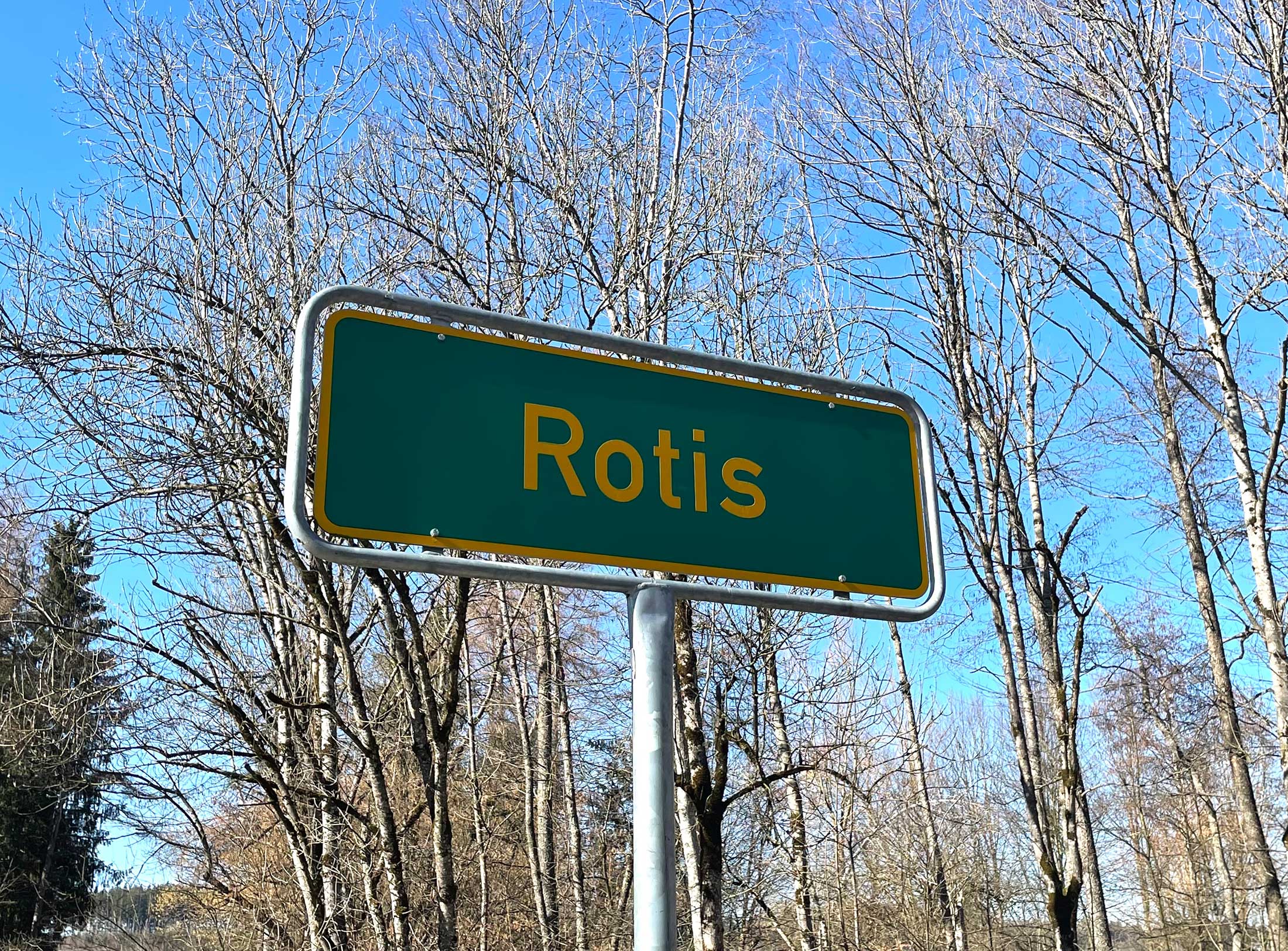
Otl Aicher as the architect of Rotis.
Otl Aicher and his critique of the automobile.
First broadcast: 15.02.1971 on Bayerischer Rundfunk, Munich (Only available in German).
Interviewed: Jürgen Werner Braun on his collaboration with Otl Aicher.
They created the signature of an epoch: designers Otl Aicher, Willy Fleckhaus, Anton Stankowski and Kurt Weidemann.
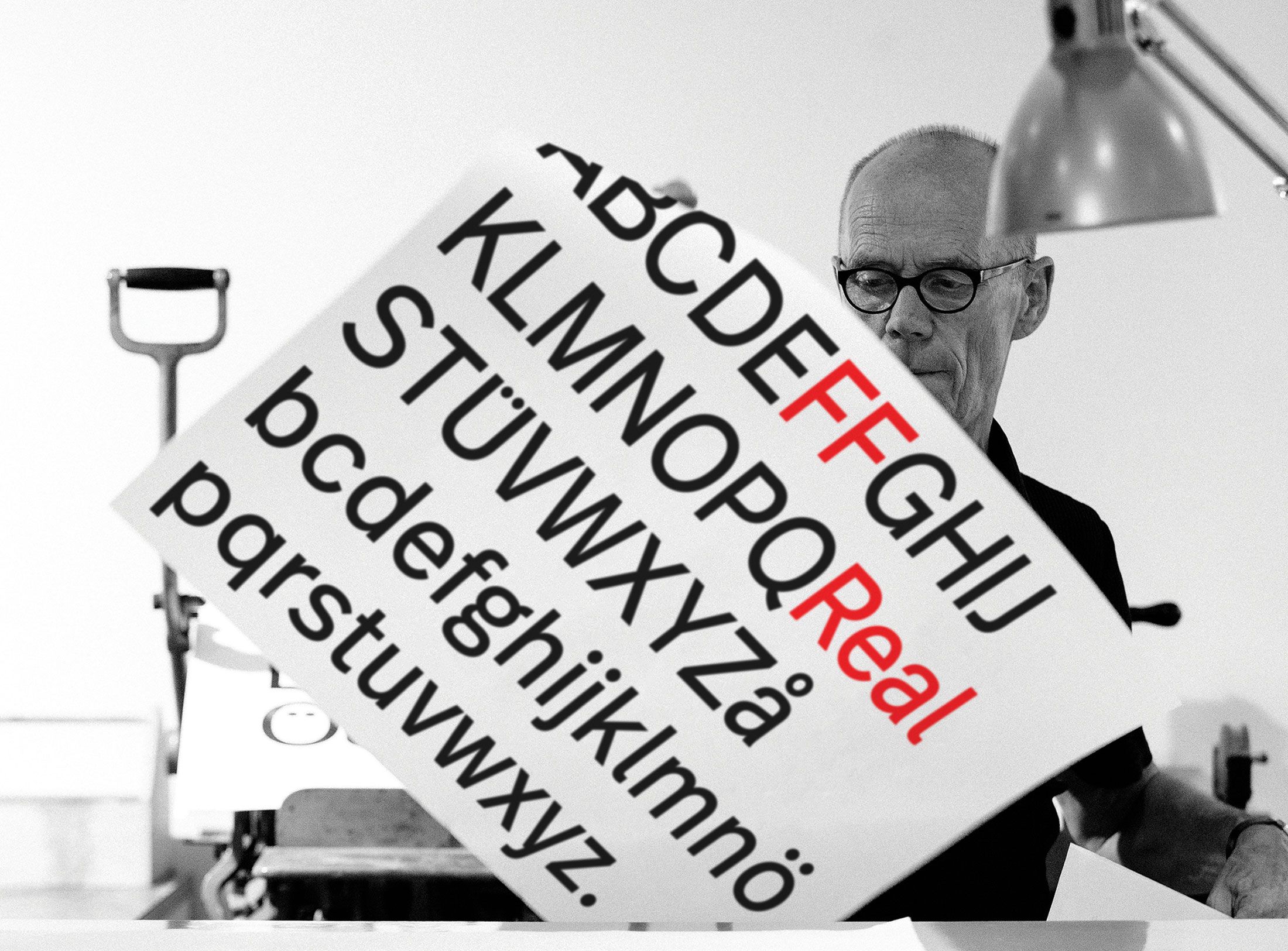
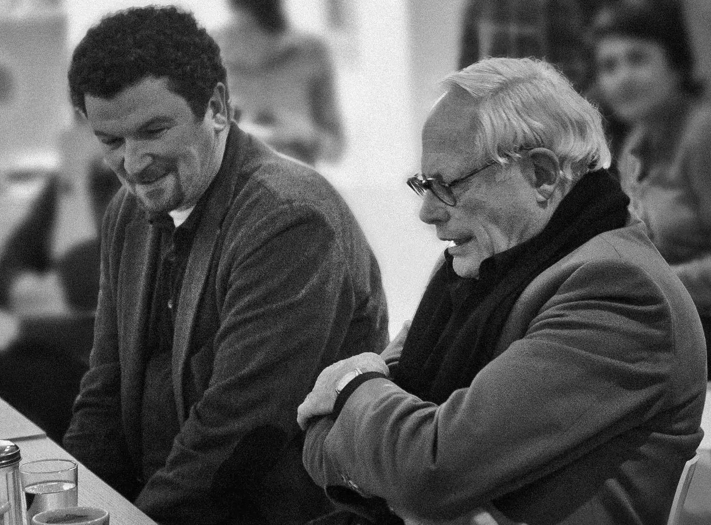
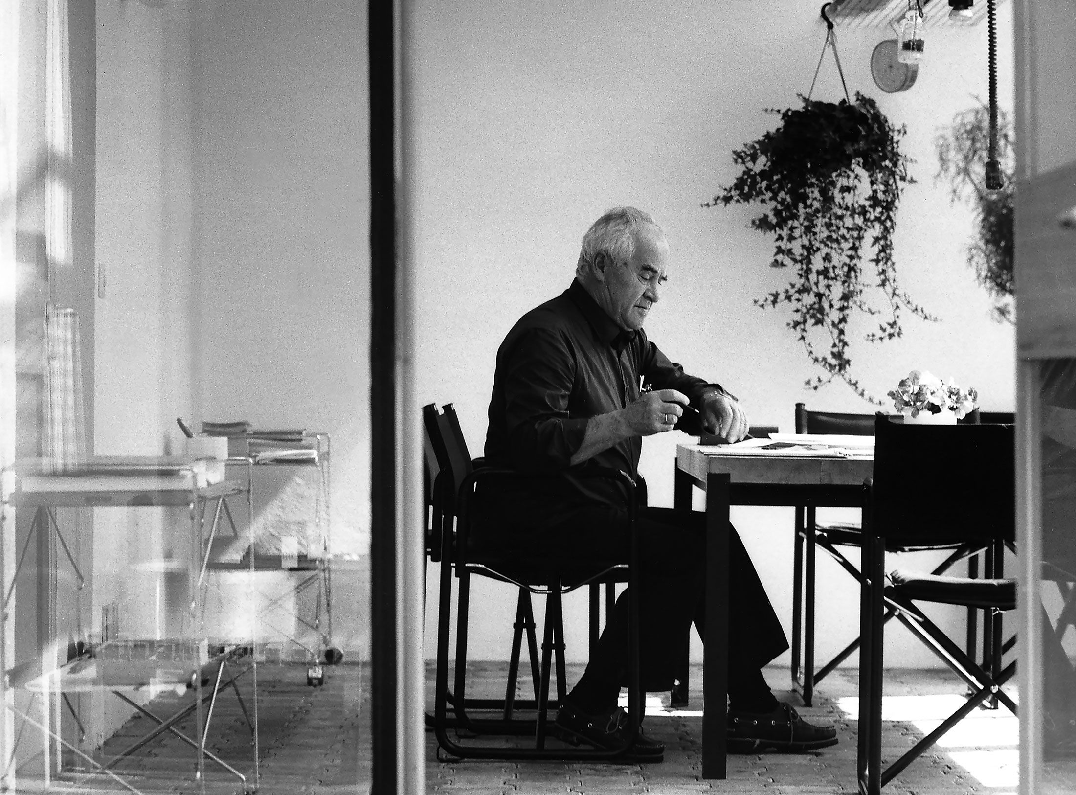
Erik Spiekermann is one of the world’s most renowned typographers and corporate designers. In the past, he has strongly criticised Otl Aicher’s typeface Rotis. How does he assess the work of the designer from Ulm today?
Erik, it is well known that you are a vehement critic of Aicher’s typeface family Rotis. You even called it a “typographic catastrophe” in a tweet, and elsewhere a mere “figment of the imagination”. What exactly are your criticisms?
Incidentally, I am not alone in my criticism; numerous type designers, such as Günter Gerhard Lange or Matthew Carter, saw or see the matter in a similar way: Rotis consists of a collection of letters, some of which are very beautiful, but it is not a typeface. This simply shows Aicher’s lack of experience. Letters must not be vain. I cannot follow Aicher’s theory that, for example, the swing in the lower case e leads to the next letter, because we do not read individual letters but groups of letters. The term “transition” implies that one runs along the edge of a letter with the eye – as if on a bicycle that you would have to jump the next kerb with, so to speak. This is a completely cerebral idea – hence “figment” – that has nothing to do with reality. As a type designer, however, you need a lack of vanity to create good legibility. You can’t get so personally involved. As a designer, you either have to space out the Rotis typeface insanely or you have to set it extremely tight; in some sizes it works quite well, in others it doesn’t work at all. Some letters like the c and the e are awful.
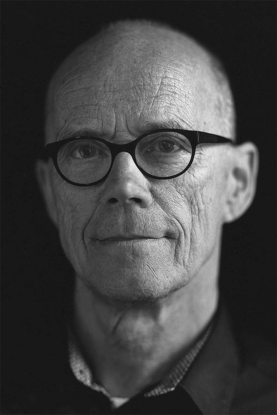
Photo: Dennis Letbetter
You called the Rotis Semi Serif the “most horrible variant” – why?
The Semi Serif can only be called a bastard. It is akin to wearing braces and a belt at the same time because you couldn’t make a decision. Birthing the computer, because you could suddenly interpolate. But you don’t have to interpolate goulash and spaghetti. No meal comes out of that. And it’s the same with the Rotis Semi Serif.
Are there any applications of Rotis that you accept? Where it works for you?
Of course you can build good logos with Rotis, as Baumann + Baumann from Schwäbisch Gmünd have shown. The best way to make Rotis work is to use Aicher’s pastel colours as a background. This typical lilac blue was internally called “Flau” (dull) in Aicher’s office, his colleague Rolf Müller once told me. (laughs) So there cannot be too strong of a contrast – and you need a lot of space, a lot of surrounding area. The problem with Baumann is that at some point they only worked with the Rotis typeface. They knew how to build very fine word pictures out of it because they got the spacing right and chose the right sizes. However, that was only possible because they had adapted themselves completely to Rotis over the years. Each letter then becomes a monument. Incidentally, I have a semi-ironic wish that Rotis be used on my gravestone, because my friends would see the irony and laugh at my grave. That would be something. (laughs)
Oh, there’s still time! If you ride a racing bike as much as you do, you’ll have to be patient with typo gravestone jokes. But back to Aicher. He published Rotis in 1988. Is it a typical child of the 1980s for you? Looking back, does it perhaps even reflect the zeitgeist of those years?
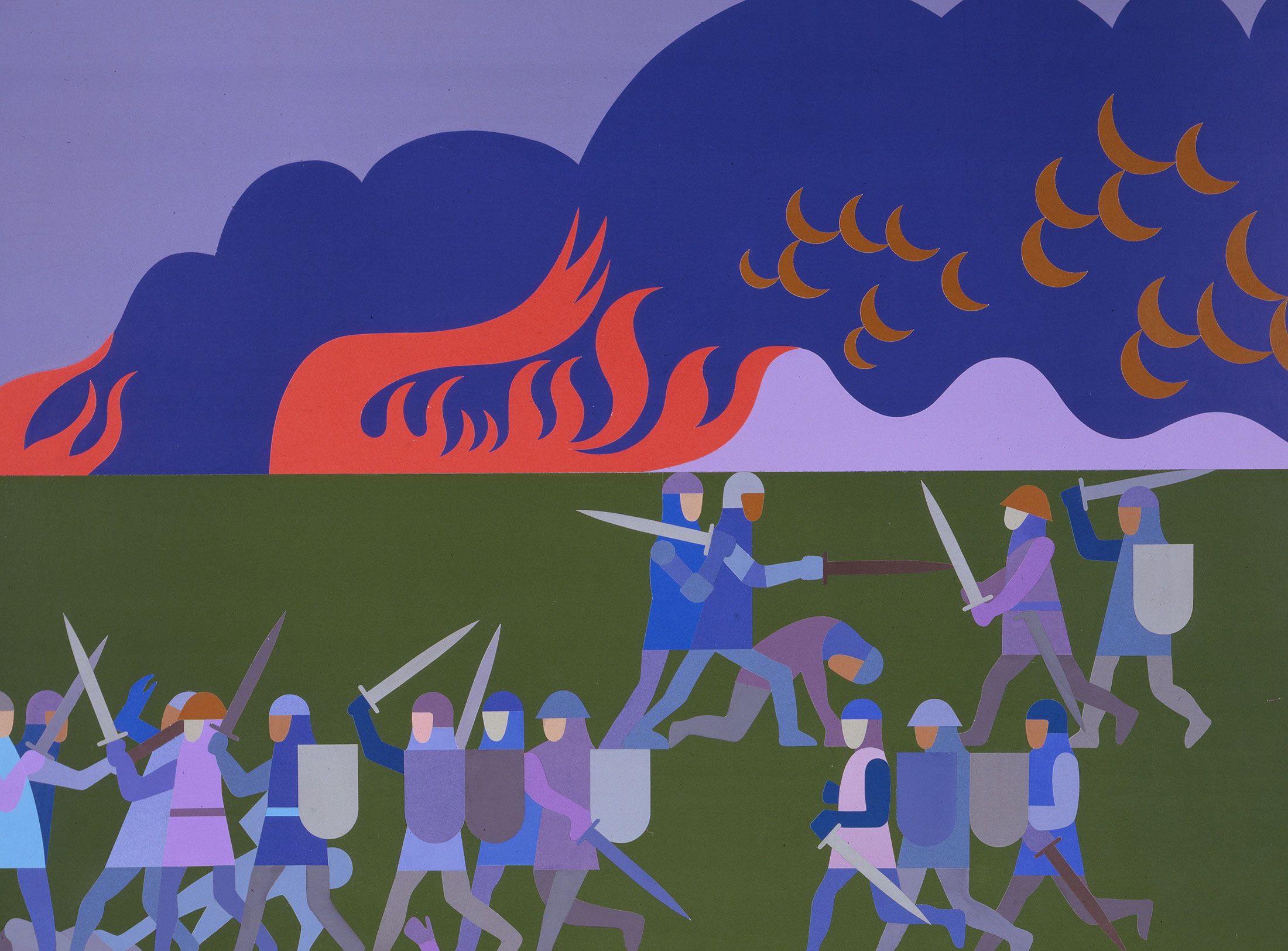
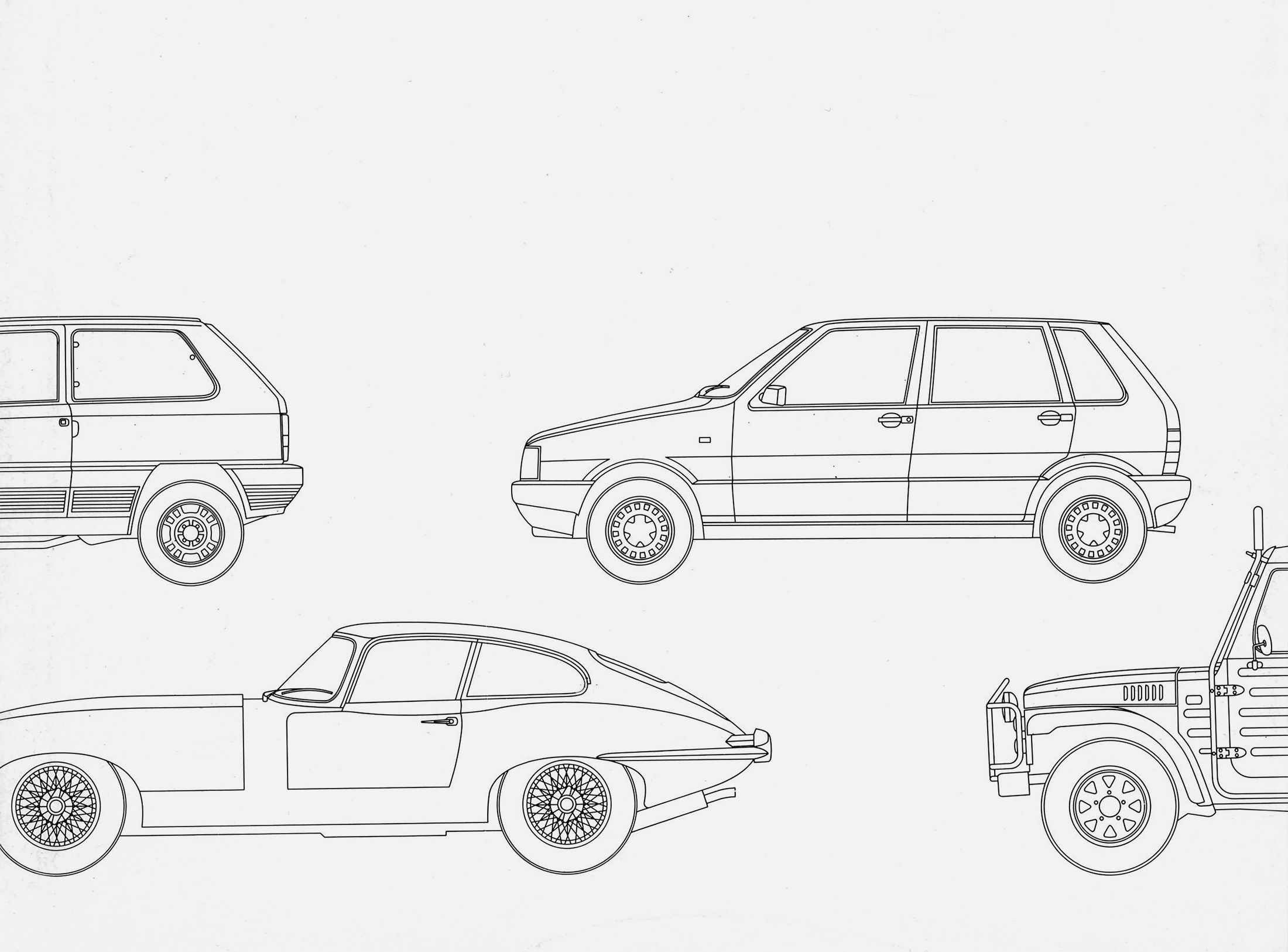
Rotis has something hybrid about it, something that was embodied in the pop music of the 1980s by bands like Spandau Ballet and people like Boy George or Bowie. Boundaries were dissolving. The Eighties were also the beginning of digitalisation – and Rotis was created on Icarus computers. Its perfection also comes from the fact that its curves were reworked with the computer. Its smoothness was in keeping with the times. Aicher was never rustic, which is why his work was always of the highest perfection. That’s why he used Univers for the Munich Summer Olympics, which – as its designer Adrian Frutiger told me himself – is a very cold typeface. After the war, Aicher was the great clearer, sorter and raster guy.
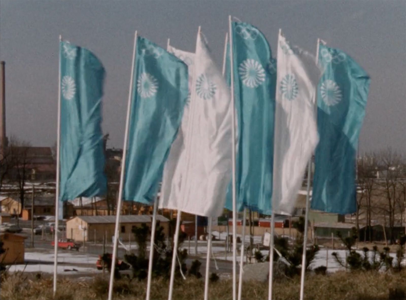
The posters for the Olympics certainly had something of pop art motifs – but the sober, cool elegance of the Univers created a counterpoint; a counterbalance to the gaudy colours of flags, posters and uniforms.
That’s right. The photos on which the posters are based were alienated and simplified in the darkroom using the solarisation method. That was all that was technically possible at the time. But it led to these wonderfully pop motifs, which were all in the corporate colours. Aicher had good people around him who had a feel for aesthetics. Part of the beauty of the posters was that so little was written on them. Today they would be plastered with stupid slogans, sponsor logos and superfluous text. Too many people would interfere with the design. Today, there are commissioners for everything.
What do you think about Aicher’s pictograms? You were also involved with the subject for Düsseldorf Airport, for example.
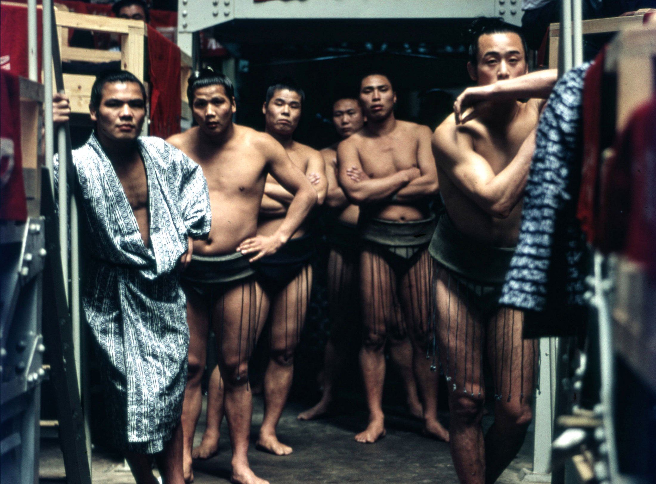
I prefer the Dutch ones by Gerd Arntz. They are more emotional because they were drawn by hand and cut in linoleum – you can see that. They are not yet so geometricised and reduced. Aicher’s pictogram grid was necessary, but some of the signs also reveal limitations. If you look closely, there are many deviations from the grid. That is also good, in order to make details easier and quicker to understand. For Düsseldorf Airport and for the BVG, we quoted Aicher’s pictograms – not only because they are good, but also because they have already been “learned”. If you make the comparison with Lillehammer, for example – with the Stone Age men designed for the 1994 Olympic Games there, which all looked like Giacometti figures – then the quality of Aicher’s pictograms becomes apparent again.

Screenshot Erik Spiekermann
The rulebook for the appearance of the Olympic Games in Munich was reissued in 2019 – and you wrote the preface for it. You say: “Munich 1972 was to be the “Cheerful Games”. In this volume, scanned from the original, we experience how colours, shapes, fonts and illustrations complement this cheerful image. Un-German lightness is here paired with the precision that was and is expected of us – a rare combination, then and now.” Did Aicher’s rulebook for the Olympics influence your work?
We made precisely these kinds of manuals. For Audi or Volkswagen. Manuals as file folders still existed until a few years ago but they often ended up on the shelves of the wrong people. On the shelves of board members or marketing staff rather than in the hands of designers. Today, of course, everything is done digitally. As instructions for action, these manuals were often far too complicated. They were more like a documentation of what had been done. The moment a corporate design ends up in a folder, it’s dead. Then you have to start all over again.
Another topic that is old and at the same time very relevant today: Aicher propagated lower case – with reference to the fact that the use of capital letters would have something authoritarian about it and manifest hierarchies. What is your position on lower case, which Aicher also used in his book “typographie”?
In my e-mails I also write everything in lower case – except for names and the beginnings of sentences. In Aicher’s “typographie” book, which is bilingual, I only read the English part, because in German the beginnings of sentences are also written in lower case. You have to read each sentence twice. In Rotis, the dot at the end of the sentence is small, so you don’t even notice that a new sentence has started. Continuous lower case is not at all suitable for long texts. Today, Americans still argue about the double space after a full stop. Equating capitalisation with hierarchies is a typical Aicher sentence; because you’re Aicher, people believe you. It’s true: Capitalisation only began in the Baroque era – that is, at a time when kings ruled. The names of the rulers were capitalised because no one knew what nouns were. There was no fixed grammar until the 19th century and no orthography until the Grimm Brothers. So it may be that historically capitalisation is an expression of authority. If it is, then I am mostly in favour of moderate lower case. The Bauhaus rumour that lower case would save time was good-sounding nonsense. Why would it cost more time to write a capital letter? Not when writing by hand, and not when typesetting either.
And what is your assessment of the content of Aicher’s “typographie” book? Seen from today’s perspective?
I bought the book very early on when it was published and wrote a review about it – I think for Page. About the content: as always, Aicher had thought incredibly well about many things. He was not a decorator – which many graphic designers are accused of – but really a philosopher. He thought a lot about the world and how we relate to it. I think most of it is great. It’s more of a philosophical treatise than a classic textbook.
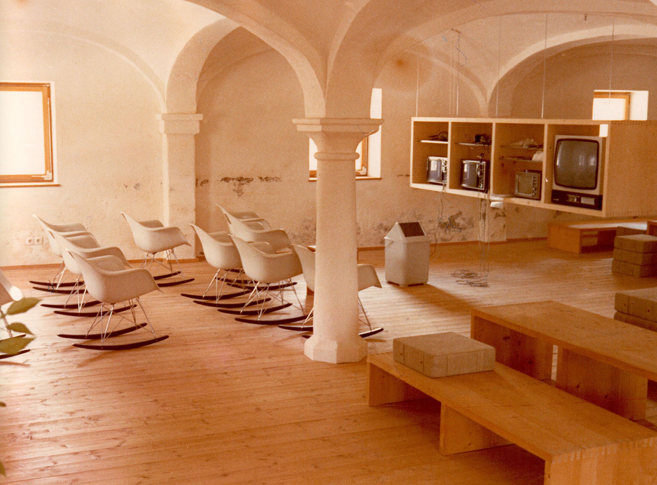
You’ve spoken several times about what the ideal room layout in design offices should look like; how the layout in an open-plan office determines the way people work together. How do you see Aicher’s room model, which he realised at Rotis? The buildings where the different teams worked separated from each other still stand today – in the middle of the Allgäu, far away from the next big city.
Unfortunately, I have never been there. I think the area is wonderful, but the concept would completely contradict my way of working. If you do communication, you have to communicate, you have to expose yourself to life. The energy that is created within a room is a potency of the individual energies. Of course you need teams for a project, but exchange is important – including with people from other teams, an intermingling. If a team has too much individual responsibility, it quickly thinks it’s the centre of the earth. At MetaDesign we worked on different floors. That in itself was a problem. That’s why the smoking breaks, for example, were so important. That’s when people from different teams came together. At first I thought smoking was costing us an enormous amount of money and was unproductive. It was only when I joined in that I understood that there was communication across teams taking place, which is very valuable.
And what do you see as Otl Aicher’s lasting merits?
Aicher was undoubtedly the most important graphic designer after the war and did a lot for the perception of graphic design in society, even outside professional circles. Many people still only think of chairs, lamps and cars when they hear the word “design”. And his legacy, his impact to this day, is also the result of the great people who studied with him or who worked for him and carried on his thinking. I worked with Florian Fischer, Heiner Jacob and Rolf Müller myself. For example, Aicher’s corporate design for Lufthansa was a really great design system that lasted for a long time. When you see what has been done with it now, you almost want Aicher back.
Erik Spiekermann, born 1947 in Stadthagen near Hanover, is a typographic designer, type designer and author. In 1979 he founded the CI agency MetaDesign in Berlin with Florian Fischer and Dieter Heil, and in 2001 the agency United Designers Network with offices in Berlin, London and San Francisco. From 2007, the agency traded under the name SpiekermannPartners; since the beginning of 2009, it is known as Edenspiekermann. Spiekermann has also taught as a professor at the UdK Berlin and as an honorary professor at the Hochschule für Künste Bremen. Some of Spiekermann’s typefaces, such as ITC Officina (1990) and FF Meta (1991), are now regarded as modern classics. Today, the award-winning designer commutes between his agencies and homes in Berlin, Amsterdam, London and San Francisco. In Berlin, he has been running the letterpress workshop and gallery p98a since 2013.
spiekermann.com
Inge Aicher-Scholl preserved the legacy of the White Rose.
Isny im Allgäu owes Otl Aicher a corporate design that is concise, bold and singular.
First broadcast: 15.02.1971 on Bayerischer Rundfunk, Munich (Only available in German).