What’s become of Otl Aicher’s former abode? A visit to the Allgäu.
What’s become of Otl Aicher’s former abode? A visit to the Allgäu.
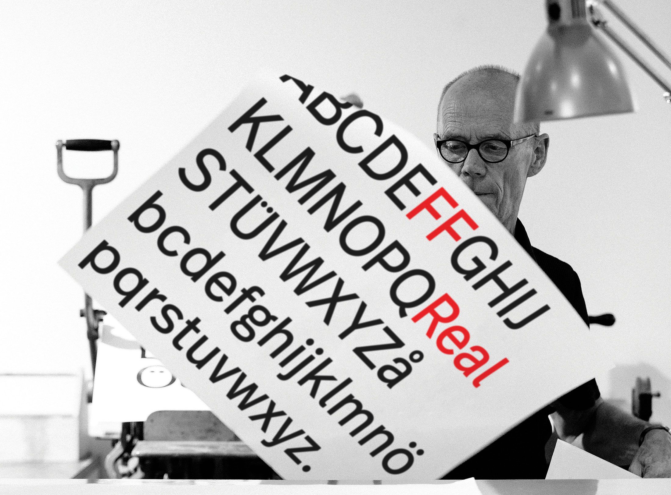
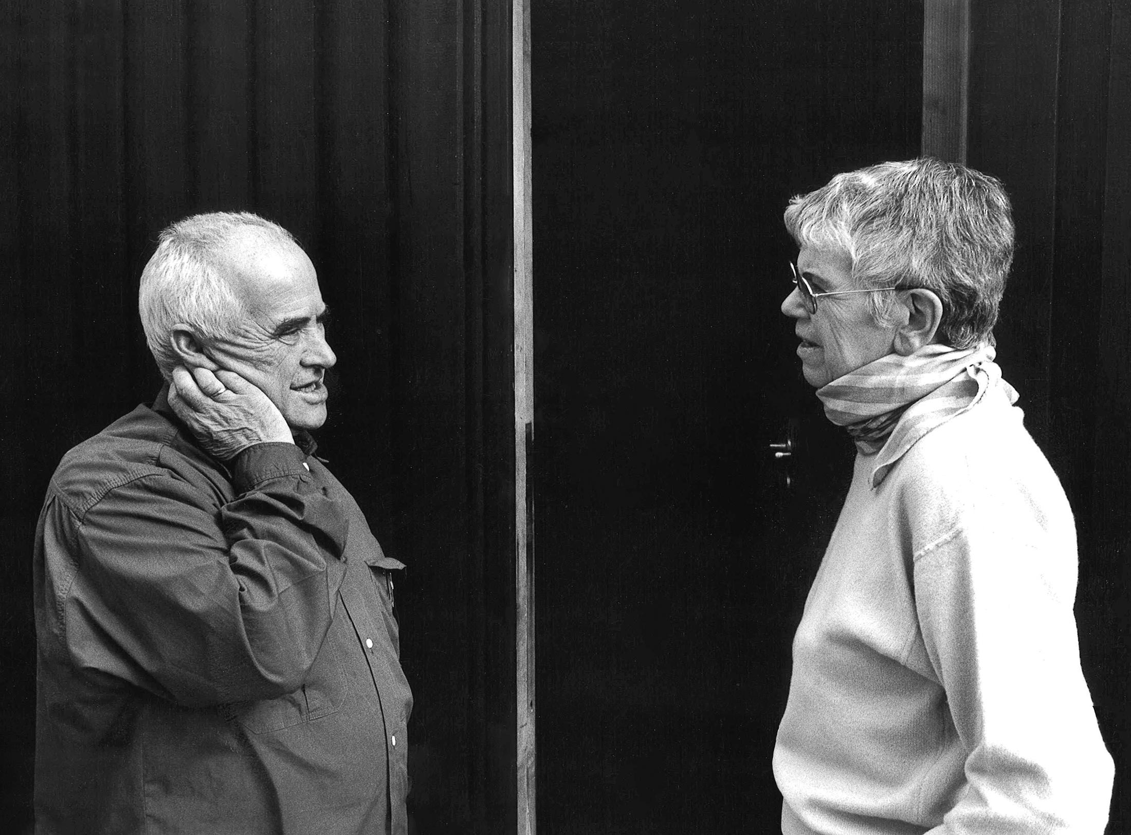
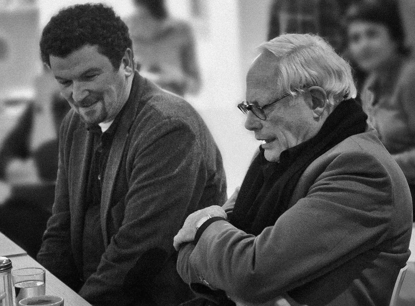
Interviewed: Erik Spiekermann, type designer, author and Aicher critic.
Technology: a central notion and fixed point of perspective in the work of Otl Aicher.
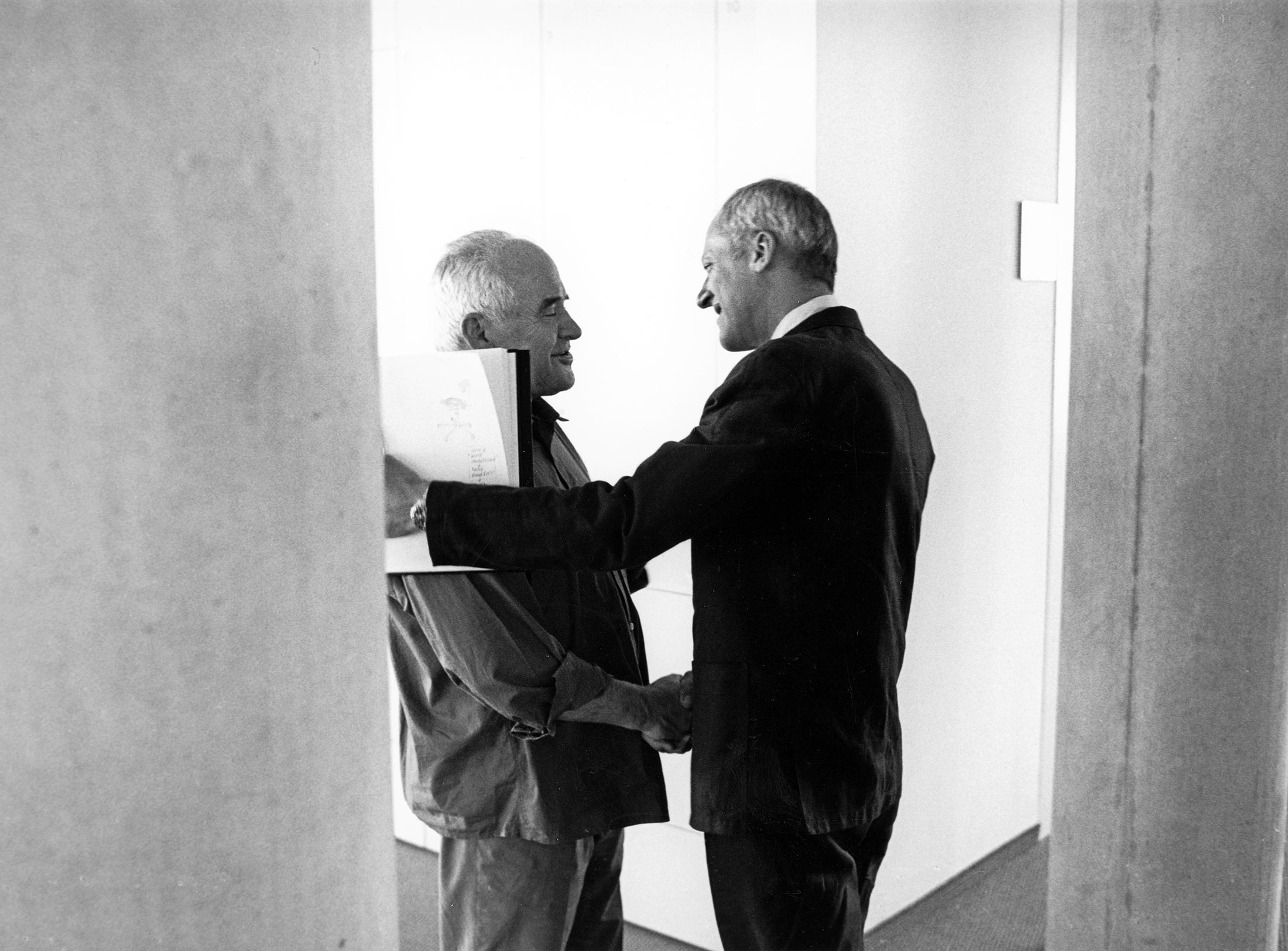
The British architect Norman Foster on his friendship with Otl Aicher: He had absolute integrity.
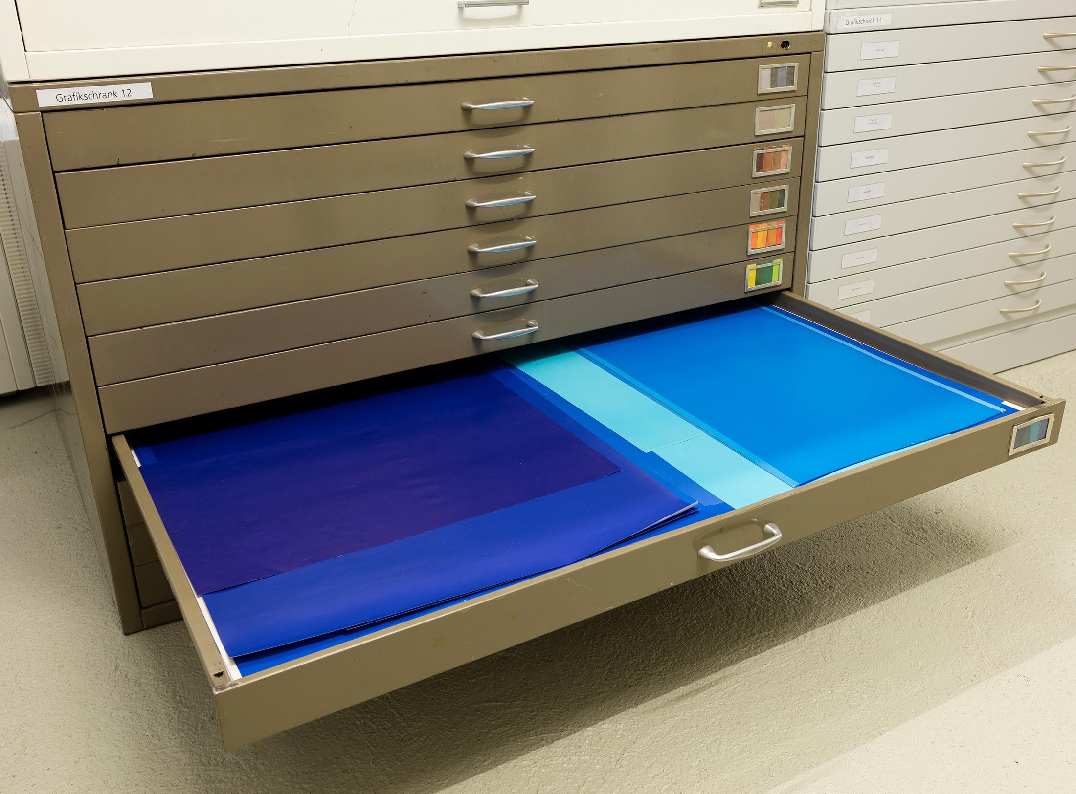
Thoughts on the colour palettes of Otl Aicher.
Absolute sharpness, reduction and strict rules determine the character of his pictures: Otl Aicher as photographer.
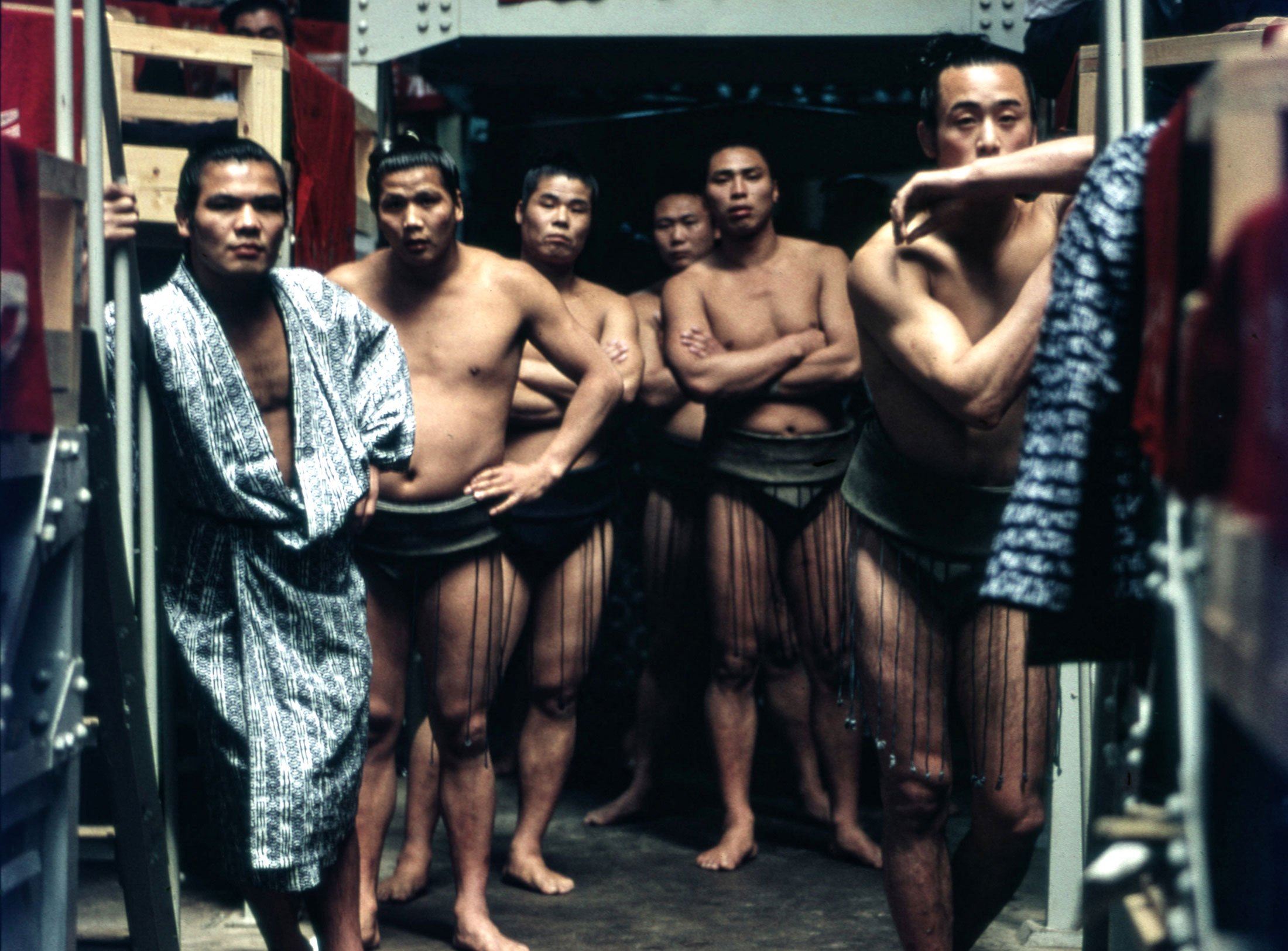
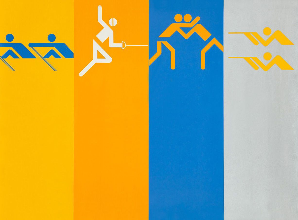
Under Otl Aicher’s direction, designers, architects and landscape planners shaped the face of the Olympic Games 1972.
Inge Aicher-Scholl preserved the legacy of the White Rose.
An interview with design icon Stefan Sagmeister about typefaces, beauty and the legacy of Otl Aicher.
The International Design Center Berlin (IDZ) invites you to a slide show and panel talk at Architektur Galerie Berlin on 20 October. Karsten de Riese and Prof. Michael Klar will report on a photo reportage commissioned by BMW that took them to Tunisia in 1975 together...
On the occasion of the 50th anniversary of the 1972 Olympic Games, the IDZ invites you to a discussion on the vision of the Munich Games and the status quo as well as the future of the Olympic movement on 26 August. The event at Berlin’s Akademie der Künste on Pariser...
Isny im Allgäu owes Otl Aicher a corporate design that is concise, bold and singular.
With a retrospective of Otl Aicher’s book “kritik am auto – schwierige verteidigung des autos gegen seine anbeter” (Criticism of the Car – Difficult Defence of the Car against its Worshippers) published in 1984, the IDZ continues its series of events on the “otl...
Today marks the centenary of Otl Aicher’s birth. The International Design Center Berlin (IDZ) is taking this date as an opportunity to pay tribute to this great designer. With otlaicher100.de, a new online platform is being launched – a curated space that provides...
Reflections on Inge Aicher-Scholl and Otl Aicher.
The International Design Center Berlin (IDZ) is taking Otl Aicher’s centenary as an opportunity to pay tribute to this great designer and to make his work visible. An online platform and a series of events will address Otl Aicher’s multifaceted cosmos of topics and...
Eine Stadt leuchtet: Mit seinem farbenfrohen Erscheinungsbild der XX. Olympischen Sommerspiele 1972 setzte Otl Aicher ein Signal. Die junge Bundesrepublik war in der Moderne angekommen.
Otl Aicher’s Poster displays for the Ulmer Volkshochschule (Ulm Adult Education Centre).
From O to R: Let’s talk about a hedgehog, standardisation and neurotis for a change (please click on the letters).

Otl Aicher’s Dept. XI team: the visual identity of the Munich ’72 Olympics was the work of graphic designers, illustrators and technical staff from all over the world.

Aicher’s childhood and youth: the years 1922 to 1945.

Otl Aicher’s signage systems for airports, metro stations and hospitals are considered exemplary to this day.
Der einstige Braun-Chef-Designer im Gespräch über den Co-Gründer der HfG.
A Broadcast: What is his place in today’s world?
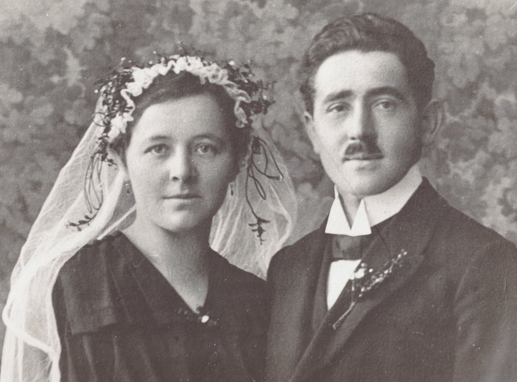
The Aichers: a brief family history.
Drawing in Rotis: former Aicher co-worker Reinfriede Bettrich talks about hand sketches, the first computers and everyday life at the office.
How Otl Aicher’s papers and materials came to the HfG-Archiv/Museum Ulm.
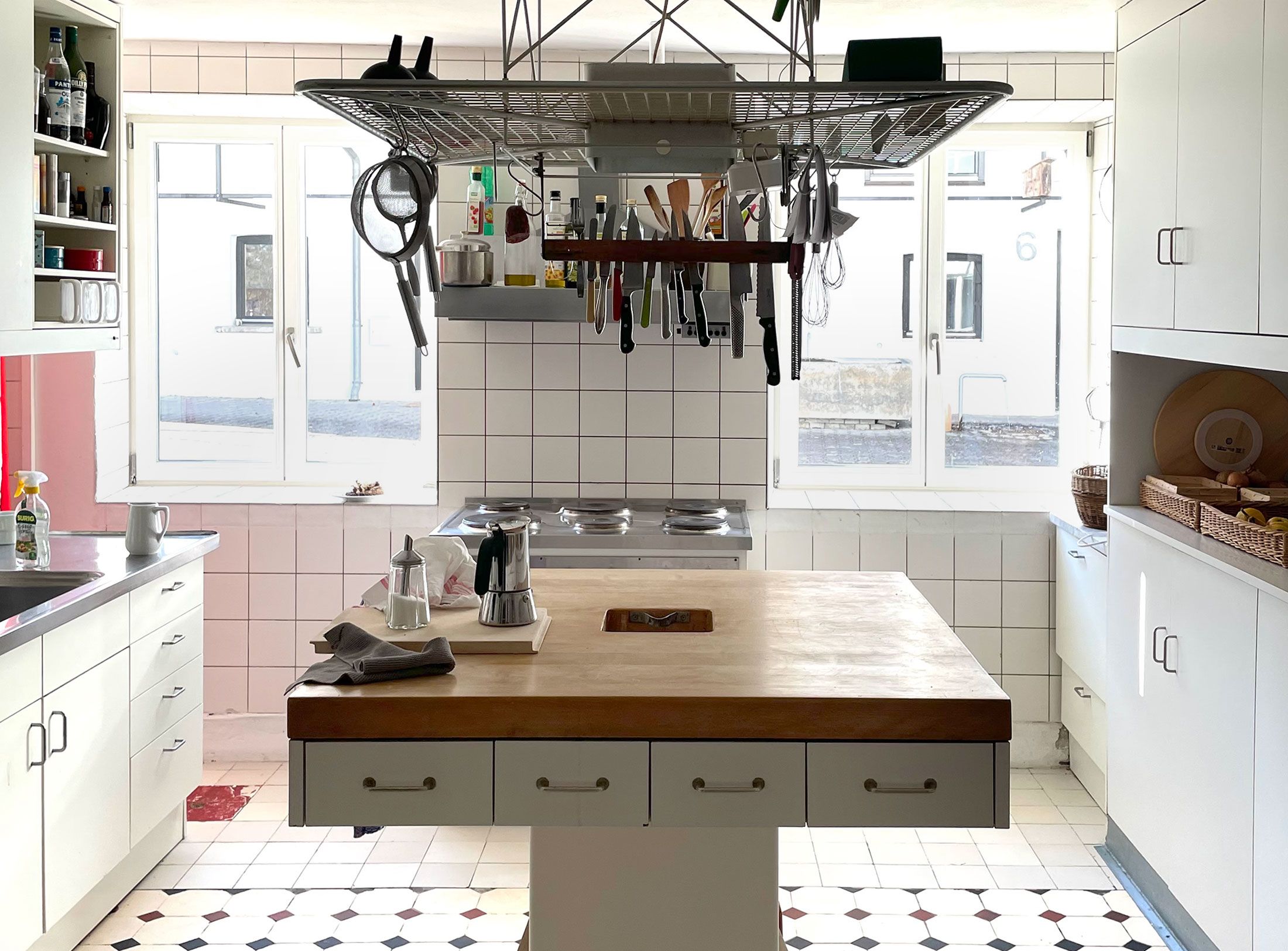
Die Küche zum Kochen (The Kitchen for Cooking) – the genesis of a book that has lost none of its relevance.
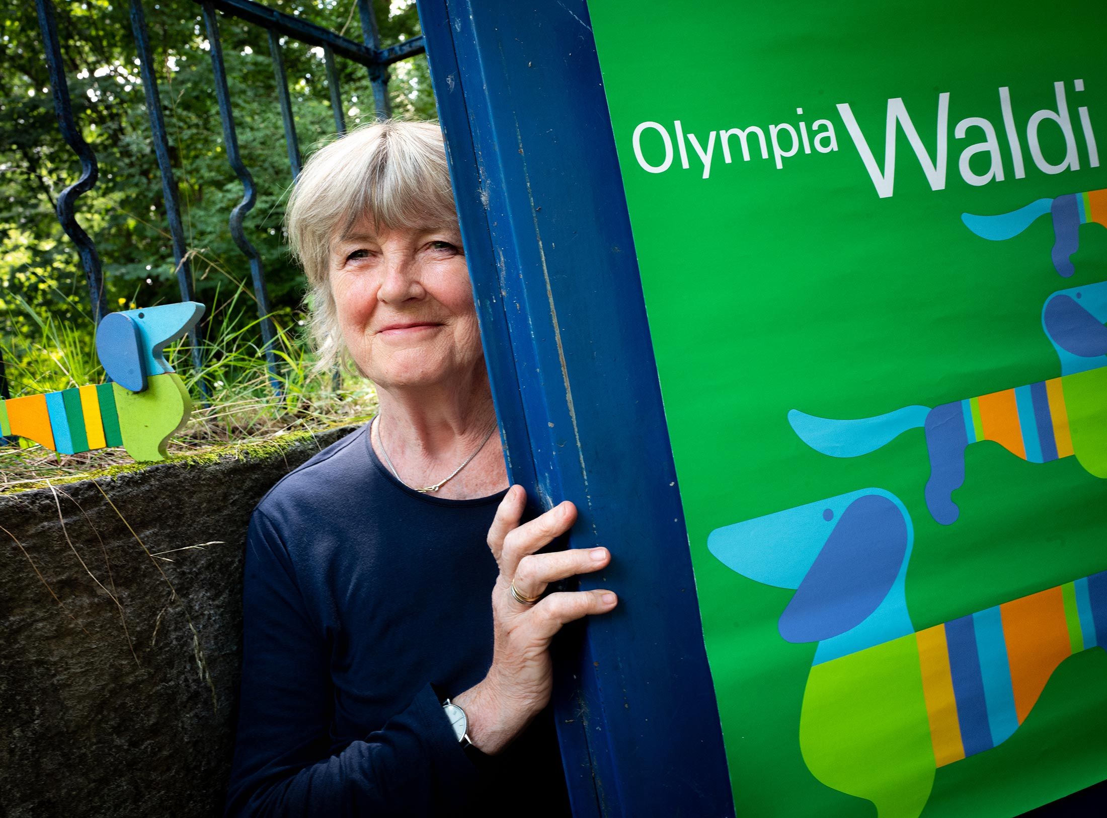
How a dachshund conquered the world: former Aicher staff member Elena Schwaiger on plush animals, fakes and the authentic mascot of the 1972 Olympic Games in Munich.
Le Violon d’Ingres or An Attempt to Defend the Writings of Otl Aicher.

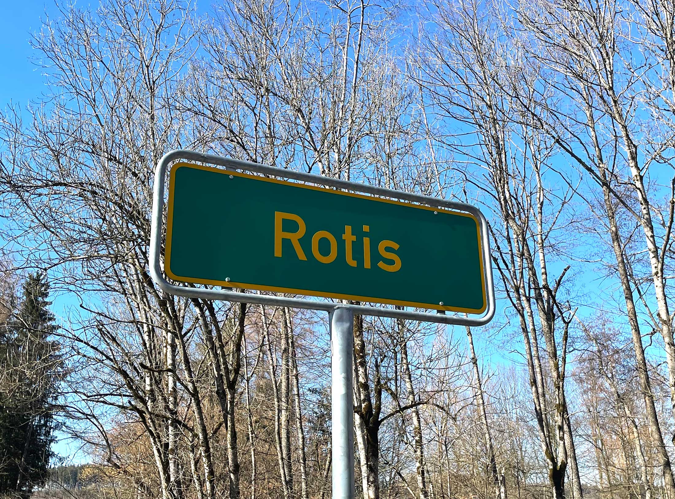
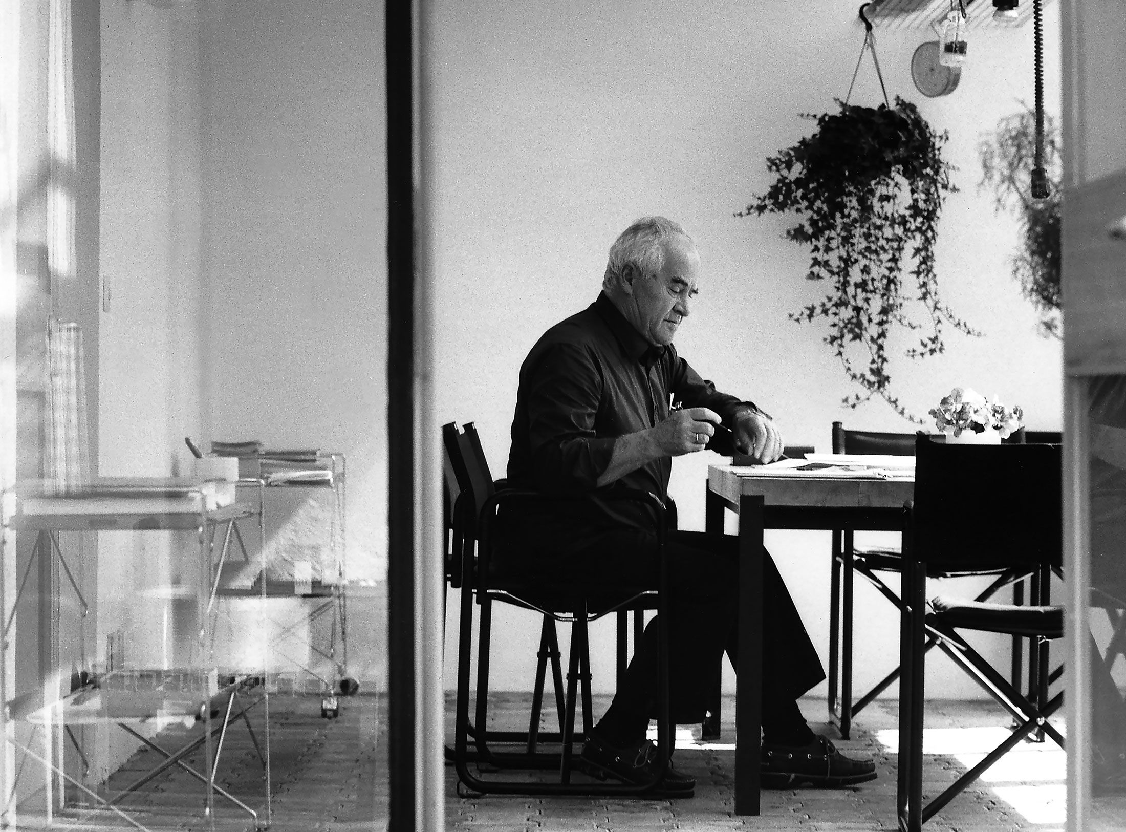
Otl Aicher as the architect of Rotis.
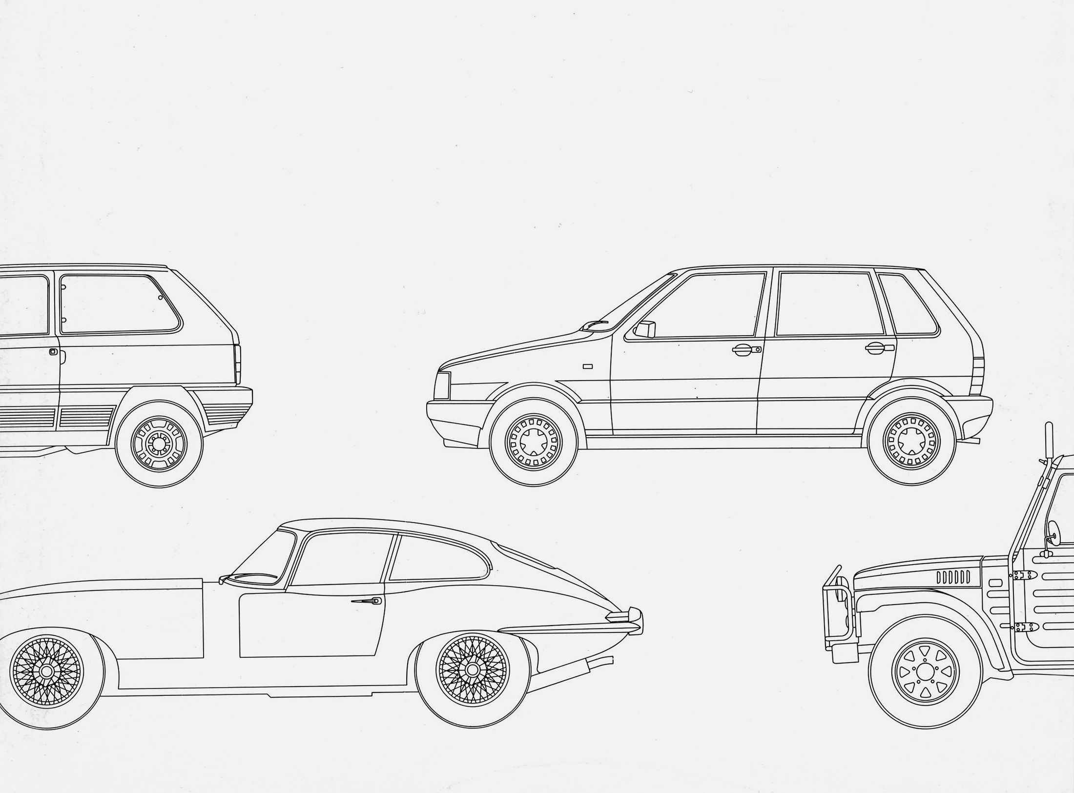
Otl Aicher and his critique of the automobile.
First broadcast: 15.02.1971 on Bayerischer Rundfunk, Munich (Only available in German).
Interviewed: Jürgen Werner Braun on his collaboration with Otl Aicher.
They created the signature of an epoch: designers Otl Aicher, Willy Fleckhaus, Anton Stankowski and Kurt Weidemann.
From the cut of the hostesses’ dirndl to the design of the programme booklets and posters to the designs of pictograms and parking tickets: Aicher’s design guidelines with the rainbow as colour palette and a colourful dachshund as mascot were all-encompassing. They followed an elaborate concept: the ‘kinship approach’. This system of variable elements enabled the designer to react quickly and flexibly to different requirements – without questioning the underlying concept of his corporate design.
Willi Daume’s concept for the Munich Olympics was ‘the cheerful Games’. In response, Otl Aicher’s strategy would become an overarching one transcending visual design alone. In his discussions with the Organising Committee, Aicher stated that the Games, like any other sizeable, staged event, needed a director, a decision maker, a helmsman. That’s how he saw his role and he set about guiding the form, aesthetic and ambience of the Games, across all touchpoints, and by so doing, set out to influence the visitors’ and TV viewers’ first and last impressions. In essence, as Commissioner for Visual Design, he was overseeing the Games’ branding – the creation of a visitor experience, decades before the term ‘user experience’ entered every branding guru’s lexicon. But it was evidence-based branding, with Aicher asking the Organising Committee, ‘Will the world believe us if we say that Germany is different today to what it was then? Responding himself, he said: ‘Trust cannot be gained through words, but instead only through visual proof and the winning of sympathy. It is not about explaining that this Germany is different, but about showing it’.

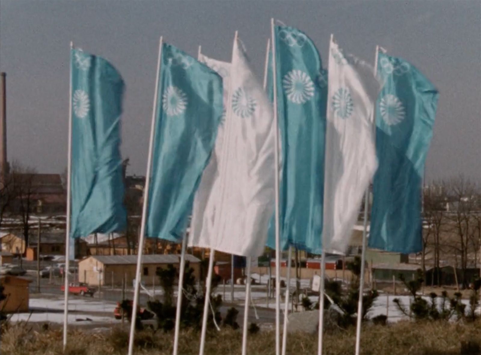
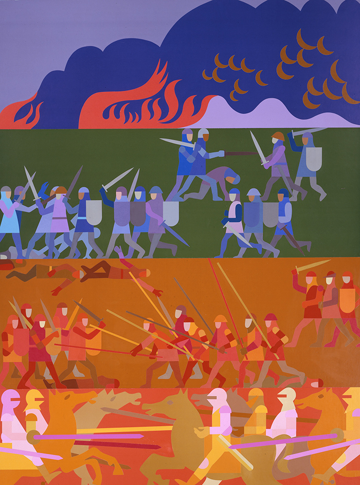
Pictograms and colours instead of pathos and airs and graces: Otl Aicher staged a counter-image to the Nazi Games of Berlin 1936 in Munich.

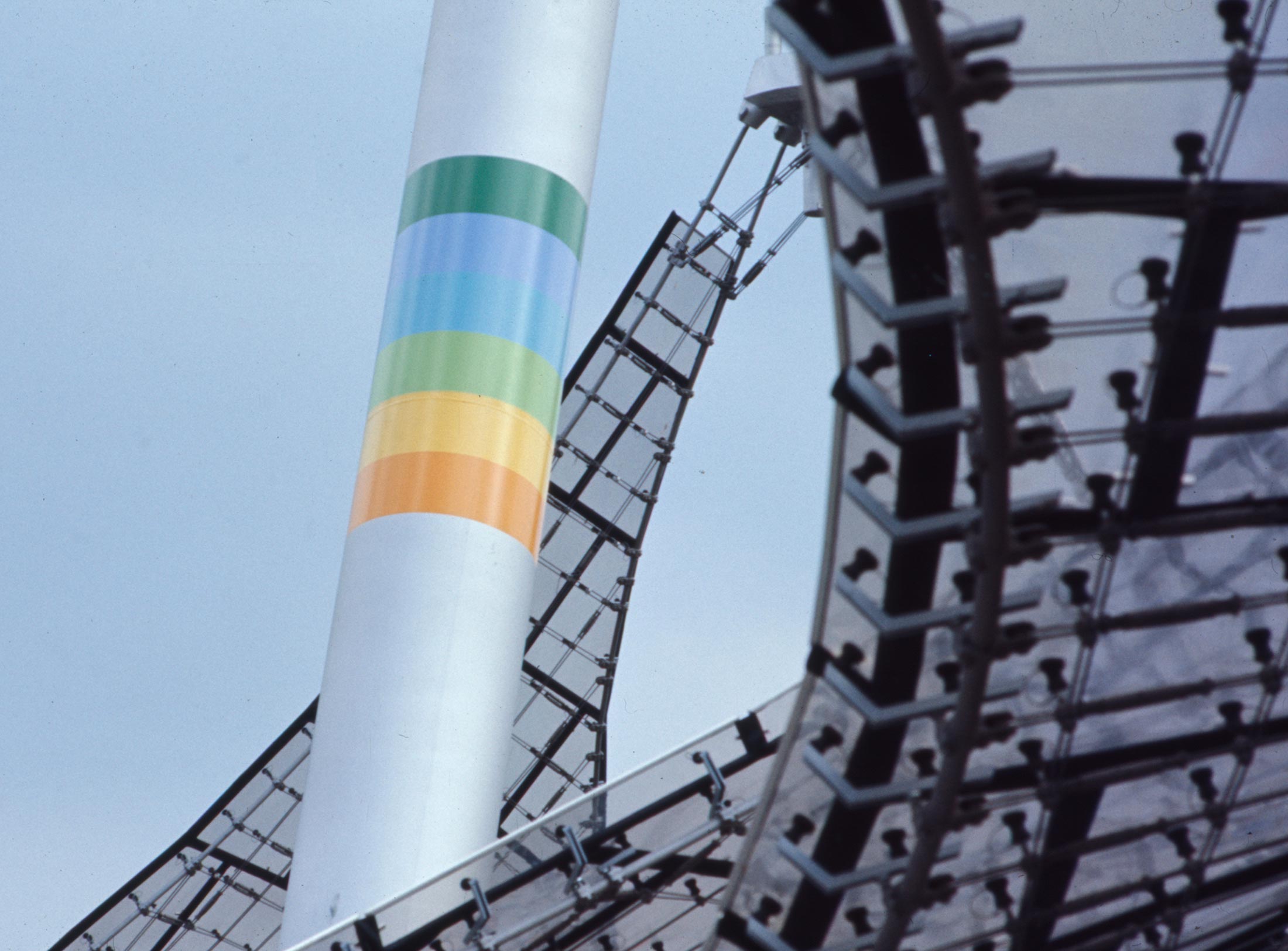
Bundles of colours on the poles of the tent roof construction in the Munich Olympic Park, 2021, Photo: Hannes Gumpp.
Pictograms and colours instead of pathos and airs and graces: Otl Aicher staged a counter-image to the Nazi Games of Berlin 1936 in Munich.
Bundles of colours on the poles of the tent roof construction in the Munich Olympic Park, 2021, Photo: Hannes Gumpp.

Hostesses with mascot Waldi in front of the Olympic Tower, 1972. © BSB/Bildarchiv/Georg Fruhstorfer
In developing the creative brief, Otl Aicher and the Ausschuss für visuelle Gestaltung, an advisory board set up by the Organising Committee, met from as early as July 1966, to discuss Munich’s intentions in the belief that the visual details of the Olympic Games must be preceded by as precise as possible a definition of the perception that visitors should take with them from the event (and that this would then determine the whole image). Together they determined the following:
Visitor expectations
Unexpected characteristics
Rejection of pomposity, nationalism and enormity of scale
The Games, ultimately, would be free of much of what characterised the Nazi’s Berlin Games of 1936, Aicher stating, in detail, ‘There will be no demonstration of nationalism and no enormity of scale. Sport will no longer be considered an adjunct of, or preparation for military discipline. Pathos will be avoided, as will ceremonial awe. Depth is not always expressed through earnestness. Light heartedness and non- conformity stand just as much for serious subjectivity. The Munich Olympics should have an unforced character and be open, carefree, and relaxed. It is clear that this will give them an emphatically celebratory character. Celebratory not in the traditional sense but in terms of playful improvisation.’

Posters for the weekly cultural events in the city during the of the Olympic Games. Design: Michael Burke, Ian Mc Laren, Rolf Müller © HfG Archive / Museum Ulm, IOC.
Otl Aicher wanted ‘a playful Games in an apolitical, relaxed, free and graceful atmosphere of encounter’. In the planning of the Munich Games he hoped to regain the playful dimension of sport believing this had been lost, stating that ‘nation states understood sport as military training, the party state needed it as proof of superior ideology, and that a commercialised society needs it as a market for stars and superstars’. Aicher wanted to reinforce sport as a game, without eliminating the competitive element, and not ‘as an exercise in compliance with norms’. He argued that ‘playful sport requires playful architecture and a playful visual image’.
Aicher believed that, ‘It has become a relied-on experience that free play is only possible when clear decisions are in place regarding the elements and rules of application. The freedom of the game does not involve leaving the rules to chance. Only their strict application enables the full range of variations. Playful Games take on the character of a sport by themselves. Their openness and randomness are the result of discipline and compliance with rules’.

For the picnic: Wrapped Olympic paper tablecloth with the pictograms for the Games.

Gloss on Aicher's Olympic colours. Transcript of a phone conversation with a reader of the “Frankfurter Allgemeine Zeitung”, November 1967.

Aicher’s personal badges, permits and passes, held at the HfG Archive in Ulm. © HfG Archive / Museum Ulm.
For the picnic: Wrapped Olympic paper tablecloth with the pictograms for the Games.
Gloss on Aicher's Olympic colours. Transcript of a phone conversation with a reader of the “Frankfurter Allgemeine Zeitung”, November 1967.
Aicher’s personal badges, permits and passes, held at the HfG Archive in Ulm. © HfG Archive / Museum Ulm.
For Aicher, the theoretical occupation with sport brought gains in terms of working methods claiming, ‘Sport is – more than we know – a rational event. Rational game rules lead to rational strategy and rational tactics. Play involves rules. We transferred that to the design’.
Guidelines, directives and visual tools
Like sport itself, Munich’s visual design was conceived as disciplined play, an individual and collective team effort working within the rules of the game (the rules here being those defined by Otl Aicher’s framework for visual design). The framework consisted of two primary parts; directives and visual tools. Together, these enabled Aicher to compose and arrange the Games Mise-en-scène.
Aicher’s directives outlined the use of the representational symbols ranging from the Olympic rings to the official emblem and the coat of arms of the cities of Munich and Kiel. These were followed by a system of signs and symbols (the sports and information pictograms), that communicated to foreign visitors who did not speak English, French or German. Directives were also given on page layout and basic typography, Aicher of the view that the overall typographical image should not be over styled, hence the need for a restrained typeface (Univers, a light grotesque font, considered agile, fresh, light and without pathos), and no big titles, no bold distinctions, no aggressive typeface sizes.

Aicher collaborator Gerhard Joksch drew the first sketches for a “body alphabet”. © Eva Joksch, Starnberg.

The 1971 Athletics pictogram (left) and the later refined version as used at the Munich Games.

Sketches for pictograms by Gerhard Joksch, April 1968 © Eva Joksch, Starnberg.
Aicher collaborator Gerhard Joksch drew the first sketches for a “body alphabet”. © Eva Joksch, Starnberg.
The 1971 Athletics pictogram (left) and the later refined version as used at the Munich Games.
Sketches for pictograms by Gerhard Joksch, April 1968 © Eva Joksch, Starnberg.

For the cover of the Olympia day programmes, the designers used the pictograms and the Siemens Typesetting System (for the background). Graphic design: Ian McLaren, Michael Burke, Barbara Heimerl, Erik Liebermann for Department XI; Mark Holt Collection.
The second part of the framework, the visual tools, took the form of a number of visual assets to be put to work by his Dept. XI design team. Firstly, a colour palette of seven colours plus white, including silver and the official colour of the Munich Olympics, an apolitical light blue, the colour of peace. All the colours were carefully selected in terms of their hue by Aicher himself, a master of colour, and collectively referenced the Bavarian Alps. There was no red, gold or black as previously associated with the Berlin Games, or black and yellow, the colours most associated with the City of Munich.

British graphic designer Ian McLaren with Munich-based designer Margarete Bodarwé. On the wall and desk are mock-ups for the cover of the Official Guide. All photos in this series © HfG Archive / Museum Ulm.

The architect and designer Eberhard Stauss worked for Aicher from 1970 to 1972 and designed the street furniture for the 1972 Olympic Games. All photos in this series: © HfG-Archive / Museum Ulm.

Horst Fleischmann (inks) and Erik Liebermann worked with Hans „Nick” Roericht on the exterior furnishings of the Olympic site, including the seats in the stadium as well as the work and living furniture in the accommodation, recreation and administration rooms of the Olympic Village.
British graphic designer Ian McLaren with Munich-based designer Margarete Bodarwé. On the wall and desk are mock-ups for the cover of the Official Guide. All photos in this series © HfG Archive / Museum Ulm.
The architect and designer Eberhard Stauss worked for Aicher from 1970 to 1972 and designed the street furniture for the 1972 Olympic Games. All photos in this series: © HfG-Archive / Museum Ulm.
Horst Fleischmann (inks) and Erik Liebermann worked with Hans „Nick” Roericht on the exterior furnishings of the Olympic site, including the seats in the stadium as well as the work and living furniture in the accommodation, recreation and administration rooms of the Olympic Village.
The kinship approach: unity within diversity
Aicher believed strongly that the effectiveness of the Games’ visual image was dependent on achieving visual consistency. He explained to the Executive Board of the Organising Committee that this could be achieved in one of two ways, ‘either as a visual system consisting of equal elements that leads to more or less great uniformity, or as a system with predominantly variable elements that leads to a ‘kinship tie’, each application sharing certain characteristics or origins. Aicher believed this would ‘lead to more authors, more diverse results, more flexibility’, stating the approach would require more authority from himself as the design commissioner and that to protect a variable system from dilution and dissolution, it would require a clear lead when it came to decision making. A flexible system he would say, ‘needs a director’. In creating a comprehensive, consistent family of communications, Aicher was able to present to the Executive Board the following advantages of a kinship approach for the Games’ visitors:

The first Bulletin dated October 1968, the second May 1969. Up to twenty thousand copies were printed. The design was in the hands of Rolf Müller and Otl Aicher.

The official international Olympic guide comprises 236 pages (English brochure) and has a slim format (26 x 12 centimetres), it contains the schedule of sporting events, cultural programme, transport and accommodation. The designers were Ian McLaren, Otl Aicher, Jennifer Cecil, Barbara Heimerl, Sepp Klement and Walter Schwaiger. © Florian Aicher, HfG Archive / Museum Ulm, IOC.

Printed both sides in seven colours, the Michael Burke-designed “Shedule for all Sports Disciplines” is one of the more spectacular information designs of the Games. Design: Micharl Burke and Paul Simon.
The first Bulletin dated October 1968, the second May 1969. Up to twenty thousand copies were printed. The design was in the hands of Rolf Müller and Otl Aicher.
The official international Olympic guide comprises 236 pages (English brochure) and has a slim format (26 x 12 centimetres), it contains the schedule of sporting events, cultural programme, transport and accommodation. The designers were Ian McLaren, Otl Aicher, Jennifer Cecil, Barbara Heimerl, Sepp Klement and Walter Schwaiger. © Florian Aicher, HfG Archive / Museum Ulm, IOC.
Printed both sides in seven colours, the Michael Burke-designed “Shedule for all Sports Disciplines” is one of the more spectacular information designs of the Games. Design: Micharl Burke and Paul Simon.
Aicher’s kinship approach was intentionally in direct contrast to the visual consistency achieved through rigid uniformity (the kind practiced by global car manufacturers and other multi-national corporations). Aicher’s ambition was ‘to create an atmosphere instead of fixed constants’. Instead of features, he added, ‘we were looking for a feeling’.

Sport Eveis bynt Tickets: The first designs date back to 1970.

The graphic design Jürgen Hoffmann and Sepp Klement.

Programme booklet for French visitors. Design: Rolf Müller and Paul Simon, 1972.
Sport Eveis bynt Tickets: The first designs date back to 1970.
The graphic design Jürgen Hoffmann and Sepp Klement.
Programme booklet for French visitors. Design: Rolf Müller and Paul Simon, 1972.
Although Aicher’s Dept. XI issued a set of visual guidelines in 1969, these were targeted at corporate sponsors and other external users such as the manufacturer of the official merchandise and maybe two or three printers and so were concerned primarily with the dissemination of fixed rules concerning the correct sizing and positioning of the official emblem and when and how to use Munich and Kiel’s coat of arms. In addition, there was one section on the colour palette but this only went as far as acquainting the user with the colours themselves and providing information on where the pre-mixed inks could be ordered and purchased. The guideline was rarely sent out in full, recipients more often than not receiving only the relevant sections covering their needs.


Rules of the Game: A light blue ring binder contained the guidelines and standards for the visual design of the games.

Point 4.1 of the guidelines states: The colours of the visual image have order and recognition functions. Fold-out double pages from the ring binders.
Rules of the Game: A light blue ring binder contained the guidelines and standards for the visual design of the games.
Point 4.1 of the guidelines states: The colours of the visual image have order and recognition functions. Fold-out double pages from the ring binders.
Dynamism instead of rigidity and uniformity
When it came to how the colours and other framework tools could be used expressively and dynamically (an important characteristic of the kinship approach), in a way that projected cultural significance and committed itself to contemporary design trends, no such instructions existed for the simple reason that Aicher had agreement from the Executive Board that all official applications of the visual tools would be handled by Aicher’s team alone. This meant the rules of the kinship approach could be developed over time rather than agreed early on with a view to documenting them for external use, nor was there a requirement for tutoring or managing external teams. Arguably, if this had not been the case and instead a number of external agencies recruited to handle certain jobs, then it might have been that the kinship approach would have proven to be unworkable and that visual consistency brought about by rigid uniformity, was the only feasible and practical way forward.

Poster "Torch Relay". Design: Otl Aicher, Alfred Kern, Elena Winschermann, 1971. © Florian Aicher, HfG Archive / Museum Ulm, IOC.

Poster "Public Transport to the competition venues in Munich and the region". Design: Birgitt Willikens, 1972. © HfG Archive / Museum Ulm, IOC.

From dugout canoe to sports boat: posters advertising cultural events during the Games. Design: Ian McLaren, Jennifer Cecil, Barbara Heimerl. © HfG Archive / Museum Ulm, IOC.
Poster "Torch Relay". Design: Otl Aicher, Alfred Kern, Elena Winschermann, 1971. © Florian Aicher, HfG Archive / Museum Ulm, IOC.
Poster "Public Transport to the competition venues in Munich and the region". Design: Birgitt Willikens, 1972. © HfG Archive / Museum Ulm, IOC.
From dugout canoe to sports boat: posters advertising cultural events during the Games. Design: Ian McLaren, Jennifer Cecil, Barbara Heimerl. © HfG Archive / Museum Ulm, IOC.
Rigid uniformity can be described as an unthinking, ‘one-size-fits-all’ approach, an attempt to minimise decision making by creative agencies in the pursuit of consistent brand expression, whereas visual kinship is the very opposite, requiring a willingness on the part of the designer to explore new possibilities in layout, born of inventiveness and curiosity. In essence the kinship model is never set in stone, it is ever evolving (completed projects nearly always inform the next and inspire colleagues to investigate new avenues and possibilities). It takes time for a team to uncover the specific ways in which the visual tools can be combined most effectively – whether it be the combining of colours, or colours and type, or colours and photography. Kinship recognises the necessity for a point of difference from one communication to the next, to the extent that dramatically different executions are encouraged, as are designs that push the rules to the absolute limit. The only pre-requisite is that everything produced, the product of many hands over time, should be immediately recognised and acknowledged as coming from one official source.

Weekly Event Poster. Design: Ian McLaren, Michael Burke, Rolf Müller. © HfG Archive / Museum Ulm, IOC.

Poster for an exhibition of Olympic works by African graphic artists. Design: Michael Burke, Sepp Klement, 1970. © HfG Archive / Museum Ulm, IOC.

The sports posters of the Games are now traded as design icons. The first designs were developed by Aicher with Gerhard Joksch's team in 1970. © HfG Archive / Museum Ulm, IOC.
Weekly Event Poster. Design: Ian McLaren, Michael Burke, Rolf Müller. © HfG Archive / Museum Ulm, IOC.
Poster for an exhibition of Olympic works by African graphic artists. Design: Michael Burke, Sepp Klement, 1970. © HfG Archive / Museum Ulm, IOC.
The sports posters of the Games are now traded as design icons. The first designs were developed by Aicher with Gerhard Joksch's team in 1970. © HfG Archive / Museum Ulm, IOC.
The degree of flexibility afforded by the kinship approach enabled Aicher’s Dept. XI team to meet the differing challenges of print, signage, city decoration, apparel, the Waldi mascot and importantly, to set the visual differentiator between the sports and cultural events. It would surely have been the case that if a rigid and uniform approach had been chosen, the visual image of the Games, within a matter of months, would have become stale, lacking any element of allure and surprise and ceasing to inspire and energise the audience, such was the sheer number of print and other applications requested from the various Organising Committee departments throughout the duration of the project. Kinship was the method by which Aicher’s designers kept the Games’ appearance fresh, providing the means to reinvigorate the visual image as and when required.

Sports poster. Design: Gerhard Joksch, Otl Aicher, Nanke Claassen, Sepp Klement, György Nagy, Gabriele Pée, Henri Wirthner. © HfG Archive / Museum Ulm, IOC.

Bright, friendly and colourful: for the sports posters, Aicher's team alienated large-format photos and used a solarisation process © HfG Archive / Museum Ulm, IOC.
Sports poster. Design: Gerhard Joksch, Otl Aicher, Nanke Claassen, Sepp Klement, György Nagy, Gabriele Pée, Henri Wirthner. © HfG Archive / Museum Ulm, IOC.
Bright, friendly and colourful: for the sports posters, Aicher's team alienated large-format photos and used a solarisation process © HfG Archive / Museum Ulm, IOC.
The development of the kinship approach can clearly be seen when you look at Dept. XI’s visual outputs in full. The early designs of 1967 are more monochrome; promotional booklets and invitations that mainly use silver, white and black, the designer perhaps conscious of making the wrong choices concerning the use of the colour palette as a whole. The official colour of light blue is principally and intentionally the one colour used, thereby quickly establishing blue as the official colour of the Games. The blue features strongly throughout 1968 utilised for example on the covers of the first two bulletin publications. It’s not till 1970 that we see a bulletin cover in green and yellow. At this time there begins a gradual explosion of colour; orange no longer used for signifying technical documentation alone, or the light green used solely for press communications. The decision is taken to nominate the colours to each of the sports disciplines as well as using the entire colour palette to signal a multitude of roles across the apparel designs produced for the Games’ various judges and supervisors, stadium hostesses and stewards, and security and cleaning staff. Other colours than those of the established colour palette gradually appear as the number of projects increases dramatically. In the final run up to the Games, Aicher, in the belief that the visual appearance needed refreshing, called for a more rainbow-like application of the colours.
Aicher was certain that, ‘If we want to be sure that young people can see and feel that they are supporting and participating in the Olympic Games, their dynamism must be integrated and, in terms of content and form, a standard that meets their expectations must be the aim’. There would be no ‘formal constant’ in the rainbow’s application; the use of multi colours became the norm, what Aicher would call ‘an expression of positivity and openness’, ‘extreme aesthetics’ and a symbol of an ‘optimistic psychological climate’. Such was the use of colour in the final months that Munich would soon be acknowledged as the Rainbow Games.
Mark Holt is a designer and author. He was co-founder of design studio 8vo in London and typography journal Octavo. In 2020 he published the 536-page book Munich ’72. The Visual Output of Otl Aicher’s Dept. XI. See also: markholtdesign.com.
Thoughts on the colour palettes of Otl Aicher.
Le Violon d’Ingres or An Attempt to Defend the Writings of Otl Aicher.