What’s become of Otl Aicher’s former abode? A visit to the Allgäu.
What’s become of Otl Aicher’s former abode? A visit to the Allgäu.
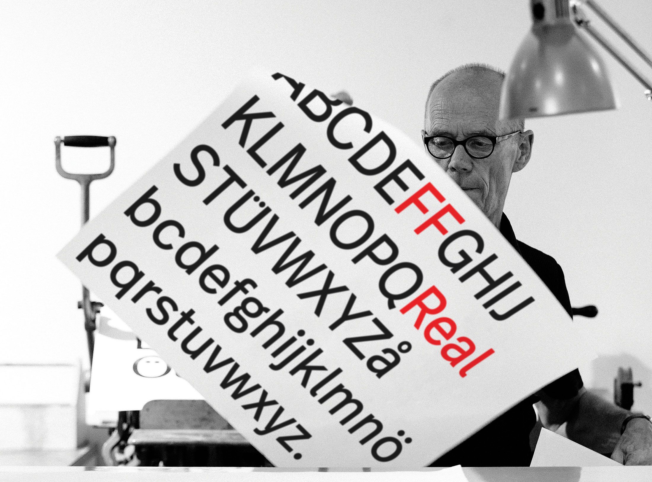
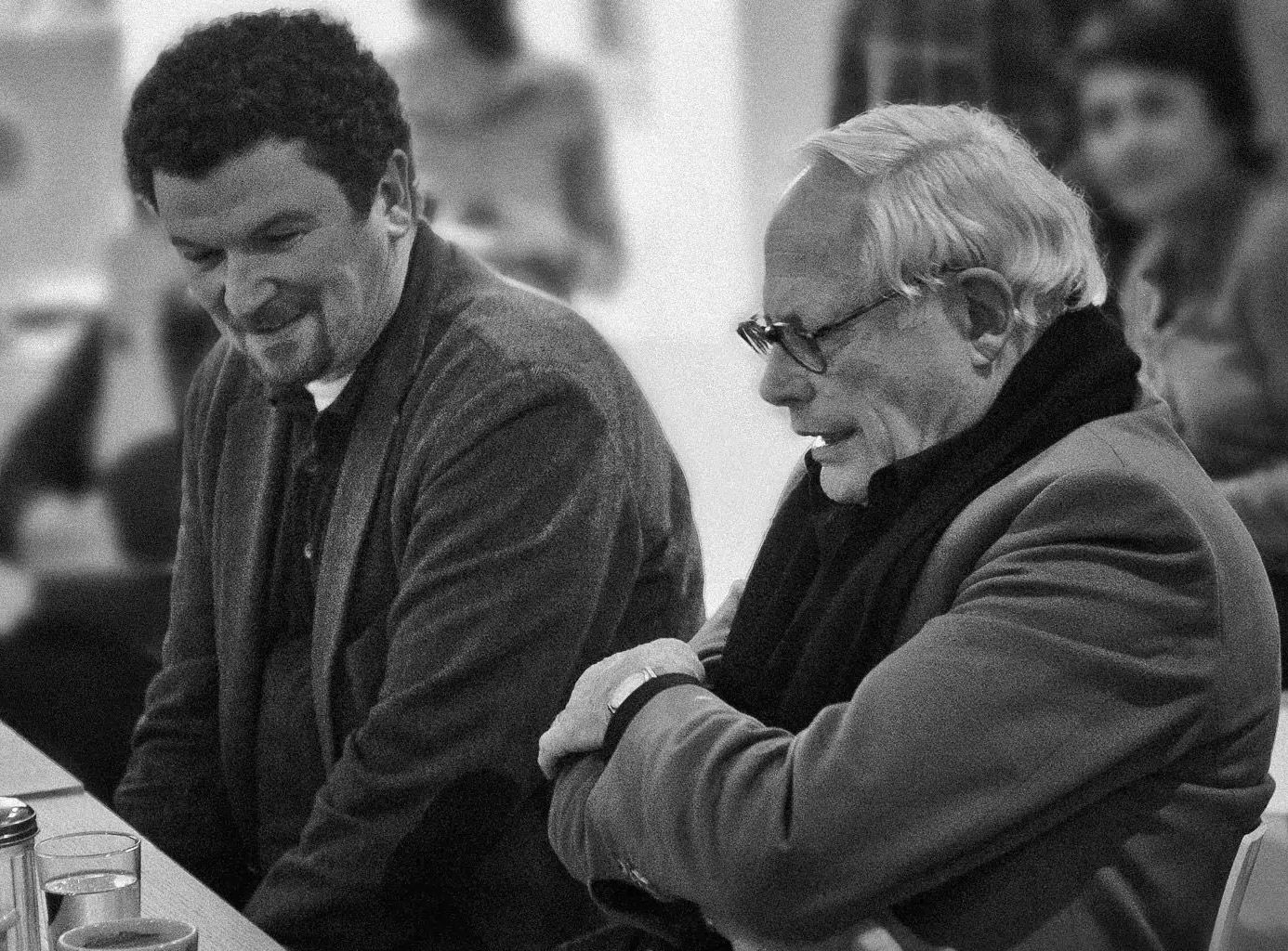
Interviewed: Erik Spiekermann, type designer, author and Aicher critic.
Technology: a central notion and fixed point of perspective in the work of Otl Aicher.
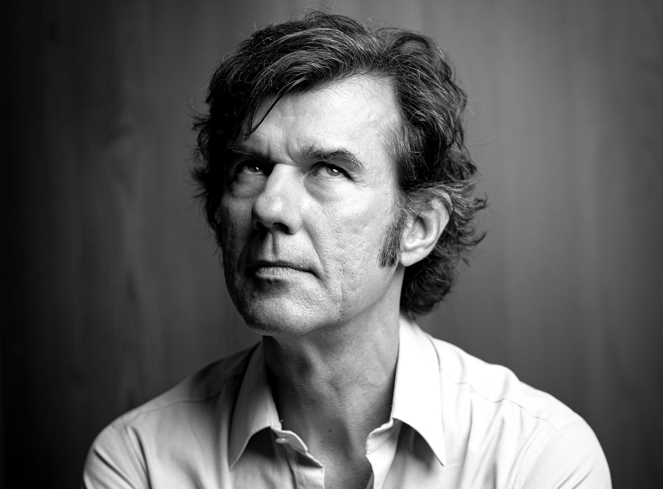
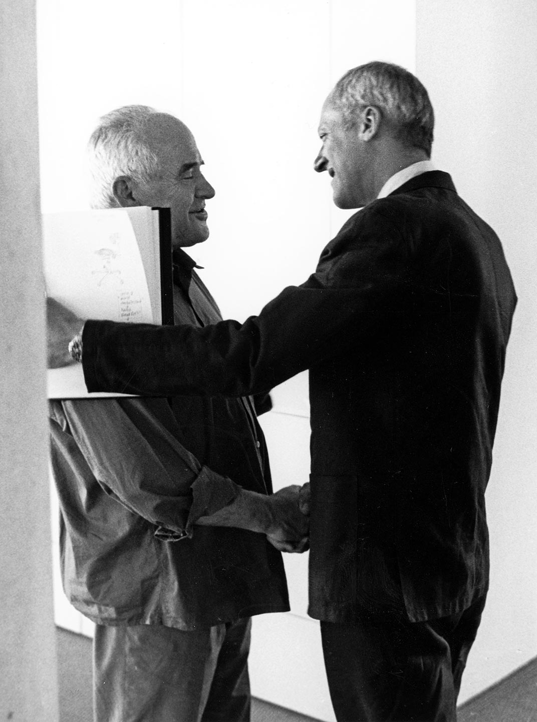
The British architect Norman Foster on his friendship with Otl Aicher: He had absolute integrity.
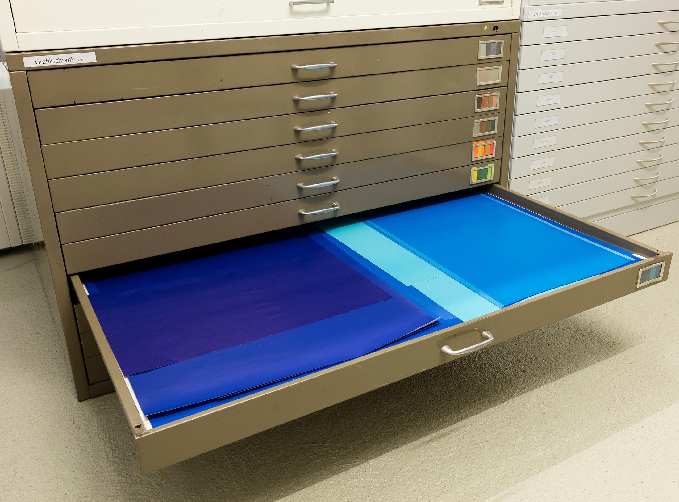
Thoughts on the colour palettes of Otl Aicher.
Absolute sharpness, reduction and strict rules determine the character of his pictures: Otl Aicher as photographer.
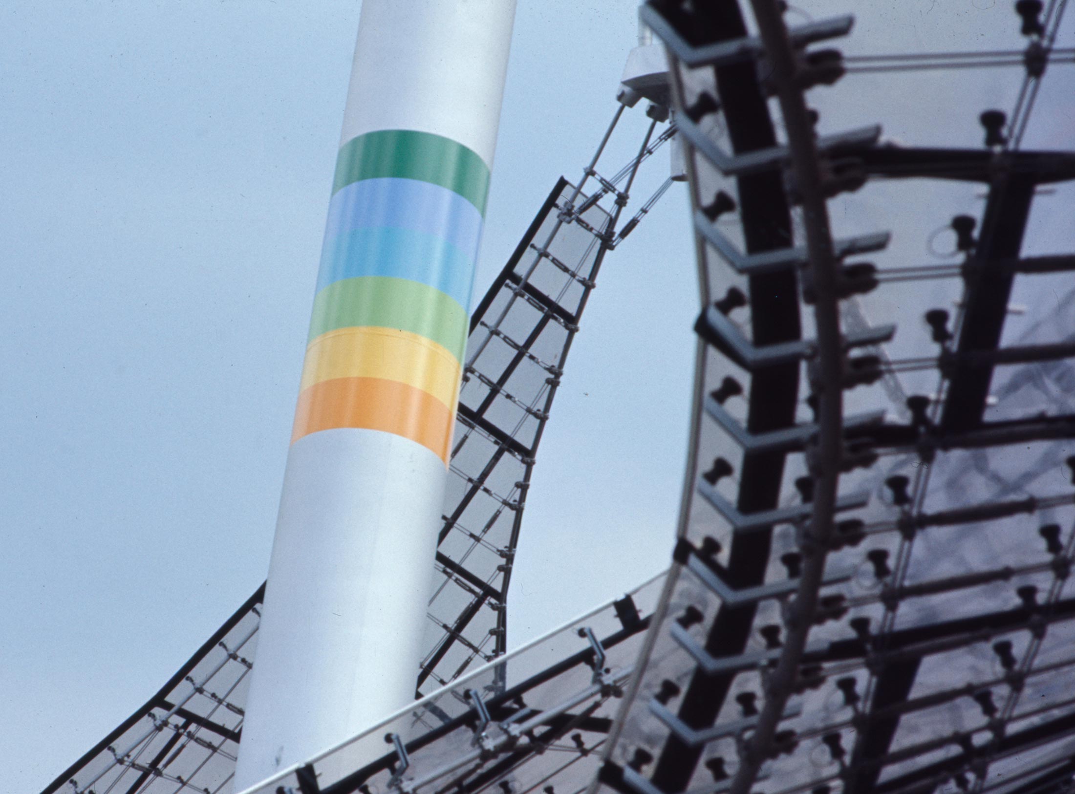
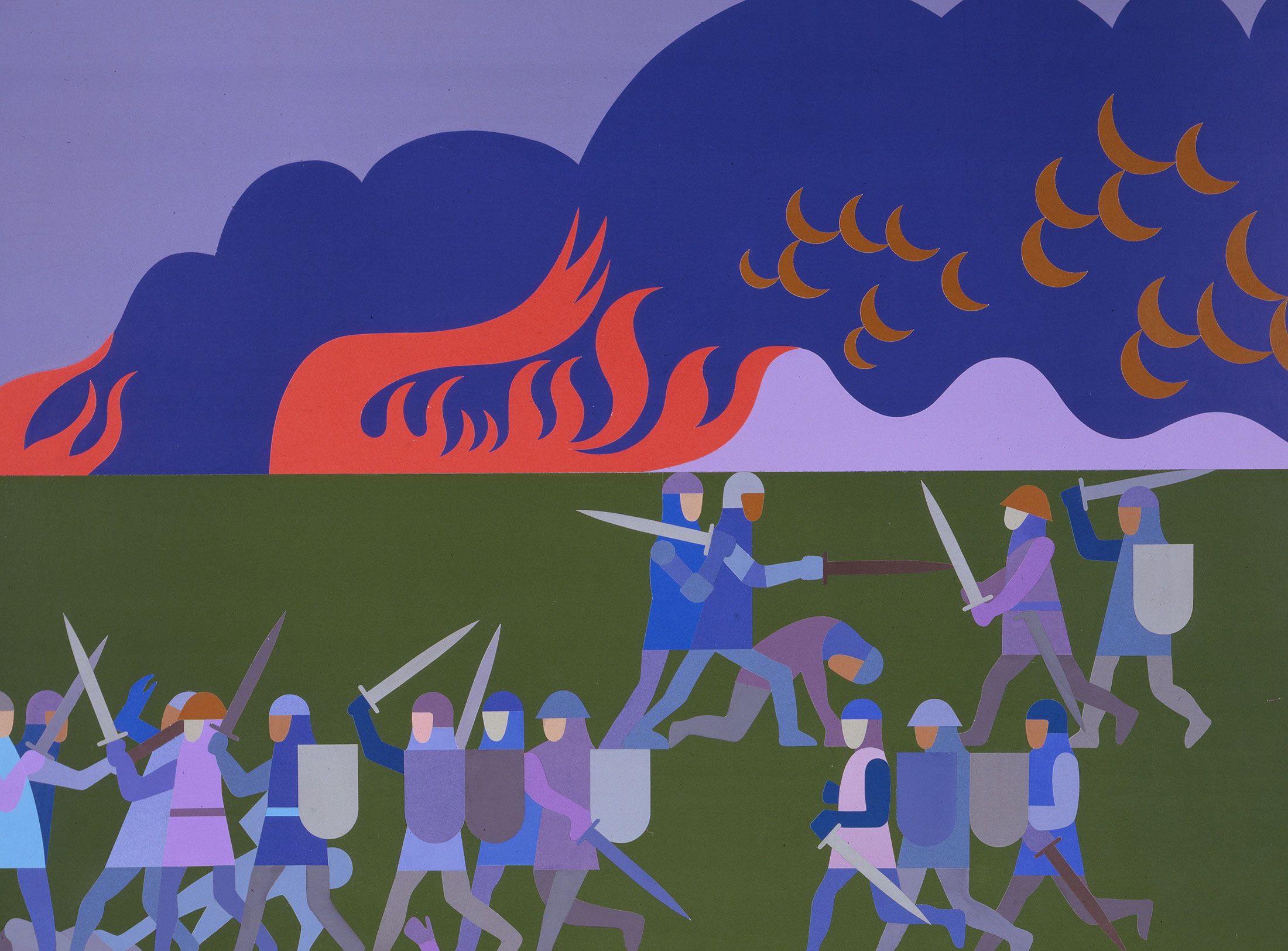
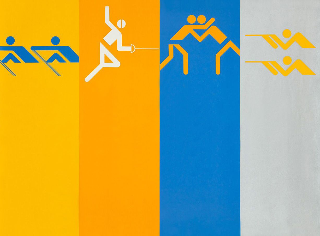
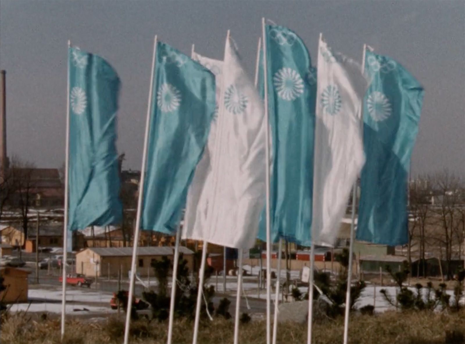
Under Otl Aicher’s direction, designers, architects and landscape planners shaped the face of the Olympic Games 1972.
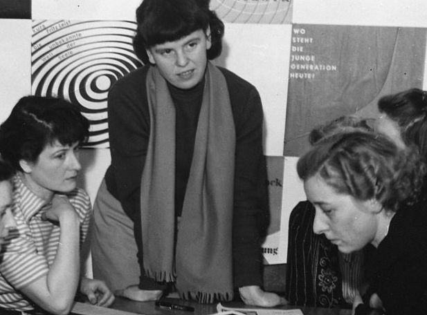
Inge Aicher-Scholl preserved the legacy of the White Rose.
An interview with design icon Stefan Sagmeister about typefaces, beauty and the legacy of Otl Aicher.
The International Design Center Berlin (IDZ) invites you to a slide show and panel talk at Architektur Galerie Berlin on 20 October. Karsten de Riese and Prof. Michael Klar will report on a photo reportage commissioned by BMW that took them to Tunisia in 1975 together...
On the occasion of the 50th anniversary of the 1972 Olympic Games, the IDZ invites you to a discussion on the vision of the Munich Games and the status quo as well as the future of the Olympic movement on 26 August. The event at Berlin’s Akademie der Künste on Pariser...
Isny im Allgäu owes Otl Aicher a corporate design that is concise, bold and singular.
With a retrospective of Otl Aicher’s book “kritik am auto – schwierige verteidigung des autos gegen seine anbeter” (Criticism of the Car – Difficult Defence of the Car against its Worshippers) published in 1984, the IDZ continues its series of events on the “otl...
Today marks the centenary of Otl Aicher’s birth. The International Design Center Berlin (IDZ) is taking this date as an opportunity to pay tribute to this great designer. With otlaicher100.de, a new online platform is being launched – a curated space that provides...
Reflections on Inge Aicher-Scholl and Otl Aicher.
The International Design Center Berlin (IDZ) is taking Otl Aicher’s centenary as an opportunity to pay tribute to this great designer and to make his work visible. An online platform and a series of events will address Otl Aicher’s multifaceted cosmos of topics and...
Eine Stadt leuchtet: Mit seinem farbenfrohen Erscheinungsbild der XX. Olympischen Sommerspiele 1972 setzte Otl Aicher ein Signal. Die junge Bundesrepublik war in der Moderne angekommen.
Otl Aicher’s Poster displays for the Ulmer Volkshochschule (Ulm Adult Education Centre).
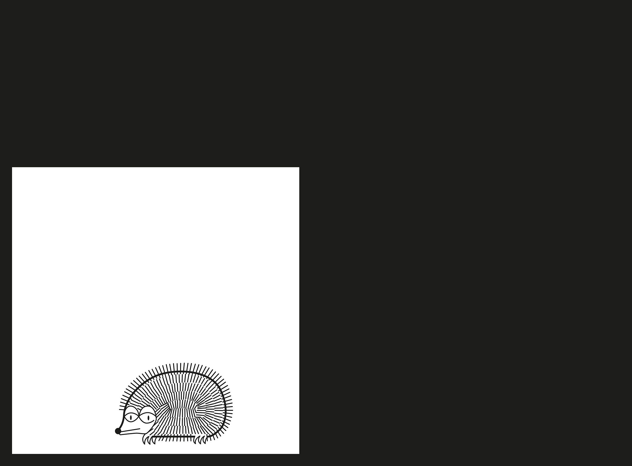
From O to R: Let’s talk about a hedgehog, standardisation and neurotis for a change (please click on the letters).

Otl Aicher’s Dept. XI team: the visual identity of the Munich ’72 Olympics was the work of graphic designers, illustrators and technical staff from all over the world.
Aicher’s childhood and youth: the years 1922 to 1945.

Otl Aicher’s signage systems for airports, metro stations and hospitals are considered exemplary to this day.
Der einstige Braun-Chef-Designer im Gespräch über den Co-Gründer der HfG.
A Broadcast: What is his place in today’s world?
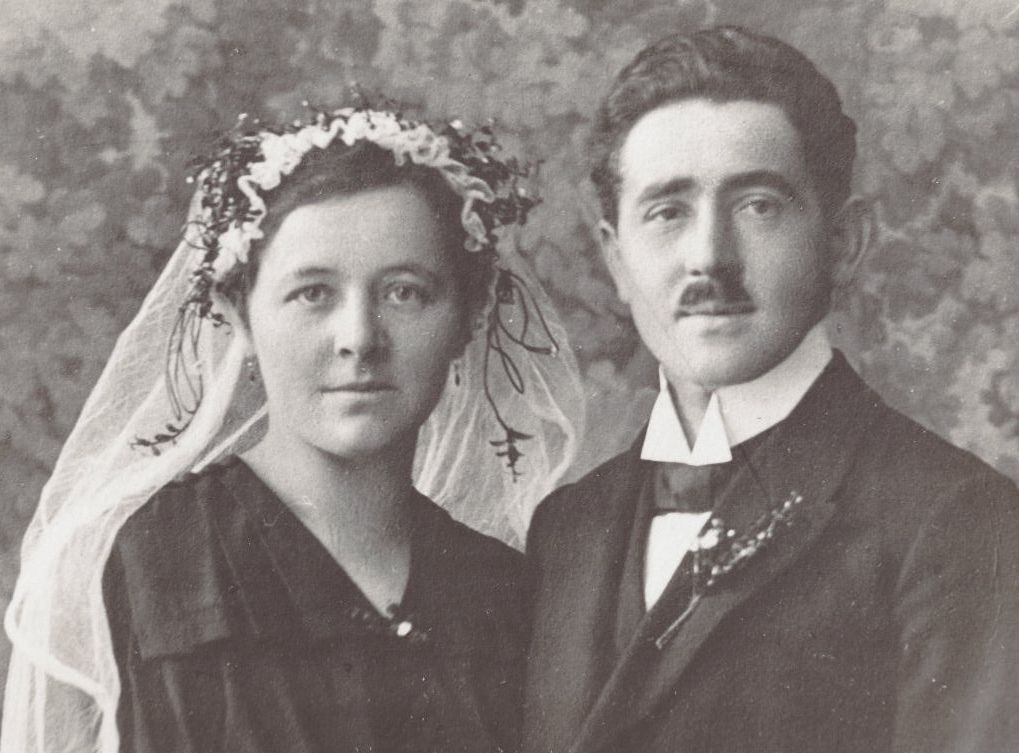
The Aichers: a brief family history.
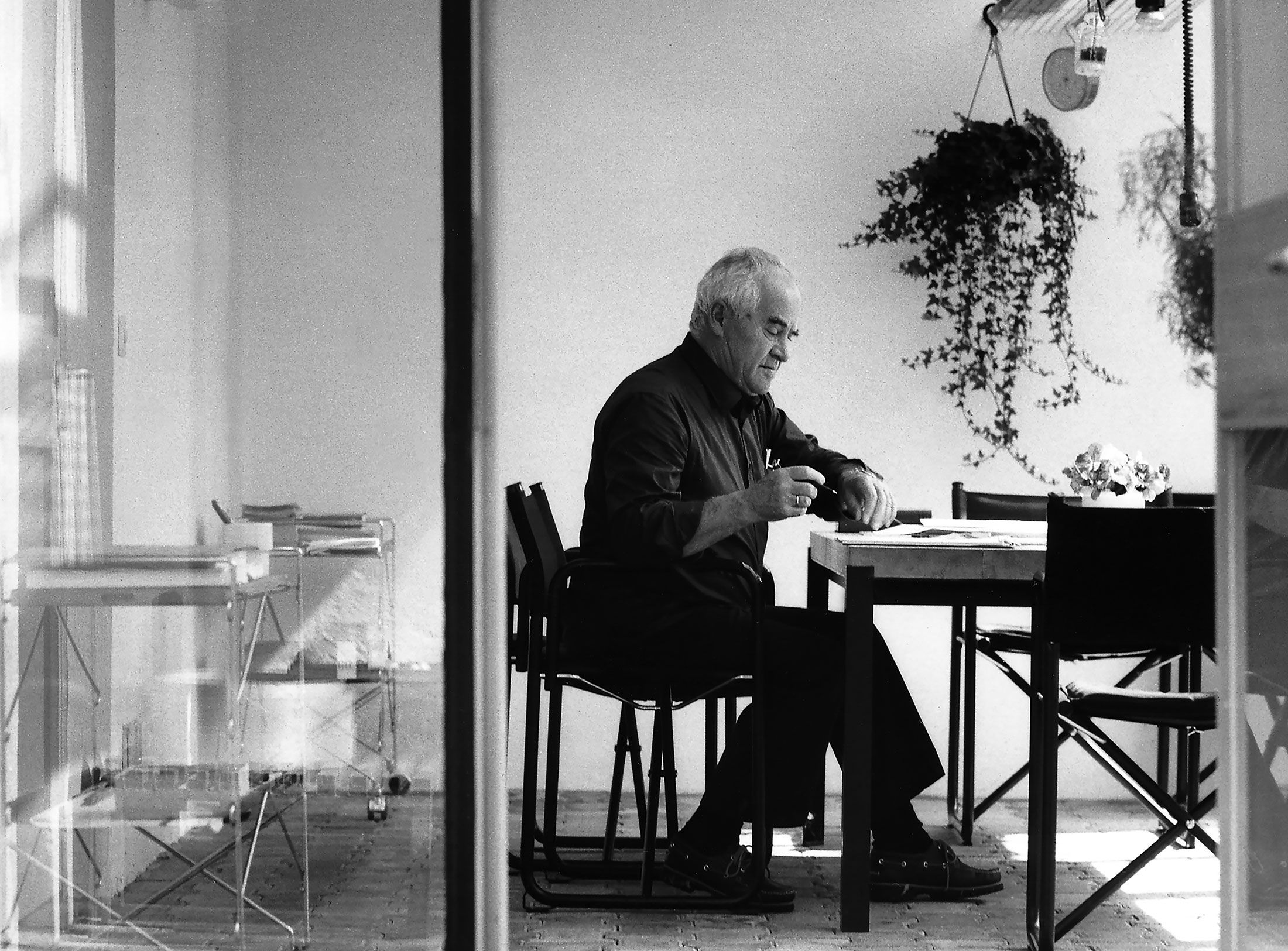
Drawing in Rotis: former Aicher co-worker Reinfriede Bettrich talks about hand sketches, the first computers and everyday life at the office.
How Otl Aicher’s papers and materials came to the HfG-Archiv/Museum Ulm.

Die Küche zum Kochen (The Kitchen for Cooking) – the genesis of a book that has lost none of its relevance.
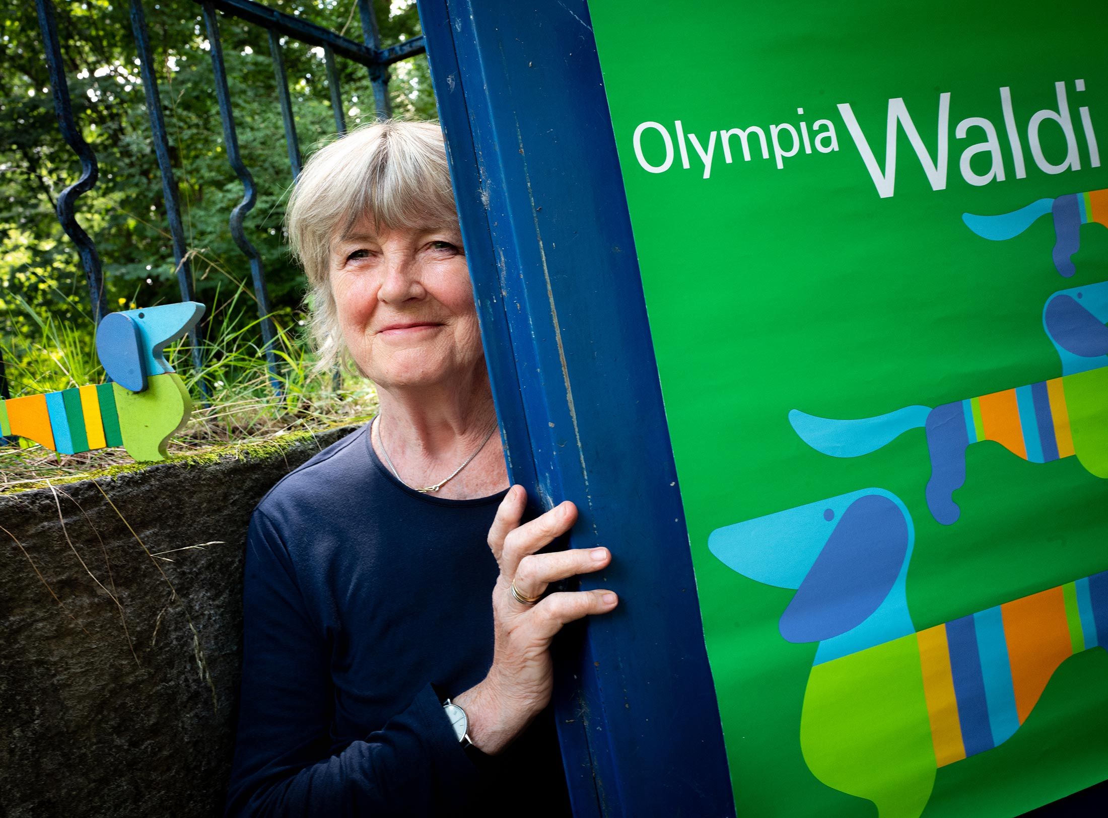
How a dachshund conquered the world: former Aicher staff member Elena Schwaiger on plush animals, fakes and the authentic mascot of the 1972 Olympic Games in Munich.
Le Violon d’Ingres or An Attempt to Defend the Writings of Otl Aicher.

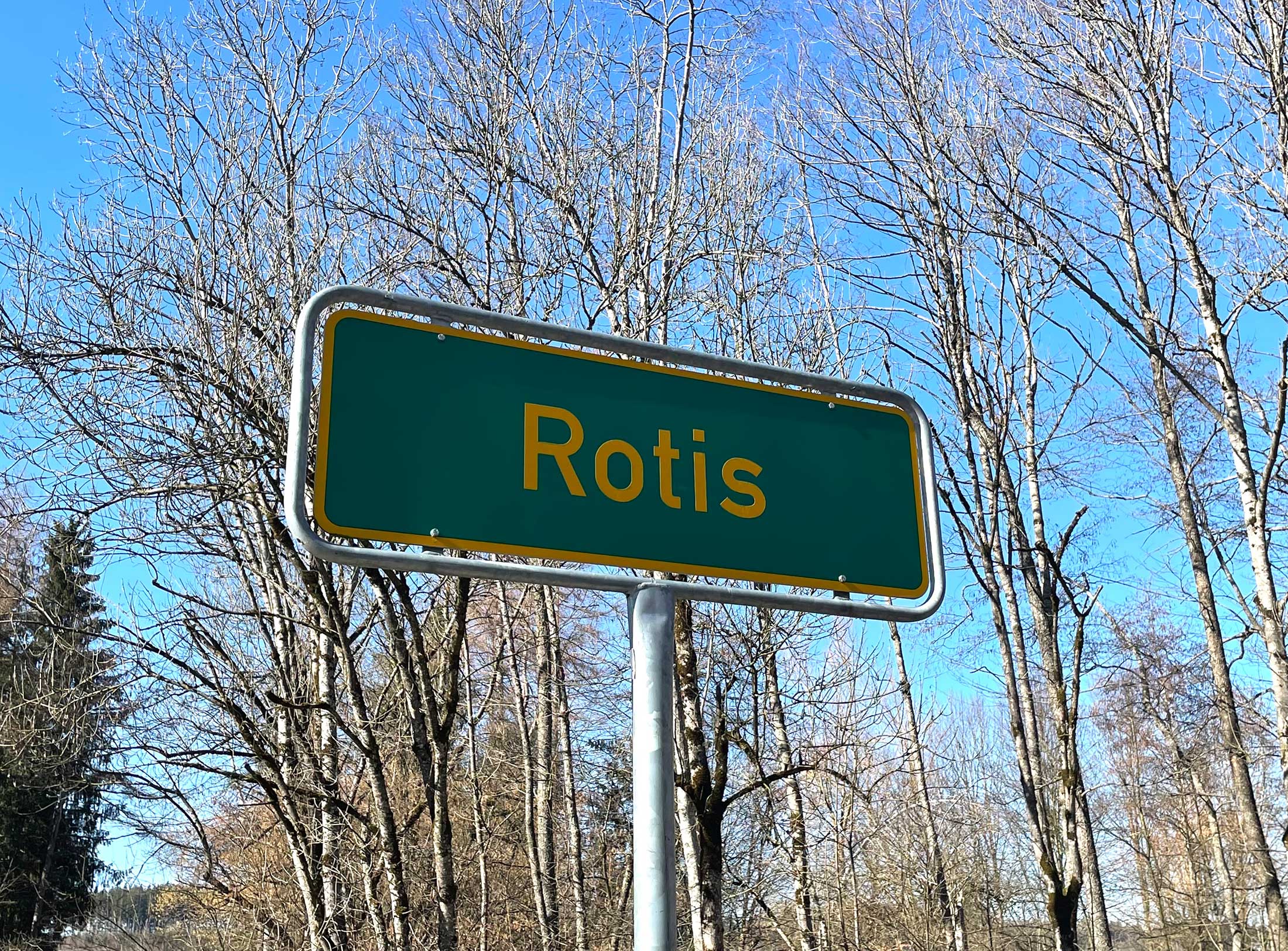
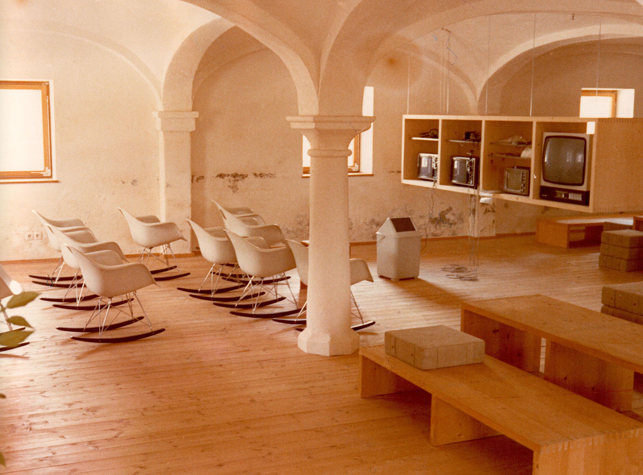
Otl Aicher as the architect of Rotis.
Otl Aicher and his critique of the automobile.
First broadcast: 15.02.1971 on Bayerischer Rundfunk, Munich (Only available in German).
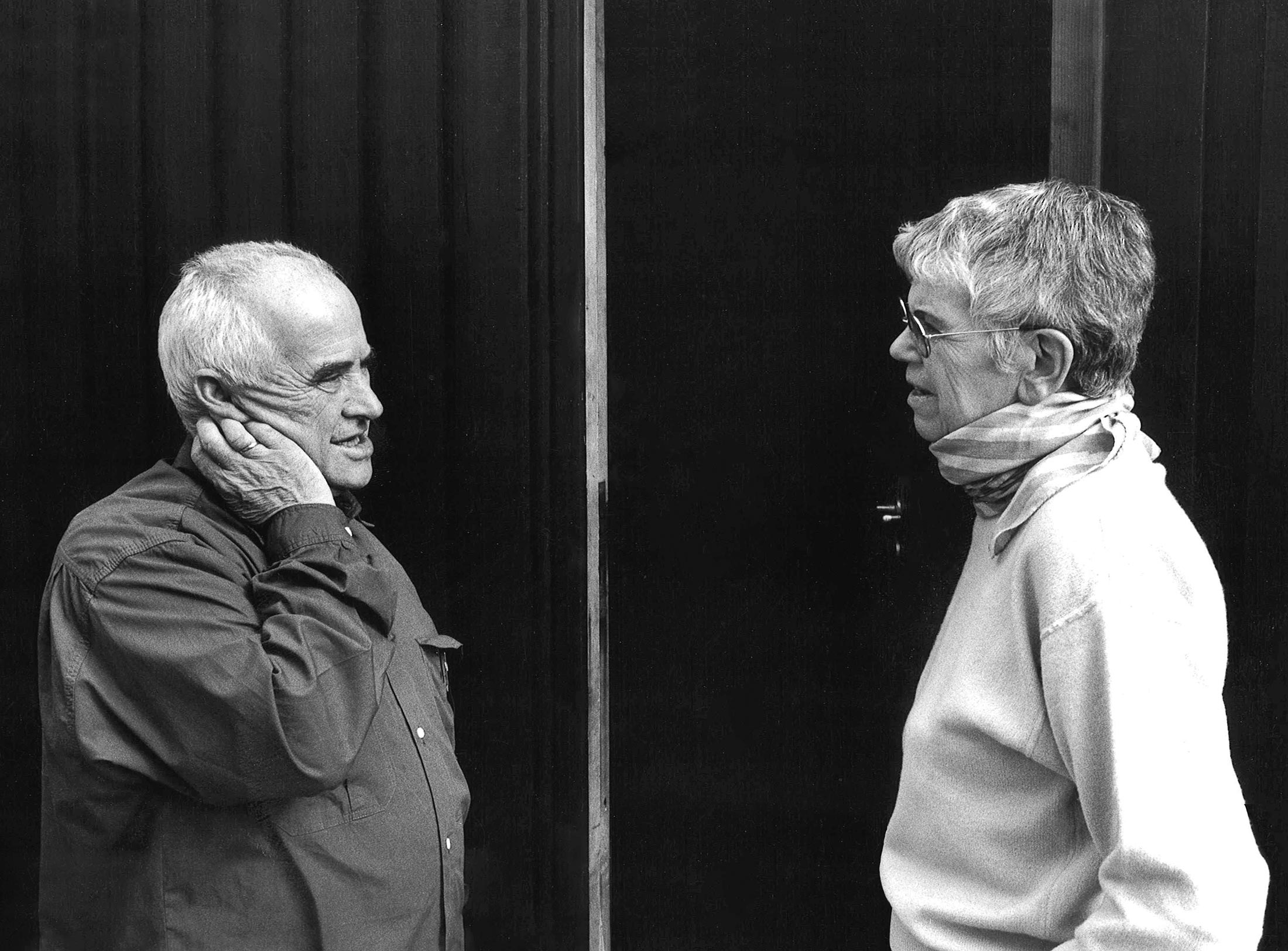
Interviewed: Jürgen Werner Braun on his collaboration with Otl Aicher.
They created the signature of an epoch: designers Otl Aicher, Willy Fleckhaus, Anton Stankowski and Kurt Weidemann.
The signage systems developed by Otl Aicher are never merely a stringing together of fonts and signs but always part of an ingenious corporate design. In combination with the transport facilities, they even become aesthetic ensembles.
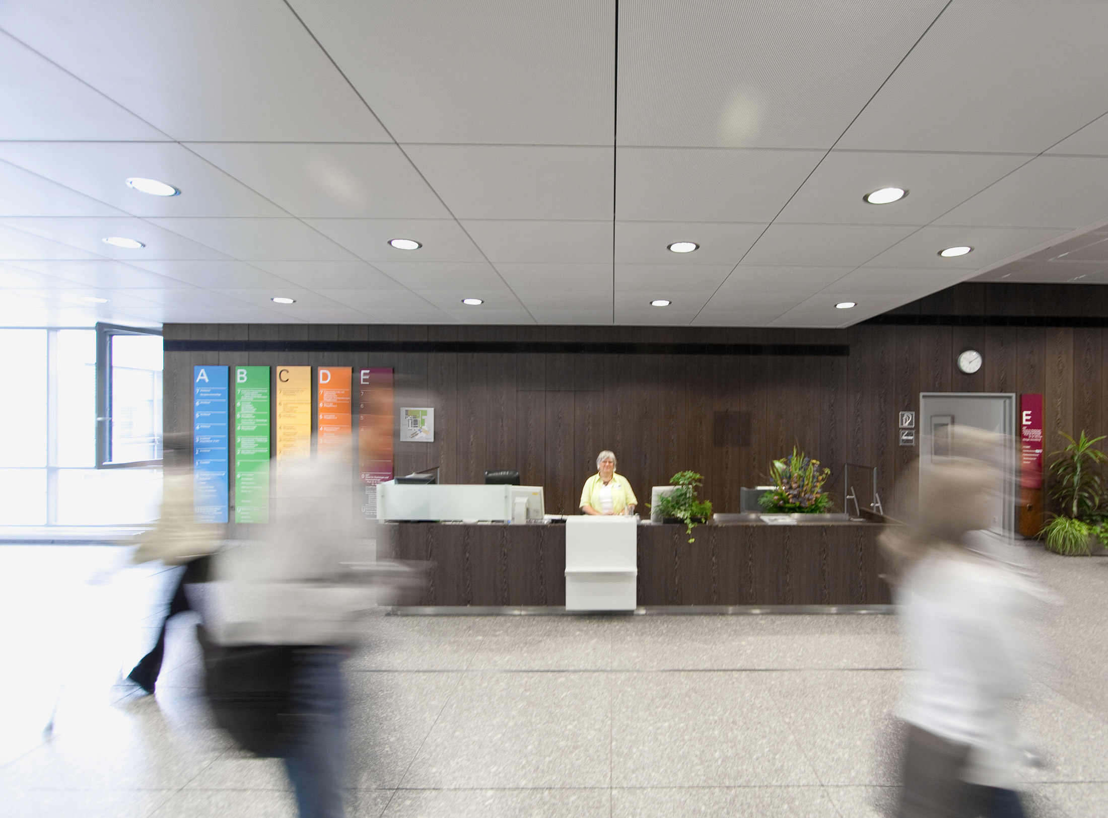
Nobody wants to feel lost as they make their way through an airport or hospital. It’s far more pleasant to feel welcome and be headed in the right direction. A cleverly designed signage system can make life easier, optimise routes and make destinations visible. A great many aspects are important when developing signage systems: cognitive factors like information processing and decision-making are essential for comprehensibility. Emotions play a role too. And in order for people with disabilities to use a signage system on an equal footing with everyone else, barrier-free accessibility is crucial. First and foremost, the basis for planning a signage system is the usage concept of the operator, for instance of a transport, service or social facility. Even the architecture itself can make the function of buildings and structures visible.
In his corporate design projects, Aicher focused a great deal of attention on both the history and values of the company involved. He factored cultural, sociological and not least of all environmental aspects into the design process too. For him, that was the prerequisite for being able to develop a signage system or logo that corresponds to a company and establishes its identity in visual form.
The focus of this article is on four extensive signage systems that are typical of Aicher’s work: the wayfinding system for Frankfurt Airport (1972) and the orientation system for the Alfried Krupp Hospital in Essen (1980), the implementation of which Aicher oversaw all the way through to completion. Munich Airport II (1992) and Metro Bilbao (1995), on the other hand, whose signage systems Aicher played an instrumental part in, were not inaugurated until after his death.
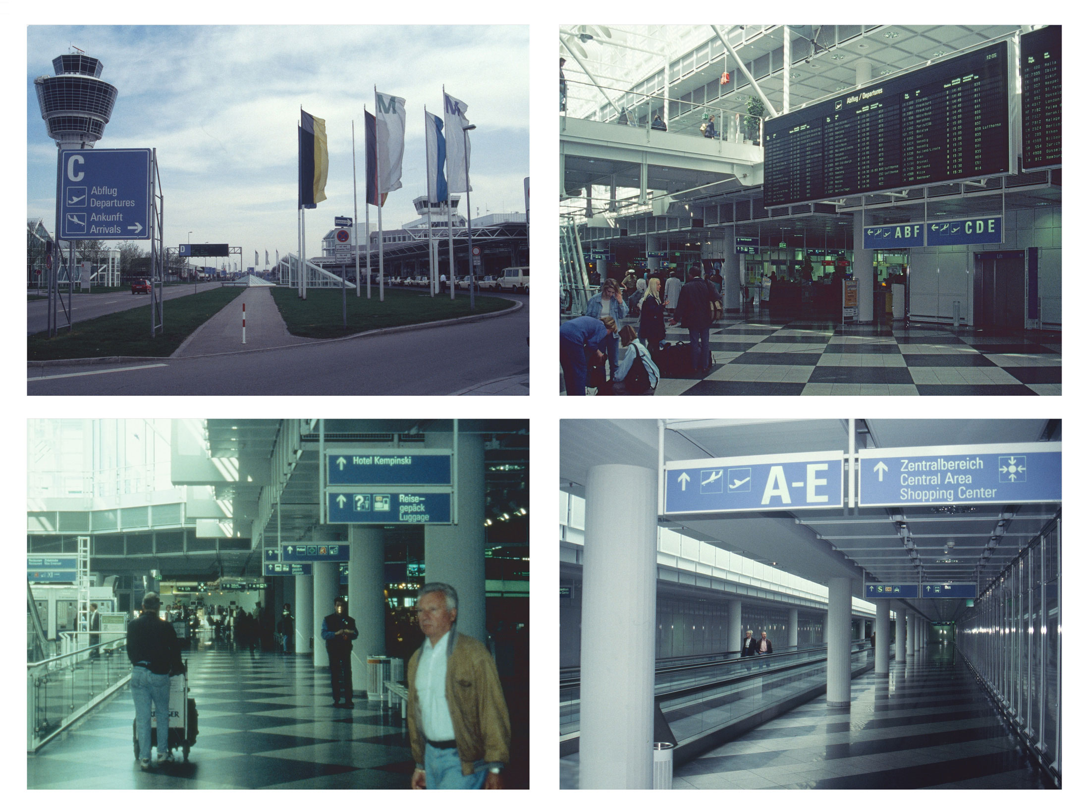
Connected with far-off lands – Frankfurt Airport
When the newly built Central Terminal went into operation in the southwest of Frankfurt in March 1972 and with it the wayfinding system that Otl Aicher had developed for the airport, this was one of the biggest international airports in the world. It was around this time that flying was becoming popular. The extension was to equip the Rhine-Main Airport to deal with a capacity of 30 million passengers – 14 times more than in 1960.
Otl Aicher used colour coding to resolve the challenges that the complex airport architecture by Alois Giefer and Hermann Mäckler posed in terms of orientation and wayfinding. The three passenger areas for departures and arrivals were accommodated in three concourses labelled with the letters A, B and C and clearly structured into different usage zones by means of a colour-coded signage system: blue for everything to do with air traffic, green for secondary services like toilets, lockers, pharmacies etc., and white for commercial facilities such as shops and eateries. Because commercial advertising space was becoming an increasingly serious competitor for visual attention, Aicher ensured its spatial separation from the elements of the signage system and restricted its format as well.

Enamel signs, two pictograms of the guidance system for Frankfurt Airport, 54 cm by 54 cm by 2.8 cm, circa 1972, metal sheet enameled. © Quittenbaum / Florian Aicher
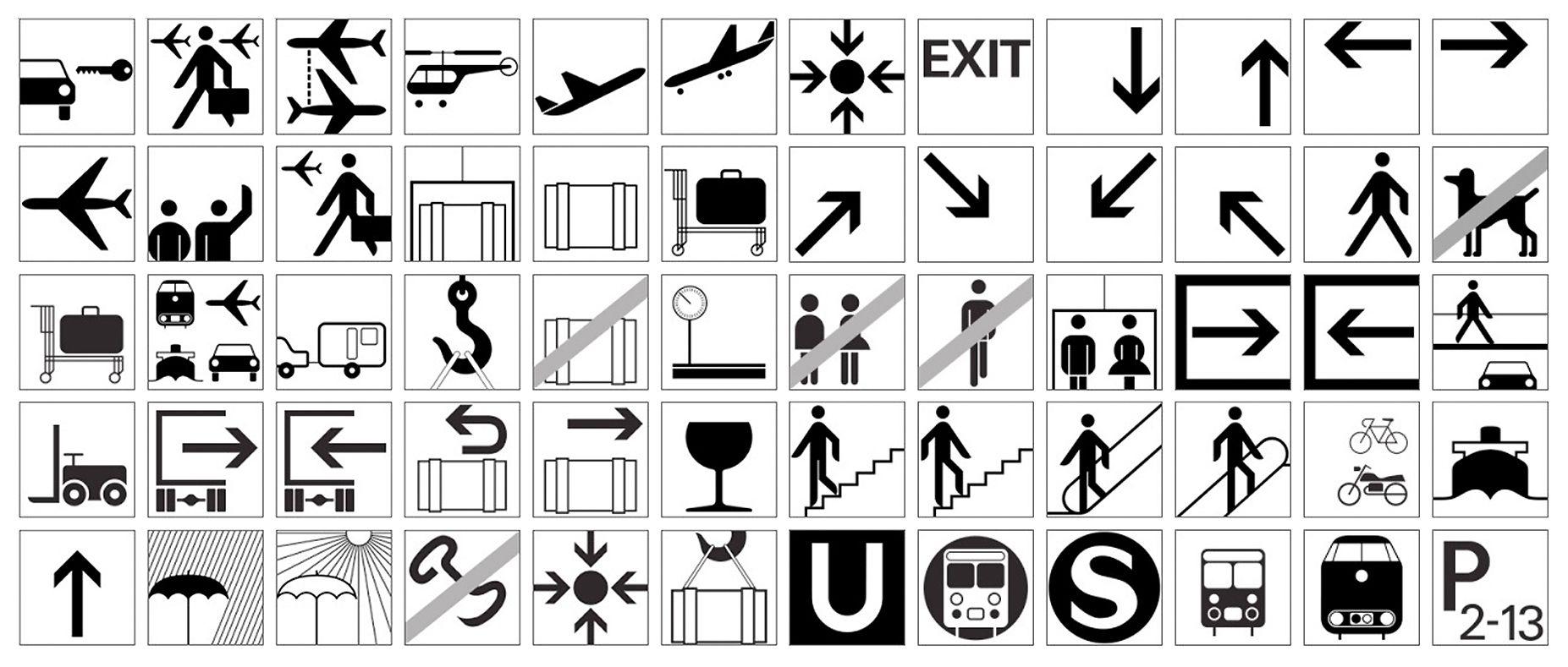
Starting in the late sixties, Otl Aicher developed a repertoire of pictograms to help visitors to the Olympic Games in Munich find their way around. At the same time, he designed the guidance system for Frankfurt Airport with further pictograms. © ERCO / Licensing: Stiehl/Over/Gehrmann
Enamel signs, two pictograms of the guidance system for Frankfurt Airport, 54 cm by 54 cm by 2.8 cm, circa 1972, metal sheet enameled. © Quittenbaum / Florian Aicher
Starting in the late sixties, Otl Aicher developed a repertoire of pictograms to help visitors to the Olympic Games in Munich find their way around. At the same time, he designed the guidance system for Frankfurt Airport with further pictograms. © ERCO / Licensing: Stiehl/Over/Gehrmann
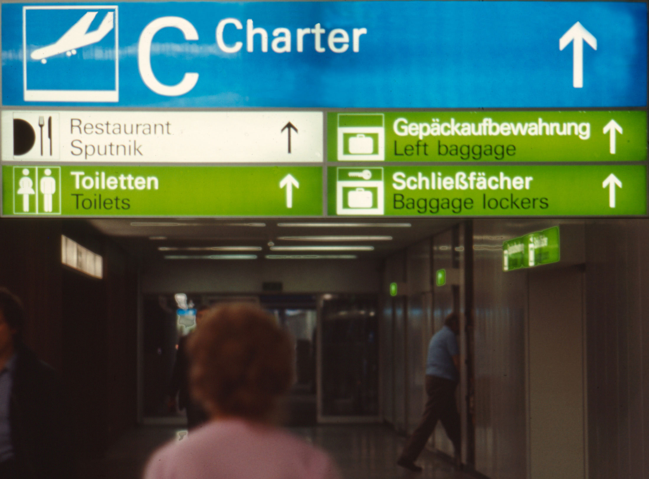
Frankfurt Airport signage system: directional signs with color coding; photo: probably Otl Aicher or Büro Otl Aicher © HfG-Archiv / Museum Ulm, Ai_D_3085
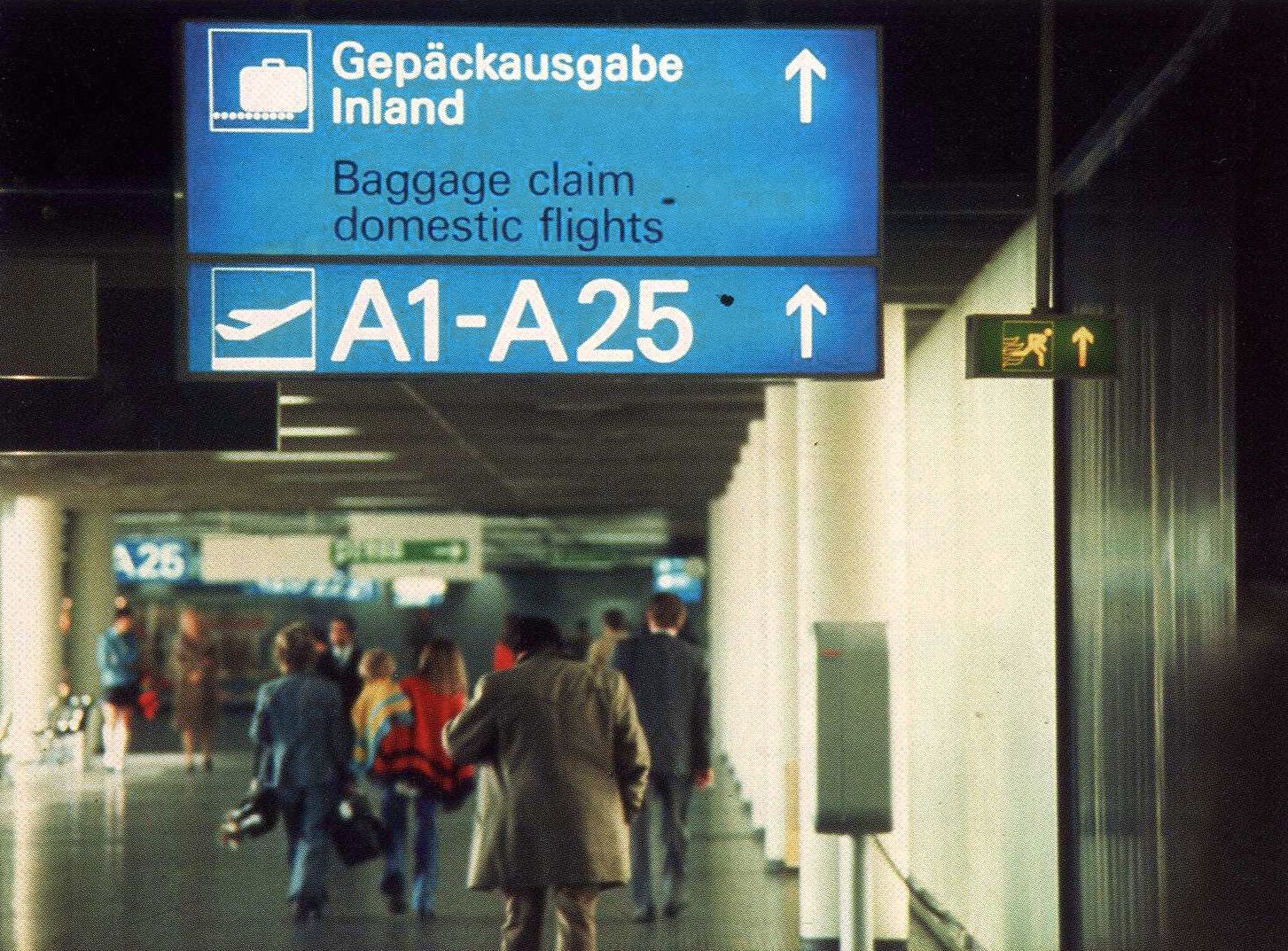
Frankfurt Airport signage system: directional signs with color coding; photo: probably Otl Aicher or Büro Otl Aicher © HfG-Archiv / Museum Ulm, Ai_D_3085
Frankfurt Airport signage system: directional signs with color coding; photo: probably Otl Aicher or Büro Otl Aicher © HfG-Archiv / Museum Ulm, Ai_D_3085
Frankfurt Airport signage system: directional signs with color coding; photo: probably Otl Aicher or Büro Otl Aicher © HfG-Archiv / Museum Ulm, Ai_D_3085
Prohibition signage was red. On the roads in the surrounding area, green signs pointed the way to the airport. The signage system was set in Univers 55. It was bilingual (German/English), and a total of 95 pictograms were developed in order to ensure language-independent orientation for international passengers. Parallel to the Frankfurt signage system project, Aicher was also working as Design Commissioner for the 1972 Olympic Games. As a result, the pictograms for Frankfurt were created together with those for Munich.
The first element of the corporate design to be published was the Rhine-Main Airport’s ribbon-like logo in 1971, composed of two shades of blue. Around 1990 Michael Peters, who was managing director of a subsidiary of the airport and Messe Frankfurt at the time, coordinated the renewal and expansion of the signage system on the basis of Aicher’s concept. The airport had grown in the meantime, and passenger numbers had increased considerably. Following Werner Kroeber-Riel’s concept of behavioural marketing, Peters investigated users’ actual movements and optimised the existing system accordingly. The commercial providers who Aicher had sought to keep within strict confines were now to become part of the overall system. Via Anton Stankowski and Karl Duschek, with whom Peters had previously developed the logo and signage system for Frankfurt Exhibition Centre, he got in touch with Aicher. But he didn’t want to do the redesign himself and recommended a Swiss associate who implemented the project.
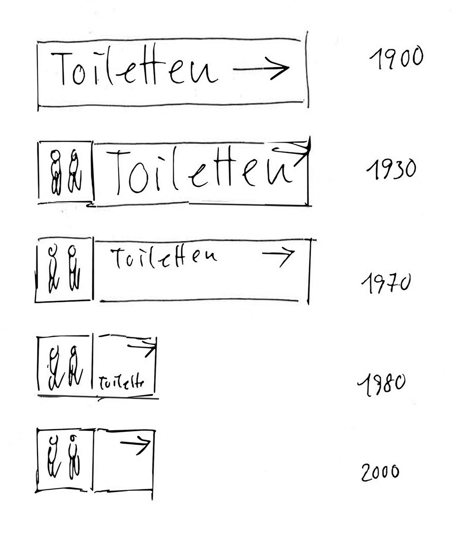
Development from text-based to pictogram-based signage systems, as sketched by Aicher © HfG-Archiv / Museum Ulm
“The patient is the centre of attention” – the Alfried Krupp Hospital
The social engagement of heavy industry company Krupp in Essen mainly focused on taking care of the sick. To that end, the firm founded a works hospital in the late 19th century, which went by the name of “Kruppsche Krankenanstalten” from 1920 on and is today called the Alfried Krupp Krankenhaus. The medical and health care continues to be provided via the Alfried Krupp von Bohlen und Halbach Foundation. Writing in Ein Krankenhaus stellt sich vor in 1980, its managing director Berthold Beitz succinctly formulated the enterprise’s commitment as follows: “The patient is the centre of attention.” That was very much in line with the debate about the “humane hospital” that was taking place at the time. Design was to help replace the clinic atmosphere that had dominated up until that point with a hotel ambience. The reception staff, for instance, dressed in ordinary clothes rather than uniforms.
Beitz and Aicher had met in the course of their work for the 1972 Olympic Games. Beitz was a member of the NOC, Aicher the Design Commissioner of the Games. The two of them agreed that the signage system for the Krupp hospital should be interpreted broadly, along the lines of an “architectural corporate identity”. Besides the signage system, the commission also included a colour concept for the building, as well as the selection and design of the floor coverings, furnishings, lighting and tableware.
Otl Aicher devised his colour concept on the basis of the clinic building complex in Essen-Rüttenscheid, designed by Frankfurt architecture practice Wörner + Partner. The eight-storey, three-wing nursing complex sits on top of two extensive lower levels that serve as the treatment area. Aicher organised the structure of the building, which was inaugurated in 1980, by allocating one colour and one letter to each wing. He used the same approach for the connecting core.
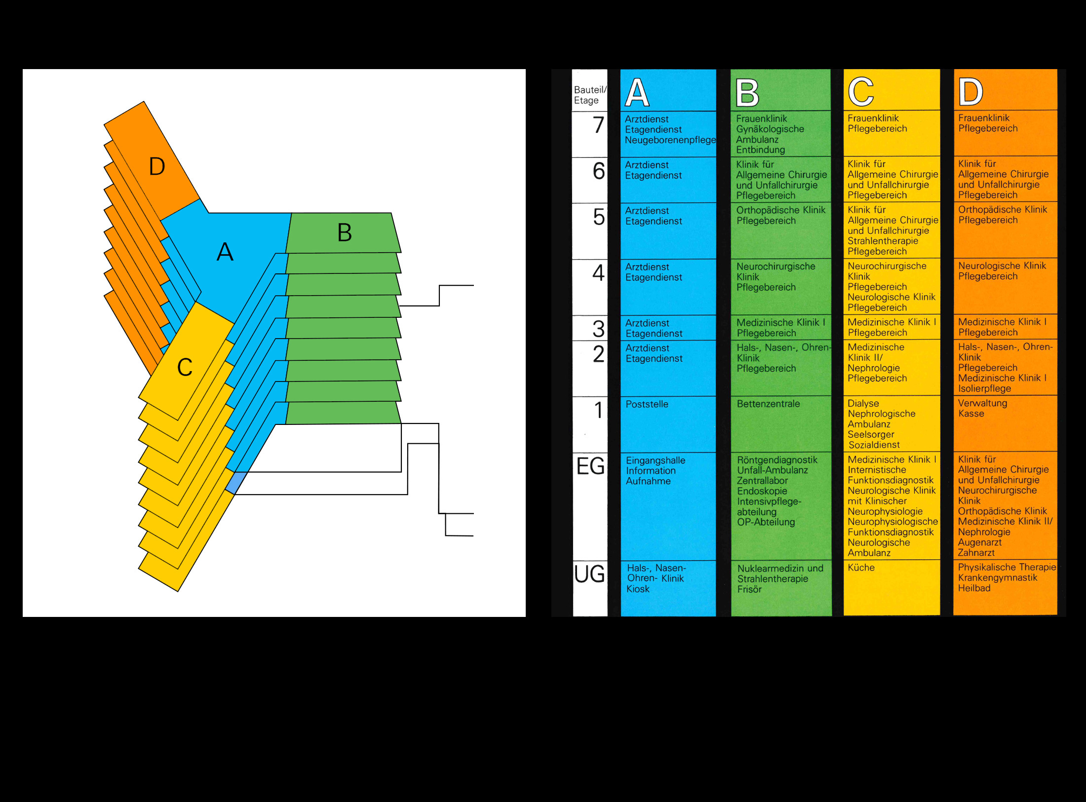
Color concept of the signage system for the Alfried Krupp Hospital 1980; From: "Ein Krankenhaus stellt sich vor" © Alfried Krupp von Bohlen und Halbach-Stiftung
The hospital’s pictograms were also designed by Otl Aicher. On design sheets that have survived from the period, it’s still possible to reconstruct his analogue method based on the pencil lines and masking.
Otl Aicher revised the logo for the Alfried Krupp von Bohlen und Halbach Foundation, partly also to make it clearly distinguishable from the emblem of the Kapitalgesellschaft Fried. Krupp AG, as the industrial company was known at the time.
Both Aicher’s signage system and the logo are still part of the visual identity of the Alfried Krupp Hospital in Essen today. In the course of the building’s redevelopment in 2008, the signage system was extended by designer Michael Göke.
The color concept from 1980 will be preserved and expanded in 2010 after renovation. Photo: Dirk Hennings
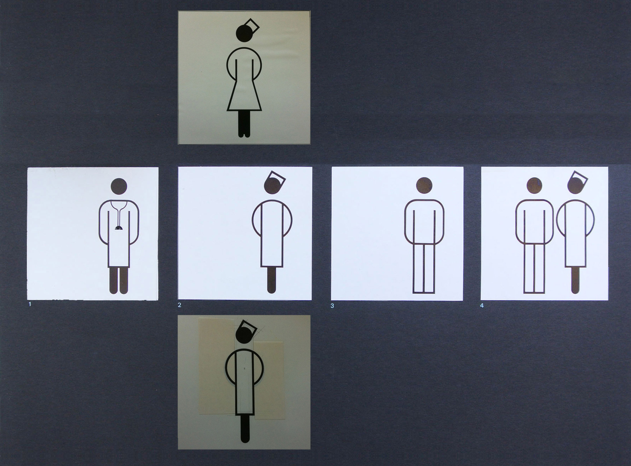
Analog design and variants of the pictogram "Nurse" © HfG-Archiv / Museum Ulm
The color concept from 1980 will be preserved and expanded in 2010 after renovation. Photo: Dirk Hennings
Analog design and variants of the pictogram "Nurse" © HfG-Archiv / Museum Ulm
Munich Airport – the airport as an aesthetic ensemble
In the final quarter of the 20th century, major infrastructure facilities seemed to look more and more alike. With his work for the new Munich Airport II, designed by Hans-Busso von Busse, Otl Aicher took a stand against this trend towards global uniformity by integrating references to the region and immediate surroundings.
His explorations of the Erdinger Moos marshlands led to sketches and initial ideas for the landscaping. At the same time, Aicher was aware of the ecological problems associated with the project for which he was the designer. Nevertheless, the doubts that he was beginning to have did not stop him from taking on the commission for the airport’s design guidelines in 1974. They did, however, play a role in his premature withdrawal in 1985. Aicher’s long-time project partner Eberhard Stauss updated the previously created design guidelines in 1987. He was subsequently entrusted with the design coordination of the entire project, although Aicher remained involved in the role of design consultant.
The planning team developed a variable but coherent design concept for the airport buildings consisting of just a few combinable constants. The system is all-encompassing: consistent design elements can be found in the landscape design, the light-flooded architecture, the design of the interiors and courtyards, as well as the signage system. The guiding principle “unity in diversity” gave the respective planners freedoms that led to a consistent visual identity.
The components that had to be developed ranged from landscape elements, bridges, bridge parapets, street lighting, signs and advertising media all the way to bathroom fittings, vehicles and uniforms, which involved defining colours, fonts, pictograms, forms and materials.
The basic form chosen for the design of the airport was the square, which could be extended into a grid through combination. But it could also be divided diagonally, resulting in a geometric key structure of elements with 45 and 90 degree angles. The 45-degree angle is found as a design device in the turnoffs to the terminal forecourts and neighbouring sections of the building, as well as in the tubular steel trusses that characterise the airport design.
The grid system continues into the outdoor areas too. Here, the grid design of the architecture is attractively overlaid with the parallelogram-like arrangement of the planting, which echoes the existing landscape structure of the Erdinger Moos with groups of trees and drainage channels. At the same time, the flat, elongated airport buildings correspond with the flat, open landscape of the marsh.
Signage system and architecture Munich Airport, 1995 - The interplay of the orthogonal with the diagonally arranged square grid. Photo: Claus Michael Semmler
Otl Aicher had initially conceived the “M” logo for Munich Airport for the Olympic Games in 1972. Measuring six metres square, it welcomed passengers on the main approach road on freestanding elements made of tubular steel trusses. In 2013, the operating company modified the M with a “slash” or “connector” in a contrasting colour. Critics consider the new logo visually “unstable” and doubt that it will last for long.
Similarly to the colours of the 1972 Games, Aicher derived the colour space for Munich Airport, which he developed out of light blue, white and silver, from the natural colours typical of Upper Bavaria. Green, for instance, echoes the landscape of the Erdinger Moos marsh. At the same time, it is intended to demonstrate ecological thoughtfulness – an airport in the countryside. The white corresponds to the traditional building culture of the region’s houses and churches. It is used for central buildings associated with passenger handling. Blue cites the blue mountain backdrop seen against the light, the blue of distance or the skies of Upper Bavaria. Light blue with white lettering is used for the signage system in the passenger area. The silver triggers associations with both the silvery aluminium of aircraft fuselage and the silvery light of winter. Together with a light grey, it dominates the buildings in the other areas of the airport.
Parameters Technology, Landscape, Culture and Winter; from Design Guidelines M Issue 5 (Munich Airport) 1982 © HfG Archive / Museum Ulm, Otl Aicher
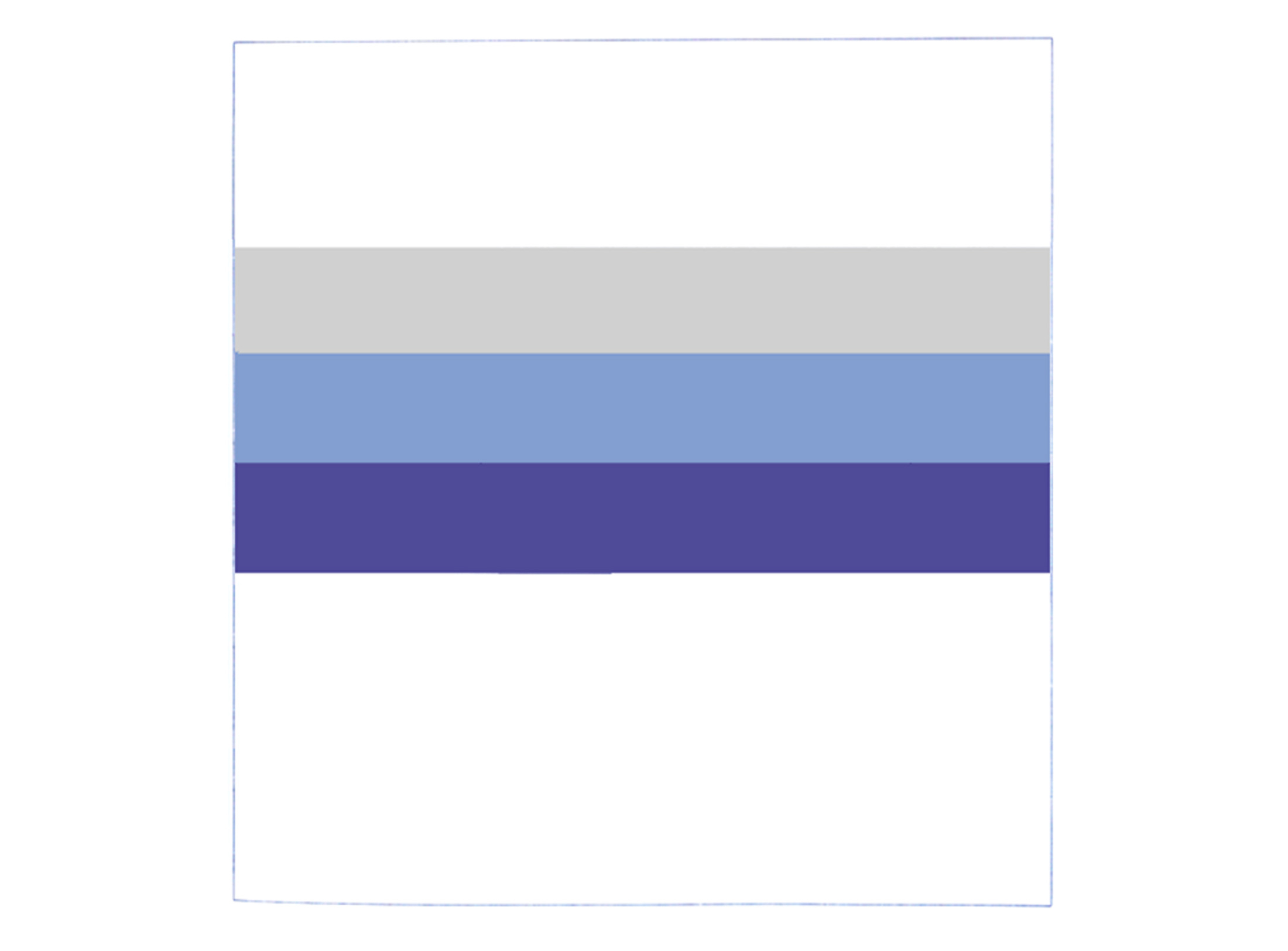
Colors from the parameters of technology, landscape, culture and winter; from Design Guidelines M Issue 5 (Munich Airport) 1982 © HfG-Archiv / Museum Ulm, Otl Aicher
Parameters Technology, Landscape, Culture and Winter; from Design Guidelines M Issue 5 (Munich Airport) 1982 © HfG Archive / Museum Ulm, Otl Aicher
Colors from the parameters of technology, landscape, culture and winter; from Design Guidelines M Issue 5 (Munich Airport) 1982 © HfG-Archiv / Museum Ulm, Otl Aicher
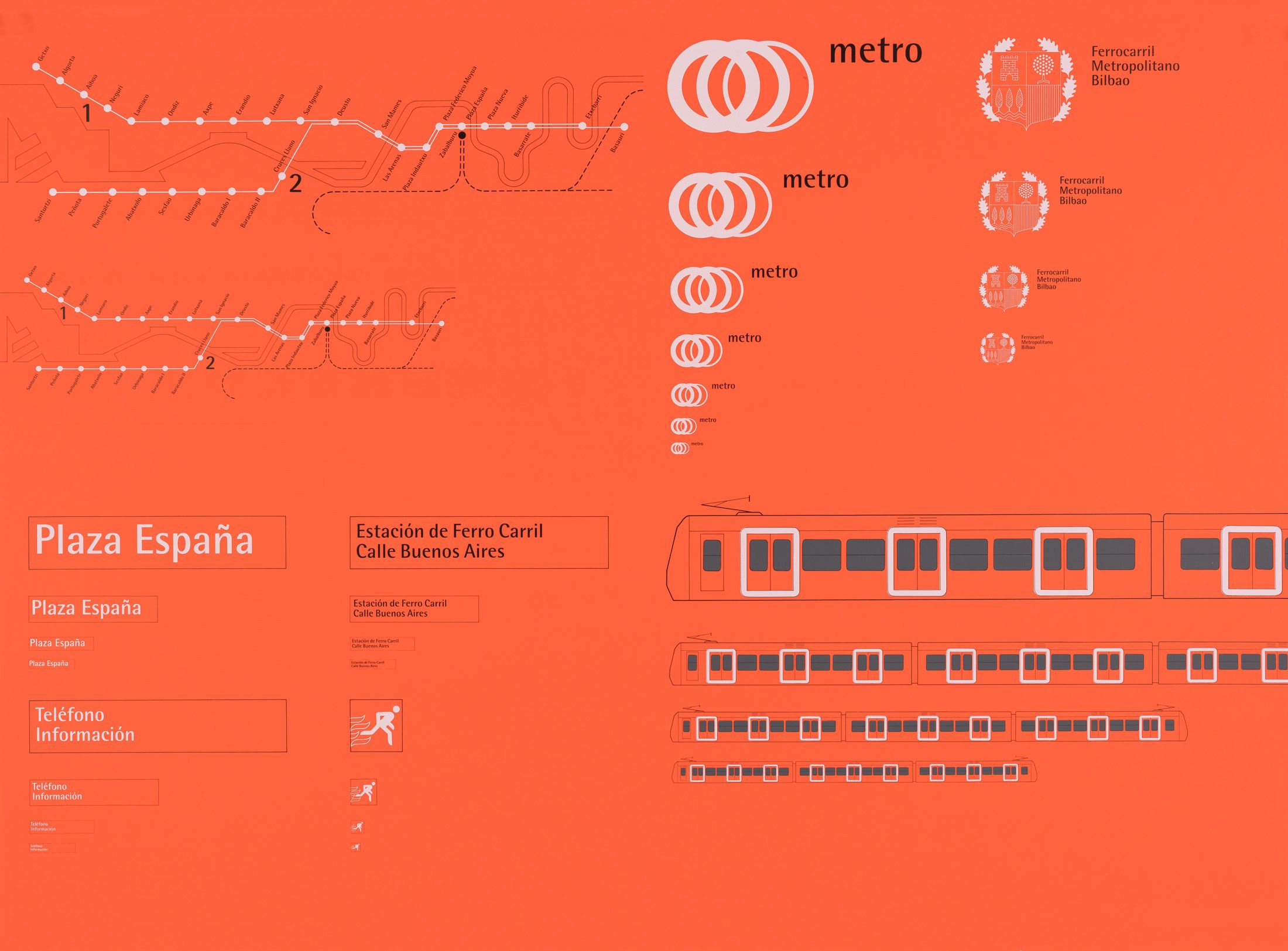
The Bilbao underground – from metro to regional identity
Even in its invitation to tender for the construction of the city’s underground system, the Basque government followed a clear concept: the design should go beyond the technical function of the metro system and merge outstanding architecture and engineering into a single aesthetic entity.
Norman Foster, who won the architectural competition for the metro in 1988, regarded the corporate design as an important component of the overall concept. Even at this stage, his project already encompassed network maps, the logo, the Bilbao red, even a wristwatch and the details of the metro stations – nothing was left to chance.

© Foster + Partners
© Foster + Partners
Logo and elements of the metro bilbao guidance system; © HfG-Archiv / Museum Ulm
© Foster + Partners
© Foster + Partners
Logo and elements of the metro bilbao guidance system; © HfG-Archiv / Museum Ulm
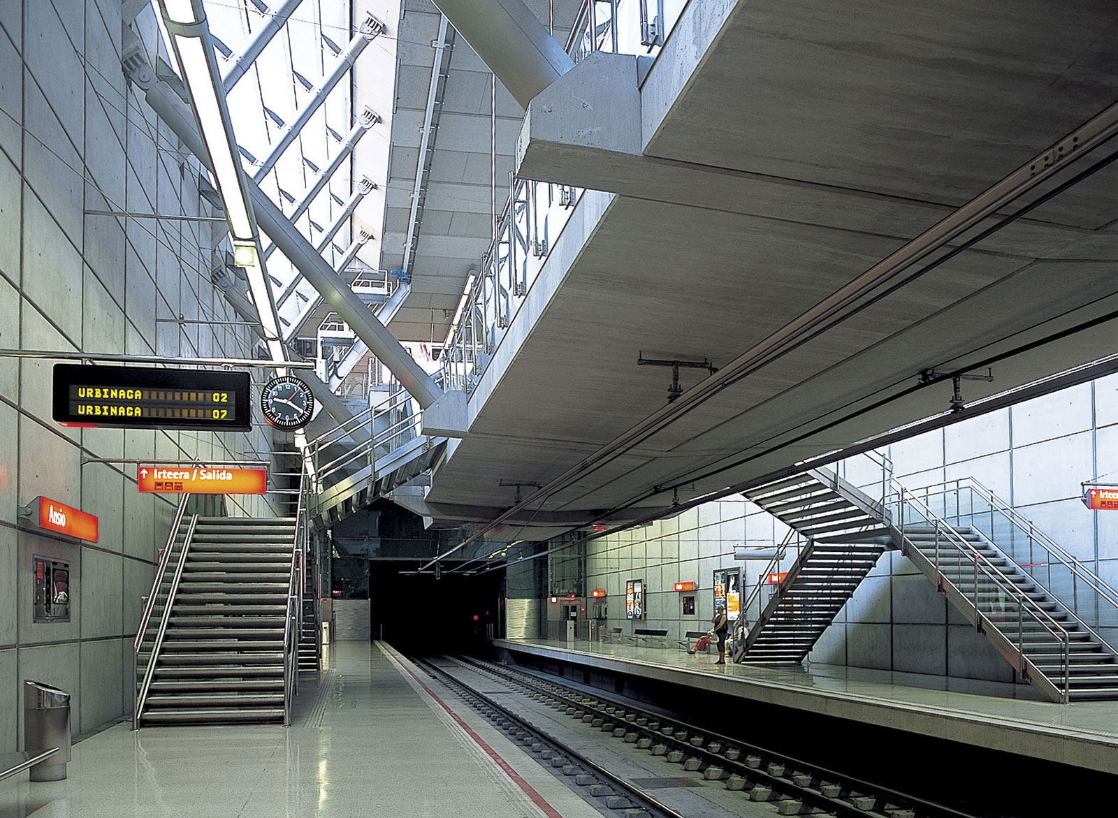
Architecture and signage system metro bilbao: The example of Ansio station © Nigel Young / Foster + Partners
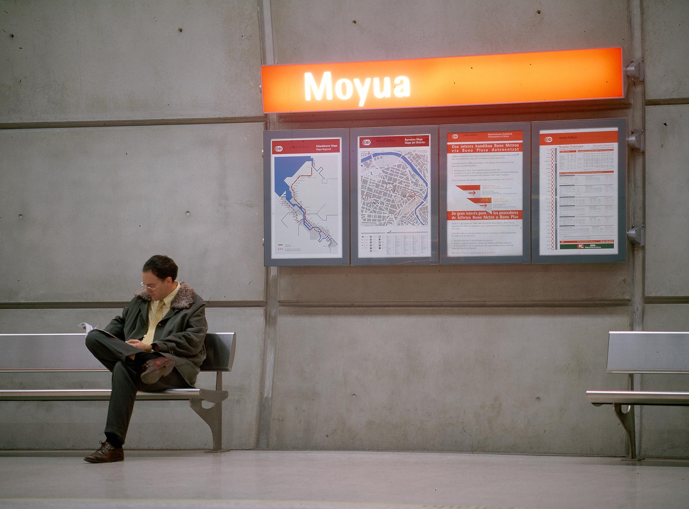
Photo: unknown
Architecture and signage system metro bilbao: The example of Ansio station © Nigel Young / Foster + Partners
Photo: unknown
Otl Aicher was involved in the design process right from the start and asked himself the question: “What is Bilbao?” He turned his attention to the history, geography and culture of the Basque city and went there so as to understand the place in its entirety. In the flag and crest he found the colours red, grey and black, as well as white and green, and the cityscape was dominated by white and red as well. Accordingly, he chose red and white, supplemented by greys, as the defining colour scheme for the metro’s corporate design.
Bilbao is located in a river valley near the Bay of Biscay. Its character is shaped by the river landscape and it is the coastal region’s major city. Economically and socially, the traditionally industrial civilisation transformed itself into what Otl Aicher described as a physically, chemically and technically oriented society. The project, which Foster and Aicher collaborated closely on, aimed to ensure the recovery of the “sick” industrial region in northern Spain.
Aicher’s three “supplementary studies” provide a deep insight into his work.
In the first there are diagnostic drawings. Aicher identified and reworked historic and contemporary symbols of the region. He also designed new ones and used them to develop an extended iconography. These symbols were to be used on maps and in the signage system.
In the second study – a photo story consisting of panoramic and aerial views – Aicher shows how Bilbao is expanding into a region, which is why he interpreted the task in hand as regional rather than urban planning.
In the third document, rough sketches show what Bilbao would look like after the construction. He didn’t see the underground purely as a feat of engineering but as a new network that was to connect citizens with the public space and the city with the surrounding region, as well as with nature, the estuary, the landscape and the recreational space.
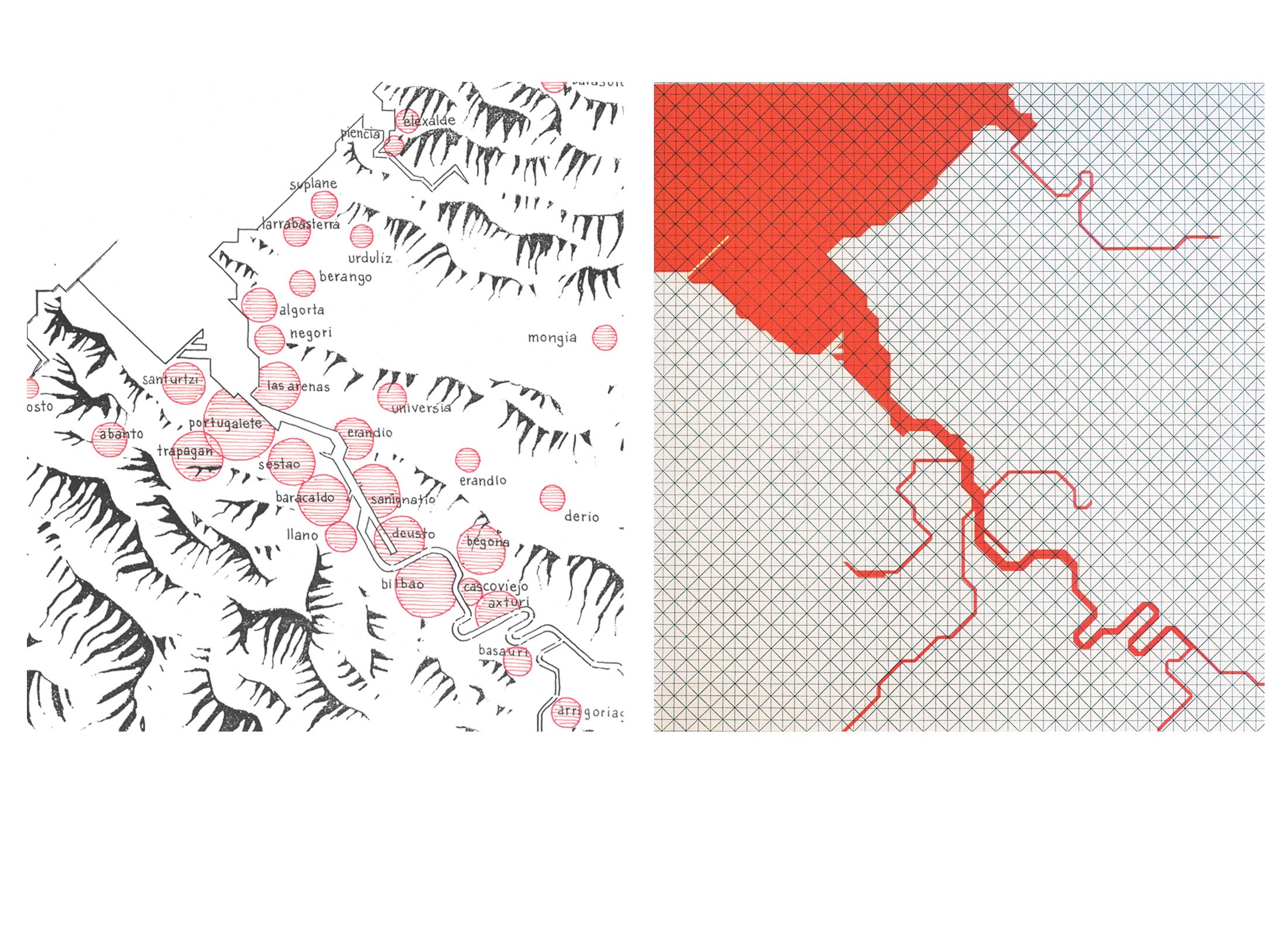
Grids and diagonals as a means of simplifying geographical maps for orientation plans © HfG-Archiv / Museum Ulm
Norman Foster’s architectural design accentuates the form and structure of semicircular tunnels as a design element. It results from the largely underground construction of the lines and stations. The wayfinding was to be equally clear and intuitive.
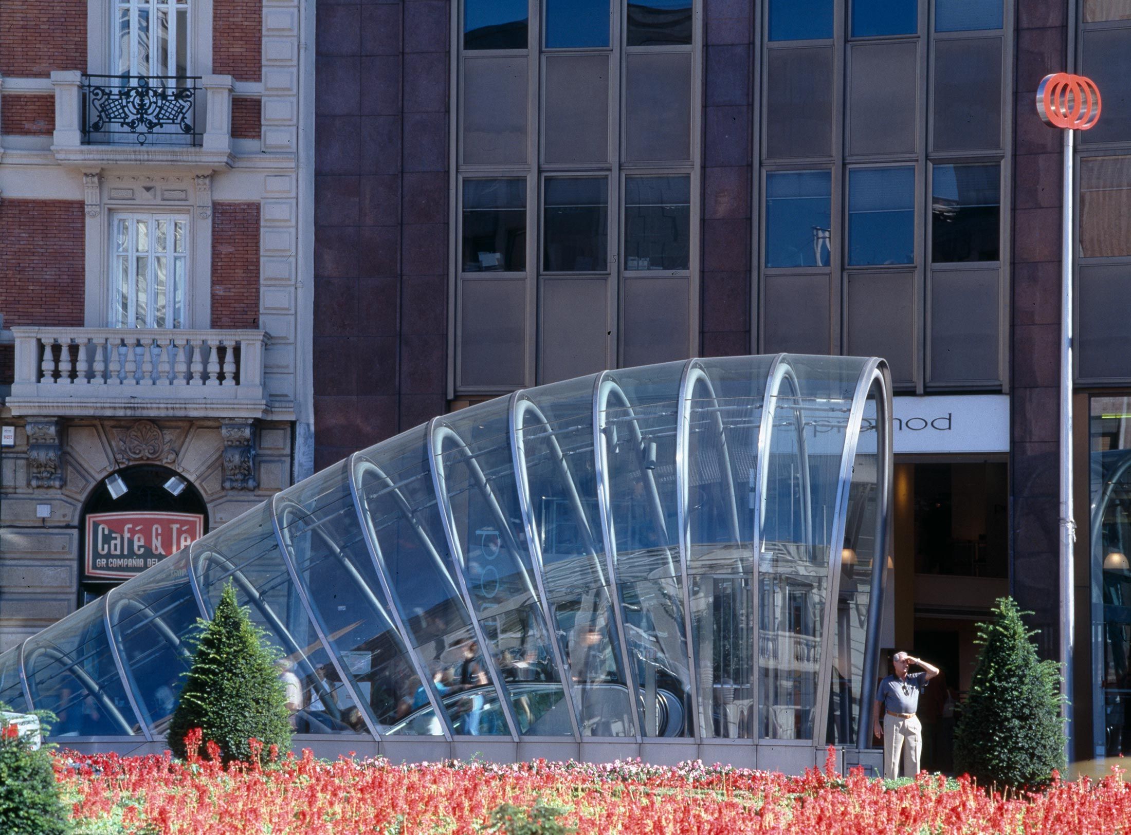
With one exception, all the stations on the first line are below ground. The wayfinding system started at street level, embodied by entrances in the form of glazed, steel-reinforced circular segments that emerge from the ground and are affectionately called “Fosteritos” by the citizens of Bilbao after the architect who designed them. They are identified by the Metro logo and orientation maps. The routes to the platforms are simple. The minimalist signage system doesn’t come in until just before the platform level; it consists of maps and notices, directional signage featuring pictograms and the name of the station in white letters on red signs.
© Nigel Young / Foster + Partners
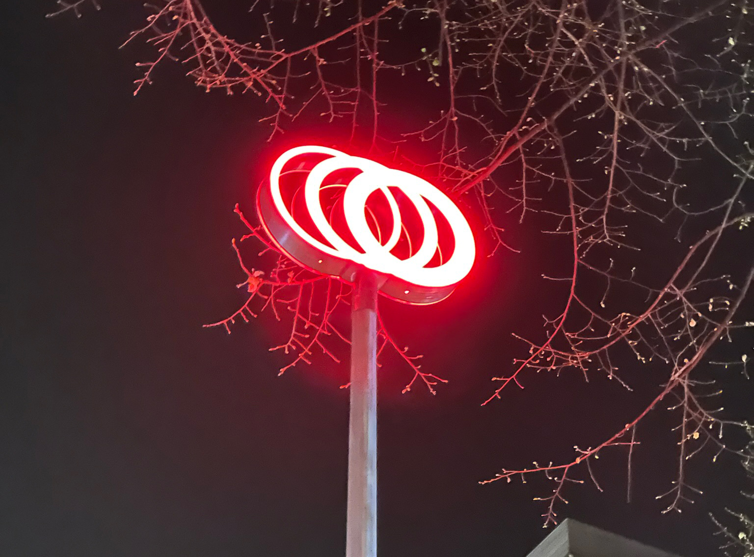
Photo: Ingrid Krauß, private
© Nigel Young / Foster + Partners
Photo: Ingrid Krauß, private
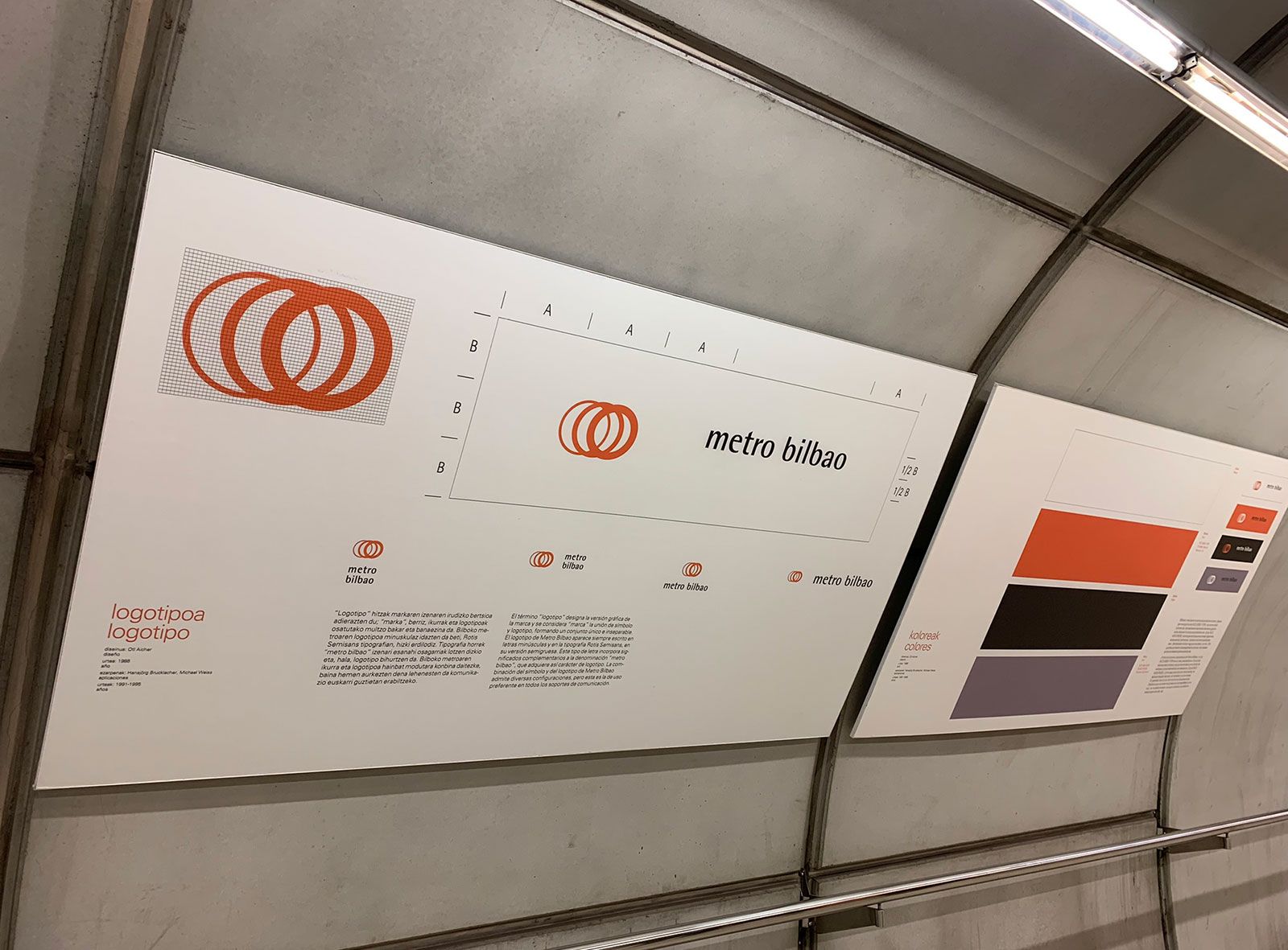
Photo: Ingrid Krauß, private
Photo: Ingrid Krauß, private
Photo: Ingrid Krauß, private
Photo: Ingrid Krauß, private
During the development phase, Aicher worked towards the network maps through a process of omission, with a grid of squares and diagonals in the background to provide structure. The result is an abstract network map that can be understood quickly.
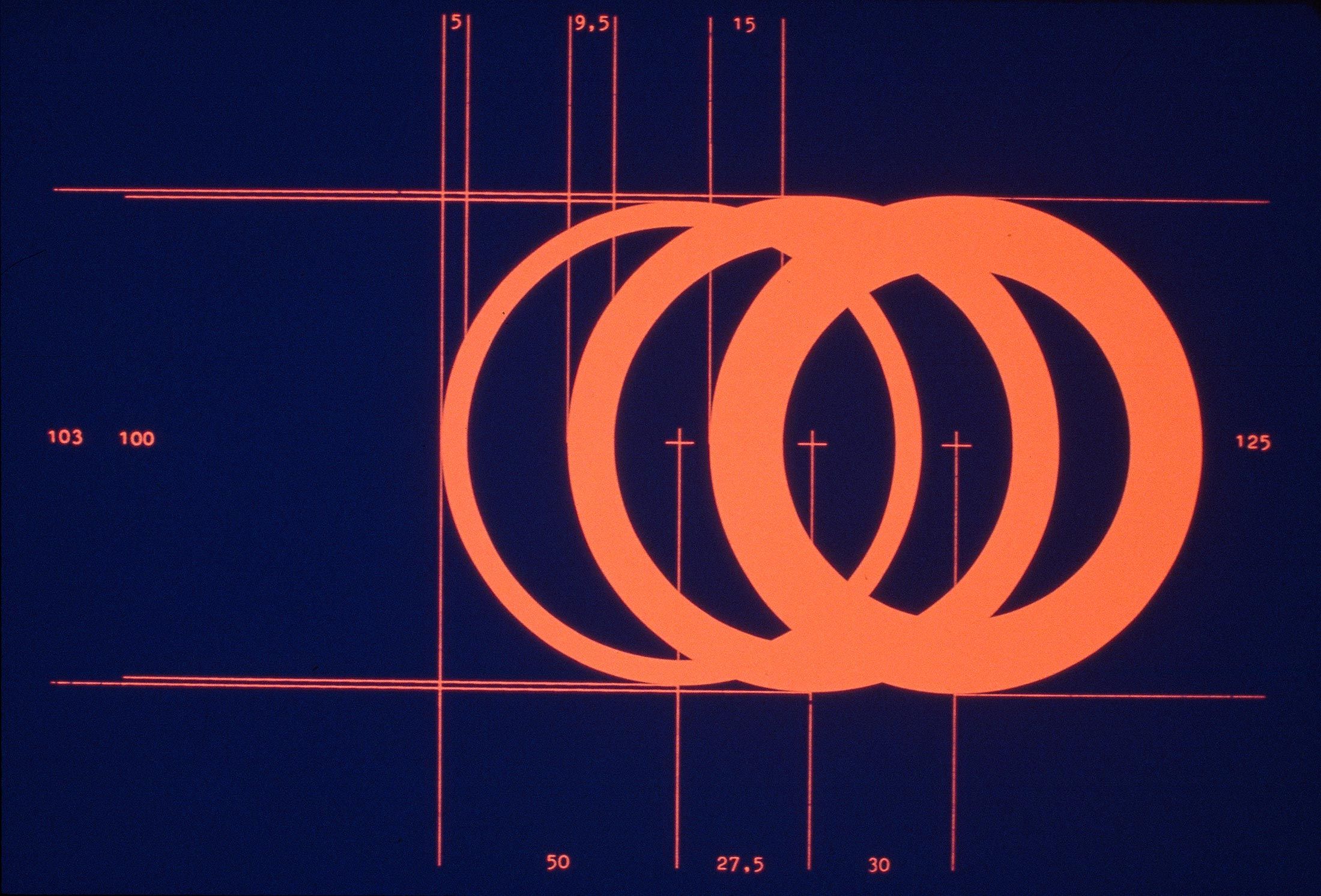
The three overlapping rings, the Metro Bilbao logo, were designed between 1988 and 1991 and selected as the official emblem when the Metro opened in 1995. According to Aicher they are intended to evoke tunnels, the wheels of the train and speed, as well as the zones of the metropolitan area that are connected by the network: city, industry and estuary. The different thicknesses of the rings represent snapshots of the wheel as the train approaches. They reinforce the association with motion and dynamism. On a red background, the rings were to be depicted in white. On a white background they were to be red.
In the course of the project, Aicher designed iconographic symbols that are specifically identified with Bilbao to supplement his existing pictograms. Similarly to the design of the metro, they were to reinforce the regional identity of the Bahía Bilbao. In this way, the connection between the city, port, industry, river and coastal region embodied by Bilbao’s metro system was to be established at a social level too.
Summary
The signage systems developed by Otl Aicher are part of a corporate design and the expression of a corporate identity, never merely a stringing together of signs. The transport facilities of Metro Bilbao and Munich Airport became aesthetic ensembles because, in both cases, the plans were developed in combination with the architecture and design. Right from the start, the signage system was assigned essential connecting functions to ensure that these facilities could be used optimally. The prerequisite for these masterstrokes was good interdisciplinary collaboration.
Aicher’s way of thinking and working becomes clear in the design of the pictograms that he used in all the projects mentioned. They show how he turned his attention to details without losing sight of the bigger picture. Starting from one design element, he kept the overarching system in mind. In this way, he created not just individual symbols but a coherent system.
In the architecture of Munich Airport, Aicher used the organising system of a grid of squares with corresponding diagonals for pictograms and sign modules. In the process, he developed another grid based on the 45-degree diagonals. This can be seen in the terminal floor plans, in the arrangement of the floor coverings and the tubular steel trusses for the signs in the terminals, as well as on the forecourts.
It is interesting to see how he uses colours in different contexts. For Frankfurt Airport he developed a colour system that structured the information according to the prioritisation at the time and thus succeeded in making both the complexity of the architecture and the volume of information manageable for users. In the Krupp hospital, colour is used for spatial orientation and gives rise to a lively atmosphere. At Munich Airport, it also performs the function of separating the administrative from the public spaces. In Bilbao it creates correlations in the urban space.
Today’s navigation apps are no substitute for the place-specific functions of the signage systems that Otl Aicher developed together with his office. But the question remains as to how analogue and digital systems can complement each other meaningfully in the future.
Claus Michael Semmler runs Werkstatt für Kommunikationsdesign in Hamburg. Among other things, the corporate designer’s company develops signage systems, including for the multi-storey car parks at Hamburg Airport or the Cruise Center Steinwerder.
Translation: Alison Du Bovis
They created the signature of an epoch: designers Otl Aicher, Willy Fleckhaus, Anton Stankowski and Kurt Weidemann.
The British architect Norman Foster on his friendship with Otl Aicher: He had absolute integrity.
Otl Aicher’s Dept. XI team: the visual identity of the Munich ’72 Olympics was the work of graphic designers, illustrators and technical staff from all over the world.