What’s become of Otl Aicher’s former abode? A visit to the Allgäu.

What’s become of Otl Aicher’s former abode? A visit to the Allgäu.
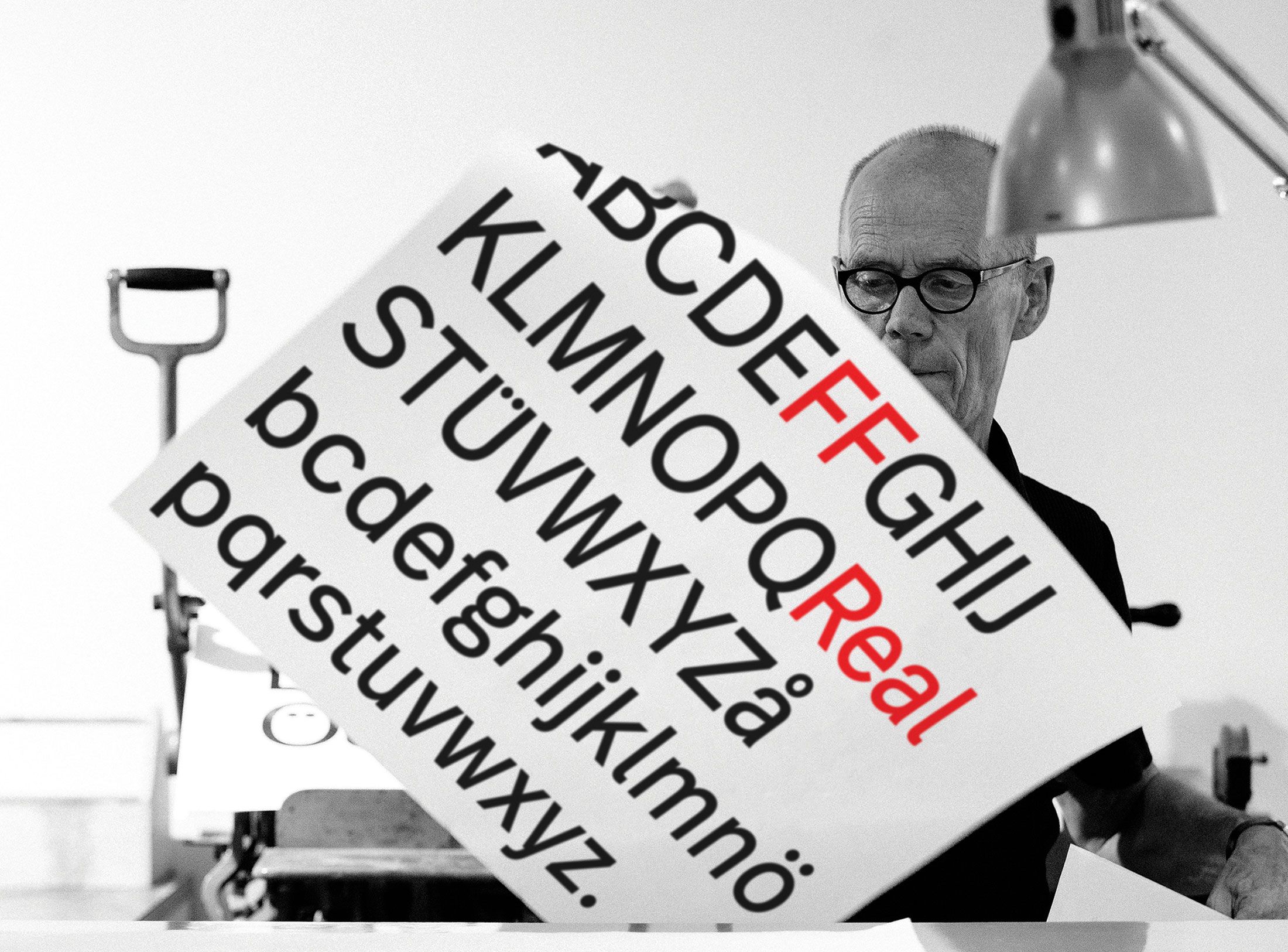
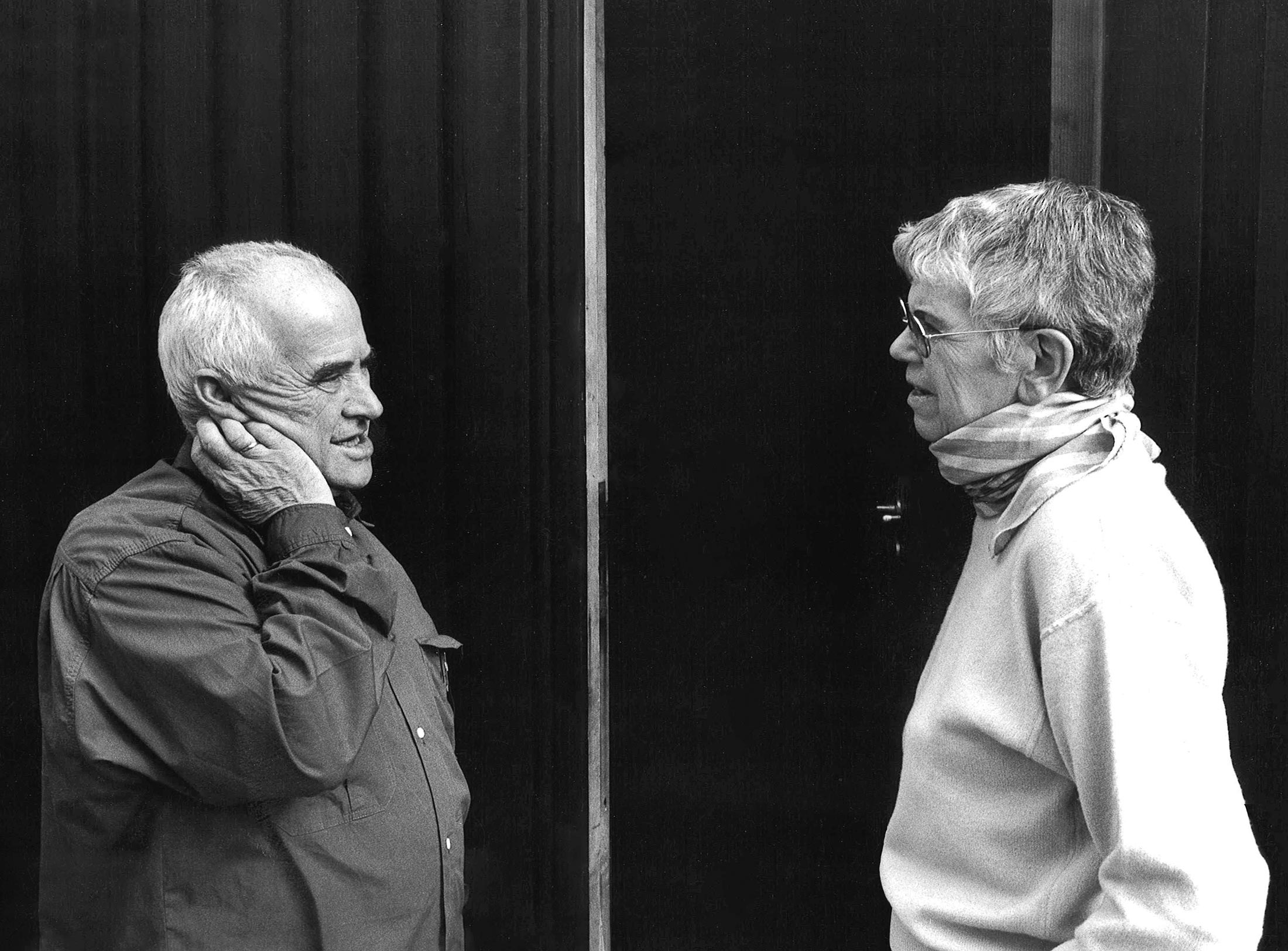
Interviewed: Erik Spiekermann, type designer, author and Aicher critic.
Technology: a central notion and fixed point of perspective in the work of Otl Aicher.
The British architect Norman Foster on his friendship with Otl Aicher: He had absolute integrity.
Thoughts on the colour palettes of Otl Aicher.

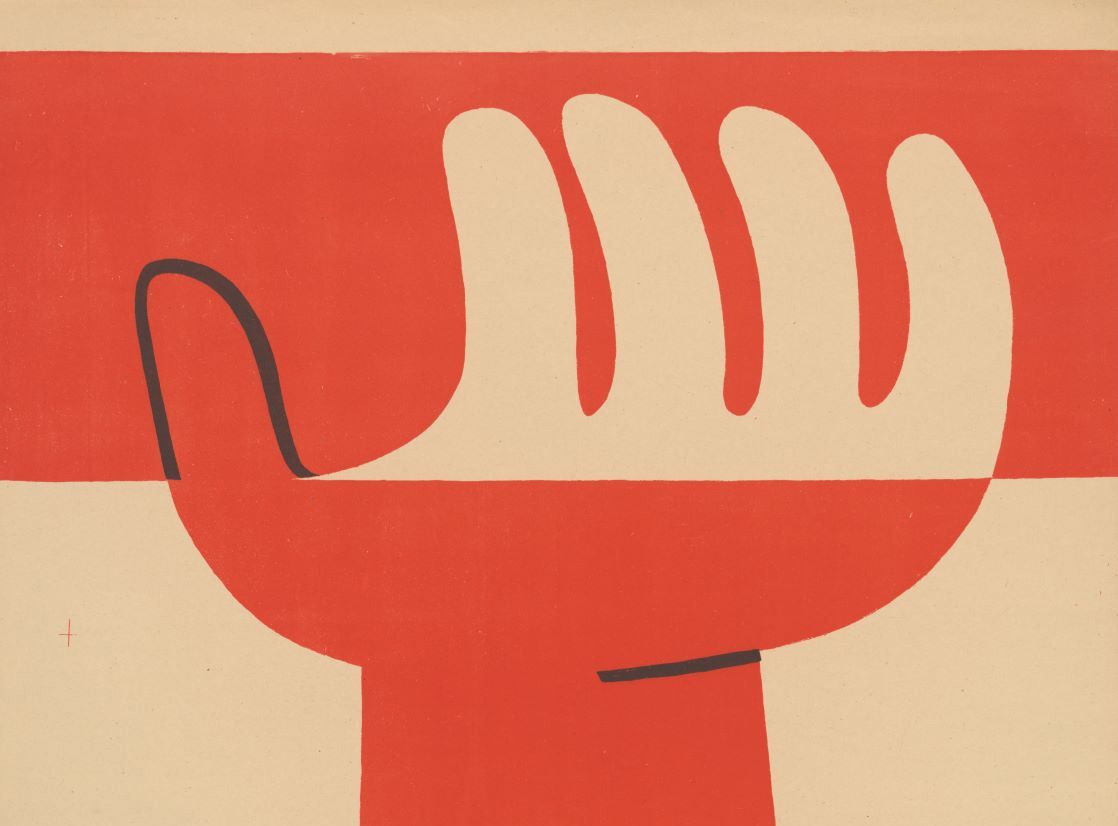
Absolute sharpness, reduction and strict rules determine the character of his pictures: Otl Aicher as photographer.

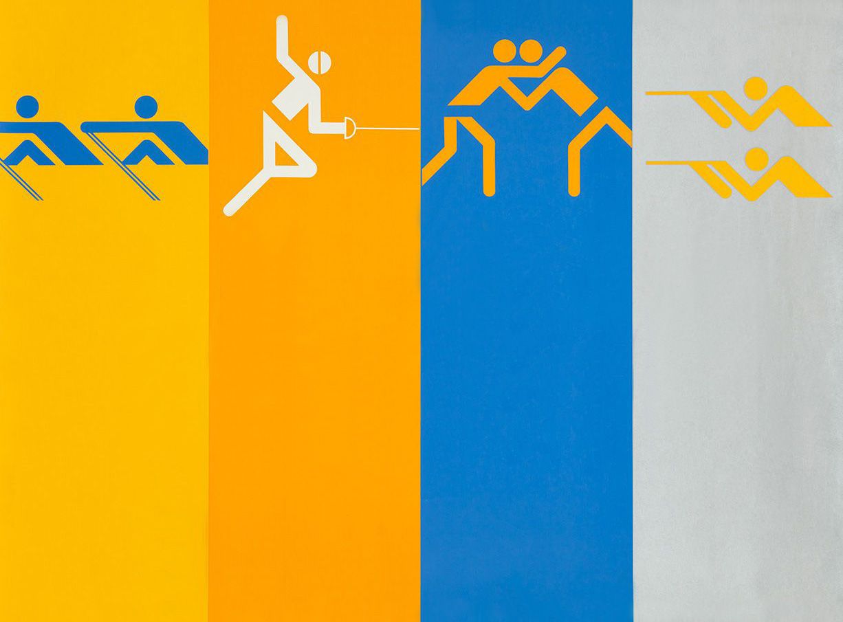
Under Otl Aicher’s direction, designers, architects and landscape planners shaped the face of the Olympic Games 1972.
Inge Aicher-Scholl preserved the legacy of the White Rose.
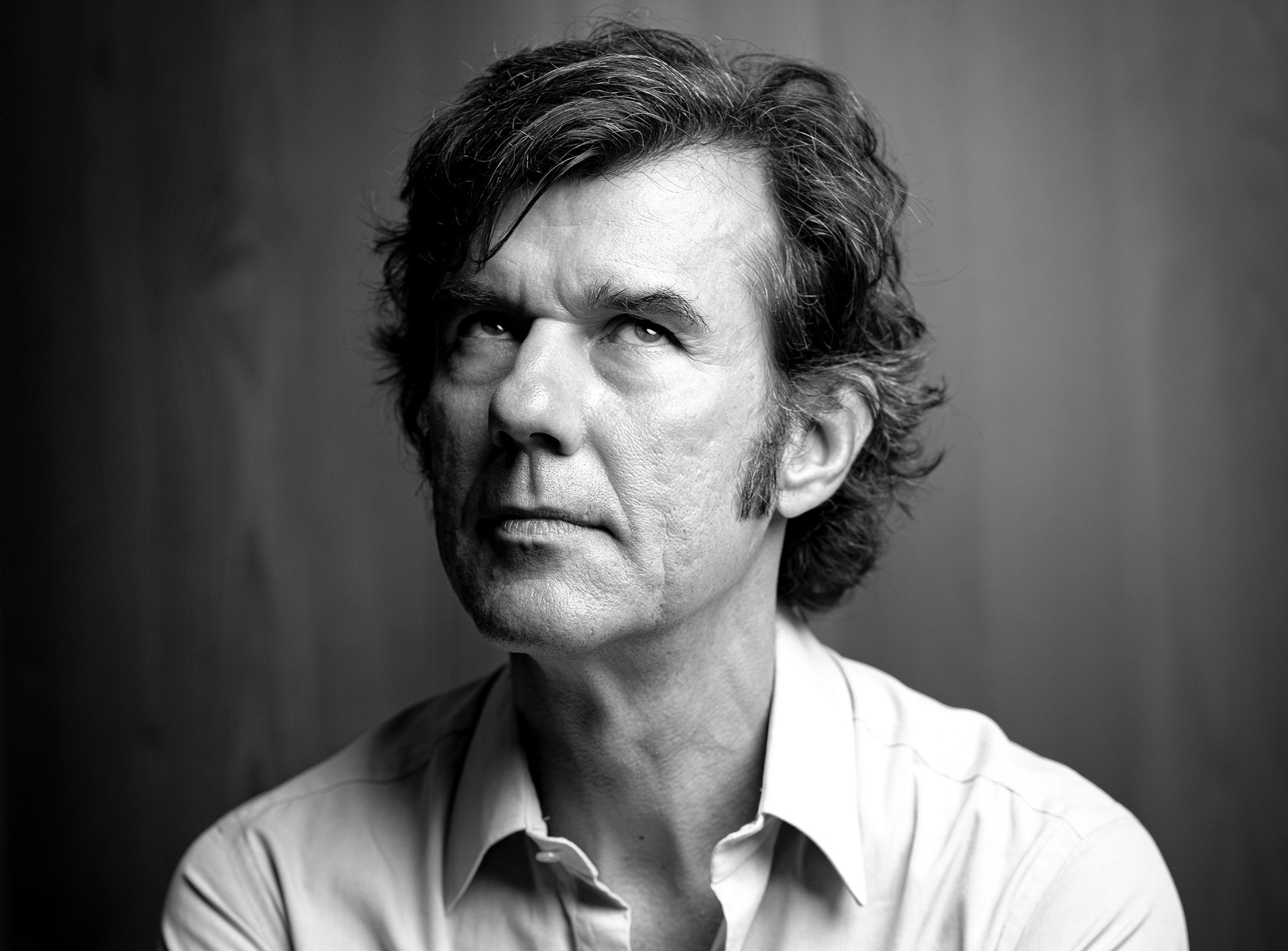
An interview with design icon Stefan Sagmeister about typefaces, beauty and the legacy of Otl Aicher.
The International Design Center Berlin (IDZ) invites you to a slide show and panel talk at Architektur Galerie Berlin on 20 October. Karsten de Riese and Prof. Michael Klar will report on a photo reportage commissioned by BMW that took them to Tunisia in 1975 together...
On the occasion of the 50th anniversary of the 1972 Olympic Games, the IDZ invites you to a discussion on the vision of the Munich Games and the status quo as well as the future of the Olympic movement on 26 August. The event at Berlin’s Akademie der Künste on Pariser...
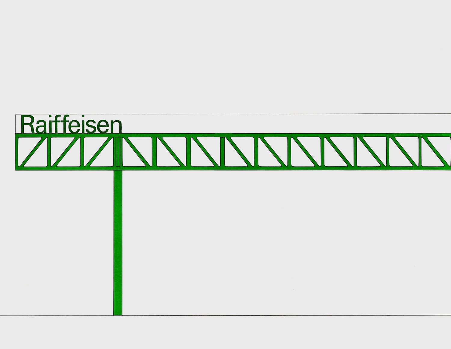
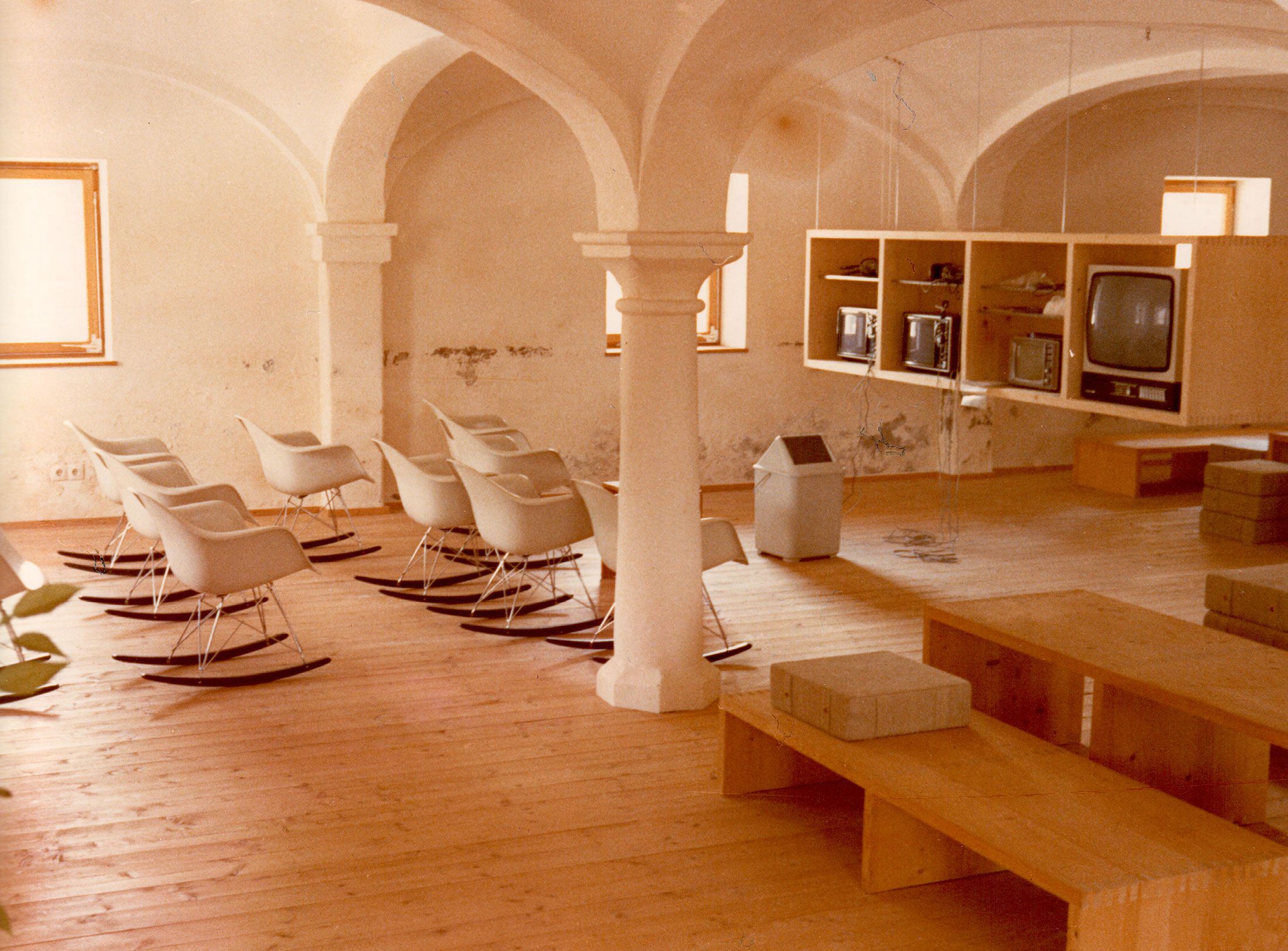
Isny im Allgäu owes Otl Aicher a corporate design that is concise, bold and singular.
With a retrospective of Otl Aicher’s book “kritik am auto – schwierige verteidigung des autos gegen seine anbeter” (Criticism of the Car – Difficult Defence of the Car against its Worshippers) published in 1984, the IDZ continues its series of events on the “otl...
Today marks the centenary of Otl Aicher’s birth. The International Design Center Berlin (IDZ) is taking this date as an opportunity to pay tribute to this great designer. With otlaicher100.de, a new online platform is being launched – a curated space that provides...
Reflections on Inge Aicher-Scholl and Otl Aicher.
The International Design Center Berlin (IDZ) is taking Otl Aicher’s centenary as an opportunity to pay tribute to this great designer and to make his work visible. An online platform and a series of events will address Otl Aicher’s multifaceted cosmos of topics and...
Eine Stadt leuchtet: Mit seinem farbenfrohen Erscheinungsbild der XX. Olympischen Sommerspiele 1972 setzte Otl Aicher ein Signal. Die junge Bundesrepublik war in der Moderne angekommen.
Otl Aicher’s Poster displays for the Ulmer Volkshochschule (Ulm Adult Education Centre).

From O to R: Let’s talk about a hedgehog, standardisation and neurotis for a change (please click on the letters).

Otl Aicher’s Dept. XI team: the visual identity of the Munich ’72 Olympics was the work of graphic designers, illustrators and technical staff from all over the world.

Aicher’s childhood and youth: the years 1922 to 1945.

Otl Aicher’s signage systems for airports, metro stations and hospitals are considered exemplary to this day.
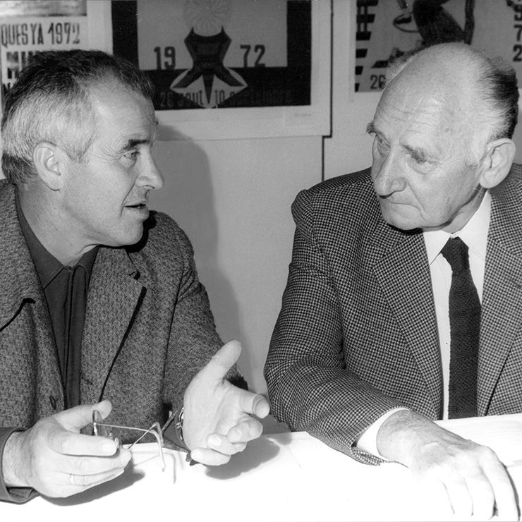
Der einstige Braun-Chef-Designer im Gespräch über den Co-Gründer der HfG.
A Broadcast: What is his place in today’s world?
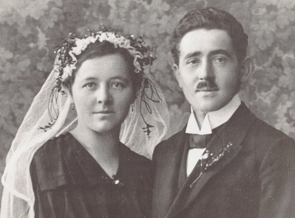
The Aichers: a brief family history.

Drawing in Rotis: former Aicher co-worker Reinfriede Bettrich talks about hand sketches, the first computers and everyday life at the office.

How Otl Aicher’s papers and materials came to the HfG-Archiv/Museum Ulm.

Die Küche zum Kochen (The Kitchen for Cooking) – the genesis of a book that has lost none of its relevance.
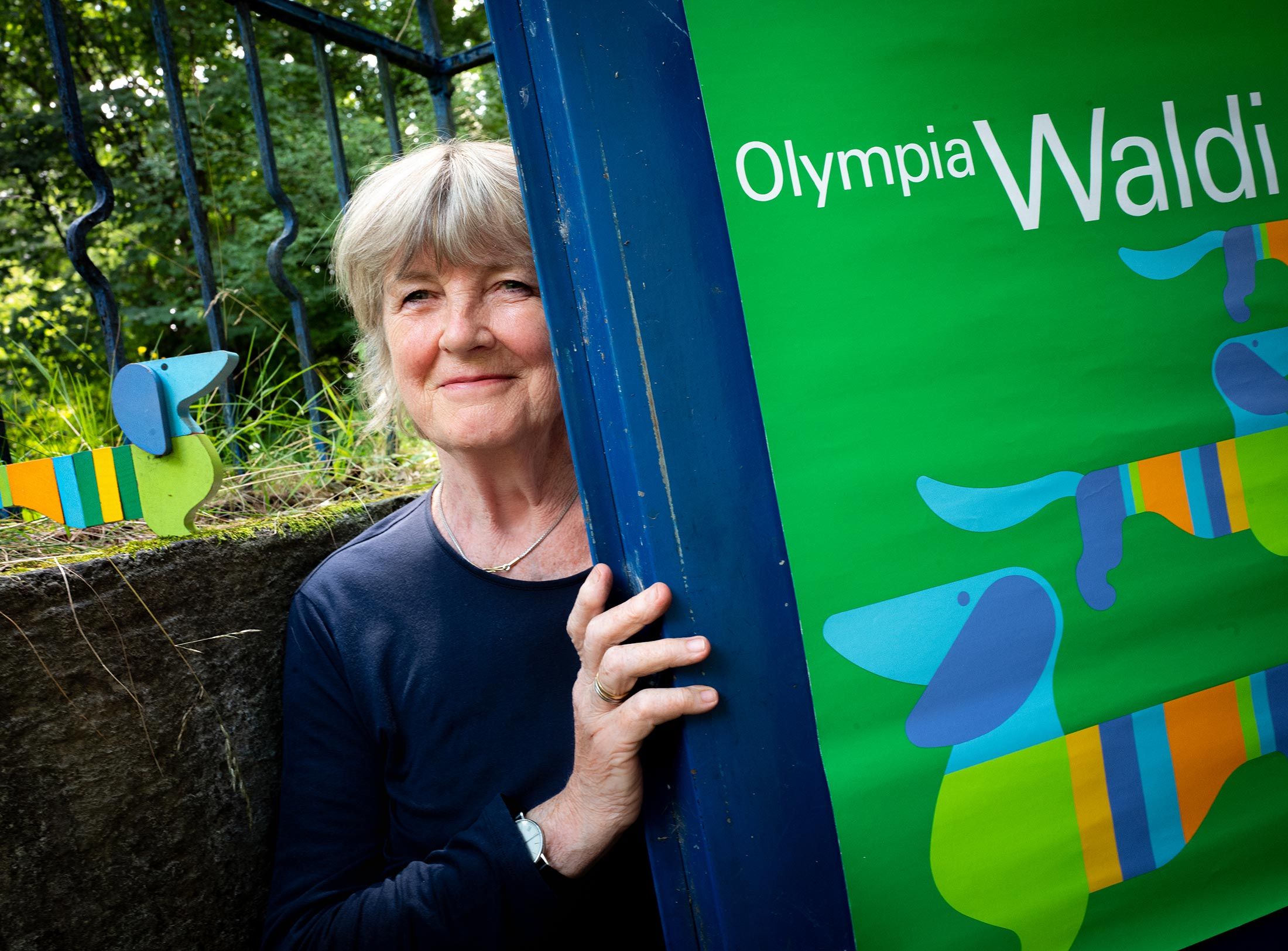
How a dachshund conquered the world: former Aicher staff member Elena Schwaiger on plush animals, fakes and the authentic mascot of the 1972 Olympic Games in Munich.
Le Violon d’Ingres or An Attempt to Defend the Writings of Otl Aicher.

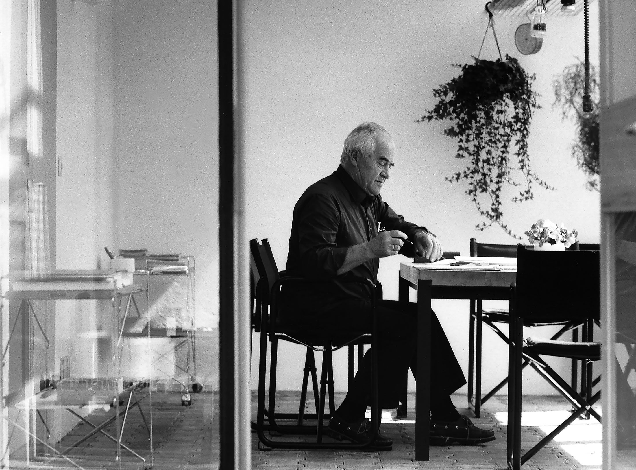
Otl Aicher as the architect of Rotis.
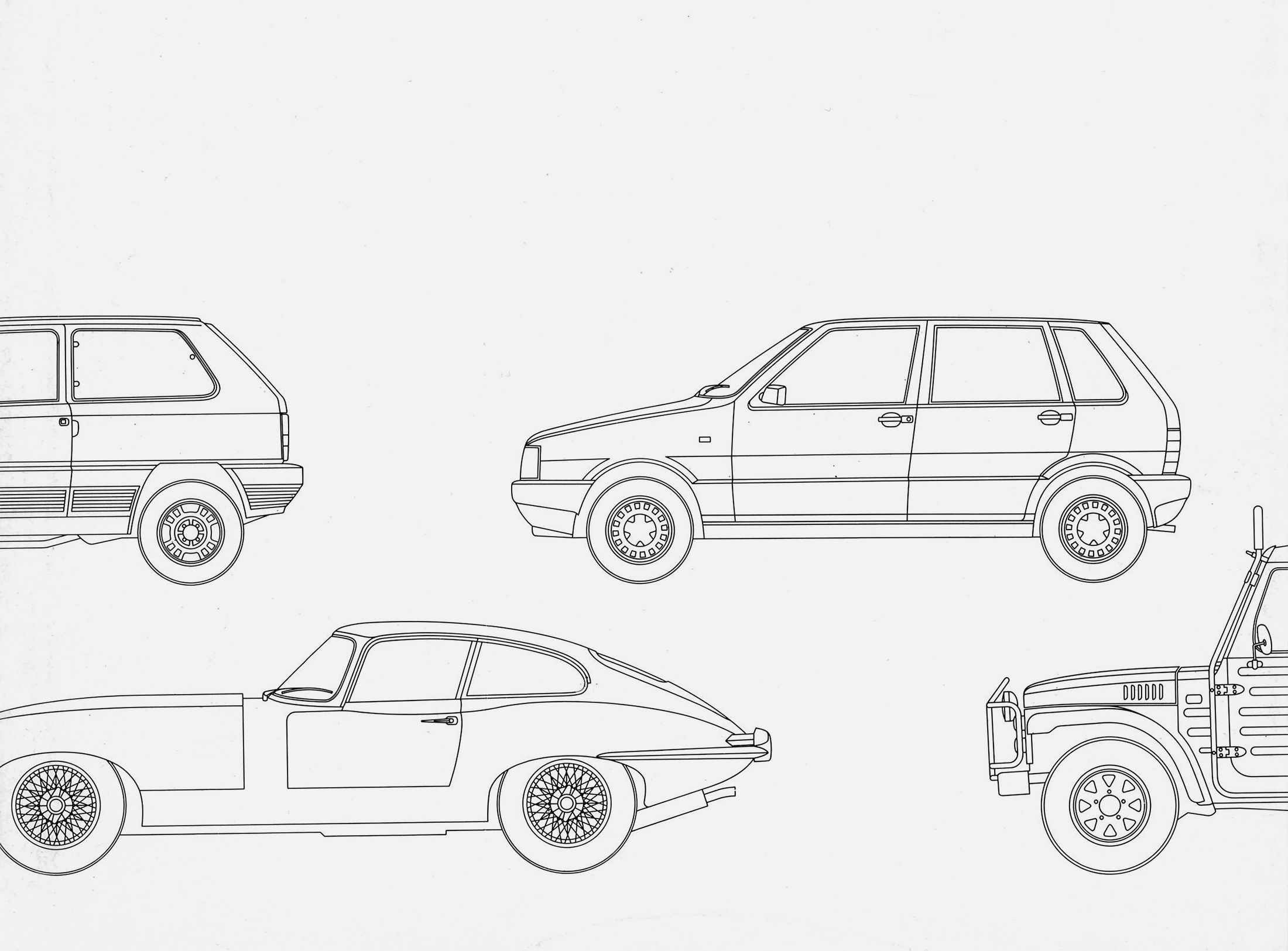
Otl Aicher and his critique of the automobile.

First broadcast: 15.02.1971 on Bayerischer Rundfunk, Munich (Only available in German).
Interviewed: Jürgen Werner Braun on his collaboration with Otl Aicher.
They created the signature of an epoch: designers Otl Aicher, Willy Fleckhaus, Anton Stankowski and Kurt Weidemann.
He ranks among the most prominent graphic designers of international repute: Stefan Sagmeister, Austrian by birth, has lived in New York for almost 30 years. He owes his fame to album cover designs for the Rolling Stones and Lou Reed, lectures, exhibitions and his film, Happy. At first glance, Sagmeister doesn’t seem to have much in common with Otl Aicher – but that’s precisely why we were so interested in how he sees the formative German designer. His answers are surprising.
The differences between your work and that of Otl Aicher are many and obvious: there are few designers who put as much of themselves into what they create as you do. Your designs are often personal, playful, experimental. Aicher’s work, on the other hand, stood for clarity and consistency – but as a person, he stepped back from it. It’s this contrast that makes me think this is going to be a very intriguing interview. When did you first come into contact with Aicher’s work?
I came across Otl Aicher in 1993, shortly after we’d opened our studio in New York. One of our first clients was a Japanese bathroom manufacturer for whom we were supposed to create an American identity. The bathroom manufacturer’s team included a manager from Germany who was a big Otl Aicher fan. So I went and got myself Aicher’s book on typography because I found him really interesting. On the client’s side it was clear that only one typeface came into question: it had to be Rotis. I didn’t have a problem with that stipulation and the entire corporate identity turned out great: clear, stringent, in a grid. I thought Aicher’s theories on typography were good – but what bothered me about the book was its large format and heaviness. It was meant for reading, after all: there were huge amounts of text in it. But who wants to read books sitting at a desk? I was really surprised that such a fundamental, function-based mistake could be made by a designer who focuses so much on function.
What do you think of Aicher as a person and designer?
I have very good feelings about him because of a film that showed him working on the design for the visual identity of the Munich Olympics – it really impressed me. The way he talks in front of the camera is very free and easy. I get the impression that our goals as designers are related in a certain way – although not the paths we take to reach them, obviously. But at the end of the day, it doesn’t matter whether I take a minimalist path or an eclectic one, only whether I approach the task at hand with lots of love and care. Before he died, I had several good discussions with Massimo Vignelli – Vignelli and Otl Aicher would have been much closer to each other in terms of their design approach – and in the case of Vignelli, who was strongly influenced by Swiss graphic design, there was always a bit of a twist despite the fact that everything was so pared down; there was a certain wit that made the way he dealt with typography, colours and surfaces special. I’m not sure whether many of the teaching staff at the HfG Ulm had Aicher’s attitude – his humour, his charm. My impression is that Ulm School of Design was pretty dogmatic in its teaching, along the lines of “there’s only one right way to do things”. And that some designers who were influenced by the HfG or connected with it in some way still have that attitude, even today.
Who, for instance?
Dieter Rams is one example. In Gary Hustwit’s film about him there’s a scene where Rams is at the Vitra Schaudepot, making fun of various things. Personally, I think the things he criticises are way better than all the furniture designs he’s done. If you ask me, it’s a real shame when somebody can’t accept anything but their own point of view. It’s a very blinkered attitude that’s just not contemporary any more. I might work in a totally different way, but when I look at Aicher’s work for the 1972 Games in Munich – it’s fantastic! Recently I even bought an Olympic poster from the Art series in an auction: the huge foot by Tom Wesselmann. Aicher gave the artists behind this series a lot of freedom for their designs, but at the same time the series fits in with the identity he developed, which conveys the source behind the posters very clearly thanks to the Olympic rings and the logo of the Munich Games, as well as the Univers font. But all in all, the reason that Wesselmann’s foot makes such a strong impact is that it enters into a dialogue with Aicher’s corporate design. The mascot was very appealing too – Waldi the dachshund. There are very few examples of good Olympic mascots.
With a huge project like that there are often a lot of different people who have a say in the decisions – and it’s not uncommon for that to water the design down …
That’s true. We once did a logo for New York City’s Olympic bid – in fact, we even won the competition. Then they took the logo away from us and anther agency was forced to imitate our design. It was an impossible situation for everyone involved. I didn’t even care, because I didn’t think our logo was any good! (laughs) But the last thing I wanted was to do a huge job that wasn‘t good. The brief was so narrow that our design was the only thing that actually worked – and back then I was still too young and inexperienced not to accept the brief or to interpret it more freely. Later, during the period when we were creating lots of identities, I would have loved to take on bigger projects. Like American Airlines, for instance – in terms of size, it would have been similar to Aicher’s work for Lufthansa. But at that time, from the mid-1990s until about 2010, major companies only gave jobs like that to big branding agencies – who often ended up making a mess of things. In the decades prior to that, Otl Aicher, Saul Bass or Paul Rand had it easier because they were able to implement huge identities on their own or with a small team. And if you look at the logos of real global players – Coca-Cola, Nike or Google, for instance – all of them were designed by a single individual. In my opinion, small studios are much better at focusing a brand than a big, international conglomerate. The corporate identities that have been done by big agencies in recent years and turned out to be any good – well, the responsibility for those project was transferred to a single person. And crucially, the designs weren’t turned over to huge teams, where everything often gets ruined. But I think even big firms have meanwhile understood that they get better advice from small or medium-sized studios than from international branding agencies. Being a good client is difficult!
Photo: Sagmeister Inc
Otl Aicher’s little studio in Rotis is still a good example for illustrating your theory. He was in a position where he could send anybody off to do their homework before he got down to work, even CEOs: he wanted them to think about their company, what it stands for, what’s special about it, what direction it should develop in. Only when the entrepreneurs had a clearer picture of those things themselves did Aicher start giving them more focused advice and designing for them. And in most cases he had them come to Rotis – which is very off the beaten track. As a studio location, Rotis is a stark contrast to where you work in the heart of New York. Don’t you sometimes feel the need for solitude and quiet in order to be able to work?
Yes, I need that too. That’s why I take sabbaticals when I don’t take any jobs on for a year and just experiment – far away from New York. Unfortunately I never got to meet Otl Aicher, but I’m quite sure that he deliberately chose Rotis because a lot of things are probably simpler in the seclusion of the Allgäu. There are no distractions and you can concentrate completely on designing. I know places like that where I come from, of course, in the Vorarlberg region of Austria. Even today, the area still has little design firms in tiny places that do some really great work. But I don’t want to romanticise it. I don’t know all that much about those firms. It could well be that they’re stressed out and work day and night too. (laughs)
One fundamental thing that you and Aicher share is your striving for an independent, self-determined way of working in a small team.
That’s very definitely the case, especially the bit about a small team – that should be double-underlined. I prefer to work with five people or fewer. I put a small team together for every single project; every now and again it might just be two people- but never actually just me. In a small team, everybody has responsibility and knows what they have to do – and there are nowhere near as many of the interpersonal problems that you get in big teams.
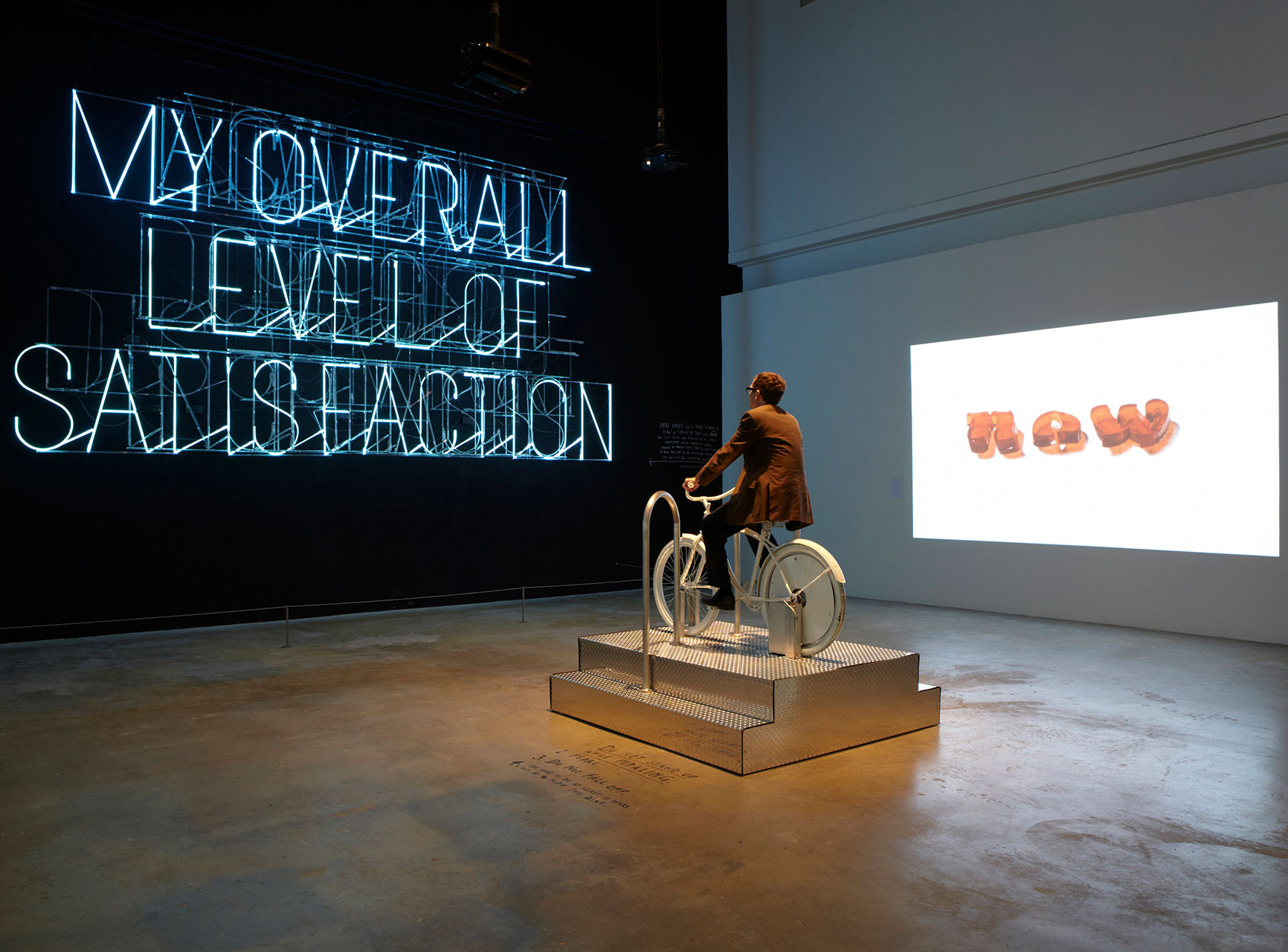
Photo: Sagmeister Inc
Another area where I see a certain similarity between Aicher and you is that you both reflect on your own work and take a position on social issues. Several of Aicher’s books that aren’t explicitly about design, like gehen in der wüste (Walking in the Desert) or kritik am auto (Critique of the Automobile) address political questions in a very personal way and make the shaping of society their central theme. And you were strongly influenced by Tibor Kalman – who, as editor-in-chief of Colors magazine, addressed sensitive issues like genetic engineering, AIDS, mindless consumption or pollution.
I like it when I see somebody putting everything they’ve got into something and doing it with energy and enthusiasm, especially if they’re as talented as Otl Aicher; I like seeing somebody give everything to do something as well as they possibly can. Because you sense that in the finished work – whether it’s design, architecture, art or music. Functionality plays a huge role in what we do at our studio too. It really matters to me that the things we create do what they’re supposed to. With The Happy Film, for instance, it was important to me for us to make a film that is really watchable, that lasts more than 90 minutes without getting boring. It’s the same with my exhibitions: what matters to me is that I take people with me. I want them to be able to follow me. That’s why I spent weeks working on the texts so that they convey exactly what’s necessary in the shortest, clearest way possible. It’s a similar story when I’m designing a graphic – even if it looks complicated at first glance, it’s the clarity of what it expresses that counts. Sometimes, at my lectures, I come across students who think we do whatever we want – regardless of what comes out of it in the end. The main thing is for it to look cool. But that’s not what it’s all about, obviously.

Photo: Sagmeister Inc
I’m sure this functional aspect of your work isn’t clear to a lot of people.
Yes, and we invest a lot of time in establishing that functionality. On the other hand I’m firmly convinced that pure functionalism that isn’t concerned about anything but the function doesn’t lead to good work. Designs like that often don’t work because they’re too boring, too cold; they can often seem off-putting or inhuman. You can see that in architecture – just think of the prefab high-rises of the 1960s and 70s – as well as in graphic design – the international corporate style of the 1980s is a prime example. As far back as a 1950s lecture, Max Bill was already making the case that function and beauty should be given equal weight; he advocated elevating them to the same level in order to produce good work. Because beauty is a function in itself. In my opinion, that was occasionally forgotten in Ulm.
But as illustrated by numerous examples, the principle of simplicity can definitely give rise to something beautiful.
Absolutely! Look at this wonderful piece of graphic art on my office wall by Ellsworth Kelly. It doesn’t get any simpler than that! By comparison, even Otl Aicher is complex. (laughs) And on the other side of the room there’s a Tadanori Yokoo – who is compositional but more complicated. For me, both works are truly beautiful. And to come back to Max Bill: I can see that his goal was to create something beautiful – just think of his watches for Junghans. And I also believe that there were people in Ulm who thought that, if they could achieve optimal functionality, the design would automatically be beautiful. That would be a misguided interpretation of form follows function. But I don’t believe that’s the case. There’s more to it than that: creating beauty has to be a clear objective. For a long time now, a lot of designers have been distancing themselves from the notion of beauty and seeing themselves as nothing but “problem-solvers”. And yet the creators of modernism, artists and designers alike, had a great affinity with form. If you think of creatives who were associated with the Bauhaus, like Loos, or the protagonists of American modernism – things like form, colours, composition and balance were incredibly important to them. Any aesthetic element that leads to something beautiful played a major role. In the second half of the 20th century, the principles of modernism were often misinterpreted as economic functionalism. That’s what brought all the flaws and problems to light – especially when it comes to architecture and urban planning.
One final question: in your experience, how is Aicher’s work seen in the US today?
I think Aicher is still hugely influential in Central Europe today; but in my opinion his influence doesn’t go any further than that. In America, for instance, Aicher’s forerunners, such as the Swiss Style protagonists, are still influential. And the Basel School in particular is a lot more important than the HfG Ulm as an institution. Some of today’s prominent American designers studied in Basel before returning to the USA, sometimes to teach. Perhaps it’s because of that; maybe that explains why the ideas of Swiss designers like Max Bill, Josef Müller-Brockmann, Armin Hofmann and Wolfgang Weingart had more of an impact in America.
Stefan Sagmeister was born in Bregenz, Austria, in 1962 and studied graphic design at the University of Applied Arts in Vienna before winning a Fulbright Scholarship at the prestigious Pratt Institute in New York. In 1993 Sagmeister founded his own business in Manhattan, the graphic design studio Sagmeister Inc. The much-acclaimed Austrian made a name for himself with works in which he often staged type three-dimensionally and has won more than 200 accolades for his designs. His CD covers have received no fewer than six nominations for the sought-after Grammy Award and won twice. Thanks not just to his work for bands and musicians like the Rolling Stones, Aerosmith and Talking Heads, but also to his numerous lectures at conferences, exhibitions on big issues like happiness and beauty, and his documentary The Happy Film, his fame has spread well beyond the design scene to a much wider public. www.sagmeister.com
Translation: Alison Du Bovis
They created the signature of an epoch: designers Otl Aicher, Willy Fleckhaus, Anton Stankowski and Kurt Weidemann.

First broadcast: 15.02.1971 on Bayerischer Rundfunk, Munich (Only available in German).
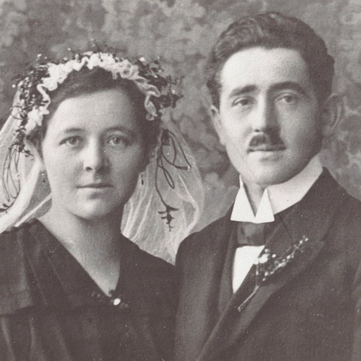
The Aichers: a brief family history.