What’s become of Otl Aicher’s former abode? A visit to the Allgäu.
What’s become of Otl Aicher’s former abode? A visit to the Allgäu.
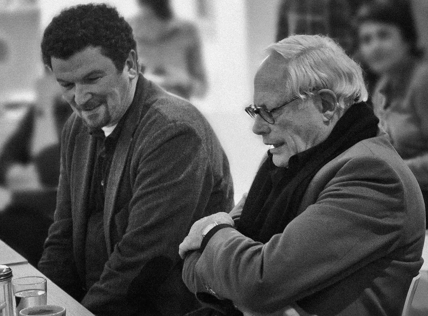
Interviewed: Erik Spiekermann, type designer, author and Aicher critic.
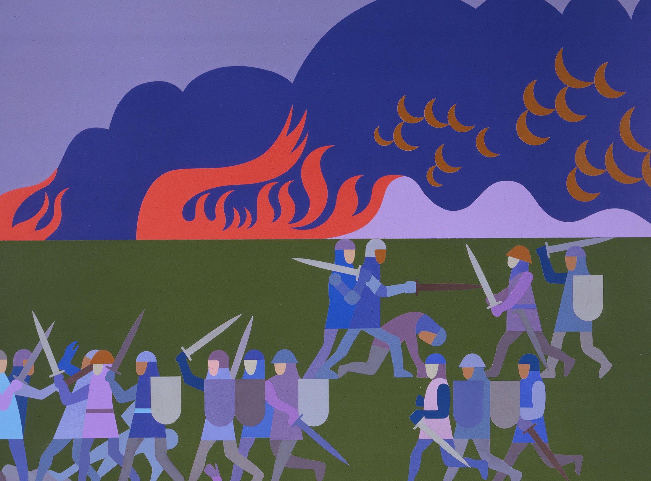
Technology: a central notion and fixed point of perspective in the work of Otl Aicher.
The British architect Norman Foster on his friendship with Otl Aicher: He had absolute integrity.
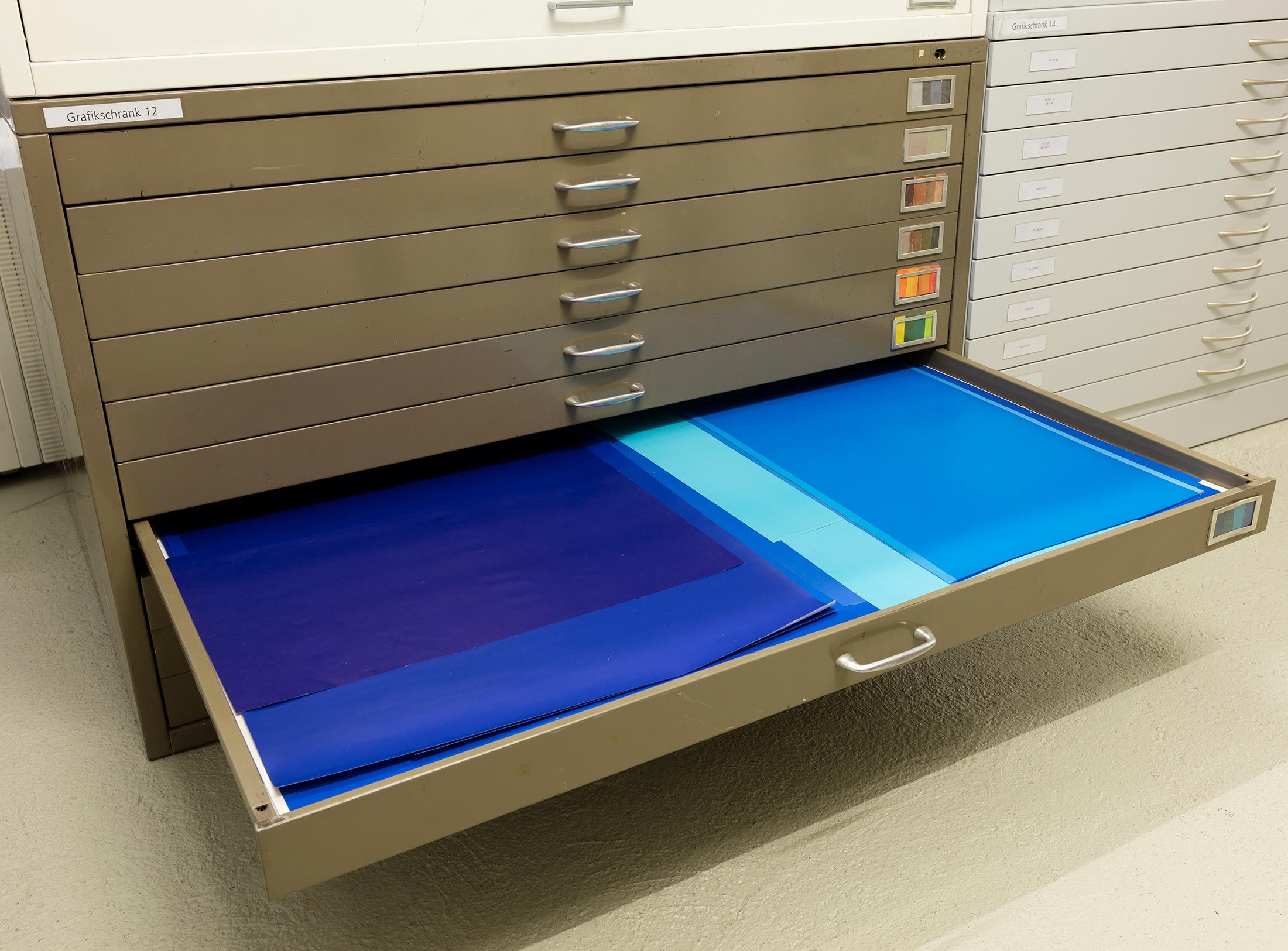
Thoughts on the colour palettes of Otl Aicher.
Absolute sharpness, reduction and strict rules determine the character of his pictures: Otl Aicher as photographer.
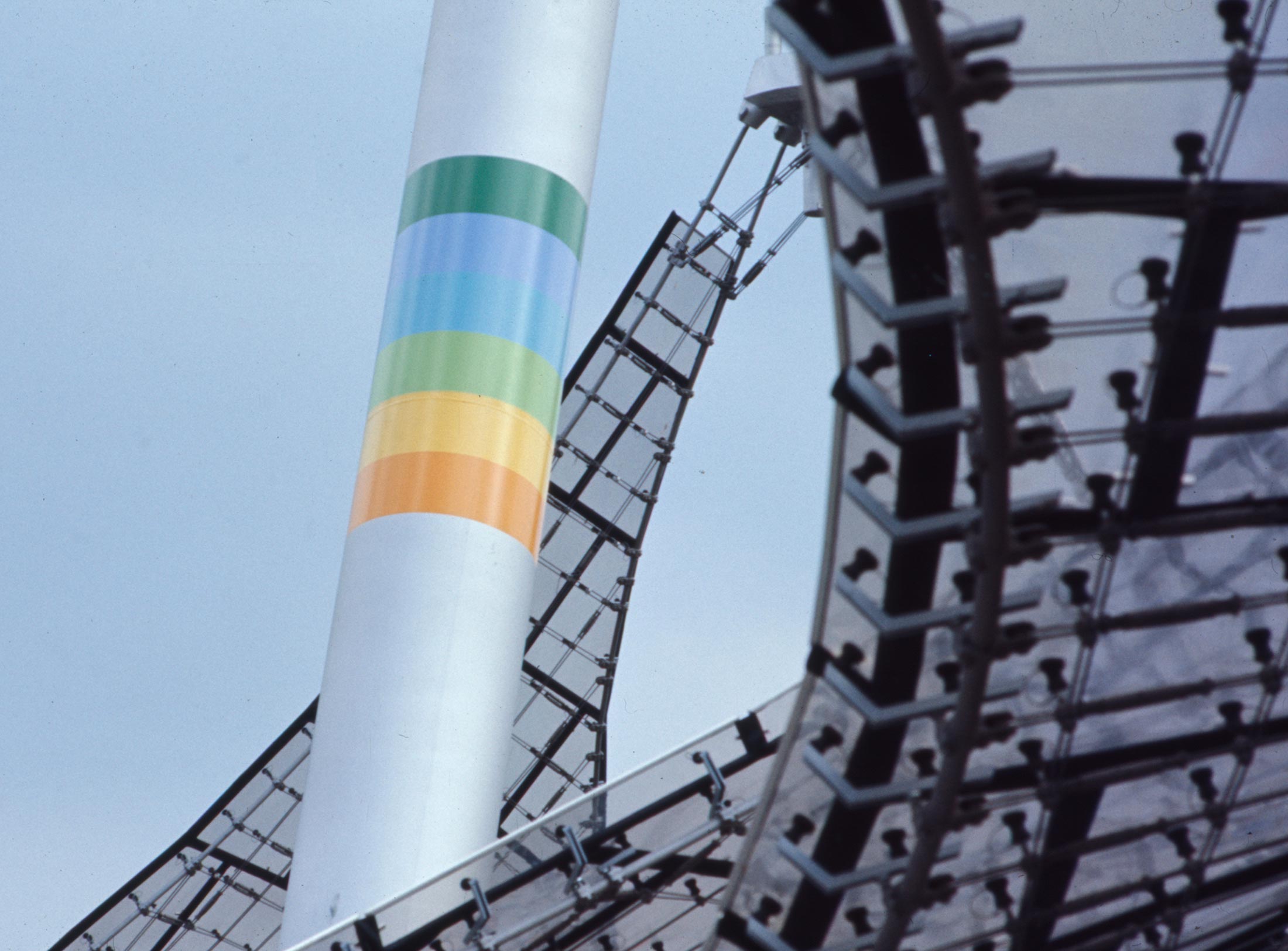
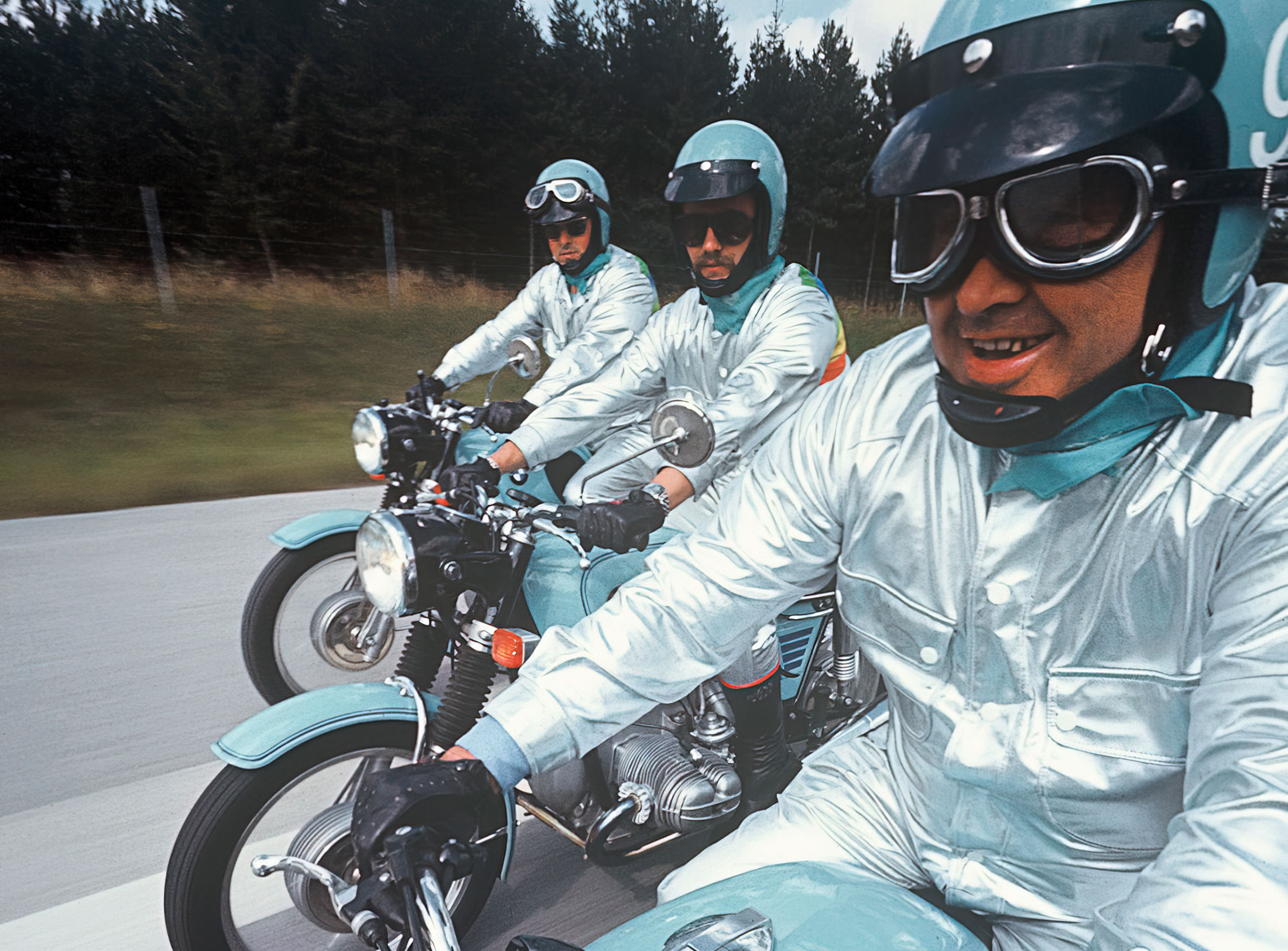
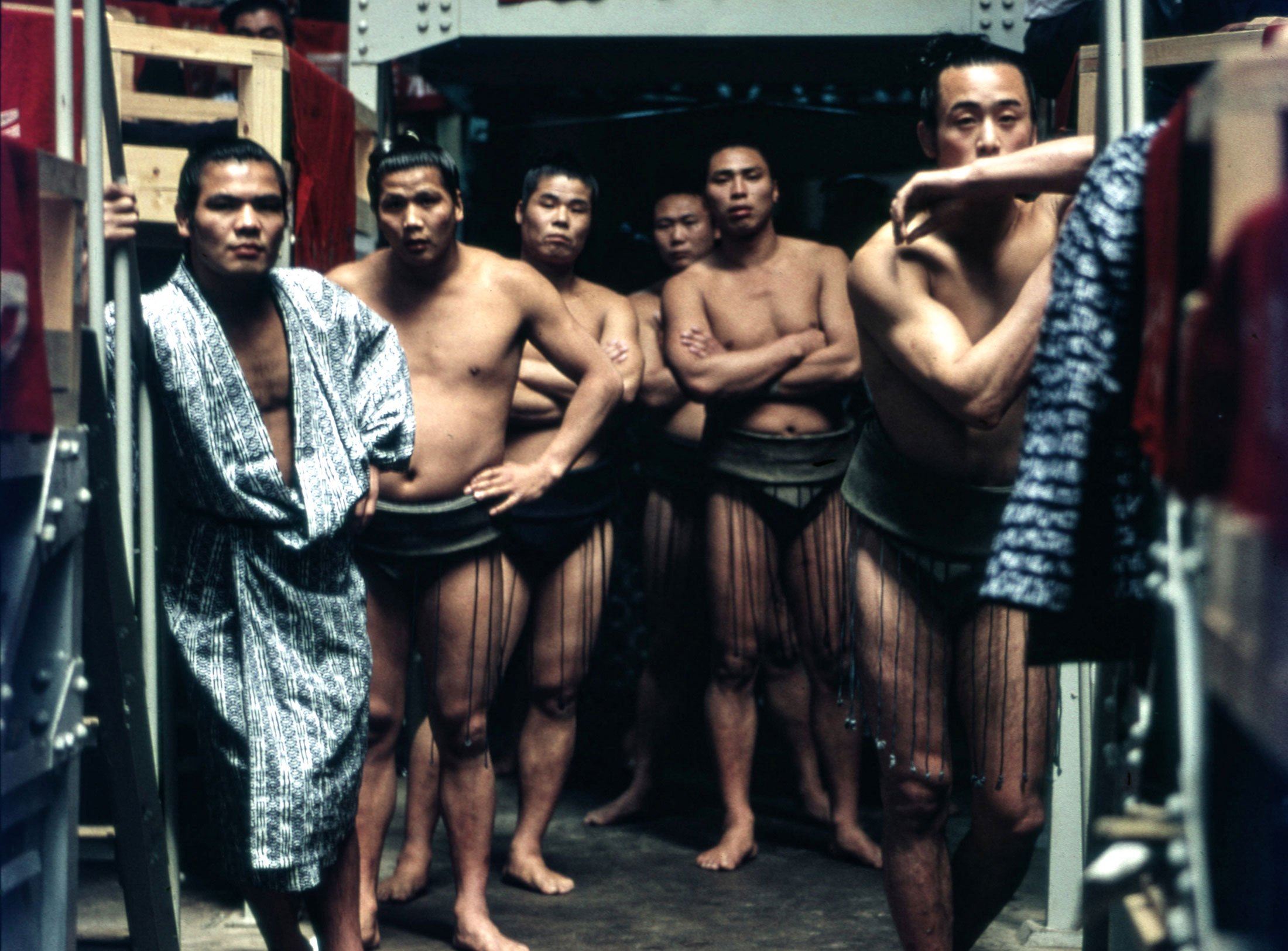
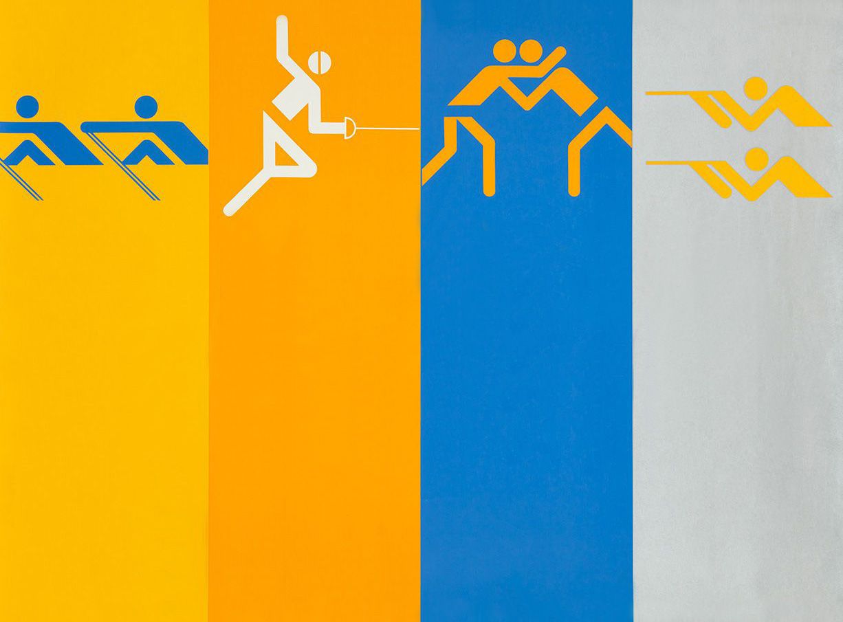
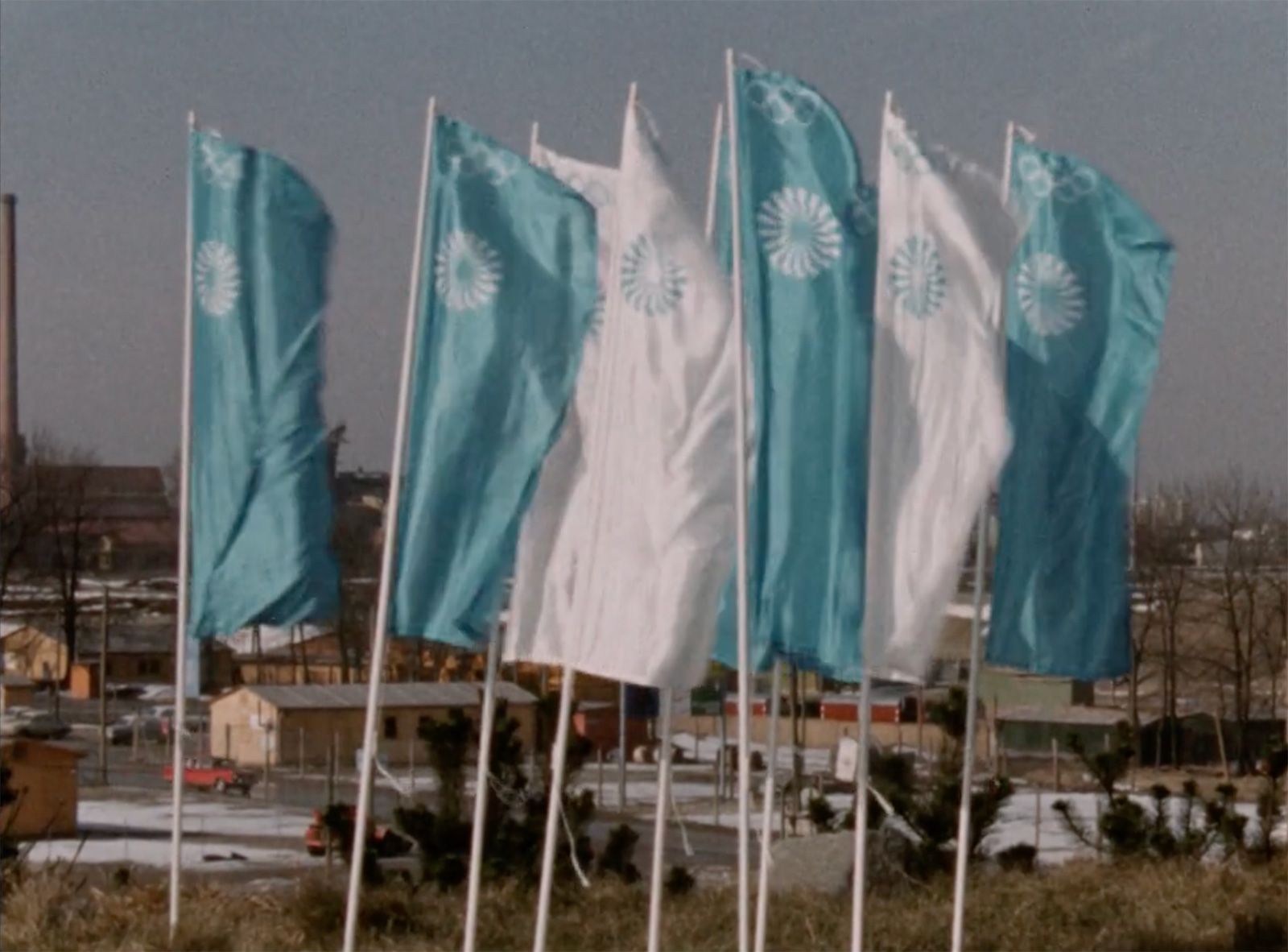
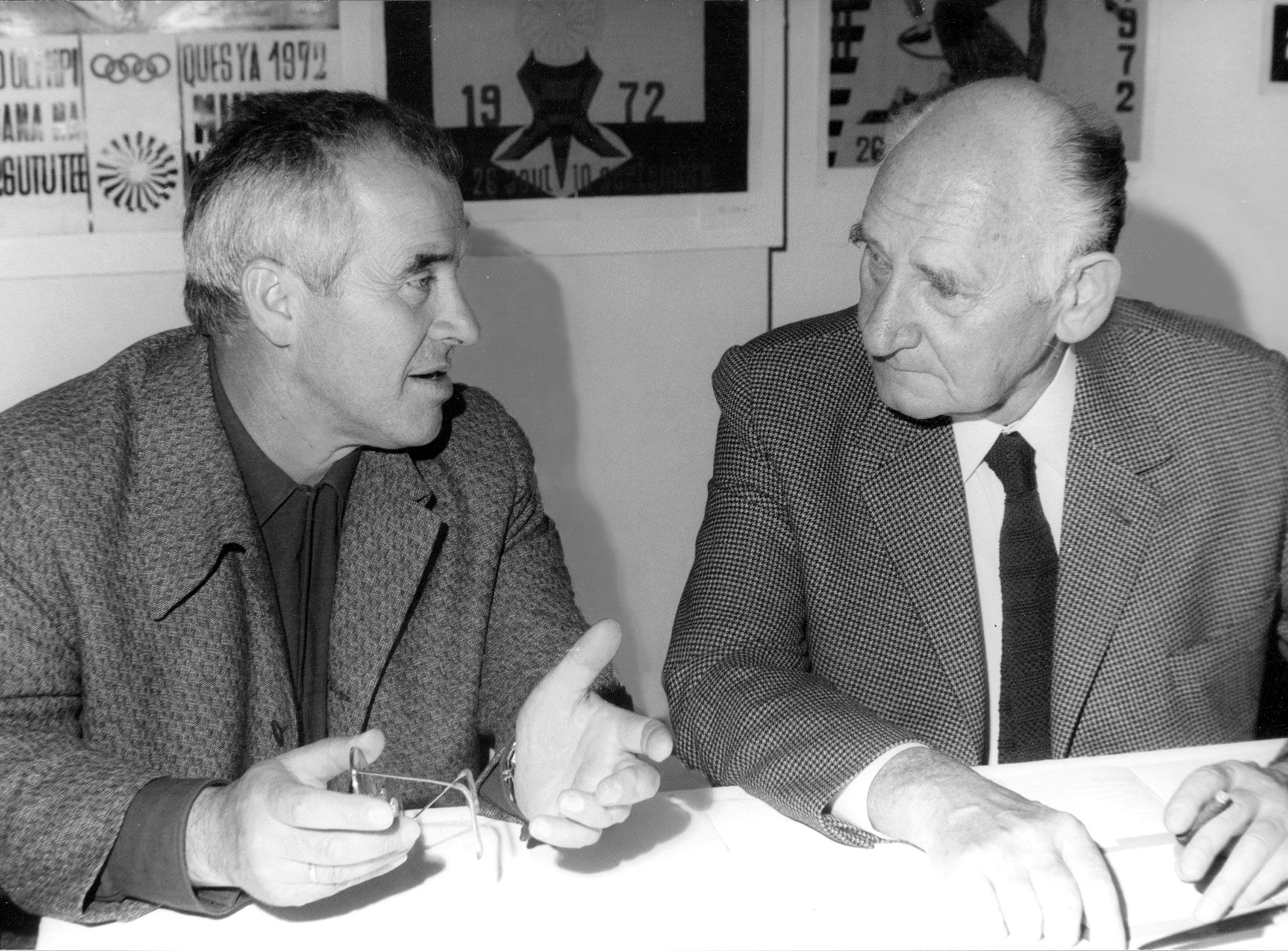
Under Otl Aicher’s direction, designers, architects and landscape planners shaped the face of the Olympic Games 1972.
Inge Aicher-Scholl preserved the legacy of the White Rose.
An interview with design icon Stefan Sagmeister about typefaces, beauty and the legacy of Otl Aicher.
The International Design Center Berlin (IDZ) invites you to a slide show and panel talk at Architektur Galerie Berlin on 20 October. Karsten de Riese and Prof. Michael Klar will report on a photo reportage commissioned by BMW that took them to Tunisia in 1975 together...
On the occasion of the 50th anniversary of the 1972 Olympic Games, the IDZ invites you to a discussion on the vision of the Munich Games and the status quo as well as the future of the Olympic movement on 26 August. The event at Berlin’s Akademie der Künste on Pariser...
Isny im Allgäu owes Otl Aicher a corporate design that is concise, bold and singular.
With a retrospective of Otl Aicher’s book “kritik am auto – schwierige verteidigung des autos gegen seine anbeter” (Criticism of the Car – Difficult Defence of the Car against its Worshippers) published in 1984, the IDZ continues its series of events on the “otl...
Today marks the centenary of Otl Aicher’s birth. The International Design Center Berlin (IDZ) is taking this date as an opportunity to pay tribute to this great designer. With otlaicher100.de, a new online platform is being launched – a curated space that provides...
Reflections on Inge Aicher-Scholl and Otl Aicher.
The International Design Center Berlin (IDZ) is taking Otl Aicher’s centenary as an opportunity to pay tribute to this great designer and to make his work visible. An online platform and a series of events will address Otl Aicher’s multifaceted cosmos of topics and...
Eine Stadt leuchtet: Mit seinem farbenfrohen Erscheinungsbild der XX. Olympischen Sommerspiele 1972 setzte Otl Aicher ein Signal. Die junge Bundesrepublik war in der Moderne angekommen.
Otl Aicher’s Poster displays for the Ulmer Volkshochschule (Ulm Adult Education Centre).
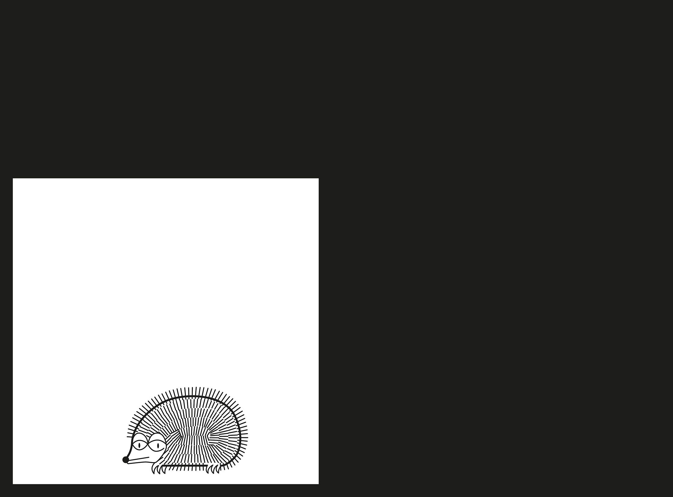
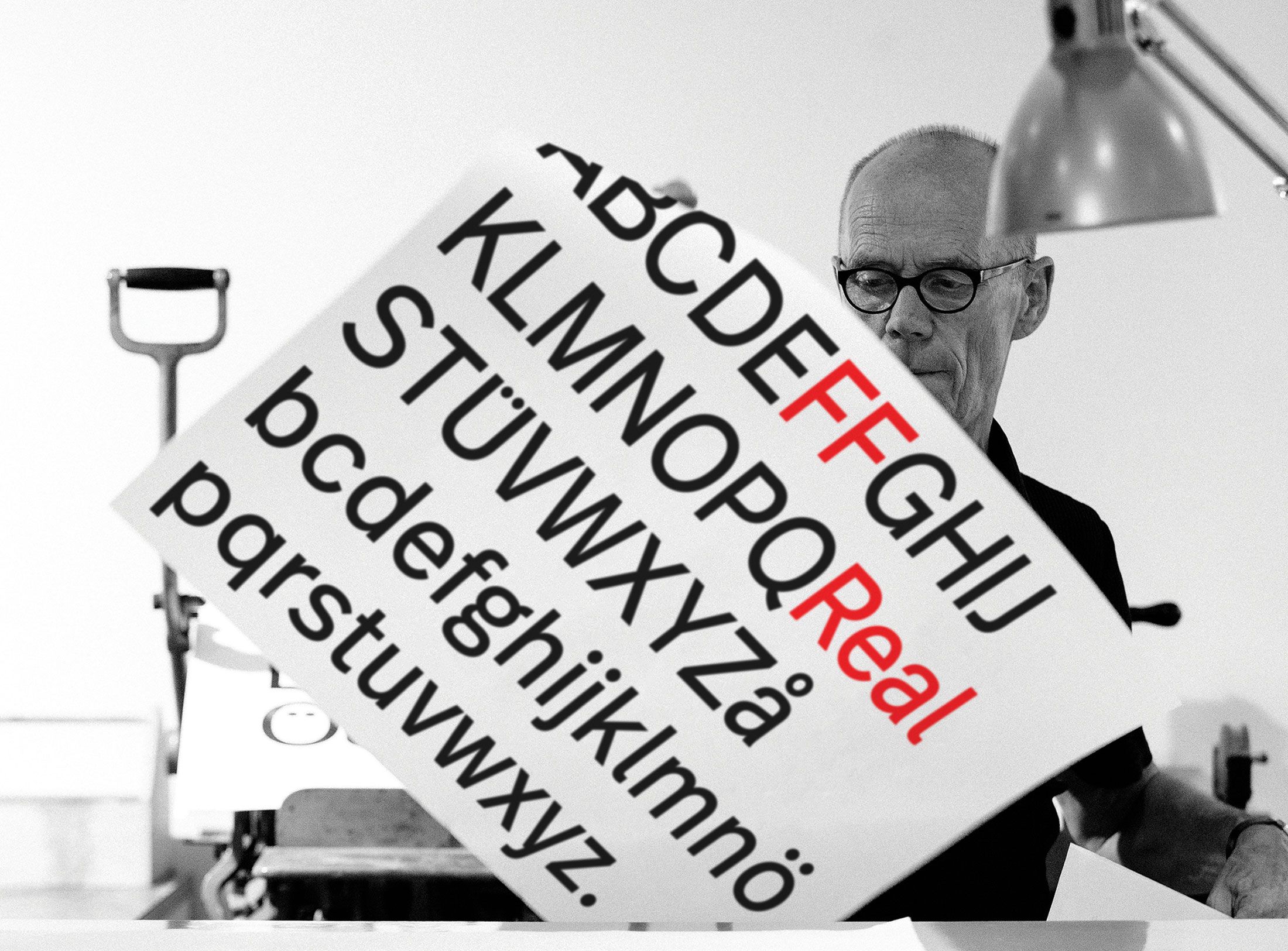
From O to R: Let’s talk about a hedgehog, standardisation and neurotis for a change (please click on the letters).

Otl Aicher’s Dept. XI team: the visual identity of the Munich ’72 Olympics was the work of graphic designers, illustrators and technical staff from all over the world.
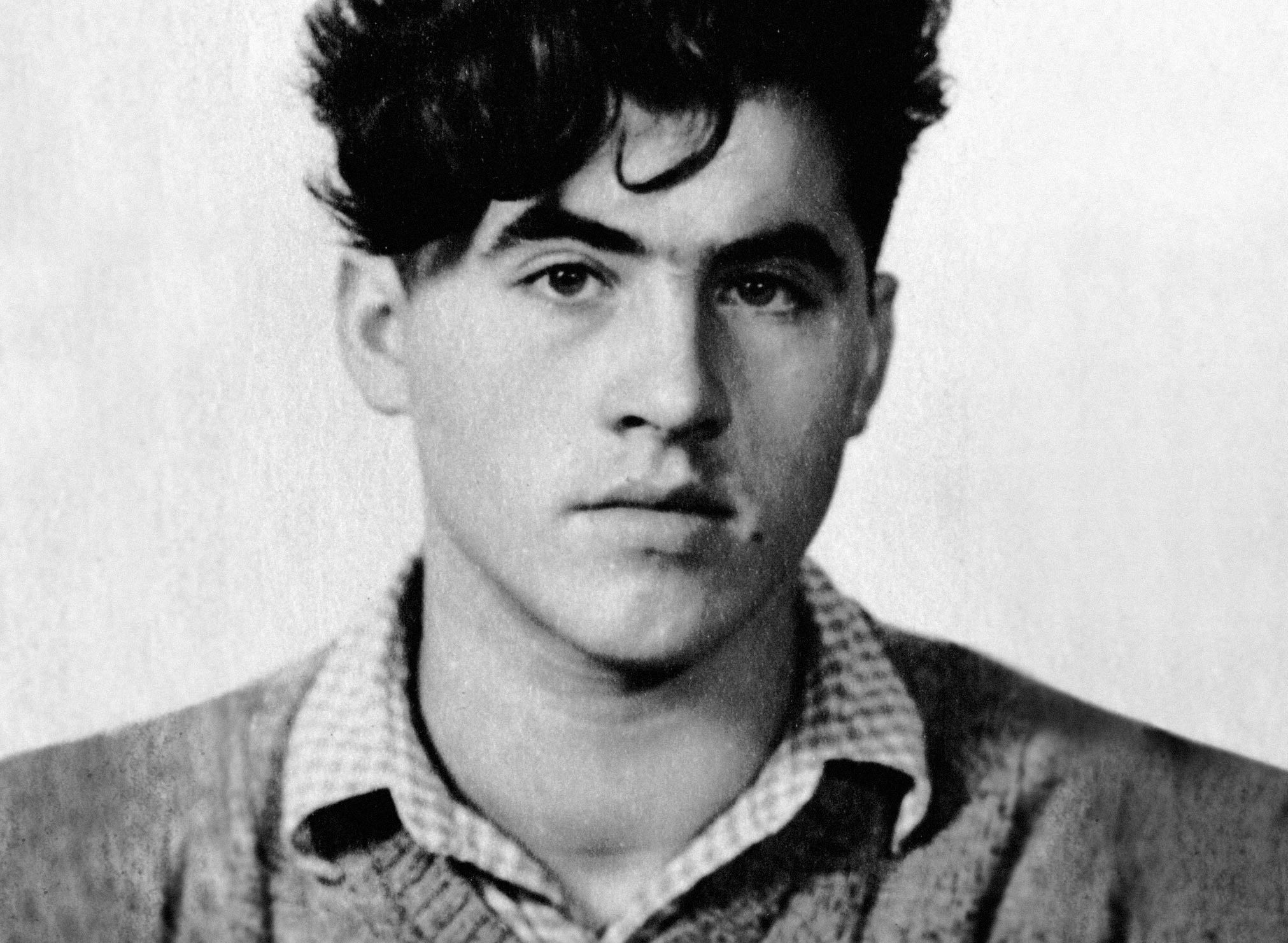
Aicher’s childhood and youth: the years 1922 to 1945.

Otl Aicher’s signage systems for airports, metro stations and hospitals are considered exemplary to this day.
Der einstige Braun-Chef-Designer im Gespräch über den Co-Gründer der HfG.
A Broadcast: What is his place in today’s world?
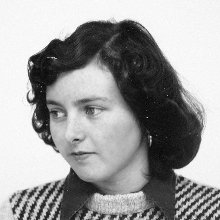
The Aichers: a brief family history.
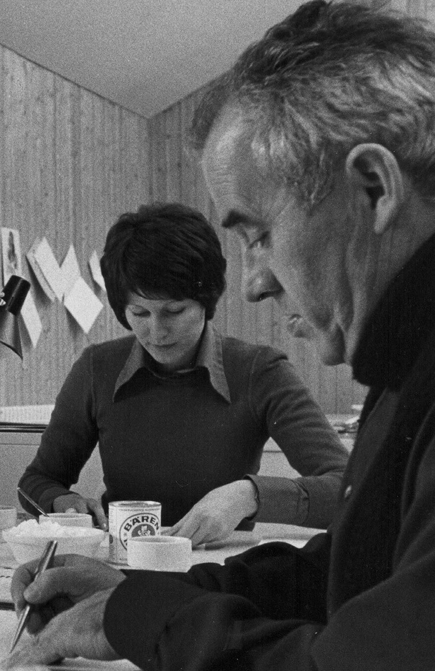
Drawing in Rotis: former Aicher co-worker Reinfriede Bettrich talks about hand sketches, the first computers and everyday life at the office.
How Otl Aicher’s papers and materials came to the HfG-Archiv/Museum Ulm.
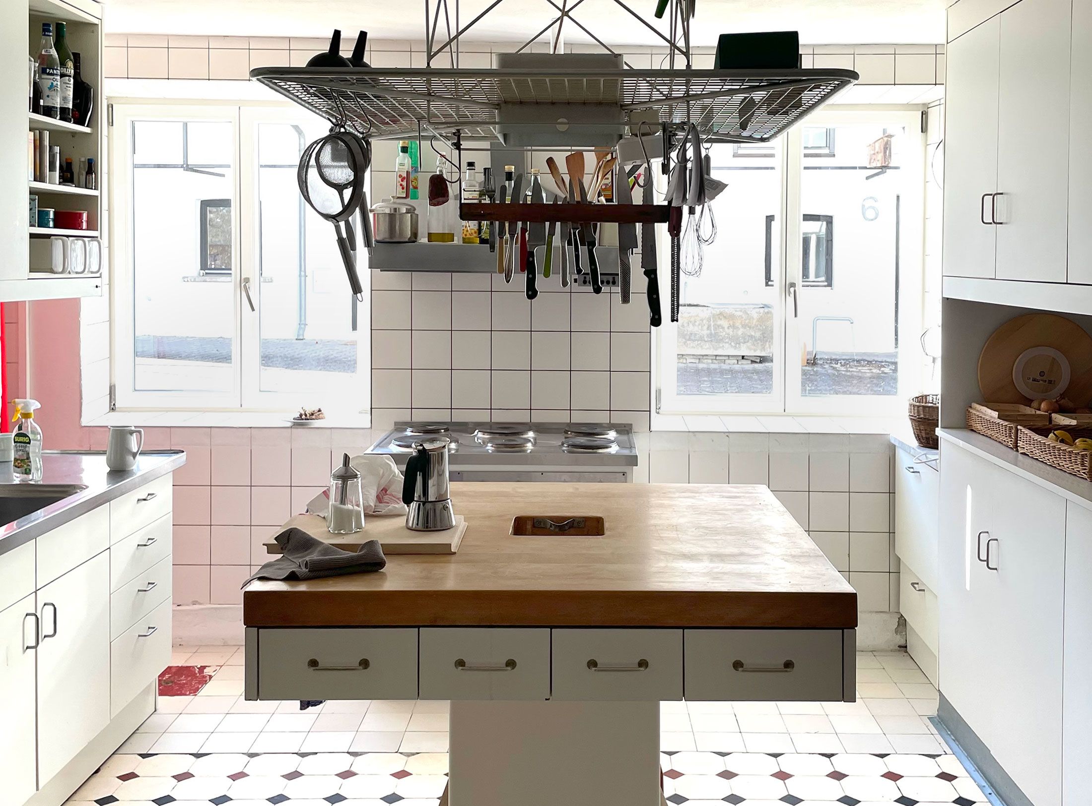
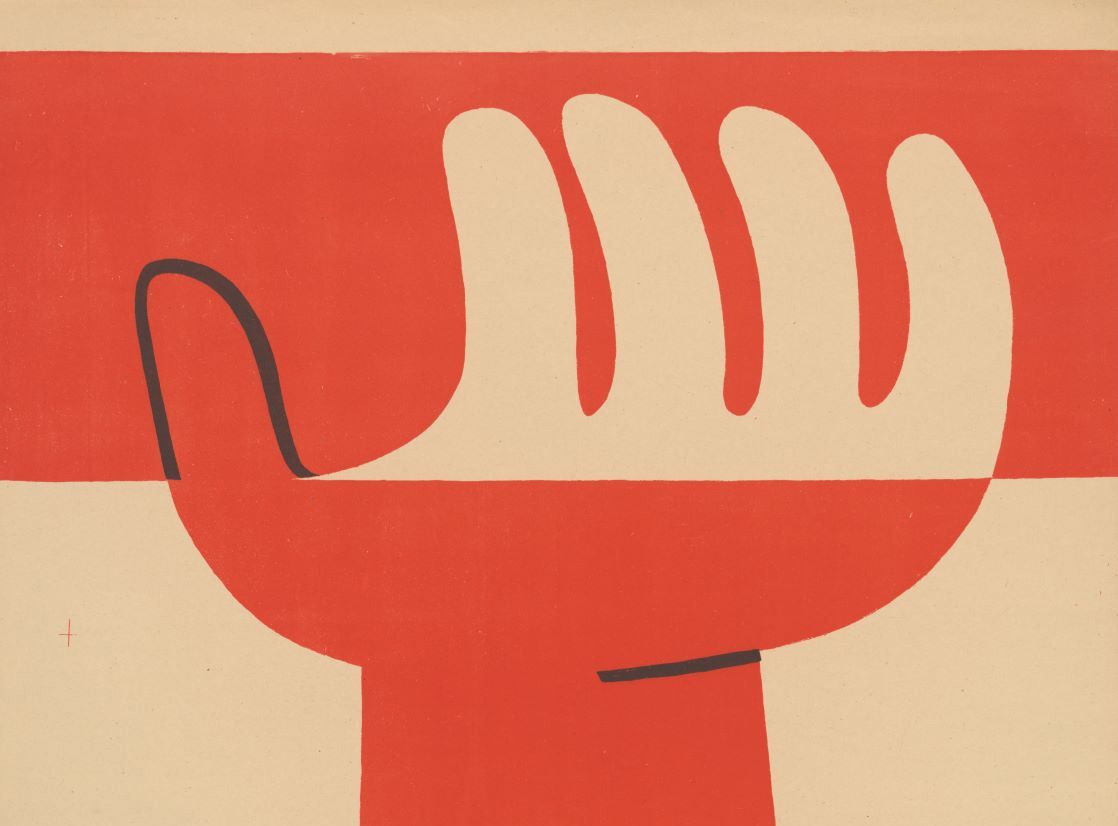
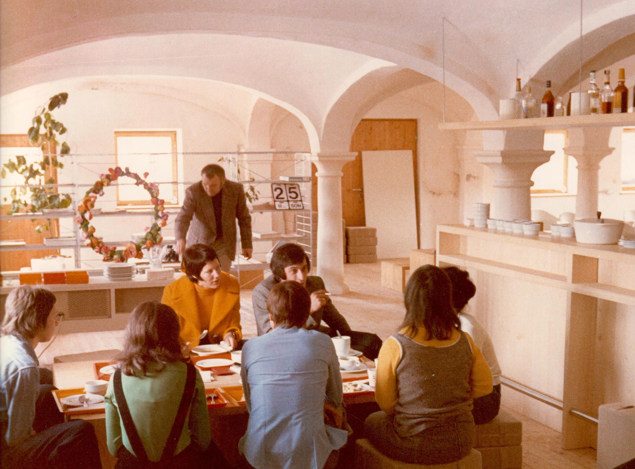
Die Küche zum Kochen (The Kitchen for Cooking) – the genesis of a book that has lost none of its relevance.
How a dachshund conquered the world: former Aicher staff member Elena Schwaiger on plush animals, fakes and the authentic mascot of the 1972 Olympic Games in Munich.
Le Violon d’Ingres or An Attempt to Defend the Writings of Otl Aicher.

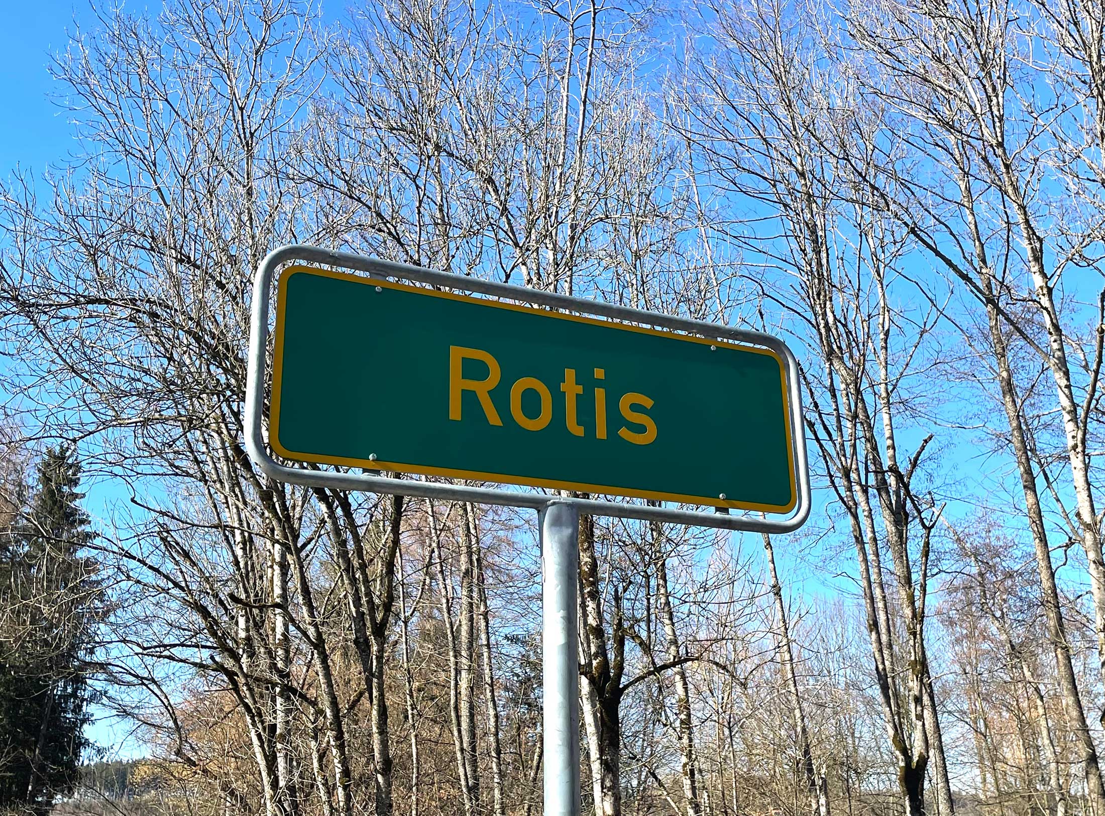
Otl Aicher as the architect of Rotis.
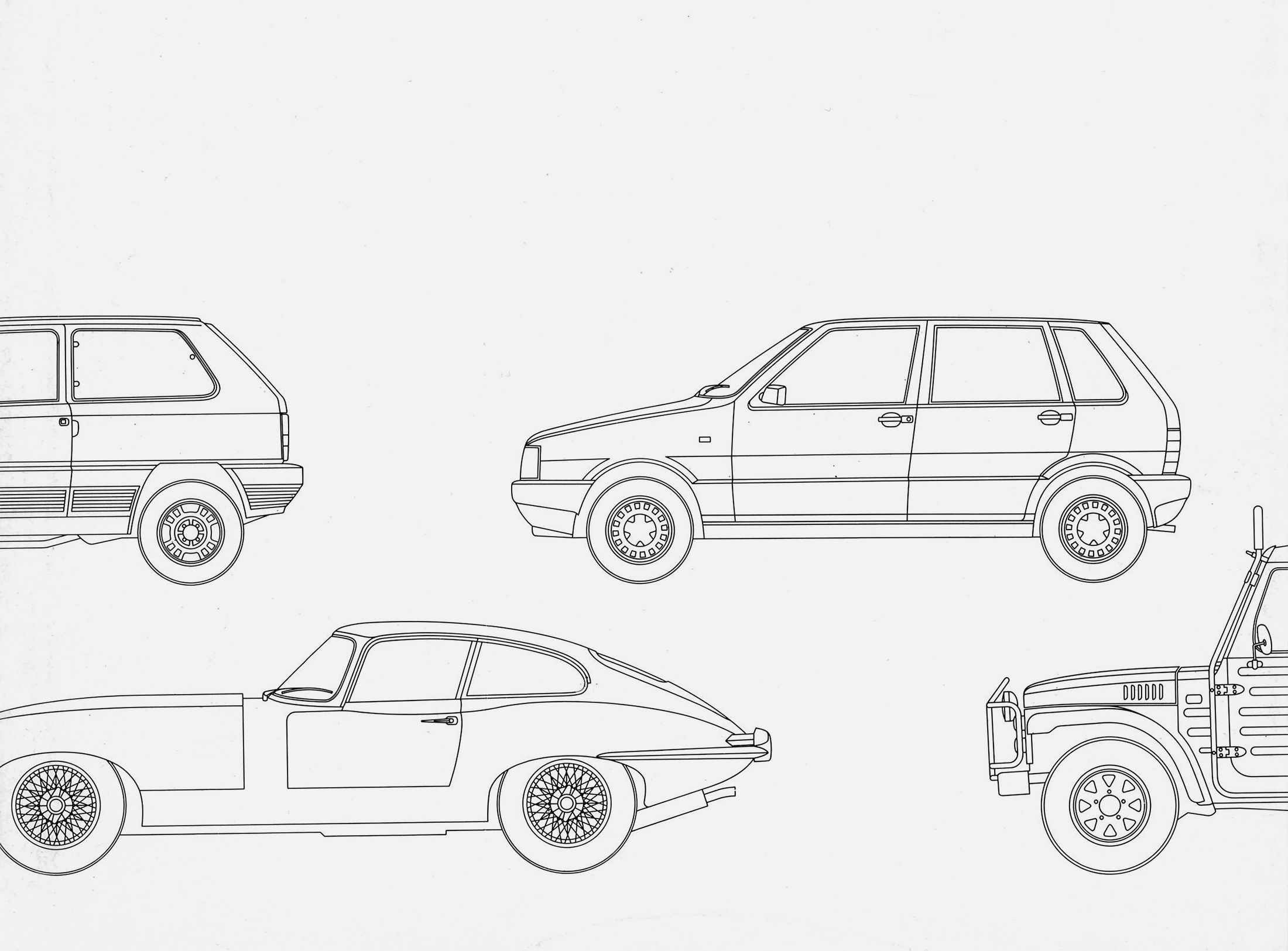
Otl Aicher and his critique of the automobile.
First broadcast: 15.02.1971 on Bayerischer Rundfunk, Munich (Only available in German).
Interviewed: Jürgen Werner Braun on his collaboration with Otl Aicher.
They created the signature of an epoch: designers Otl Aicher, Willy Fleckhaus, Anton Stankowski and Kurt Weidemann.
What is the current impact of a man who was once Germany’s most influential graphic designer? Where can we see his influence? What will be left of his work? Friends and critics, creatives and entrepreneurs give answers and express their opinions on Aicher.
Florian Adler
Communication designer, founder and managing director of adlerschmidt, professor of corporate design and information design at HTW Berlin, lecturer in communication design at the Hong Kong Design Institute.
Otl Aicher remains relevant. Much of his work is timelessly convincing; his pictograms in particular are of a quality that has never been equalled. Understanding the design process as a thought process and attitude is more important today than ever. Some things can be questioned, such as his radical use of lower case. I am involved in readability research and inclusive design, so mixed case seems more accessible to me. On the other hand, the openness of the letters in his Rotis typeface family, with which he attempted a combination of Grotesque and Antiqua and at the same time a mixture of the dynamic and static principles of form, is successful in terms of the distinguishability of characters. This remained controversial among typographers, but it was a pioneering achievement. Whether the Rotis typeface is actually more legible overall than other typefaces would have to be scientifically examined. However, the fact that it became enormously successful and was eventually used for everything and everyone, despite its idiosyncratic character, cannot be blamed on its designer. I am grateful to Aicher; not only for his designs – personally as well. After my undergraduate studies at the HdK in Berlin, I was able to do an internship at Rotis in 1980. That completely changed my view on design. One of my first tasks was to produce a stylised fine drawing of the baroque church of Bad Waldsee with ink and compass. That was an excellent line exercise. There I understood what it means to give an old place a modern face. The time in Rotis was wonderful. I was far away from home, living in an attic room in the neighbouring village, and I was happy. When the cashier in the village shop said, “Grüaß Gott, Sie san doch beim roten Aicher” (dialect: “Greetings, you’re with the red Aicher”), I knew that now I belonged.
Michael Keller
Communication designer, Managing Partner of the agency Blackspace, Munich.
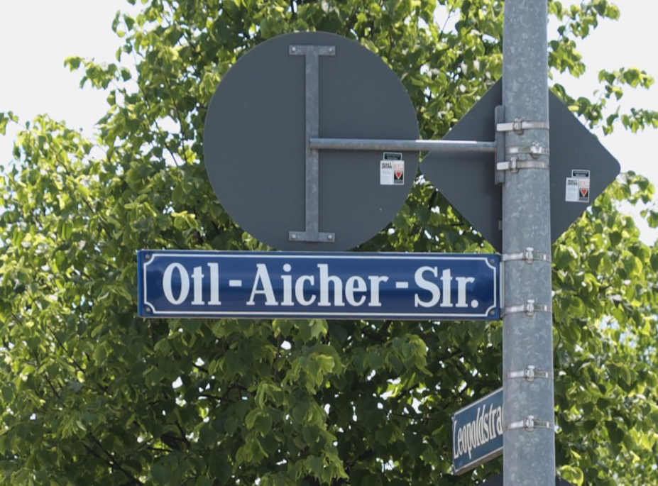
Otl Aicher is immortal. His maxim “attitude is design” is still anchored in our DNA. He not only developed pictograms, logos, typography, colours and posters, but made every design an ambassador or code for the brand or organisation – across borders. From architecture to orientation, clothing, language, colour and light. He gave each work an incomparable face. In doing so, he listened and discussed for a long time. Because he had to understand it himself before he could make a task tangible. At the same time he knew that it was extremely important to pass on his knowledge to the younger generation. That is why he founded the school in Ulm, whose guidelines are still the best tool for us to teach our profession, and which could still exist today. I once went on a pilgrimage to Rotis and saw that Aicher produced his own electricity, water, fruits and vegetables – that tells me that he was self-sufficient and autonomous. Having an attitude and doing good work, is that easy? No. For us, Aicher remains a role model; influential until today. That’s why we pushed through an initiative in 2010 to create the “Otl Aicher Street” in Munich. Thank you Otl Aicher!
Barbara Baumann, Gerd Baumann
Graphic designers, owners of Baumann + Baumann, Büro für Gestaltung, Schwäbisch Gmünd.
Is he missing? Of course he is missing, just as all people are missing who enrich our world with what they imagine and create with intelligence, attitude and resistance. For us, it is quite incomprehensible: he obviously had many critics, one could almost say attackers. In particular, his newly developed typeface family Rotis found few supporters at the time. So it was up to us to defend this “controversial” typeface on appropriate occasions, among others in 1995 at the Hochschule der Künste in Bremen on the occasion of the symposium “Positionen zur Gestaltung” (Positions on Design). Also by demonstratively – teased by many – using various Rotis patterns in almost all our work. In the meantime we have been proven right: Rotis has become internationally accepted and established.
Erik Spiekermann
Designer, typographer and author, Berlin.
Otl Aicher was living proof of my theory that design is first and foremost an intellectual discipline. He himself would have resolutely rejected uncritical idolisation, as is often heard and read today, because it does not correspond to his kind of analytical-systematic approach to his work. The epigones who parrot everything from the master without having understood anything, still consider the Rotis a great typeface, instead of understanding it as the first critical attempt to approach the drafting of a type system. Unfortunately, in the eyes of all experts, this experiment was not successful – the typeface was a mental construct that was never the solution to all problems in designing typefaces that Aicher had announced it to be. It is also true for him that we designers should not be measured by our claims, but by the results of our work. We should not trust propaganda, but our intellect and our eyes. Our idols are not exempt from it either. Aicher himself always maintained this critical attitude towards many things. In that he is a role model for me.

Monika Schnell
Graphic designer and owner of büro schnell, Ulm, worked at Rotis from 1984 to 1991 and was involved in the development of the Rotis typeface family; later she taught typography at the HBK Braunschweig.
Aicher was concerned with the class struggle of words. In written form, working verbs in lower case are juxtaposed with static, majestic nouns. The nouns in uppercase with their superior capitals. An equalisation of the two camps, i.e. a consistent lower case, was Aicher’s answer to this conflict. Another one went hand in hand with it: legibility. Lowercase letters, the many similar ones in a row, make it difficult to grasp syllables or word groups when reading without the capital letters. A dilemma. It is difficult to understand why Aicher additionally opted for an extended letter spacing in the typeface. It was a controversial dialogue that I had with him until his death. Finally, with a little wink on his part – yes, perhaps the spacing of the texts in his typography book was too open after all. But lower case is a must.
Jasper Morrison
Designer, London.
Otl Aicher was to graphic design what Dieter Rams is to product design: a driving force in the radical change of design and reflection on the discipline; a reflection that took place mainly in Germany, in Ulm during the sixties and seventies. At that time, standards were set both in terms of perfectionism and modernity. Aicher’s continuing relevance for the youngest generations of graphic designers is undeniable and will undoubtedly continue for many years to come.
Detlef Rahe
Industrial designer, professor of 3D design at the Bremen University of the Arts, where he has since also directed the i/i/d (Institute for Integrated Design).
Light-hearted cheerfulness was not necessarily his main trait, as far as I remember. Rather a kind of intellectual doggedness and meticulousness to detail. I particularly remember a visit to Rotis; it must have been in the spring of 1986. My girlfriend at the time and now wife Ulrike and I, then still students at the HfG Schwäbisch Gmünd, were designing cutlery and wanted to ask Aicher about the culture of food. He actually granted us an audience; yes, the word seems appropriate, given the respect he already enjoyed and subtly demanded. The food was then dealt with rather quickly and rather grumpily over a simple but excellent pasta. Shortly before saying goodbye, however, he said: “Oh, come with me, I’ll show you something.” He took out an oversized black “r” on a white background from a cupboard, certainly no smaller than A1. That was our first glimpse of the still unknown and unpublished typeface that was to be called “Rotis”. So, on the basis of the small fine letter “r”, he elaborated his thoughts on typography in general and Rotis in particular. He was obviously proud to be able to design digitally for the first time with the help of a computer, something he said he was actually reluctant to do, but which was nevertheless quite instructive and interesting. It was obviously important to him to show this project, which was still in the making, and also to address his doubts about the design, perhaps in order to clarify things for himself through constant discussion. When all was said and done, the visit ended rather abruptly with a polite but clear farewell. There is no question: the little pilgrimage to Rotis left a personally lasting impression. Aicher demonstrated diligence and care. He showed how, as a designer, one can – or even must – attend to the smallest details, even if one has the big picture in mind. A lesson for life!
Monika Maus
Owner of Schroer Design, Ulm, was Aicher’s assistant in Rotis for many years.
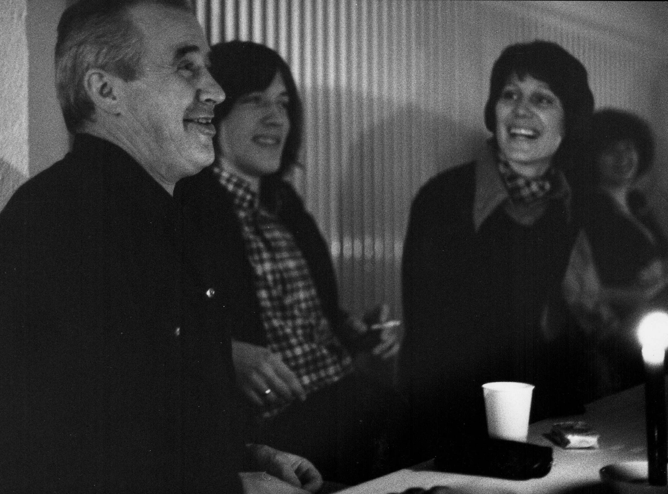
What will last? The memory, of course. My first encounter with Aicher remains unforgettable. The Olympic site welcomed me with cheerful colours. Large posters and pictograms announced the upcoming celebration. The whole atmosphere was lively and upbeat. I still had time, so I let myself be drawn into the lively stroll of athletes, coaches and guests. The special quality and impact of the graphic works impressed me and I became a little uncertain about how my interview might go. Otl Aicher was in a great mood and showed me the Olympia studio where final works were being completed. Our conversation was stimulating. He didn’t want to see any references. Nor was he interested in my lack of graphic skills. “Down there in the café on the corner,” he said, “after our conversation you can look directly into the Olympic Village and get an impression; you can’t enter the village itself without ID.” When I told him that I had already walked all around the Olympic Village, he was speechless at first. Then he said dryly: “Moni, you are hired, whoever finds entry so confidently without a security check, I can use them”. Days later, it was precisely this lack of control that benefited the assassins. The attack and the abrupt confrontation with death, in the middle of the cheerful, joyful games, left its mark on everyone. Weeks later, and then again and again in personal conversations when I was already working in Rotis, I experienced Aicher changed. His cheerfulness and joie de vivre, which I had still felt in Munich, remained hidden for a long time.
Thomas Rempen
Graphic designer, founder of the agencies Hildmann, Simon, Rempen & Schmitz (HSR&S), Rempen & Partner, both in Düsseldorf, and Büro Rempen, Drensteinfurt-Rinkerode, professor emeritus for integrated communication design.
otl aicher was a double stroke of luck for me and my life as an advertiser: firstly, because after graduating from high school, otl aicher and his ulm university of design didn’t want to accept me – so i started at the stuttgart art academy, where i became a lifelong friend of the clever typographer, courageous free spirit and cool life lover “kurtle” weidemann (which didn’t make my first encounters with the antipode otl aicher any easier …). the other time because i got to know otl aicher as an intellectual guru with a straightforward, critical, wonderfully protestant (although strictly speaking catholic) but often arrogant attitude in the seventies while working for clients such as klaus-jürgen maack and erco or gerd bulthaup. i soon came to admire him as a thinker and pioneer. it was great how otl dissected, described and designed the dna of his clients, how he created order for thoughts and design. admirable how he created both freedom and distance for his work. a place for free, different, radical, but cultivated thinking – his republik rotis, where interesting zeitgeists and ideas met again and again. of course there were arguments – i was born a swabian, too, and it took him a while to accept me as an advertiser and our efforts to create properly designed, promising advertising (the anecdotes can only be told …). maybe his hundredth birthday would be a nice occasion for the students of today’s so-called communication design at all universities to attend a seminar to learn and copy otl aicher and his principles of order in order to understand them. a must for all: reading “analogue and digital” – writings on the philosophy of making.
ps: i too – quite independently of otl aicher – became a lowercase writer early on: just no letter hierarchy!
Sibylle Schlaich
Communication designer, runs the office Moniteurs, Berlin, together with Heike Nehl.
Meeting Otl Aicher had a strong influence on my career path. After graduating from high school, I asked myself the question: should I study geography or graphic design? I was undecided. Then the opportunity arose to do an internship at Rotis. For Aicher, if I think about it, it was actually an imposition, because I had few qualifications. But I was interested. And he exercised patience. He gave me tasks, showed me how to draw perfect ellipses with a pencil. He was often on the road, though; his trip to Japan was during this time. But I had Inge Aicher-Scholl, Hans Neudecker or Berthold Weidner as interesting contacts. For me, Rotis was dreamlike. I went from Leutkirch, where I was staying, to Rotis either by bicycle or – even better – on my skateboard. Everyone thought that was fun. I sometimes helped out on the neighbouring farm. I was happy. The solitude, the greenery, I liked it. After my internship in Rotis, I saw things more clearly and went to the Hochschule für Gestaltung in Schwäbisch Gmünd. I remember the days with Aicher fondly, especially since I’m involved with him again today – completely independent of his birthday. Our agency is redesigning the guidance system of Munich Airport. We were able to convince our clients that Aicher’s work is a unique feature. A few years ago, the airport’s corporate design moved away from Aicher’s guidelines. We recommended retaining the pictograms, carefully developing them further and modifying the typeface – the Univers. Staying with Aicher and bringing in “today” is the motto for our Munich project.
Albrecht Hotz
Graphic designer, 1989-1991 graphic designer with Otl Aicher in Rotis, owner of Burkardt | Hotz, Büro für Gestaltung, Offenbach am Main.
Just in time for the centenary, Otl Aicher is put on a pedestal – rightly so. But neither preserving a monument nor overthrowing it interest me in his case. Aicher’s topicality can be quickly asserted. He was – there is no doubt about it – a dominant figure. In Rotis, he succeeded in designing and realising large projects with just a few employees: the corporate design for ERCO, for example, the identity of ZDF and FSB. In secret, far away from the metropolises, he preferred to work with his small teams. Today, in times of dominance by marketing and management, that would no longer be possible. Does an Aicher style exist? He would not have wanted that. Nevertheless, the colours Aicher chose for the corporate identity of the technology company durst resemble the colours of the Olympics and ZDF. The durst typeface is also quite similar to that of ZDF. Are these corporate identities interchangeable? The companies for which Aicher has designed work in different industries. That’s not the only reason why it works: The clear form of his designs also leaves room for content. It was always important to Aicher that companies become aware of the core of their activities and develop sound, long-term strategies based on this. With the sentence “I’m not a brand stylist”, clients were sometimes sent back into seclusion. However, his designs are identifiable as works done by Aicher. This is surprising, because for Aicher, the anonymity of the designer was virtually the antithesis of the celebrity hype that surrounds artists. It would never have occurred to Aicher to sign his designs. Nevertheless, he was well-known, famous even. In Rotis, too, everything revolved around his person. He was the autocrat of this, as he called it, autonomous republic – according to Dave Godin’s motto “Dictatorship in the arts, democracy in all other areas”. There was something brilliant about him – although in his writings he thoroughly dispelled the myth of the designer creating from himself. Nevertheless, everything depended on his person – including the fate of Rotis: Aicher’s office was not continued after his death.
Reinhilde Wurst
Graphic designer, head of layout at the news magazine “Der Spiegel”, Hamburg, worked in Rotis in the late eighties.
My professors in Schwäbisch Gmünd really raved about Rotis. So I thought: this must be the top address. So I set out: first I had to do my practical semester. A little later – after my diploma – I came back. “More labora, less ora”, was the motto. Rotis functioned like a monastery with Otl Aicher as abbot. It was monastic and family-like. I fitted in well. I come from a large family and felt safe. When we cooked, everyone helped; we fetched herbs from the garden, cut onions and vegetables. Everyone was involved. With my first independent project, however, I was completely on my own. I was designing a book for the marketing department of “Der Spiegel”, which was supposed to convince the news magazine’s advertisers primarily with statistics and balance sheets. Aicher, it was thought, would later design a CI for the Hamburg company, as he had done for the publishing house Gruner + Jahr. But he didn’t get on well with the people from Der Spiegel. They represented a world that remained alien to him. Der Spiegel was obviously satisfied with my work and hired me. I was only 26 and the first few years in Hamburg I was miserable. It seemed so cold and Rotis was so homely – at least in my memory.
Wilfried Korfmacher
Designer and psychologist, professor of communication design at the Peter Behrens School of Arts, Düsseldorf, runs the office Zeichenverkehr in Meerbusch.
An enormous number of things remain from Aicher. Above all, his plea for designing with attitude. As well as his understanding of design, which encompasses the conception and drafting of projects and processes. His designs were always preceded by in-depth analyses of the task at hand, as well as background research and planning strategies. The result was what we call system design, which can be described with the keywords research, functionality and systematics. I have great respect for Aicher’s almost incomprehensible life achievement. There are only a few designers who have thought and worked in a similarly comprehensive way. The Swiss Karl Gerstner is one of them. Like Aicher, he was one of the most important innovators of typefaces, typography, graphics and corporate identity after 1950. Like Aicher, he developed typefaces and took design tasks as an opportunity to write books. His “Compendium for Alphabets” is comparable to Aicher’s book “typographie” as a fundamental work. Aicher, as well as Gerstner, followed the credo “principles instead of recipes” and dealt with cuisine as well as cooking through books. Both – towards the end of their lives – lived in their own world. But you can’t solve world issues by retreating into your shell. The autonomous republic of Rotis was – literally – confined and excluded the city and the globe.
Marc O. Eckert
Managing Director of bulthaup, producer of kitchen and interior systems, Aich near Landshut.
For Otl Aicher, the kitchen was an inviting and sensual place where family and friends could come together to enjoy cooking and eating. This image and Otl Aicher’s design philosophy are still our role models today: focussing on the essentials, clear lines and honesty in both material and function have been at the foreground ever since. Form follows function, which serves people – people who enjoy, cook, communicate, dance and laugh in the kitchen. Just as Otl Aicher observed chefs around the world cooking for his book “Die Küche zum Kochen” (The Kitchen is for Cooking), our focus to this day lies firmly on people and their needs: we develop living spaces based on socio-cultural observations and create places that not only provide space for cooking, but also invite people to come together. Otl Aicher always looked at brands in a holistic way, shaping not only our idea of the kitchen, our way of designing and our philosophy – as if this were not enough – but he also developed the corporate design for bulthaup with the logo, line graphics and the “Rotis” font. Still valid today, this bears witness to Aicher’s relevance and influence on the bulthaup brand.
Wilhelm Opatz
Graphic artist and architecture critic, Frankfurt am Main.
Admittedly, it is somewhat unfair to judge a designer by one chosen statement after decades. But I had to smile at the following passage from the book “die welt als entwurf” (the world as design) (page 115): ” … with a new gesture, with a new architecture. like the one you can see over on konrad-adenauer-street in stuttgart, where a new work of social kitsch was created, that cloying, history-decorating manifestation of state care. i mean the museum building by james stirling.” This really amused me while tediously reading the litanies in minuscule Rotis font with no line spacing. But enough ranting – thanks to Otl Aicher, the year 1972 has taken on an infinitely optimistic and colourful meaning for me.
René Spitz
Design historian and communication consultant, professor of design science at the RFH Rheinische Fachhochschule, Cologne.
Aicher exemplifies the humanistic potential inherent in modernity – despite all justified criticism of the manifestations of modernity. Aicher insists on the primacy of the political and banishes any nationalistic appeal from the appearance. I rate the design of the 1972 Olympic Games as one of the outstanding design achievements of the 20th century. Style-forming posters without black. No red at all. Without gold – if the Olympic Games could have been held without gold medals. Instead, silver as a technically connoted decorative colour. The efficiency seems unreal: the entire design only needs a few pages of manual. No thousand-page manual in which every exception is codified in minute detail. Instead, a compact instruction manual, an invitation of playful application in the style of George Brecht: “Pull start”. For Aicher, design was only legitimate if it embodied moral values: He vehemently rejected neutral or indifferent design. He did not accept the findings of science as a yardstick for assessing the quality of a design. For him, design was politics, and therefore it could not be arbitrary. Aicher formulated the programme to which the HfG dedicated itself as “the cultural mastery of technical civilisation”. This task is of startling topicality. More than ever, contemporary technology is so far ahead of its time that it has not yet been culturally mastered. But by technology, Aicher still meant the mechanical and electrical machines of the modern age. Our time has long since gone beyond that. We should no longer speak of modernity, but rather of the digital, for this names the defining characteristic of our present. We are faced with the urgent task of culturally mastering the digital civilisation. To make progress in this, Aicher’s courage, rigour and determination are needed.
Markus Weisbeck
Studio Markus Weisbeck, Frankfurt am Main, professor of graphic design, Bauhaus University Weimar.
Otl Aicher neutralised the experiences of his youth into a visual language that became a cornerstone of the cosmopolitan image of the Federal Republic. These reflections accompany us to this day as part of our DNA.
Margit Weinberg Staber
Journalist and book author, Zurich, was one of the first female students at the HfG Ulm, which she attended from 1954 to 1958.
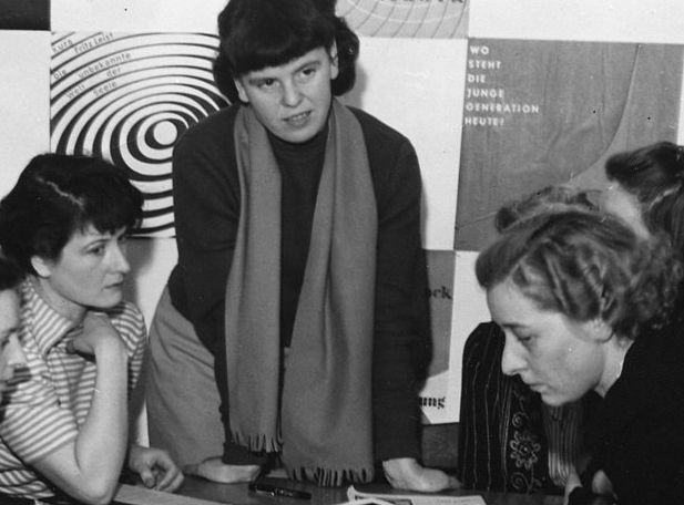
My diploma from the “Information” department in 1958 was the first awarded there: four young women and one young man were part of the rather adventurous party in the buildings of the Hochschule für Gestaltung (HfG) on the outskirts of Ulm up on the Kuhberg at the foot of the Swabian Alb, which were not quite completed at first. Otl Aicher, who together with Inge Scholl and Max Bill embodied the founding trio, became the deus ex machina for the subject of “visual communication” – although Max Bill also claimed a say in matters of the so-called New Graphic Design. After all, Switzerland, his home country, was a leader in this field. The interdisciplinary character of communication design and information processing is obvious. Learning by doing: that was the pedagogical credo. I had no educational contact with Otl Aicher. He was a lecturer in the “Visual Communication” department from 1954 to 1966. In other words, from the beginning to the early, sad end of the institution. He was undoubtedly one of the formative figures in the creative fabric of the school, and at the same time influentially discreet. We, the students of “Information”, worked on text material, poster texts, and advertising brochures, for example. I remember tall, narrow displays for public spaces with concise slogans to publicise the image of Volkshochschule and later also of HfG. We passed our designs on to “Visual Communication” for both criticism and approval. That was part of the practical part of the course. We worked together, lived together, argued and held opinions and beliefs. But somehow all under one bell of sympathetic like-mindedness in optimistically aspiring post-war Germany. The Mensa was a focal point of the architectural structure ingeniously designed to serve its purpose. Actually, it was a village of mutual relations, Max Bill commented. There were so-called master houses and for us students a residential tower, the first of three planned, but only one was completed. Hierarchies between teachers and students were no longer to exist, an experimental field of democratised pedagogy with varying success. Cliques and allegiances were formed, all of which ultimately amounted to the question of the extent to which design processes were amenable to scientification, and where individual creativity remained in the process. Algorithms were looming on the horizon. This is where Tomás Maldonado came into play, conjured up from Argentina by Max Bill, who was both admirer and critic of the master. Where exactly Otl Aicher placed himself in this battle zone of antagonistic spirits is difficult to discern. I remember him – if one may put it that way – as a visionary pragmatist.
Gerhard Curdes
from 1959 student at the Hochschule für Gestaltung Ulm (HfG), editor of the student magazine output from 1961 to 1963, later university professor for urban planning and regional planning at the RWTH, Aachen.
Aicher was a gifted and controversial teacher, an impressive personality. I studied at the Hochschule für Gestaltung (HfG) in Ulm from 1959 to 1963 in the Building Department. I first came into contact with Aicher in elementary teaching. Several lecturers gave us different tasks, those that required more brainpower and those that required more handwork. That way you got to know the lecturers and the different ways of approaching a problem. As a result, we were exposed to very different challenges, which I remember as stimulating and positive. Aicher taught elementary basics to those who had not had any drawing lessons in their training before the HfG. The free movement of the hand out of the joint was important to him. For those who could not do it adequately, he showed them how to get hand and pencil to draw figures and shapes loosely. If someone was too stiff, he could kneel down next to him or her to demonstrate the correct posture. When he drew at the blackboard or when he wanted to show one the correct hand posture, he often had prancing body movements. In the basic course, you needed a certificate from him for the exercises in “writing” and “freehand drawing”. As co-founders of the HfG, we showed him and his wife Inge Aicher-Scholl respect. But we distanced ourselves from him when he unilaterally changed the collective management of the school in his favour in an internal power struggle. A group of students founded the student magazine “output” and in a special issue we criticised the constitutional change. Aicher lost interest in the school after a while, and with the commission for the graphic design of the Olympic Games in Munich, he was hardly present in Ulm.
Manfred Eisenbeis
Design theorist, studied at the HfG Ulm, 1968 to 1976 founding member, research and teaching at the Institute for Environmental Design (IUP), Paris, 1976-89 professor of visual communication at the HfG Offenbach, from 1990 founding rector and professor of visual communication at the Academy of Media Arts Cologne.
In elementary teaching, I experienced Otl Aicher as tremendously versatile and distinctly pragmatic, who gave his all in every teaching situation, both mentally and physically, and with great passion. In his attitude he was more of a role model than a mediator. These were also the main features of his professional teaching in the Visual Communication Department, partly in direct connection with projects of the development group he founded. An inspiring experience. Otl Aicher’s interest in philosophical questions contrasted with his critical reticence towards the increasing influence of scientific teaching at the Hochschule für Gestaltung in Ulm. An interesting topic that might also have been of importance for the further development and transformation of the HfG in the sixties. When I went to the Paris Institute for Environmental Planning (IUP) after the closure of the HfG, I continued to have personal contact to Aicher related to the major Olympic project. Afterwards, at the Hochschule für Gestaltung Offenbach, I had contact with him regarding his competition project for the visual redesign of the Centre Pompidou in Paris. These were contacts for professional reasons, and they were, as always, intensive and enriching.
Lutz Dietzold
Managing Director of the German Design Council, Frankfurt am Main.
Sometimes a non-existent relationship is just as meaningful as an intense liason. In the case of Otl Aicher and the German Design Council, there was such a non-relationship; not because they ignored each other and not so much because they did not appreciate each other’s work. Rather, it was because they each focused on a different concern with their design: Aicher on socio-political issues, the Council, in accordance with its mandate, on economic or corporate policy. On the other hand, this did not mean that the other’s focus was completely disregarded, quite the opposite. Both just knew very early on about the importance of a clearly defined brand core. A connection existed more through ties, through design-oriented companies and people for whom and with whom Otl Aicher (firstly) worked for a long time and who (secondly) still belong to the circle of founders of the German Design Council today: Braun, bulthaup, ERCO, FSB and Lamy. In this sense, the triangle of designer, institution, company could be seen as a common basis for both of the above-mentioned concerns and certainly deserves closer examination in the planned project on the occasion of Otl Aicher’s 100th birthday. In any case, a common denominator between Otl Aicher and the German Design Council could be found in the realisation that design is both a cultural and an economic achievement. The fact that they have grown in different ways over the years from this realisation represents a common ground that not every relationship – no matter how intense – can claim for itself.
Jürgen W. Braun
Managing Director of Franz Schneider Brakel (FSB) from 1981-2001.
Otl Aicher captivated everyone by having them tell in detail where and how they worked in the company. Unfortunately, he did not get to see what a rich economic harvest we were able to reap over a long decade, having patiently worked through his five-year work plan step by step between 1986 and 1990. The original sketch of this work plan from the master’s hand hangs on my wall, within sight of my desk – as a reminder of exciting apprenticeship and journeyman years. I owe Otl Aicher for forcing me to develop talents that neither my parents nor my teachers would have even suspected I had.
David Kuntzsch
Head of Marketing ERCO, Lüdenscheid.
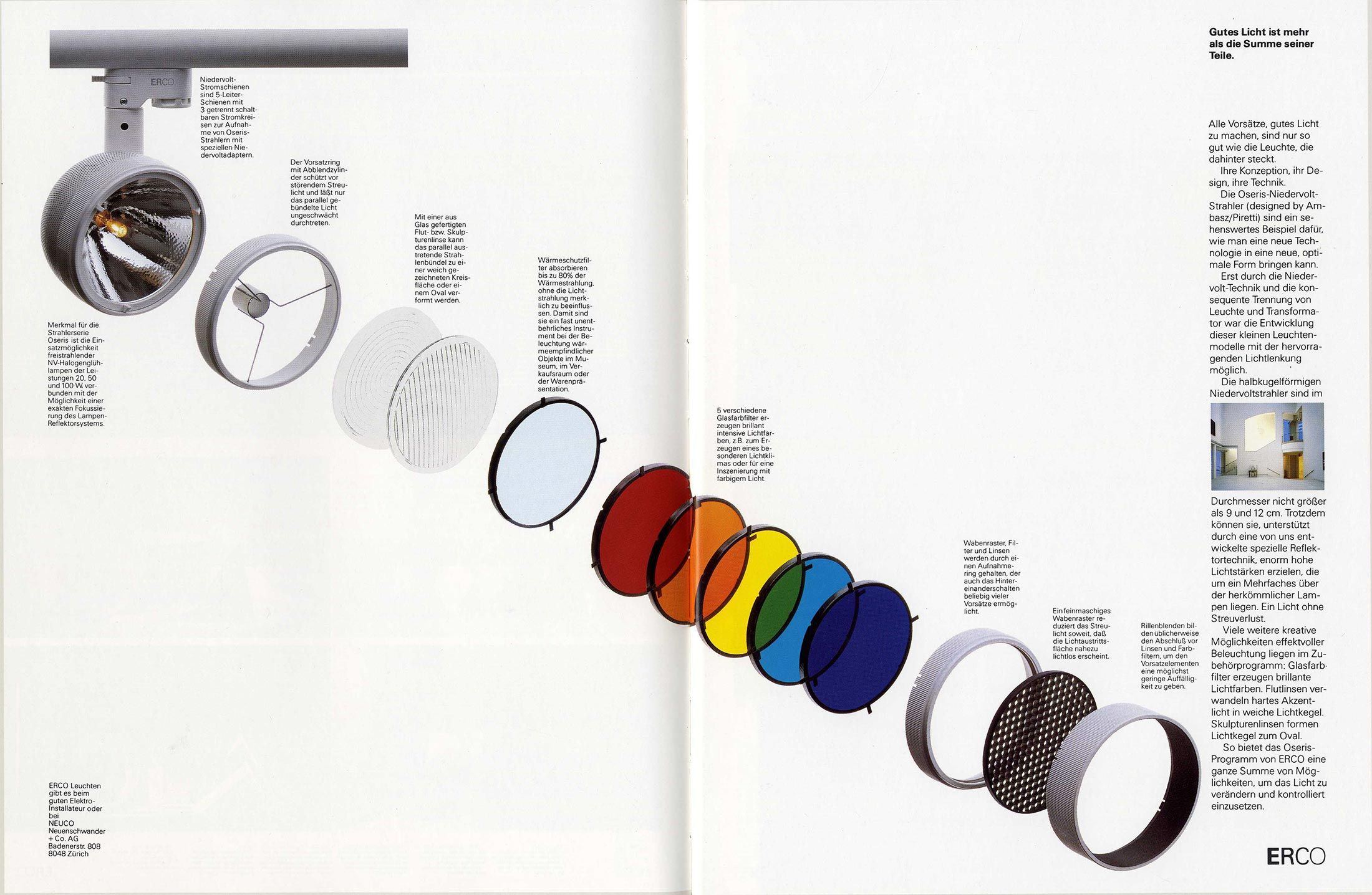
The relationship between Otl Aicher and the ERCO company was first and foremost a bond between two people who appreciated and respected each other: Otl Aicher and Klaus Jürgen Maack. Both were firmly convinced that new ideas must be expressed in a holistic approach in order to be long-lasting, credible and communicable. At the beginning, there had to be a thinking process in which the intellectual basis for everything that followed was developed. It was not primarily about design. Design was the result of the process, not its purpose. Once this basis had been defined and the impulse for change had become an attitude, everything that followed was quite simple – and demanding at the same time. Everything was questioned. Everything was redefined. The attitude and guiding ideas defined at that time still determine ERCO’s thinking and actions today: engineers and designers are dedicated to transforming technology into culture. In order to create durable tools with which light becomes the fourth dimension of architecture.
Holger Jost
Communication designer and author, staff member at the ZKM, Karlsruhe.
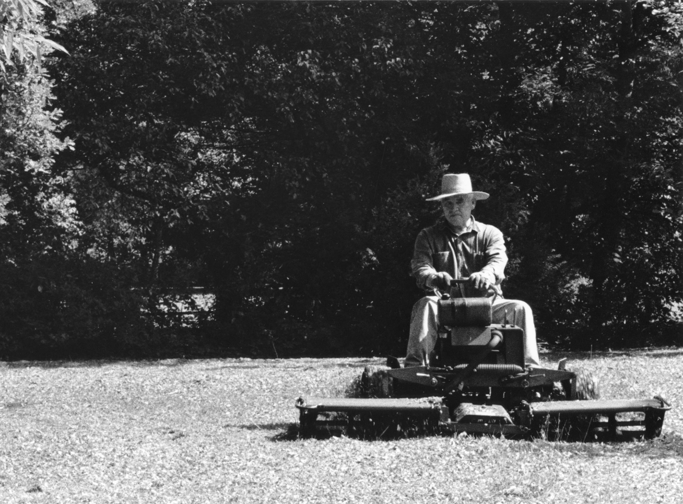
Pictograms, ERCO, Rotis, apodictic formulations, Wittgenstein, FSB – these are the keywords that spring to mind when I am asked about Otl Aicher. I can explain what they mean and what relevance Aicher has for me: Right, left, flowers, airport, swimming pool, fencing – Aicher’s system of pictograms, consisting of right and 45-degree angles, of rectangular and rounded edges, is widely used in public spaces and, compared to many similar pictograms that also emerged from signage systems for the Olympic Games, is less trendy and more expandable. The agency Stiehl/Over/Gehrmann is responsible for licensing and further development, while the ERCO company still holds the copyright. Their logo, consisting of four capitals in four stroke widths from bold to ultra-thin, is for me one of the best logos and has stood the test of time since 1975. It was designed in the remote town of Rotis, the Swabian home and workplace of the Aicher family, which I visited for a day in 1990. I remember the tidy atmosphere in the practical but not spacious offices with their skylight and tongue-and-groove boards on the wall. There was a lot of work, but not much payment. The argument: in the countryside you hardly need money to live. There was a strict separation between work and leisure. When all employees visited the beer garden, they were not allowed to talk about business. Two snapshots remain as memories: Aicher photographed our group with a digital camera that printed out its pixelated pictures immediately, I photographed Aicher on his ride-on lawnmower, with which he had the accident a year later.

Aicher’s childhood and youth: the years 1922 to 1945.
Drawing in Rotis: former Aicher co-worker Reinfriede Bettrich talks about hand sketches, the first computers and everyday life at the office.
Otl Aicher’s signage systems for airports, metro stations and hospitals are considered exemplary to this day.